A few days ago, I signed up for several pet insurance policies. Yes, after my confession of love for plants a few months ago (Truffaut email analysis >>), I'm announcing today another of my passions: animals. Well, not the most WTF passion in the world, I am well aware of that. For that, you'll have to see with other members of the team 😉
In short, here I am, requesting quotes left and right. Of course, the sites where I made these quotes all sent them to me by email. It was enough for me to wait impatiently to see where all this would take me. And well, after 2 weeks, I only received one conversion scenario, and we're going to break down the emails that make it up!
What is a conversion email?
Before diving into the subject, a quick reminder of the objective of this email scenario. A conversion workflow is a crucial step for any company that wants to convert its hot leads into customersUsing email as a channel to remove disincentives and answer frequently asked questions. A well-designed conversion email script can make the difference between a converted lead and a prospect. Normally, this script is automated and contains a variable number of emails depending on the company's strategy.
The first email of the workflow: the most important?
I received the quote by email the moment I filled in my details on the site, so it doesn't take long to send it. Moreover, it would have been a mistake not to send me a copy of the quote when I am showing a definite interest in this service. We are therefore on the trigger of our conversion workflow.
That said, I was rather disappointed with the email renderingeven though I'm well aware that I'm particularly demanding when it comes toemail design.
UX before opening the email, what does it look like
Let's quickly look at the Sender / Object / Preheader trinomial.
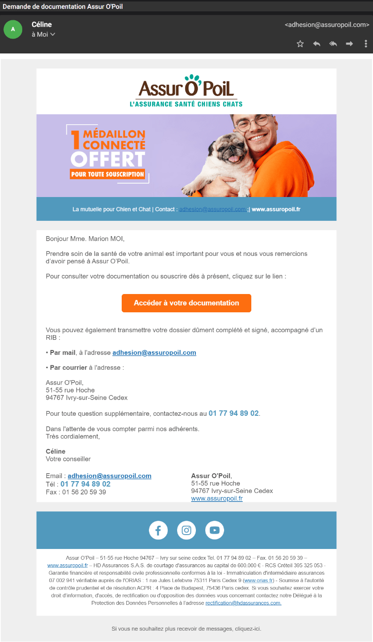
Sender : Céline <adhesion@assuropoil.com>
Subject: Request for documentation Assur O'Poil
Preheader : The mutual insurance for dogs and cats
The sender's name is not recognizable. Even if I expect to receive this email, we are here on a first request, therefore a first contact. I don't know the identity of the sender yet, so I would have preferred the brand name to be associated with the first name, and not just a first name and basta: Céline de Assur O'poil.
The subject line fits my approach, although it could have been even more specific and referred to a quote rather than documentation. Nevertheless, I notice that this word is not used in the email, I guess it is a will of the brand.
Finally, for the preheader, it corresponds to the baseline of the brand. We say it regularly, but let's repeat it: the preheader complements the subject line in order to encourage the opening of the email. I think it's a shame that it's not used in a different way and that it doesn't correspond to the content of the email. We could have imagined the following sentence: "Sacha's health insurance is waiting for you" (the name of my cat, which I indicated during the simulation), or "Only one more step to finalize your subscription" .
Email design: content and graphic charter consistency
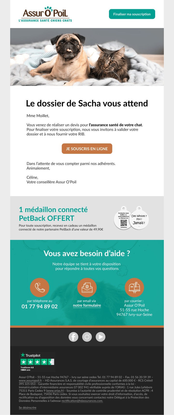
Now that these first elements have been verified, let's open email 1 of the workflow and talk about content and design. First of all, I'm a little disappointed to see a dog's face, as cute as it is, when I filled out an insurance application for a cat. You'll tell me I'm quibbling, but is it so complicated to plan several cover designs and make it dynamic according to the data?
The cover highlights a gift, which we do not find in the text below, and no mention of it in the footer. Is it a limited time offer, what does this medallion correspond to, what does it do? It lacks information for my taste.
A contact banner closes the header part of the email, in which we find again the baseline (yet already present under the logo, and the preheader), the contact email address which is displayed in blue on a blue background, so not very readable, and a link to the website. A rather useless banner all in all. I'm curious to see the click statistics on this area.
As far as the content is concerned, it lacks a lot of structure. As far as style is concerned, I can't find the elements of the website. The main colors are not respected (water green and fawn on the site), and even the logo seems to me different in its shades. We can deduce that there is no design system ! The texts are sometimes long, and repeated (phone number, address). In short, not very conclusive for a first conversion email.
Email 2 of a conversion workflow: the reassuring one
After 2 hours, I received a reminder email to finalize my request. I must admit that I found that a bit of a fast recovery. I may need time to think about the offer, discuss it with my family, make comparisons. In addition to this pressure, we have changes regarding the sender, which is a bit disturbing considering the time between these two emails.
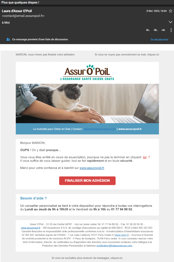
Sender : Laura from Assur O'Poil <contact@email.assuropoil.fr>
Subject: Only a few steps left!
Preheader: MARION, you have not finalized your membership
The sender is no longer Celine, who signed our previous email as "our advisor", but Laura. It's a pity not to to keep this coherence The first name (and I think I've found where the error comes from, we'll see that below), nor the sender's address. However, there is a positive point: the first name is no longer alone but accompanied by the brand.
The object is very tellingnothing to say ! On the other hand, on the preheader side, I'm not a fan of displaying my first name in uppercase, it's a bit aggressive, and it's only a mini param or CSS modification to do to fix that 😉
On this email there is a mirror link, which was not present in the first one... but which does not work. Splash.
The little cat on the cover corresponds to the animal for which I made the quote, to test soon to see if the image changes or not according to our data. For the rest, little change in style. The colors are the same as before, so they don't correspond to those of the site.
Finally, information that I could not find on the first email of the scenario, it is routed from Actito (which is the case of the next emails of the workflow too).
The following emails: must conclude now!
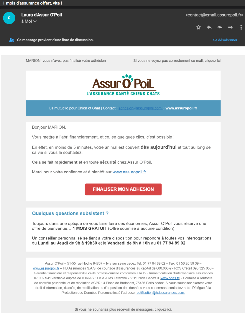
I received email 3 of this conversion scenario less than 12 hours after my request. Same sender this time, same preheader too. The subject line tells me 1 month free, which is the main goal of a conversion workflow! In terms of content, however, this offer is not the main focus that has been chosen. This element is only found in the secondary block, which is only so because of its position in the email as there is no difference in structure with the intro block. As a result, it's a bit confusing that the subject line doesn't refer to the main content. It would have been more logical to highlight the month offered at the beginning, and then remind you of the benefits, the speed of finalizing the file or the contact information via a reassurance block.
Finally, I received a last email for this scenario on the same day, a few hours later, to inform me this time that my offer expires. But no expiration date is mentioned, as you would expect from the subject line "Your offer expires!". The deadline is more than vague: soon.
I notice that in none of the messages apart from the first one is there any mention of the offered connected medallion. It's a pity that it doesn't also serve as a trigger to finalize the file.
And to conclude, I also received other emails not part of the workflow, which were signed by Celine this time 😉 So I guess there is a little mishmash on the senders between the marketing emails and the automated emails. We should do a replay on the emails in this scenario to harmonize the sender and choose who is "talking" to us.
So, do we sign or not?
I have found In this fairly aggressive conversion scenario, the commercial pressure is really strong. Four emails received in less than 24 hours, the first sent on D0 at 2pm, the last on D+1 at 10am.
From a content point of view, I would have appreciated to be reminded of the benefits of a health insurance depending on the choice I had selected in the form (there are several formulas), a speech from a veterinarian, or some examples of the expenses covered to reassure me about the service.
To finish, here is how I would have structured the contents of email 1 while respecting the charter of the website. I used the same types of content, I would have suggested an AB test on the connected medallion block to define its interest from the 1st email. In short, something very simple.
What about you, do you have conversion workflows in your company? How do you handle the pressure of these emails? Tell me all about it!