It's funny but since I was a kid I've been passionate about (and scared) by the movie "E.T. The Extraterrestrial". Passionate because I am intrigued by extraterrestrial life, and I like the way Spielberg approaches the theme in the film (and don't make me believe that this is a metaphor for separation, mourning or divorce, no way). Scared because here is the scene where Elliot falls on E.T. in the corn field (Steven you traumatized me for life, especially since I was watching it on VHS at the time).
Then the John Williams composition makes me cry every time in the end scene, when E.T. says "Come" and Elliot answers "Stay...". In short, I'm going astray.
I wanted to create, for fun, an email dedicated to my friend (and I'm not ashamed to say it) : E.T... And I wanted to play a little in this email. What do you want, I kept a child's soul! Here, I give you a preview of the final rendering of the email.
Visuals in HTML and CSS
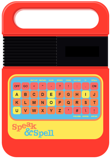
Where I tried something a bit special, is the design of the tablet "Speak & Spell entirely in HTML and CSS. Yes, you read correctly: it's not a picture, but cells, with rounded corners, background colors, sometimes borders or drop shadows. So yes, it took me some time... But not so much. And the advantage is that my tablet displays right away, no image download required.
Animation with keyframes and animate
I like to create "graphic" effects with HTML and CSS rather than images when possible... Even if the CSS properties I use are not supported by all email solutions. I already wrote an article about this with an email made for fun for Netflix.
Thus, the starry sky at the top of the email is not designed as an image, but with <p> containing the special character "•" encoded (&bull) on which I have fun applying a CSS animation to give them a white drop shadow that appears and disappears, like the stars in the sky after all, CQFD. And then a slight blur with the CSS property filter or a reduced opacity with the CSS property opacity.
It is true that the animation does not work on many email solutions (just check the support for keyframes and CSS animations in an email to realize this) but the rendering without the animation is not really bad either.
Interaction in emailing with label and input checkbox
The interaction technique with hidden checkbox inputs (in display:none) which are activated by clicking on the label referent, and display what is after this input <input> has always amazed me. We have planned a live on the subject of innovations in email in the coming weeks, an article will come soon on this subject, "keep your eyes wide open".
So I applied it here so that the keys "pressed" on the keyboard make the letter appear in the tablet window. The support is not top, since this type of interaction works mainly on the messaging solutions developed by Apple ...
The problem is that I clearly don't have the technical skills of a Megan Boshuyzen. (she killed me with her last interactive creation for a Valentine's Day email) of a Jay Oram of a Mark Robbins of a Annett Forcier or a Rémi Parmentier. By the way, if the above-mentioned people want to give me their advice on what we could do to improve the support and the fallback of this email, I'm completely interested!
The problem is that you always have to find the compromise between rendering and acceptable degradation. And here, even if the interaction and the "click" on the keys of the tablet do not work everywhere, the rendering is identical on all the messaging solutions.
The lightest possible code
Innovation is cool, let's not spoil the fun.
But remember that innovation usually requires a lot of HTML and CSS code, fallbacks and workarounds to work (relatively). And that too much code, well, it requires additional servers, and therefore additional energy, and therefore we burn things to get this electricity ...
E.T. the first was ecological: we can see in his saucer that he is a kind of Stéphane Marie of the tur-fu who loves Nature! So, don't forget to optimize the weight of the HTML code by applying some good practices of eco-design specific to the development of emails :
- shortened CSS properties (the CSS mega property
fontfor example, which can group the CSS propertiesfont-size,line-height,font-family,font-weightused here as followsfont:bold 14px/100% Arial, Helvetica, sans-serif) properly supported on messaging solutions. - A minimum of images called (only the big title "E.T." to guarantee the display of the typography, the tree and the arm of E.T. with the waves).
- Use of nested arrays is limited to the strict minimum.
- Shortened colors (
#FFFinstead of#FFFFFFfor example). - Removal of the
;at the end of the CSS properties in thestyleif no other CSS property is specified afterwards.
As a result, for an email that contains a complete visual made from HTML and CSS, and animations and interactions, we end up with a final HTML file size of 65kb, which is pretty clean...
I'm planning a small series of emails for fun centered on E.T. First of all because I do what I want. And also because there are still plenty of objects, or memorable scenes that I think I can have fun with: E.T. walking in the forest, between the huge trees... E.T.'s heart... The flowers that come back to life... The Reece's pieces (kind of skittles) that E.T. picks up... The famous scene of the corn field... The stuffed animals where E.T. hides... WHEN I TELL YOU THAT I AM PASSIONATE!
I'll... Be... Right... Here...
E.T.
Special thanks to Jonathan Burton's poster which I find superb, and which helped me to finalize the creation of this email.
Leave a Reply