Here's an example of editorial newsletter for which I confess to surprising myself. Not the kind of content or even design I really pay attention to.. This tends to go straight into the trash without even bothering to open it. As a neat freak and Zero Inbox addict, I plead guilty.
No, it wasn't the front-page story on urinary tract infections that caught my eye. Yes, yes, I can already hear the mocking laughter of my dear comrades. I had no knowledge of the subject prior to the opening, and it's a point we'll come back to later.
So why an editorial newsletter?
Well, simply because it's a subject close to our hearts at Badsender. Marion and I have just proposed a Live dedicated to newsletters and I thought it would be interesting to take a look at what happens in practice. Today we're dealing with an exercise in style in the greatest tradition of LA newsletter.
A variety of information content in a single newsletter
Yes, it's definitely a newsletter: no products to sell, no action buttons, no prices, no countdowns, no sponsorship and no other commercial promotion. Here, the Assurance Maladie via ameli&vous news offers us information content, and not just a little!
Reading sequencingin addition to being visually rhythmic by color codes and section headings, quickly gives an idea of the types of content:
- Headlines Is it really necessary to go into more detail? A subject in the spotlight, isolated and the first to reveal itself to you as soon as you open.
- In practice two practical contents linked to health and prevention advice. Clearly, this is the purpose of this newsletter, and the main aim here is to hierarchize the information by proposing a layout that distinguishes the "front page" content from these two other practical sheets.
- On the ameli forum A new feature: the highlighting of a question asked via the forum and answered by an ameli expert. We can't stress this enough: the questions raised by your subscribers, readers and users via your contact points (support, after-sales service, etc.) are a rich source of content for your newsletters. The design of this question-answer block could have been based on the one on the forum, but that will be for the next update.
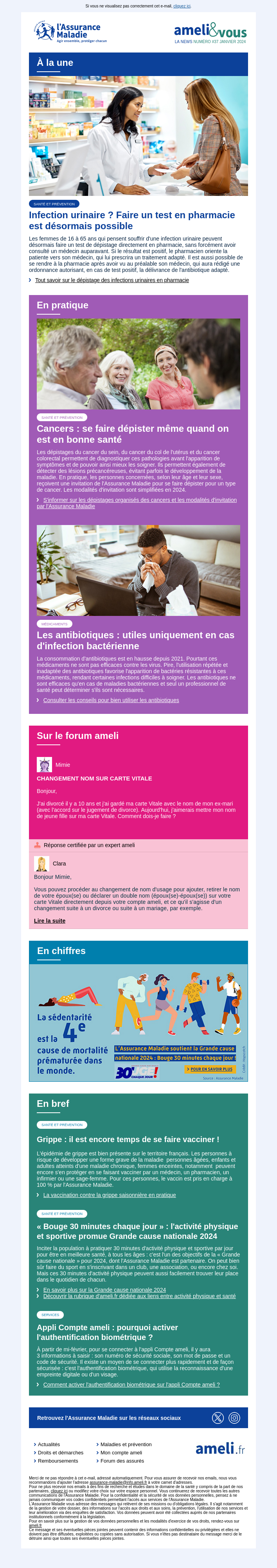
- In figures For the time being, this is the content that least convinced me by its execution. The intention is really quite interesting: to break up the text-heavy rhythm by providing brief information in the form of an infographic pushing a key figure. The problem here is that all we have is an image with a lot of text. Yes, there is an alternative text tag (we'll come back to that, because it's a very good point), but I sincerely think that an insert like this could be much better designed. Both in design and integration.
- In brief A list of content that could be described as secondary. Less prominent, with no images to illustrate the point. A title, a description and a link.
I won't list the other content blocks in the newsletter here, as they're simply the header and footer. As for the footer, I confess I don't really understand the point of including pictos and links to social networks X (Musk's version of Twitter you can do without) and Instagram. On the other hand, the thematic menu is a nice touch.
Editing down to the last detail
Indeed, it's a bit THE point that caught my attention and has chosen to present the ameli&vous newsletter: the design editorial work pushed.
Clearly, in terms of design and structure, there's nothing revolutionary here. I don't know if that's the objective, but it does make it possible to focus on content. For each item we find :
- image : systematically with an alternative text tag
alta one-word summary of the subject and/or associated heading - label category: a keyword to identify the theme
- title Tone of voice: for which we can already feel the work on tone of voice. Often sequenced in two parts to ensure fluid reading. Or in the form of a question to challenge the reader, who may be asking the same question himself.
- paragraph presentation: a good effort too, as it's not simply a copy/paste of the châpo of the article in question. It orients the reader by directly evoking the target audience concerned or the seasonality of the subject to be developed.
- link and I'm melting. A text link that's completely explicit and descriptive of the content to which it redirects. Hats off to you, a very fine piece of work when we know how quickly it can become a headache.
This emphasis on copywriting makes it possible to "quick scan. Even if you only read diagonally (which is highly likely with so much content), we already have a high level of information.
Content design, rendering and readability
Between block sections that facilitate visual cues, the choice of a font-stack web safe in a large size, left-ironed paragraphs (no justification or centering), work on images and hypertext links the entire design of the newsletter is clearly geared to encourage reading. And this is clearly the right approach to take with this type of email.
All the more so as it has a direct impact on the code and therefore the weight of HTML. Despite the density of information HTML is less than 60kb and is therefore not truncated on Gmail (which can happen very quickly).
Content with no real colonization (single column) makes work much easier for the mobile version, although there is a breakpoint and an adaptation of the side margins for even greater reading comfort on mobile.
Does this mean it's the perfect email?
Unfortunately not. A few more efforts and we could make it:
- text size for legal notice and mirror page link
- contrast between text link colors and colored block backgrounds in green, attention
- management of certain design elements by unnecessary images (rounding on category labels)
- for me the sender is problematic "Your Health Insurance" is truncated in my inbox and it is nice fail that only shows me "Votre Assurance Mal." Ironic if ever there was one.
- In the same vein, the mock "cobranding" of Votre Assurance Maladie and ameli&vous. It's a bit unnecessarily confusing. The sender could, it seems to me, be "Ameli&Vous". This would also avoid repetition in the subject line and focus on the message rather than the branding.
- The object. I don't understand, it doesn't include the "front page" content at all, so... no common thread. What's more, it includes a section on "sporting activities", which is one of the least readable items of information in the present contents.
- And finally, there's no preheader, and we know just how much the triptych : sender, subject, pre-header have an impact on openings