I have all the vices, that's a fact. Among them, I bet a bifton, sometimes... You want to bet? Who wants to bet? You want to bet? Who says bet, says gambling, says "Française des Jeux" (French Games). It's a good thing, I'm French and I like the game. So I let myself be tempted. So I asked to change my password to access my account.
Ben on the grave of his dead, I am very disappointed by the transactional email confirming the change of password received. Here it is in screenshot.
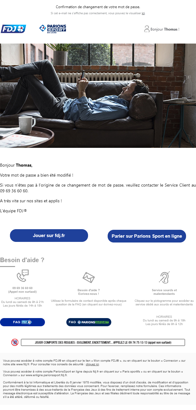
Damn, we are at the FDJ! First operator of money games in France. The gateway to the LOTO, to the Euromillions... We are talking about more than 25 million players, that is to say about one Frenchman out of two! It should be at the top on emails, whether transactional or not. WE PLAY FOR REAL! And I already see the FDJ teams...
When I am disappointed by an email, I vomit I tend to make it an article to criticize, point by point, and then offer something, just to keep it constructive. And do I look like an ass-kicker... So play along Lared, and GO for the critique first!
Critical...
...of strategy
- The sender address is fdj@auto.fdj.fr... Funny, but I it doesn't necessarily inspire confidence when the sender's domain name is not exactly that of the site concerned (just expediteur@fdj.fr for example). But well, why not...
- The answer address ? nepasrepondre@auto.fdj.fr... And here, I refer you directly to the article of Sébastien on the dialogue established with the reply addressI can't say it better ! If the recipient wants to report a problem with the person, the rendering, or ask for additional information, how-do-you-do it?
- And the gmail annotations in all this? Ha ha! I'm teasing Marion Duchatelet, who swears by it. But really, it's so easy to set them up and it gives you a little extra information in Gmail, that it's a shame to do without them...
...of Design
- What's the problem? Come on, you fools, don't be soft! Well, first of all, the colors, the typography, the pictograms are not all connected. First point. And we've already explained to you that it's important to have coherence between the different means of communication to establish credibility and trust with your recipients. With a Design System Email for example?
- The preheader "Confirmation of your password change." is visible. Personally, I never liked the idea of having this element appear IN the e-mail. It's there in addition to the subject line, at the notification of receipt. So it doesn't have no visual utility. In my opinion, it should be invisible to reduce the height of the header.
- The mirror page link is a bit long which again adds height to the header. Moreover, as this is a transactional email that should be simple, short, concise, there should be no problem of rendering. So, this link could either go in the footer or be dropped.
- A "Hello Thomas." is present in the header, but does not bring anything. I still know my name, thanks. In fact, it's a connection link to the personal space... Yeah, not very explicit...
- Why two logos in the header? I only play on the FDJ website, sir! I suspect (perfectly, I suspect!) both sites to use the same automation scenarios for this type of email. Yes, but a little segmentation wouldn't hurt I think, and it would probably be possible from the automation workflow.
- Does the cover visual bring anything? I'M NOT GETTING ANGRY !!! I have a question... A transactional e-mail must be clear, concise. Is it then necessary to add a visual without interest?
- Two call to actions are present under the explanatory text, at the same level, with the same graphic layout, and therefore, no hierarchy. Here I find the same problem as above: why offer me access to "Online Sports Betting when my request is for my FDJ account?
- The hierarchy of the texts is not globally accentuated on the whole email: The texts are all approximately at the same size.
- The reassurance block is not clear, with its two call to action to access the different FAQs.
- Mandatory information ("Gambling has its risks") are here managed in animated gif. Honestly, with such a sensitive subject, I think it would be wise to design them in HTML text and display them in their entirety so as not to play with fire... Besides, the legifrance.gouv.fr specifies that the appearance of this warning message must be guaranteed... But then, as it is, how does it work if the images are kéblos?
... of the Mobile rendering
- The texts are not enlarged. As a result, they are quite small on the mobile version, and difficult to read.
- The call to action are not modified either, so the "tapping" on mobile version is a bit more complex. You're not going to do that to me... YOU'RE NOT GOING TO DO THAT TO ME !!! We do not forget that, for design, experience, ergonomics or accessibility, the call to action on the mobile version of an email must have a height between 42 and 72 pixels. It is not me who says it !
- The reassurance block is a bit confusing: the elements come one under the other, aligned, while the title is shod on the left...
...of accessibility
- The texts are a bit small, in general:
14pxfor the main text,10pxfor the texts of the reassurance block. I would be curious to know the average age of the users of the FDJ site, but I doubt that such small texts meet the expectations of most people. - The contrasts of the texts are not really convincing. Not all of them, of course, but let's take the reinsurance block: I get a ratio of 2.77:1 on the site webaim.org. So, no validation for a normal size text, or even a large size text...
- The animated gif of the compulsory mentions turns in loop. Not so good, according to the recommendations of accessibleweb.com which strongly advises to limit the animation of a gif to 5 seconds !
...of technique
- The mail does display a mobile version. But with media queries. And here, I am very surprised. I really thought that a group like FDJ would think about designing their emails (at least transactional) with the Spongy Method. Well, no. Yet, I imagine that the number of users on mobile must be growing. It seems important to me to offer a mobile version on all supports, even when media queries are not supported.
- We find contradictory information in the code: background colors that are not the same on the same cell, sometimes via the HTML attribute
bgcolorsometimes via the CSS propertybackground-color. - Empty cells are used for spacing. It's funny by the way, I just did an article on the subject of empty cells or margins in an e-mail. So yes, it's true, if it's a Master Template that's being used to design this email, it may be more relevant to use empty cells, at least when the email is being built. But once the e-mail is finished, why not replace these empty cells with internal margins?
- Because of the two points listed above, the code is probably "too heavy" or in any case, not optimized. I notice a total weight of the HTML file of 20kb after automatic indentation. Maybe that we could reach the same weight, with a Spongy design.
- The CSS property
max-widthis used, while there are no ghost tables for Outlook. Inevitably, the rendering is laaaaargely degraded on mail clients that do not support the CSS propertymax-widththe tables then take a width of 100%. Want to see how it looks? - The alternative texts are not formatted. It's annoying, it wouldn't take long though and it would significantly improve the rendering of the e-mail when the images are not displayed or downloaded.
- The CSS property
displayattribute with the value presentation to allblockis missing on the<img>. And you know what that means? It means that we can have breaks on Gmail under the images.
...Technical and accessibility
- There is no attribute
langattribute with the value presentation to allfrin the tag<html>. - No attribute
roleattribute with the value presentation to allpresentationon the<table>which are not data tables but formatting tables. - Semantic tags (
<h1>,<h2>,<p>…) are not always used. For a complete detail of the code modifications to make your code accessible, I invite you to read the article on email accessibility tips'n tricks I wrote in 2019.
Transactional email redesign: Time for medication!
Let me explain all the changes I've made before delivering the mock-up of this transactional email:
- The preheader is now invisible.
- Colors, typos, pictograms and hierarchy of titles, texts and call to action are now established in a beginning of Design System Email with Atomic Design on Figma.
- The mirror page link is moved to the footer.
- The header now only features the FDJ logo, with a more explicit button to access the personal space.
- Two variants are envisaged: one with a cover image (animated gif to bring a little life) and one without, to get straight to the point.
- The main texts have a
font-sizefrom18pxwith aline-heightfrom140%to optimize readability. - Contrast on all texts is optimal.
- Calls to action under the text are revised, to get a main button (Play on fdj.com) and a secondary button (Betting on Sports Betting).
- Hovering effects are brought to all the call to action present in the creative.
- Reassurance banner is more readable and better contrast. Two versions are envisaged: one with texts and pictograms on the left, one with contents centered horizontally.
- Mandatory information "Playing has its risks" are now managed in HTML and CSS.
- Everything is thought out in advance (at the design stage) so that the Spongy method can be implemented, so that a mobile version of the e-mail is displayed on all mobile devices, without exception.
And here is the mobile version.
You may think that such a short creation does not take much time. Think again! All the elements are thought through, in terms of content, font size, alignment, width, layout, order, etc... A good transactional email can't be made in five minutes!
At least I will have tried, damn it, at least I will have tried...
