And zou! Taïaut! A new article in a week of time, even if I am not a machine! Today, it's Madura(cuire). No but I'm kidding! Come back ! Come back kid, it's for fun! Madura, for the novices, it's a number 1 in interior design. It's simple, above them there's nobody below them there's nobody. There are tiny cushions, comforter covers that you want to sleep on, sofas that put Skrug® and Klimsen® from a brand you know only too well! In short, it's the North style in your living room!
I discovered the newsletter at the same time as you, let's be casual and not look like anything!
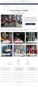
I decided to be generous and to put you two of the last news sent by the brand ! Yes well, this way we can see what exists until now, it's a kind of Christmas present before time!
We must recognize the aestheticism of these creas. It's not bad at all, I must say! I've always liked to be sincere, and my goal is not to criticize the current creations during my redesign articles, but rather to find the axes of optimization to creas that already appeal to my eyes! So, after the justification and self-congratulation, let's go to the main course.
So, a little practical question: What's our concern with these creations? Hm? What do you think? What do you think about it ? For my part, what bothers me a bit is the lack of coherence between the news and the site. It's not personal, it's only business as it seems. And above all, the big problem is that we are on full image and that only the legal mentions are in html. I'm not going to hide from you that I'm a bit... disappointed. And there is one thing I hate, it's to be... Disappointed. Well ok, I've already done that one! 😉 Anyway, excuse me Madura, but you've bitten the line, it's a mistake ... I beg your pardon, it's a precise art with good practices, it's a mistakethen we put zero. Unfortunately, so much news is still designed this way! It depresses me! However, full image is a real bane for a campaign, it's like shooting yourself in the foot! The images will not be displayed without an authorized download by the recipient, and for the responsive... Well, it's double-edged, it can be simpler as it can be more complex...
Let's talk about responsive, shall we? In all transparency, because that's just the way I am and I prefer to play it straight with you, I haven't had a chance to test these news in responsive. But let's face it! We all know that there's very little chance that responsive was planned and that this thing is going to blow up in our faces on mobile! And as Ventura would say in "L'Aventure c'est l'aventure", there's more to it than that. This layout of the three modules "mirror page - notification - unsubscribe" at the top of the e-mail is tingling me. And there's also the fact that no news (ok, I only put two of them here, but you can see 6 or 7 on the site newslettermode)As I was saying, no news is really based on the same structure as another. In fact, sometimes there are different headers or footers! But sometimes there is a man it's important to create a certain consistency in this communication medium! You need to accustom the recipient to a slightly more consistent structure and identity. Putting this down to a recent redesign of the site is quite possible! It would also explain the slightly different menu, the reassurance banner that you don't see this way on the site, and so on, and so on...
Come on, no more nonsense, get in the car Simone, I'll take my courage with both left hands and I'll tell you what I thought of!
Well then, no need to specify that the fonts used are websafe fonts, I think you have already guessed that, we are not at our first redesign! I chose the Trebuchet MS, classic, that I particularly like and which is closer, in my opinion, to the MetricWeb Light typeface used on the site.
Yep, so let me explain a little bit: At Badsender, we often offer our clients Master Templates: templates with many different modules and structures to be able to alternate the final construction of a campaign. That's exactly what I've done here, you've understood everything... You're too smart for me, it's beyond me! So you deduce that it is quite natural that there are two "types" of header, one with the social network pictograms, the other with the same services as the one on the site. Moreover, for the social networks, I decided to present them as well in the header in picto version but very light (with reduced opacity a max) than in the footer in text version.
If I go back quickly to the preheader: I added the little emailing best practices preheader above the add to address book and the mirror page link. I think all this should be simply formatted, without frills, above the header. No need to lose height on this with weird formatting like we had before.
On the menu, I simply said to myself: "Well, let's try to get all the tabs on the site? It worked... So I said to myself "Why not?"... Once I got there, I thought I could run through Greebow County... I'm getting excited... After that, I really enjoyed the different modules that we could put in the Master Template. In the end it was pretty simple, all I had to do was to answer "Yes Sergeant Instructor". (I'm getting carried away again) to take what already existed on the site and adapt it accordingly, on a width of 600 pixels. This time, I didn't really bother with responsive without media queries. Considering the latest Gmail announcements, you have to know how to move on and move on to something else! Fi, the bugger!
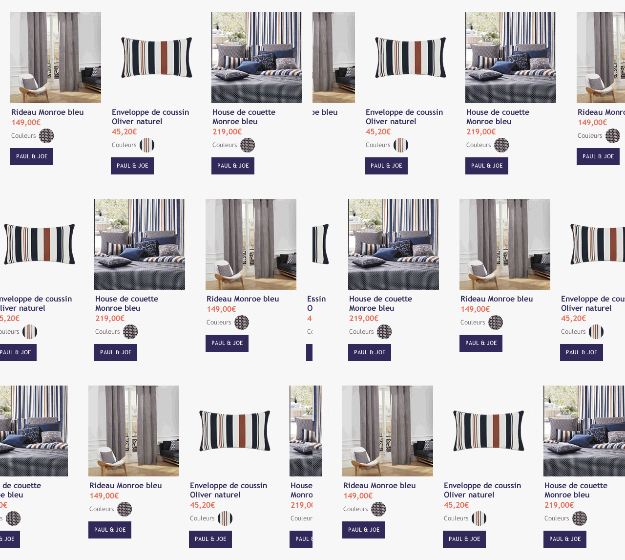
For the module of the three side-by-side products, I was counting on (well, I'm still counting: one, two, three, four all that) propose a carousel and a clean display on webmails and email softwares that do not support this technique. It would look something like this:

You will tell me that this is "too much". I won't do you the honor of pointing out this remark which denotes resentment against me. But I owe it to you to criticize your pessimism which borders on defeatism! And still to bring a bit of cheerfulness, a bit of freshness, a bit of lightness in this world of brute, I also said to myself that we could add a bit of animation on the ctas themselves. Something light, a small transition in css3 on the hover for example which could be translated like this:

So, you can think what you want... But if you allow yourself little animations like that on a campaign, it can only attract a little more the eye of your recipients and there I say "What a feeling". It is also with this "little extra" that of the Periglioni house that you will manage to stand out ! And don't come and tell me "You're just a pooorc Francis !!!", because it took me a long time to make these little animated gifs ! And with time goes, with time goes, everything goes, it's well known! (We miss you Leo!)
To conclude (because it's not all that but it's going to get dark soon, you'll have to think about going there!)I have redesigned the reassurance and service banners in the same way as those on the site, so that everything is held together with a brush, I'm taking off the scale!
See you on the bus! (I wanted to make this article based on outdated expressions, but this one is already more than enough...)
Need to redesign your emailings ? Discover our email redesign service


