For once, I'm going to present you with an email that disappointed me. Yes, disappointed, because the advertiser and consequently the brand spoke to me fully: outdoor clothing with a strong environmental and social commitment, a B-corp label, transparency on the production chain and concrete actions to protect and share. Bingo! It's right up my alley and should fit in well with a responsible communication.
But why is this Christmas promotional email so disappointing?
A promotional email for Christmas isn't really the type of communication I'm interested in. But now I'm biased and obviously "business is business", so I understand. Curious when it comes to email, this one nevertheless creates a dissonance for me in relation to the image I've formed of the brand. Here are the points I feel could have been handled differently, while still aligning the brand positioning:
- FOMO (fear of missing out) object AND preheader A bit of a dirty technique, warmly recommended on Linkedin and elsewhere. But if we care at all about the mental wellbeing of our customers and readers, then we avoid putting them under pressure and stressing them out as much as possible. All the more so since here there's a preheader (invisible in the design but present in your mailbox) which repeats exactly the same content as the subject line. All with a "red alarm clock" emoji. It's a shame.
- Pressure through tone and writing as a reminder: "Don't miss your chance! FOMO when you hold us
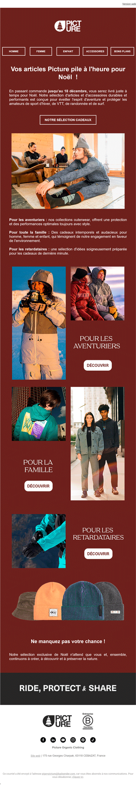
- Speaking of mental health, the entire product presentation (atmospheric images) uses animated GIFs that loop around on a montage cut of fast-paced product changes. That's 9 visuals flashing by without us really having time to stare. If you have attention problems or are prone to epileptic seizures, do not open this e-mail.
- A seamless transition to thecontent accessibility. Text in images, ouch! 14 images present in all of creation. Ouch! And of course no text alternative (attribute
altbeaconsimg). Using a screen reader? Then you won't have access to most content. Is your inbox blocking image downloads? You won't get the main information in this promotional message either. All the more unfortunate since all the images are clickable and supposed to be "call to action" images.. - As a corollary, the logo - the visual identity that makes the brand identifiable and unique - is an image that takes up the entire width of the design (the logo is not cropped and includes the margins, so the file weight is not optimized). Here again no text alternative. No image, no brand. We don't know who you are!
- Other possible value alignment, the weight and resources required. Part of what can be covered by eco-design. We've already seen that we had 14 requests for image resources, including 3 animated GIFs of around 200kb each. A guest has slipped into the downloaded resources: a Google Fonts! The weight isn't that great, as Evil Corp optimizes its resources, but when I look at the design, I can't see it? Not right away, in fact. It looks used only for the text of the legal notices in
11pxand light grey on white background. My eyes bleed tears of blood and my heart is broken. - Design system and component identification. The graphic treatment of buttons contained in images and those in HTML/CSS is different. This not only results in inconsistent branding, but also makes it difficult for readers to find their way around.
And otherwise there are good things in this email from Picture?
Yes, fortunately!
- HTML weight down to 63 kb and therefore well below the 102kb that would truncate it on Gmail. This is partly due to the fact that the content is in the images, so it's worth testing to see what happens when you do things properly.
- Image weight optimization. There are a lot of them. There are some large animated gifs, and I was expecting huge numbers, but we're still under 200 kb, which is not bad.
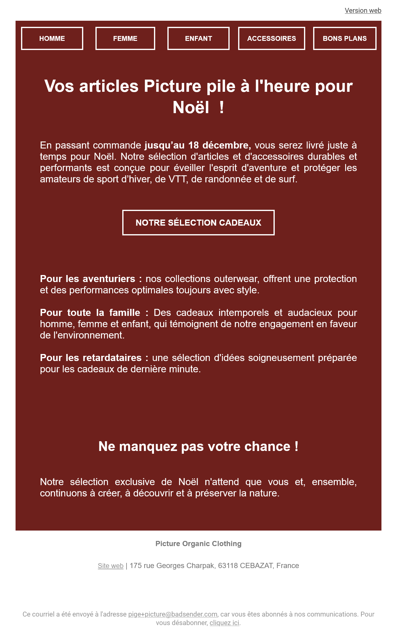
- Legibility of text content. Apart from the legal notice and mirror page link, all content is at least 16px. There's a hierarchical structure with identifiable headings at different levels. The contrast between text color and background color is top-notch (AAA WCAG-compliant). And to top it all off, the capital letters are accented (a rarity in emails). As a quibble (because I'm said to be a "nitpicker"), the text paragraphs are justified, thus generating gaps that make line-following more difficult to read.
- No fallback or specific code overlay. Particularly visible on the one and only button that isn't an image. No overkill with effects or "innovative" content as a result, the Dark mode version passes off cleanly and effortless.
- Mobile version. Yes, email is responsive! Phew ^^ On the other hand, it has a fixed width of 320px, which corresponds to aging viewport sizes. Given the brand's positioning, it wouldn't be surprising if a good number of subscribers were browsing on recent, high-end smartphones. As a result, they'll have large white side margins and an email stuck in the middle.
Get involved, he said!
Picture's commitment is evident in their products and corporate architecture, but not in their email communications. Not much is missing, and a few quick actions could easily correct this dichotomy.