Greenweez is a partner of the Paddle Major Tour, which took place in Paris in September. Hence my 1st encounter with the brand. The 2nd was a Google search for a product and Greenweez came up at the top of the list. I placed a small order on the site and signed up.
When you sign up, you get a little welcome trigger if you've built up a customer loyalty program. I've chosen this email because it's good, and there are a few simple improvements you can make to make it 'very good'!
It all starts at the beginning! (JCVD my idol ^^).
Pay attention to the subject line, which appears to be the email description in the routing tool: 'Mail inscription'. And also pay attention to the sender address: 'noreply@greenweez.com'! Avoid 'noreply + @domain name' - it's a question of customer experience or UX.
Come on, I'll let go of the 8 remaining faults right away, so we can stay on the positive side:
- The mirror link is missing. Watch out for the customer experience here too!
- An unsubscribe link is also missing. Attention to UX and deliverability !
- The preheader has to be changed, of course.
- The word 'Magazeen' in the menu. The association of Magazine & Green is not immediately obvious, and sounds more like a spelling mistake than a neologism.
- The title 'Welcome!' stuck to the border. A small detail indeed.
- Headings are not clickable. They are in text, which is fine. But the images are.
- The quality of social network pictograms.
- I'm informed' in social networks is unclickable, yet underlined.
15 minutes tops and all is corrected.
So what's good about this email?
- The spirit! Which is in line with our ethics here at Badsender, where we try to be as green as possible (without competing with the Hulk^^).
In fact, it's not for nothing that my beloved Grand Chef Jonathan Loriaux has interviewed Manon Le Bourdiecmarketing and communications director, or rather CMO, of Greenweez. (Any attempt at spin would be purely coincidental^^).
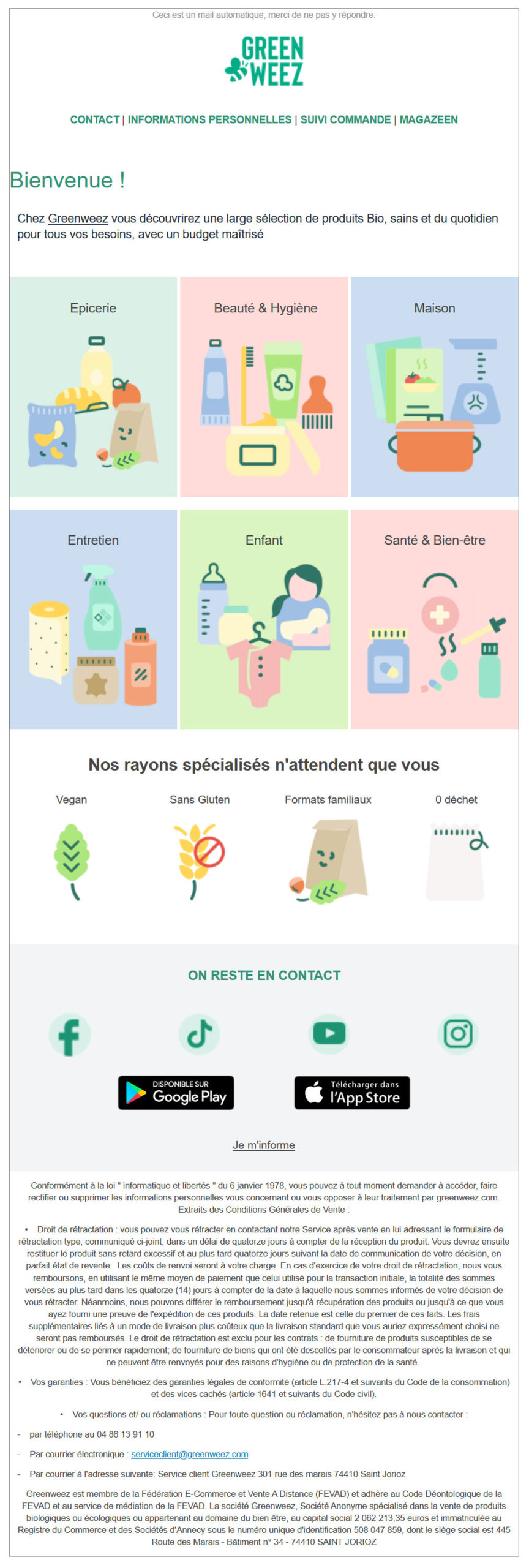
- Simplicity of message: a logo, a menu, a single descriptive sentence, main categories, special categories, social networks and apps, and legal notices.
Plus points :
- The message is well organized and clear. Simple and effective.
- The illustrations are pretty and to the point.
- Maximum text content
- A complete legal notice that's transparent. I have to admit that, in addition to the reminders of the law and so on, I like it when a company puts its e-mail address, telephone number and address in the footer.
In conclusion:
There are a few errors that can affect the deliverability of this email. It's all easy to correct, and doesn't take much time. Take the time to check these 'details' that don't need to be checked, and improve the health of your communication very quickly.
Keeping it simple and visual makes a big impact on the end customer.
Playing your ethics card and the transparency that goes with it is a sign of courage that will be recognized by your audience if you're sincere.