I like that! Free presents refurbished equipment to its customers Free Mobile (of which I am a member, well, my children are, anyway). If you've been following our email marketing agencyAs you know, we try to campaign on sobriety issues.
Unfortunately, this seems to me to be a missed opportunity on Free's part. From the point of view email campaign designnot much negative to say. The design is cool, the responsive well conceived, the dark mode top-notch, the code is light, ... I'll still make a short list of the things that don't go a bit further, but that's not the point.
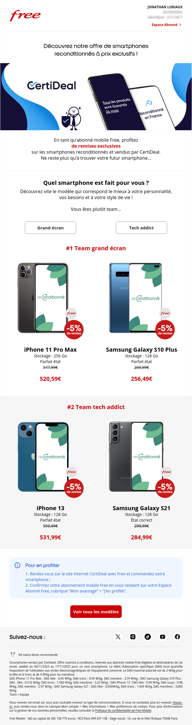
An email to demonstrate the power of the refurbished model
Unfortunately, in terms of demonstration, we're not going to get very far. All in all, when you think about it, reconditioning offers two important advantages for consumers:
- low prices,
- and a low environmental footprint.
It's on the first point that the object comes to type with an "exceptional price", on the second for the preheader with a "good plan for the planet". We could already discuss the fact that the two dimensions are not located directly in the object (we could quickly imagine a whole host of combinations around "Refurbished phone: good for the wallet and the planet").
To continue, at opening email, pfft, no more on the environmental side. And to tell the truth, the "exceptional price" section also seems to have disappeared.
But why on earth did we choose smartphones that, in some cases, still cost over 500 euros? But why proudly display these 5% discounts that will seem ridiculous to readers?
For the record, these 5% are an additional discount for Free customers on the Certideal site. In fact, if you go to the site, you'll see that these 5% are the "minimum" discount.
These choices will completely confuse the recipient, who was expecting great deals.
For an example of a refurbished email, we've seen better.
What could we have done?
Firstly, the main title of the emailwhich normally reinforces the object's impact, should have continued to focus on the three main concepts: refurbished, price, environment.
For example: Minimum 5% discount thanks to Free on already compressed prices!
Next, a short paragraph to take the concept a step further, and reinforce its environmental credentials. Browsing the Certideal website, we quickly discover that prices are 30% to 70% less expensive than new ones and that the production of a new phone is equivalent to the energy needed to run it for 10 years. It's worth highlighting!
We let's continue with a call to action. In the existing email, we have two. And they don't carry the values of sobriety, since we end up with a "Large screen" CTA and another "Tech addict". We're not even really making a choice. A real choice would have been "Super low prices" and "Refurbished not so old". In truth, we would have put a single call to action after our first paragraph. Remember the famous inverted pyramid in email.
Only thenOnce the main message has been conveyed, we take the liberty of differentiating offers or product categories. Here, personally, I would have put reassurance first. This is done in the image of the current email.
The concept of refurbishing may be new to some, and we could have reassured them by pressing :
- 24-month warranty
- Reconditioned in France
- Minimum 5% Free discount on top.
I'm not going to rewrite the whole email, but it can't be said often enough that taking time out in writing an emailing is crucial to its performance. Put yourself in the recipient's shoes, identify values, keep the focus on the starting point given in the object...
Otherwise, what else is there to say about this email from Free?
As I said, this email is easy on the eye! Still, there are a few things we could improve:
- Email hierarchy The main headline isn't given enough prominence, an image (especially with information) between the headline and the first paragraph isn't appropriate, double CTA as first buttons (but we've already talked about that), ...
- Product blocks Button my love (where did they go?)
- Unsubscribe A link you'll have to look for, which will take you to your customer account login page (but not in 2023 !!!!).
And that's all, because yes, otherwise, basically, it's not so bad this email 😉