Because I'm stunned. I wasn't expecting this kind of email from Cultura at all. And let me reassure you right away, I'm positively stunned. I'm going to focus on the design: this is a trigger-type email, sent after an account has been created on Cultura. And the brand clearly didn't settle for a basic email, with no graphic layout. I like it. Very much so.
What I particularly like about the design here is :
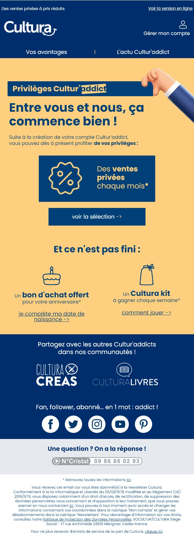
- An original layout, rarely found in emails, since colored backgrounds take up the full width of the body (
<body>). You can't tell from the screenshot, but you can. You've heard of email innovation, haven't you? Well, put aside carousels, empties, forms, etc... This kind of design is already an innovation in itself, since it's rare and therefore... Innovative 😀 - The texts are large enough to be easily read, with the smallest text (the legal notice) designed in
12px. - Most texts are designed in HTML and CSS (almost all of them, in fact).
- The use of Poppins, a typeface I'm particularly fond of, with a very well thought-out play on boldness!
- A marked hierarchy titles, texts, buttons.
- An aesthetic, graphic design, despite very few images!
Personally, there are just one or two points that I would change: put the text "Manage my account next to the icon, for example, to reduce the height of the header. I'll take advantage of this to hide the preheader. If there's only one privilege presented, perhaps try to place the call to action next to the privilege, not below it. I'll also try to design the image "Cultur'addict privileges in still image(s) and not in background image, to make sure this visual is displayed. And to polish up the final rendering a little more, I'll abandon the rather crude arrow system for calls to action, and limit myself to a simple chevron.
If I take a closer look at the HTML code, I'll make particular note of :
- The MA-GNI-FI-QUE formatting of alternative texts! In other words, when the "Cultura is not displayed, for example, well, the layout of the alternative text (white text, in Poppins, large and bold) is amazing: I almost don't realize that the logo isn't displayed!
- The same applies to "CulturaCréas, "CulturaLivresor even the Cristal number!
- Apart from the formatting, even the "filling" of these alternative texts is carefully done, since in the "And there's more to come"the two pictograms are replaced by (coherent) emojis when these pictograms are not displayed.
On the other hand, the code is too heavy, busy and complex in my opinion. It could be greatly simplified, and a few accessibility optimizations could be made (like using semantic tags for text, for example, or adding a lang on the tag <html>).