During the email designIt's possible to add a style to the alternative texts of your images. In this article, we take a look at the graphic formatting of alternative texts and their support in different messaging systems. Even if the email rendering is attractive, does it make sense to style alternative texts in terms of eco-design and email accessibility? Our answer is no in 99.99% of cases. Find out why simplicity remains the best approach to guaranteeing the accessibility and effectiveness of your email communications.
What is the ALT attribute of the image tag?
ALT stands for "alternative". The ALT attribute is an alternative tag added to the images in your e-mails. This tag becomes visible to your recipients using a mailbox that doesn't display images by default.
Why is the ALT attribute of the image tag so important?
To the best of our knowledge, there are no studies showing the proportion of people using email that doesn't display images by default.
However, you can get a good indication by doing the following a analysis of your email opening environments. For example, in the B2B sector, a large proportion of companies still open their e-mails via the Outlook business application, which does not display default images. Conversely, Gmail opening environments display images by default.
Images are widely used in email marketing to make content more attractive and easier to read. However, for the visually impaired, those with cognitive and learning disabilities, or those with a limited internet connectionimages can be a major obstacle if they are not accessible. The ALT tag then serves as a landmark for orientation in email content. Alternative text for images can be read aloud or converted to Braille by screen readers, ensuring better accessibility for all.
Styles can be applied to the ALT attribute
It's possible to style the ALT tag by defining a color, typography, size... just like the text in your email.

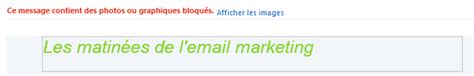
But not all messengers display ALT styles.
Which messengers display ALT styles?
We have carried out many and varied tests to find out and understand the properties supported and accepted by the various webmails and mail programs.
We've summarized the results of our many hours of research in an eye-popping little table:
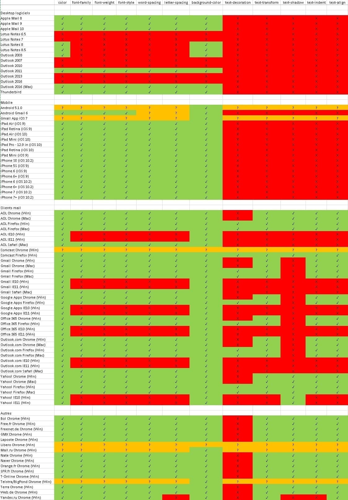
We strongly recommend that you download the picture or bookmark this page directly, as it will become a faithful friend during your integration moments. (and doubt!).
For the purposes of this test, we've selected just a few of the properties that we feel are most important for graphic text formatting: color, font-family, font-weight, font-style, word-spacing, letter-spacing, background-color, text-decoration, text-transform, text-shadow, text-indent and text-align. With these few properties, we can already achieve some nice results. You'll notice that some lines in this table contain question marks. In fact, some webmails or e-mail programs do not allow (at least via Emailonacid) to obtain a rendering when the images are disabled or not displayed. So in these cases, there are still some shadows on the support of the properties I want to test.
The most common and best-supported properties are still the first seven. Not surprisingly that browsers also participate in the good support (or not) of the different properties. You'll note that IE 10 and IE 11 don't really support optimized display of alternative texts. Firefox, on the other hand, does support the full range of properties!
For your information (and because we got the question from one of our customers), tag, you do not need to specify the style of your alternative text in the <a> in addition to the style assigned in the <style> of your <img> ? ".
Accessibility & eco-design: should alternative texts be stylized?
The other day, Grégory Van Gilsen, HTML integrator at Badsender, asked this question on our internal chat. Here we share the debate it sparked:
When it comes to accessibility, what do you think about styling alternative texts vs. eco-responsible coding?
Grégory
And Grégory adds: In my opinion, alt tags are more for screen readers, especially as they're not always displayed with their style, or don't have the space to be displayed correctly with the style. On the other hand, it's a lot of characters to define the text style (colors, family, size, ... ).
Pierre : Idem, I'm of the opinion not to put style on alt. Alt texts are purely functional and not intended to be formatted.
Olivier : No better. If you put style on an attribute that's intended to be accessible, then you're leaving the accessibility approach behind. And the counterpart of all this is that we won't be doing anyeco-design by adding code for styling.
The other point being, to whom and why would we do this? To please a decision-maker who opens on Outlook and therefore has no default image? Clearly, this isn't about accessibility, it's about seduction and glitz.
Pierre : Outlook does not support alt styles.
Olivier : Plus. So who's it for? Let me ask you again.
Pierre It's all about looking pretty!
Olivier For whom?
Grégory : For all those people who open their e-mails with images that are not displayed by default. When you have a relatively simple logo (Dior, Shine, ... ), this allows you to have the logo even without images, for example. It also lets you see the message when you put text in an image (a stylized title, for example). I'm playing devil's advocate here, because I'm not a fan of this approach.
I'd be curious to hear the opinion of @Thomas Defossez who often thinks of things I don't consider on this kind of subject.
Thomas : Personally, I think it's important to strike the right balance between accessibility, eco-design and user experience. I think that stylized alt text is proof of quality, and I'm not sure that the CSS style affixed to these alt is what weighs most heavily in an email code. Another point that can be used for accessibility: an image in a link. By default, the alternative text will be "electric blue". So what happens if the background of the cell containing the image is blue: the alternative text is invisible...
Pierre It's funny, in my opinion this overlay is absolutely no guarantee of quality. Just cosmetics where it's a back-up to a lack of dressing.
Grégory And what about marketing? Any comments?
Marion : At the beginning of this thread, I wanted to tell you that for the logo at the top of a newsletter, a stylized alternative text is cool to identify the sender. And after reading your opinions, I found my approach completely stupid, since the sender is known just before the newsletter is opened, in the first reading pane of the mailbox. It's very rare to find truly useful information on images. And any useful information in emailing has to be written in text format, so... I've looked hard, but I can't think of any use cases where it would be indispensable. In any case, this conversation needs to be turned into an article!
Jonathan I think there's a missing element in your thinking, and that's context. Today, in a B2C context, the overwhelming majority of images will be displayed by default, so there's no point. In a B2B context, it depends. So the initial question is, "What are the messaging systems that don't open images by default and display ALT styles?"
Secondly, what percentage do they represent of our customers' (or a particular customer's) openings?
Grégory : What's more, it requires a lot more work, especially if you're concerned about dark-mode, in which case it can start to become a real headache and much heavier code. Because in my opinion, either you do it, and you have to do it thoroughly and correctly, or you don't do it and you're left with a purely technical, screen-reader approach.
Jonathan : I think we all agree that you shouldn't do it 99.9% of the time.
What about you?
Best practices for filling (or not) the ALT tag
The best practices below come from W3C site providing recommendations and guidelines for Web content accessibility.
If your image contains text 3 possibilities
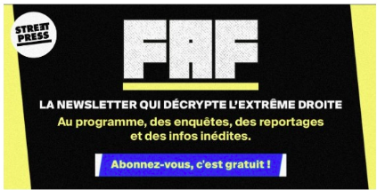
Case n°1: the text is also present in text form real nearby as shown below. Use an empty alt: alt= " "
Case n°2: the text has a specific functionUse the ALT key to communicate the function of the image. Use ALT to communicate the image's function.
Case n°3: the text in the image is not otherwise presentUse ALT to include the image text.

If your image is purely decorative
Like borders, separators and icons, use an empty ALT.
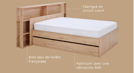
If your image adds meaning to the email content
If it's a graphic or a photograph, use a brief description of the image to transmit this meaning to the ALT.
Badsender's conclusion on alternative text design
We recommend that you take care with your alternative texts. This doesn't mean you have to put them everywhere. A common belief in email marketing is to systematically fill in the ALT tag of images without much thought. We invite you to ask yourself the following question: is it really useful to fill it in? It's essential to keep in mind that all emails and newsletters must be easily readable. by everyone, including people with disabilities. Prioritize accessibility and eco-design before the "wow" effect of design.
