Hello friends! Please allow me, of course, to wish you all a very happy 2017! And good health, " ch'urtout eul' sung!" as my uncle Jean-Michel would say... "My hen" I call it. Anyway, I digress... Let's get back to the point (it's good timing, I just read "The Little Prince")
After these few formalities, I warn you that today we are going to talk about a serious subject (As I tell my 3 year old daughter all day long: "no no, I'm not kidding!"). I decided to address this Wednesday, January 4, 2017, newsletter redesign of a NGO. Ah well, I know I'm breaking the mood, but sometimes you have to be reasonable!
So you won't be disappointed, because I didn't choose a "light" subject (if any...) The NGO in question is "Reporters Without Borders". It's an organization that touches me a lot, that reaches me and really speaks to me. So I wanted to work on this theme.
Let's recall, to get us in the bath, a succinct definition of an NGO, and its objectives.
"A non-governmental organization is a non-profit association, of public interest, which is not part of the State or international institutions. The main criteria defining an NGO are the following:
- The non-profit purpose of its action
- Financial independence
- Political independence
- The notion of "public interest
The NGO "Reporters Without Borders", if you are not familiar with it, aims to the defense of press freedom and the protection of journalists. However, I will try to keep a light tone in this article, and I sincerely hope that the organization in question will not hold it against me. It is sometimes easier to talk about sensitive and tragic subjects in a light tone to, even better, send a message (especially since we are just an email marketing blog after all!).
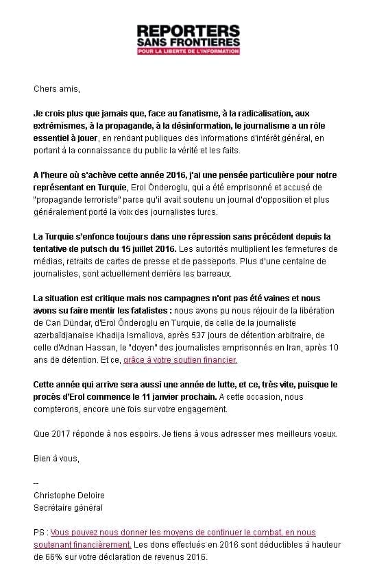
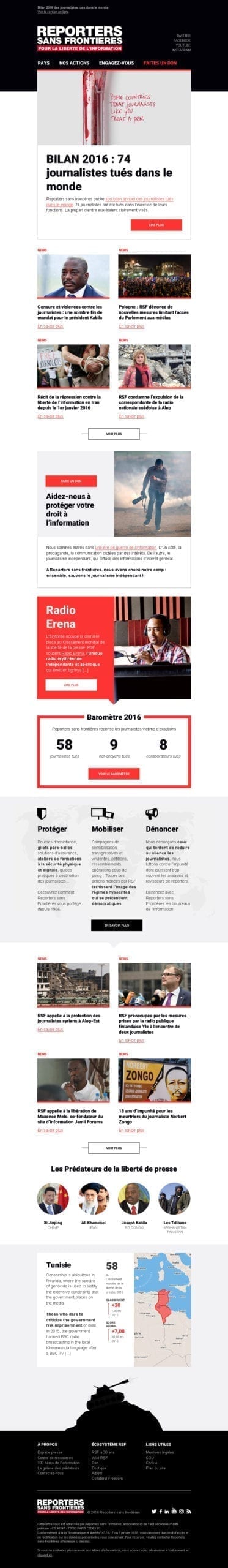
I only recently subscribed to the newsletter. I have, until now, only received two campaigns, of which you can find an overview below.
So. We won't lie to ourselves (I won't dare to lie to you by the way, and you know how much I like to give you my opinion frankly, raw apple). So let's not beat about the bush. Let's not beat around the bush. Above all, do not procrastinate. When you have to go, you have to go...
"We have the atmosphere of Motus, with the black ball in addition..."
It's clear that when you come out of the holidays, you've been celebrating until late, throwing cotillions in the face of your friends, it stings when you wake up, and then it stings even more. Well, the theme of these campaigns is serious and does not really lend itself to jokes, it goes without saying. But we can still bring a bit of graphics, a bit of visuals, to make it all come alive, while remaining sober, don't you think?
In any case, it is an advantage for this task: I have no element, no constraint, my mind is still virgin of any idea and I do not risk to be influenced. My only graphic reference will be the "Reporters Without Borders and its logo. I decided to envision this email as a template, a master template composed of numerous modules. Header, menu, main cover, suite of news or articles, call for donations, barometerThe principle is to think of every possible scenario, to anticipate every potential need, and every layout that the newsletter administrator might wish to take advantage of.
The colors chosen will not only be identical and specific to the charter of the NGO but also symbolic of the themes addressed: murder, exaction, violence, repression (If you were hoping to laugh a little in this paragraph, go straight to the next one! I say it for the fragile hearts: forget the mischievous Thomas, the prankster Thomas, this is Doctor Hekel and Jekel!). The red oneThe color, close to a "blood" red, conveys the violence and the image of the murders of journalists and war reporters. The black symbolizes, in my opinion, repression, confinement, detention.
I'm going for it and attacking in order!
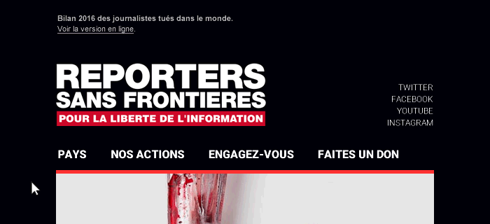
The header differs from the one on the site: it becomes much darker, to bring a much more pronounced identity to the email.
Direct text links are proposed in the header to bring more visibility to social networks. NGOs must benefit first from viral communication on these networks. It is through their images, their messages touching each of us, that virality occurs and that messages are quickly shared, that "noise" is created around the organization.
"More socionauts donate than in 2014 (35 vs. 17 %) but more generally, they mainly follow NGOs on social networks to get information, watch a video or even "like" their publications."
Harris Interactive: The French, NGOs and social networks
These texts are in a particular typography, not a "basic" typography. The use of webfonts must be brought with care in emailing. But today, they are supported by more and more webmails and email software, and fallback solutions are possible. From now on, you should not hesitate to use web fonts (even if their implementation is sometimes laborious and my last experience was not the best I will admit!).
A "menu" module is located just under the header, with the 4 priority tabs of the site. On these tabs as on the titles of the social networks, I propose to try new experiments and to bring some CSS animation to the hover in this email!. The tabs of this menu can also be considered as shortcuts to the different sections of the email which could, in some cases, be relatively high and long.
The titles of the articles will be strong on their formatting (as for their content, independent of my choices). The size of their typography will therefore be voluntarily pushed to the extreme, to attract and shock the eye of the recipient. Most of the titles will be of a very dark, total black, in order to to increase the contrast with the background of the email as much as possible or modules. In general, there is a real desire to play on these contrasts, to strike the eye and make a mark.
The CSS hover effects will also be implemented on the email ctas, as a direct reminder to the ctas present on the RSF site.
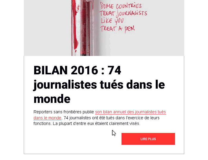
The articles presented in the newsletter will be very similar to those mentioned on the site. Title, cta, surtitle, visual formatting. We are here on an almost exact copy of the articles of the site.
Other modules will be born in this emailing master template: a call for donation for example, the donation being one of the means for this type of organization to exist, to live. This insert has therefore a real utilityIt must be clear, readable, and quickly lead to action and clicks. Its purpose is to arouse emotion and decision making in the recipient. Its visual must therefore be strong, shocking.
The "Barometer" module will inform the recipient in a few figures about the situation of journalism in the world. It is only an indicator but brings a more graphic look in the middle of the mail. This type of module is also very similar to the one on the website in terms of its graphic design and content.
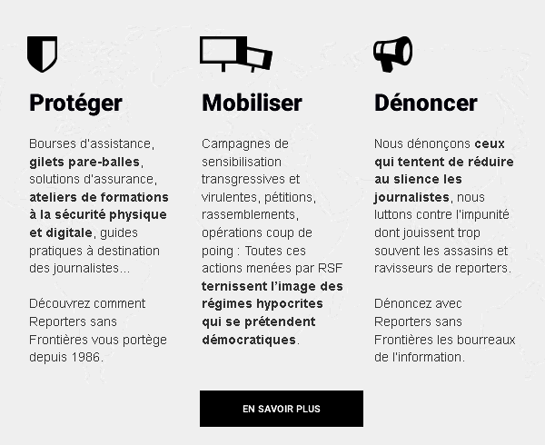
A little "break". (or rather transition) is brought with the introduction of animated pictograms to present the objectives and values of "Reporters Without Borders". A subject, as serious as it is, must not be (for as much) to remain on a frozen form, without life. I will even say: On the contrary!. It is important that animation, in all its forms, is inserted in this email. This brings deep topics to life, and engages the recipient's interest.
A module recalling the position of a country in the world in the 2016 World Press Freedom Index will also be proposed. Many readers today are no longer "afraid", are no longer afraid of content-laden newslettersAs long as the formatting of this content is appropriate.
But, fi! I am failing in all my obligations! I realize that I have not yet presented the model in its entirety, and that I am speaking in the wind!
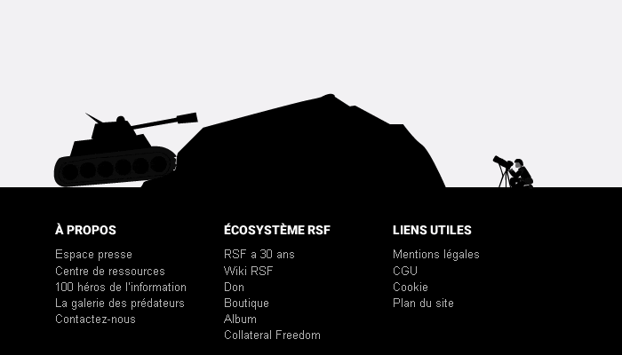
To return to the subject of animations illustrating a serious subject: it seemed interesting to me to propose a draft of animated illustration at the bottom of the mail. This illustration would be the simplified vision of a Reporter Without Borders: The reporter without fear, going in the face of danger to inform everyone about wars, conflicts, abuses, supremacy...
This article is rather short and the ending a bit rough, but the layout speaks for itself, right? It's hard for me to deal with such a subject... I promised to try to approach things with a relatively light tone, but it's hard to keep that in mind when you take the time to think about these issues. Especially since marketing on sensitive information topics is complex to addressand that it is not always to the taste of the subscribers to the NGO newsletters to find marketing, but rather information. Nevertheless, I hope that you will have enjoyed this article as a whole? Take the time to tell us what you think about it, how you perceive the thing, your opinion on this theme, or simply on the proposed model! Ciao artist!
