I really like Spotify's emails. Graphically speaking at least:
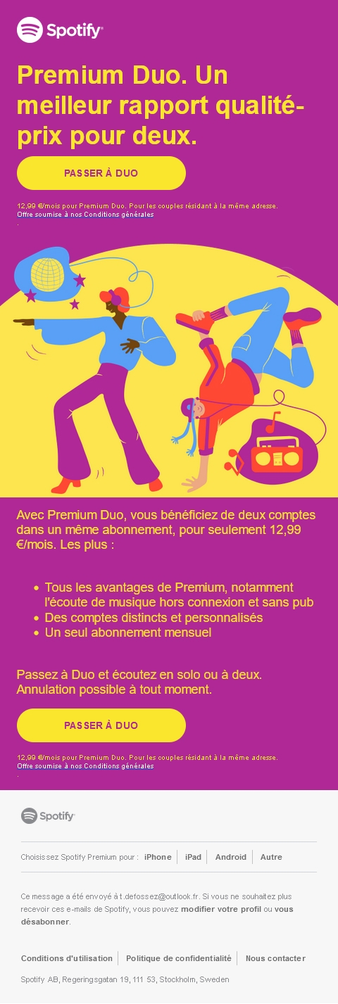
- The width of the email is very narrow (480px vs. 600px for standard emails) and it gives the impression of a bookmark with all the content in one-column.
- All text, titles and calls to action are designed in HTML and CSS with Helvetica or Arial, and the result is still very aesthetic.
- I love the illustrations they use, always relevant and graphic.
- The brand takes a lot of liberty by using colors that are completely out of its ordinary graphic charter. And it works! The eye is undoubtedly drawn to these bright hues!
- The texts are short, clear and concise. No need for superfluous explanations or storytelling... Straight to the point (without being too promotional).
- The narrow width of the email on desktop and the one-column format should no doubt make it even easier to adapt on mobile. All the more so as the email seems to have been designed using the Spongy Code method, for mobile display even on messaging solutions that don't support media queries.