For a few weeks now, most of us have been telecommuting forced. And like me, you must have seen dozens (to be kind) of emails in your inbox, from companies promoting their services under a new sales axis, which I will call telecommuting friendly. Apart from the blatant lack of targeting, I notice that these campaigns are sorely lacking in... a bit of everything, actually!
Ooooh the beautiful badsender!
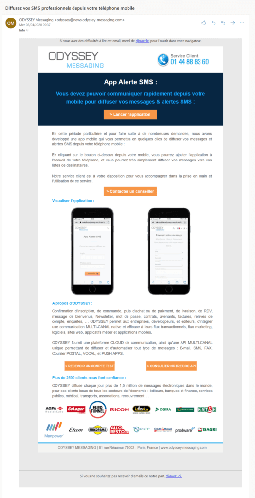
At the beginning of April, we received on our address info@badsender.com the following email:
As this one is sent to our generic address, it is not necessary to have our opt-in. However, I didn't see it right away, because oops, it was in the junk folder.
After a few days of waiting impatiently among the spam, I finally opened the email.
I was quite puzzled by the content, and it took me a full reading of the text to understand the offer: a multi-channel routing platform with a smartphone app. And the app is what Odyssey Messaging has chosen to highlight in the first part of the email. Then comes the presentation of the platform in its entirety, to close the email with a nice frieze of logos. A bit of a mess.
That said, the problem, in my opinion, is not only the message but above all the targeting. I do not doubt the interest of a mobile app to manage its campaigns (although), nevertheless the first CTA that we find in the header sends us to the connection page to the platform. But still, I have to be able to access the tool, you might say. Yes, except that here it is not an email sent to users, but to a list of prospects. I don't have an account yet, so what's the point of sending me to a login page?
To complete my thought, it is possible that the email was sent to customers at the same time as to prospects (which could explain the CTA link). If this is the case, instead of the customer service phone number in the header, it would be better to integrate the login here. In addition to adapting the message to the segment, a specific customer mailing would have made it possible to compare statistics, which is always good to take, we agree.
Regarding the screenshots of the app, one obviously expects to be able to download it from the store of his smartphone. Not only it is not the case, but the visuals are simply not clickable. Disappointing. The screens do not represent an application, but a mobile version of the platform accessible from a browser. The main message is therefore wrong since it is not an application in the true sense of the word, too bad.
Shall I put a little design on you?
After this little content focus, let's quickly stop on the design if you want. We often see examples of B2B emails that are rather old school, with no particular design, and I deplore this. Just as I appreciate beautiful communication as a consumer in my private life, it is also the case in my professional life and I am much more willing to read an email with a strong style.
You will have understood by this introduction that the design of this campaign is perfectible for my taste. Nothing catastrophic however because the email is displayed correctly and it is essential, but some small adjustments would make it more sexy.
What a surprise when I went to the Odyssey Messaging website to find a rather modern design. Blue monochrome, orange CTA, pictogram library, elements that could easily boost the campaign's look.
To facilitate reading, we recommend structuring the information, without overloading the content, for example:
- Integrating a cover with the mobile platform as a background image, adding a blue filter and an attractive title, as on the showcase site, would make everything more dynamic.
- Lighten the content and format it to make it easier to read.
- Add a reassurance banner to highlight benefits and commitments.
Conclusion
A work of writing and hierarchization of information seems to me necessary to improve this campaign. From a design point of view, why not take a little more inspiration from the website, which has an established charter. Finally, the most important point in my eyes remains the targeting. Without a serious work on your lists, whether they are acquisition or not, your campaign will not have the expected results. Worse, it will have a negative impact on your reputation... and that's a NO!
Identity card
Generic email information:
- Subject of the email : Broadcast your professional SMS from your cell phone
- From : ODYSSEY Messaging
- Preheader : no
- Sending platform : Odyssey Messaging
Checklist :
