- If not, we could use the menu of my site next to the logo in our newsletter?
- NOOOOONNN, this is not a web page!!! We are talking about emailing name of a table tr td ...
Well it is not the good answer to give to certain customers. Let's do it again:
- Ok but we wouldn't modernize the concept a bit for email because it's not web.
Indeed, it is understandable that some graphic charts must stick to each other. Putting the menu of its site on the emailing is not trivial.
Several CTAs are integrated into the header and besides having more links easily on the email, it will influence the behavior of the final recipient:
- we hope for more clicks. Well, invoking the routing gods doesn't work every time to make the expected numbers...
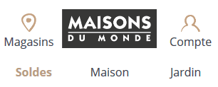
- we arrive directly in the desired category. For example, we have the ready-to-wear which often has the famous triptych Woman - Man - Child
And here are some examples of dishes:


==> Here we stack and shrink.

==> Little change between desktop and mobile.

==> No changes have been considered.

==> Here we stay in the simple and logical.
Here are 3 menu tips that are quite user-friendly for your end customers. All with a little class. Have a nice day
1- The "Hamburger" menu

Ketchup or mayo? Yes, it's the famous menu that we have everywhere on websites. Well, on mobile it doesn't look too bad, but it's far from working everywhere. Unless you know your customer base and devices well.


So you have to test and think carefully about how to use this menu. It seems to be the least digestible and I confirm this with the tests done here at Bad on our phones and various machines. The advantage is that there is no breakage.
Note that a real test on Orange gives an absence of menu on desktop and mobile for example ...
Otherwise here is the result on Emailonacid :
https://app.emailonacid.com/app/acidtest/MZdSdLn57BHHuxbvSAKgGVQJszPMakEtrKR3OhT36bYGp/list
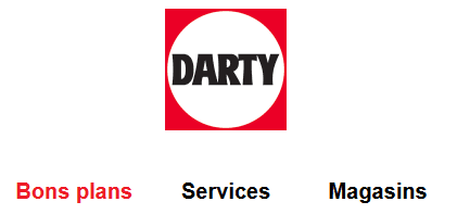
2- The "Good Plans" menu
Here we
focus on the last item of the menu. It is already highlighted on
desktop but we emphasize it even more on mobile. The tip is that we make a
table in 3 columns that are aligned one under the other.
Notice that the logo/menu bar is 100% wide.

Personally I find this version very graphic. I salute Marine Demarque for this efficient idea.
Otherwise here is the result on Emailonacid :
https://app.emailonacid.com/app/acidtest/AV9aZQIzUmovBvYJ0mDrzLTGJquVFWDfs5raDB6OZ1gun/list
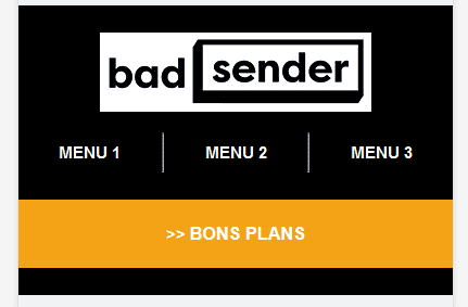
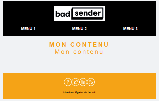
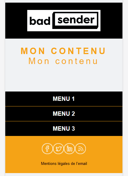
3- The "I disappear from the header on mobile and eventually return to the footer" menu also commonly known as the "Garcimore menuche". And siche'

Ok, it's not the shortest name but at least you get it. You can have a nice dressed up version on desktop and you remove a part of the top on mobile (it reminds me of an old ad for the older ones...). Let's go, I'm cracking up:
At least we can keep a purified version. And if you really want to, you can slide it just before the footer by sliding the items one under the other in the form of beautiful clickable buttons on a small screen even with big fingers!
Otherwise here is the result on Emailonacid :
https://app.emailonacid.com/app/acidtest/L7FBaILkF2AzcHUnd6CFfCWvlFEyjpTSEiX4pt0v1GInl/list
Several advices/complaints though... well yes, you don't want to be on the verge of indigestion:
- Not too many items because if we want to align 12 categories it becomes a bit busy. So light menu (like salad / Sanpé). I didn't mention any brand !
- Also be careful that it does not overshadow the main information of the email. Because the more you load at the top, the more you have to scroll down.
- Be careful, this will not necessarily generate more clicks. As usual, it depends on the targeting.
A menu = generic! - Focus on the stats once the campaign is routed and analyze the click zones. We will quickly know if it pollutes the email or if it clicks seriously.
- I was able to show you how to remove the top but don't count on me to remove the bottom tomorrow.
- We're not into rocket science, so if you've got some menus that are going well, feel free to add your two cents.
See you soon !!! And if you're a little hungry with your email, just go to Badsender, you'll see the cantoch' is not bad !
Leave a Reply