Have you ever opened a prospecting email without any clear idea of its content? It happens to me a little too often. Sometimes I'm pleasantly surprised, but in the majority of cases it's rather disappointing, because it's not a question of a mysterious writing style, but rather of a lack of imagination and daring. This may be due to a lack of editorial charter, framework for writing and brand positioning. However, there are some mistakes that can be avoided, and in this article I hope to give you a few pointers to help you do so.
The email with mysterious content
Like many of us I imagine, I love to dream in front of fabulous images of beaches and coconut palms. So when a few weeks ago I received a prospecting email whose sender and subject line were Wallis Pôle ImageI was already in the lagoon, surrounded by thousands of Demoiselles and other fish.
I'd love to introduce you to this beautiful island in Polynesia's Pacific Ocean, but... no. Here, Wallis isn't that little rock paradise, it's more like a bitter-tasting shipper.
Prospecting email content analysis
I'm not going to judge the name of the company, and even less so when your name is Badsender while we campaign for more virtuous email marketing. Although I was rather confused about the relationship between Wallis and the South of France.
Sender: Wallis Pôle Image pierre@wallis.fr
Subject: Wallis Pôle image : This is the South !
Preheader: KO
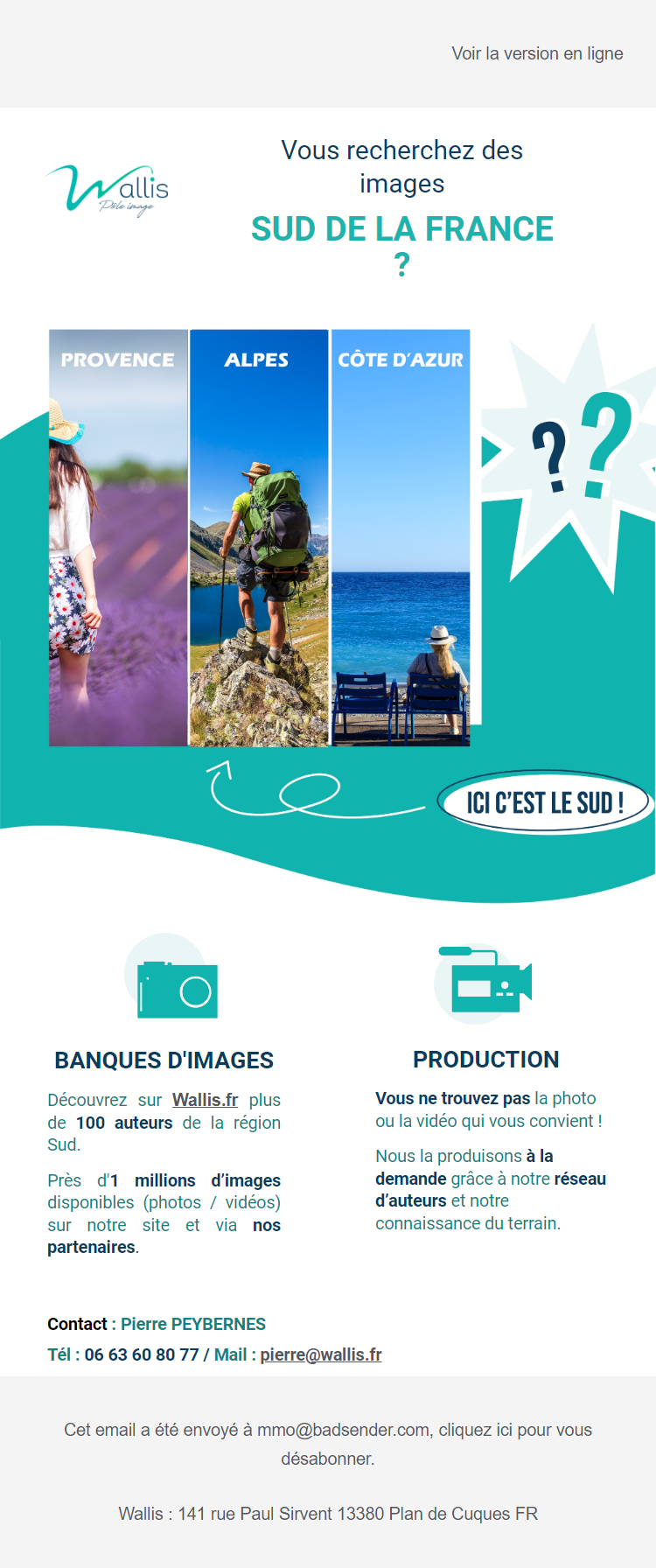
At the risk of repeating ourselves: the subject of your email must not contain the sender's name! What do your readers learn about the email content when you duplicate the sender name? Nothing, nada, zilch! Yet this little bit of text can make all the difference to the results of your campaign, which is why it's advisable to write different types of objects and run AB tests. Be imaginative, stand out from the crowd, intrigue your readers... and put yourself in their shoes. "Wallis Pôle image: Ici c'est le Sud!!!"I'm sorry, but personally I'm finding it hard to project myself onto the content that awaits me at the opening.
In addition to the object, as you all know, there's our good friend the preheader. There's none in this prospecting email. It's a pity, because it would have given context and clarified the subject.
Let's move on to the content of this prospecting email. The main headline, which should be consistent with the subject line, could be more detailed, explaining the purpose of the email. After this title, we find a large image accompanied by question marks. At this stage of the email's discovery, I'm still wondering about the purpose of this communication and the underlying subject. In my opinion, what's missing is an introductory paragraph to give some context, why I'm receiving this email, the offer or service, and obviously a CTA... Otherwise, what's the point of sending a prospecting email?
Finally, the secondary blocks give us the purpose of the email: to promote a regional image bank and personalized production service.
This means work to be done on the hierarchy of information in this campaign. Withholding content and placing it low in your email won't encourage your contacts to read it - quite the contrary. Today's readers want to understand quickly, without having to search for information. Make it easy for them, and keep the suspense for books and movies 😉
A look at HTML code
At Badsender, in addition to analyzing the content of an email, we have a special evaluation grid for a more technical analysis of an HTML email. I'm sharing it with you exclusively here. It's a bit of an early Christmas present, so make good use of it!
This enables us to analyze the ergonomics of an email, the HTML code, accessibilityand eco-design.
Ergonomics
- Email width not exceeding 640px : OK
- HTML buttons : there is no CTA in the email.
- Readable without images: OK
- Consistent email rendering in different email clients: fairly correct in EOA.
- Mobile relevant display : the contents of the 2-column block pass one under the other, except for the 2 photo/camera pictograms, which are a single image and therefore displayed side by side.
- Textual content in HTML : the cover image contains text that could be integrated into HTML.
- The total weight of the email and images is less than 500kb: the 3 images weigh 489.1kb in total! The code weighs around 40kb. That's over 500kb for a short, uncomplicated email.
- Dark Mode version: the logo is unreadable in dark mode.
HTML code
- Presence of doctype: OK
- Code indentation: Criterion not evaluated because initial file not recoverable.
- Streamlined HTML code (no unnecessary code) : the code contains a multiple nesting of phantom tables.
- Hexadecimal colors in 6 characters: OK
- Presence of inline style: OK
- Explicit CSS class naming: OK
- 120 DPI email client management: OK
- Encoding special characters : some characters are not encoded.
- The total weight of the HTML file is less than 102kb: OK
- Alternative text on images : present but not specified.
- All attributes have correct HTML values : OK
- All CSS properties have correct values: some unnecessary classes.
- HTML architecture is semantically correct: OK
- Eco-design : some CSS classes and phantom tables make the code unnecessarily heavy. Images are too heavy.
Accessibility
- Title tag filled in: OK
- Use of semantic tags for texts : semantic tags are missing
- No title attribute on images: OK
- Add role="presentation " to table tags that are not data tables: OK
- Alternative text formatting : Alt unformatted.
For this email, patches should be made, such as :
- Provide images with an outline or drop shadow to make them readable in darkmode (especially the logo).
- Clean up unnecessary CSS and ghost tables.
- Fill in the 'alt' tags.
- Lighten the code so that it is eco-designed, in particular by working on the size and weight of images.
- Add CTAs to encourage clicks.
Targeting in prospecting
When we analyze an email campaign, in addition to content and technical analysis, we also check targeting. And in email prospecting, this is usually where things go wrong.
I always ask myself when I receive this kind of email (on my non-generic pro address in this case): what is the sending brief for me to be selected for this prospecting campaign? Probably a brief with few restrictions: marketing agency, advertising agency, communication agencypossibly in the South of France, and that's probably all.
So, I know that my business address is all over the Internet (brrrr), and that we're dealing with a case of BtoB communication and therefore in compliance with the RGPD. But just because my address is public doesn't mean I'm okay with receiving prospecting emails without a modicum of meaning.
In the future, please work on your messages so that they thrill me, make me want to go further, a little fantasy what the heck. I want unicorns, rainbows, twinkling stars (or kittens, as the case may be).
How to design a prospecting email
Don't lose sight of the fact that it's not about convincing YOU, or pleasing yourself, but about meeting your target's need(s). Explain how your product/service best meets their needs. How to access it. Why they should trust you.
Designing a prospecting campaign, or any other type of email, means finding the perfect alliance between sending the right message, to the right person, at the right time.
- the right message: because its rendering must be readable everywhere and for everyone (accessibility, dark mode, mobile compatible, the list goes on), AND its content must be clear and useful.
- the right person: I hope you don't think it's inconceivable to send a campaign to a full base (kiss inactivity management goodbye). In the case of a prospecting email, you're adding another layer of complexity: the contacts haven't contacted you, and sometimes don't even know you. As a result, the return on investment is rarely good, both in terms of statuses and sender reputation.
- the right time: if your message and targeting are perfect, your campaign might as well arrive at the most opportune moment for your contacts. After all that work, it'd be a shame if your e-mail went unread because of bad timing. So do some AB testing to determine the best time to send your message.
And after all that, if you're not able to implement these recommendations, maybe it's time to stop prospecting emails... 😉
Leave a Reply