Here is the third and penultimate step of the Email Marketing analysis of "La Redoute France" emailings. We will discuss the ergonomics, the content and the interactivity of the newsletters sent.
Preamble
As we only have access to publicly available data, this analysis only looks at the user's perspective of a newsletter.
The actual performance of the email marketing program in question, the data management, the routing, the creative process, the triggers, the opt-in management, the cross-channel, the AB Testing, ... are therefore not targeted.
Do not hesitate to contact Badsender for more information.
Ergonomics
Preview
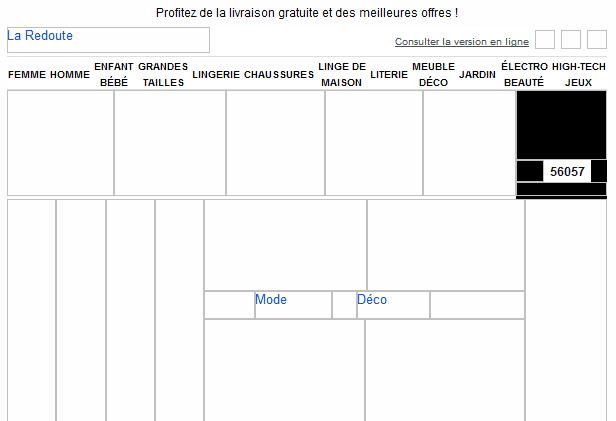
This is an area in which many newsletters break their teeth, the preview of the email without image display. And the various newsletters of La Redoute do not no better than the rest of the market in this area. It is often difficult to understand the meaning of the email if the images are not displayed. In addition, there is often no call-to-action text in the first 300 pixels of the email.

Header & Footer
A good point (at least every other time), the first line of the email (the preheader) is a sentence that reminds the subject of the email. Unfortunately, there is no no link that follows this sentence! However, it is a first opportunity to send the consumer to the landing page of the action.
The rest of the email header is quite classica logo, a link to the web version and some links to the social networks ... and the mobile version ! Let's go back to this link to the mobile version ... which points to the mobile home page of the La Redoute website and not to an adapted version of the newsletter or to a mobile landing page dedicated to the action. Also to be noted, theThe "mobile" icon is 20 pixels by 19 pixels whereas it is recommended to have buttons of at least 40 pixels on a side so that it can be easily clicked on a touch screen.
To finish with the header, this one is ended by a list of links which are the same as those present on the laredoute.fr website. It would be interesting to know the usage statistics of these. They are indeed very close to each other and difficult to read.
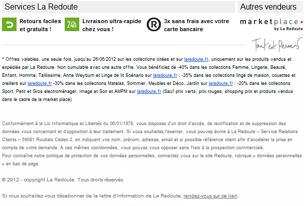
The footer is always made up of the same elements. A first paragraph that includes the conditions of the action a paragraph with information about the privacy and use of data, a line on copyright and finally a unsubscribe link.
This unsubscribe link is very difficult to findWith a grey background and small text, we are far from recommendations. It should be kept in mind that the link of unsubscribe should be easy to find otherwise the Internet user will classify the email as a spam.

Use of images
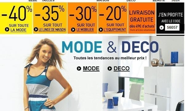
As we have already seen in the section on integration, La Redoute's emails are consisting almost exclusively of images. There is only text in the headers and footers. Everything else (with a few exceptions) is always images. In general it's beautiful, but it gives the impression of an assembly line production without any real perspective.
Call-to-Action
This is a part that is rather disappointing. When there is a call-to-action present in the emails, it is rarely directly related to the subject of the email. Most of the time, it consists of a single word. There are also too few real click-through buttons. As for the previous point, the production of content has certainly become too mechanical to take the time to think about things that are absolutely essential, such as calls to action.

Content
There is a lot of push on promotions but very very little "story telling. It is essential to involve more importantly the consumerto involve him in the life of the brand and especially him request frequently its opinion.
Need help?
Reading content isn't everything. The best way is to talk to us.
What is surprising is that this strategy is used in a very beautiful way on the different social networks, but not for email ! So the content exists elsewhere.
Be careful not to mislead the consumer. For example, on May 1: "Last day : Free delivery, including on bulky items!" and a few days later: "Right now free delivery even on bulky items! Too many promotions can make the consumer's confidence fall.
Distinction between primary and secondary content
It is difficult to comment on this part with the newsletters sent by La Redoute. The emails being only oriented around promotionsThere is not much to say.
Editorial quality
Find a complete sentencewith a subject and a verb is somethingextremely difficult in the various newsletters of La Redoute. We only talk about it by launching slogans and words in bold. While this is a technique that can be effective in many cases, it is not the way that a relationship will be able to establish with the consumer. As for the previous point, it is therefore very difficult to form an opinion as the content other than promotional is non-existent.
Customization
In terms of personalization, it seems that there is at least a distinction between men and women. But not significant since only one specific newsletter has been sent since registration.
Otherwise, there is no use of personal data to "dress up" the newsletter. For example, to call out the subscriber's first name in the subject line of the email.
Interactivity
When sending an email, the easiest interactivity ... is to reply to this email. To try this with an email from La Redoute would be like talking to a wall. Indeed, there is a "reply-to" that is configured in the emails ("Conseiller_la_Redoute" which is a good omen), but the email address in question returns a error message ! It is therefore impossible to communicate with La Redoute in this way.
Unsubscribe
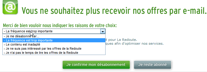
Here, despite the difficult link to find, in both cases the process is clear. In both cases, because depending on whether the registration was done via the creation of an account or via the "light" form, the process is different. It is essential to merge the two methodsbecause they are both good. One asks for the reason for unsubscribing, while the other offers two different levels of unsubscribing. These are good methods, but need to be merged and improved.

Profile update
Here it is quite disappointing. If the registration was done via the light" formthere is no no possibility to change the profile. This is a missed opportunity for La Redoute to gain some additional information about its subscribers.
On the other hand, if registration was done via the create an accounts, the My account" and "My newsletters" links are proposed in the emails. However, when clicking on these links, you must identify yourself with login and password to access the forms.
To be continued!
In the last partWe will analyze the landing pages, the privacy and we will try to draw some general conclusions.