- Already, all texts are designed in HTML and formatted using CSS. This is a very good point, because the texts will be displayed immediately when the email is opened, without the need to download images.
- Because titles, tags, paragraphs and buttons are CLEARLY recognizable at first glance. Readability is so much improved in this sense, it's crazy. Do the test: squint and squint slightly while viewing the email, and you'll still be able to detect headings, paragraphs, buttons...
- There are hover effects on email call-to-actionsI love it! And what's more, these call-to-actions are designed entirely in HTML and CSS I have to say "Bravo"! Even the rounded corners are designed in CSS, with the knowledge of the acceptable degradation of this effect in emails.
- The width of the email is 540px and I love narrow emails: they're so aesthetic, so polished.
- The blocks are sometimes in the full width of the
bodywith a transitional background color. It's simple, but it works! - There are two types of Call to action: both a "button" layout with rounded corners and internal margins, and more simplistic Call to action, with simple hyperlink-style underlined text in the "button" section. "Recommended reading by the Zapier blog team".. So I can better distinguish the most important buttons to click.
- The call-to-action texts have been cleverly written to arouse curiosity AND respect accessibility principles.
- Two types of "tags" or labels above the articles, so you can see at a glance what the post is about.
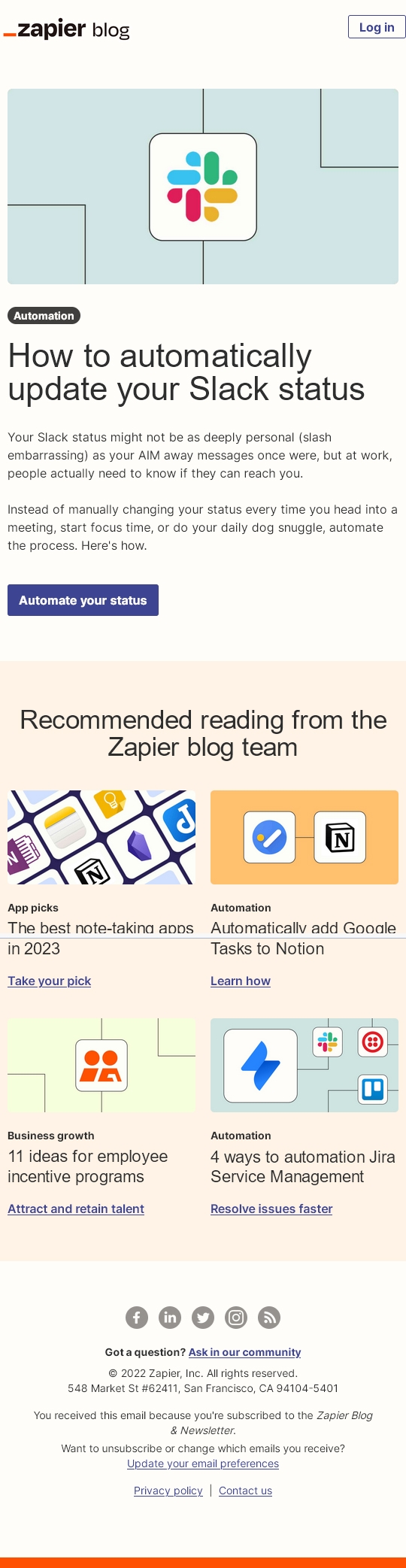
- The visuals are simple, coherent and designed in the same vein and spirit!
The only question that comes to mind is: why the button in the header ("Log in") protrudes slightly to the right, enlarging the overall width of the email?