Hey little ones! How are you doing? Nice tits by the way! I hadn't taken the time to write an article yet since this new year, so I didn't have the time to wish you good wishes... No more politeness ! I want to talk about emailing design which is dear to my heart and which I am still being asked about today: Which width to choose for an emailing ? This is glue...
At first sight, and by habit...
... I would advise a width between 600 and 640 pixels maximum. That's what I do automatically by the way when designing email templates. And when asked the reason, I answer: "The reason for his deaths!" On a more serious note, I tend to explain that the preview windows of some mail clients do not exceed 650 pixels in width, and therefore if you want to see the whole email, it is better not to exceed 640 pixels wide.
Anyway, we must also know how to question ourselves and not be satisfied with habits and customs, otherwise we don't move forward. As Audiard said, "The idiots it does not change opinion, it is even with that that one recognizes them" (I'm almost there). So I took the initiative to make a tabula rasa of the past (Hey Mrs Boutin, your efforts were not in vain! #profdelatin).
What would your Montaigne say?
The best thing to do when in doubt is to look at what other email marketing experts are saying. And that's what I did. So I proceeded to an overview of the best practices on the subject to draw the relevant conclusions. So I share my findings with you:
Chamaileon, in 2016
It's getting old of course, it was already 4 years ago. And we know how much technology, eum' gif and the consultation media can change in that time. Nevertheless, this is one of the most complete articles on the subject. And it's Chamaileon, it's not my aunt Geneviève who says so...
But in sum, in the article written by Roman Polanski Roland Pokornyik, Roland reminds us first of all that, unlike the W3C (International Standards Organization for the World Wide Web)There are no standards for the emailing field. This may explain why there is no absolute "truth" on the subject that concerns us.
Roland with the unpronounceable name first relies on a graph from the NNGroup, which highlights the fact that screens get wider and wider as time goes on. Kind of like my shirts.
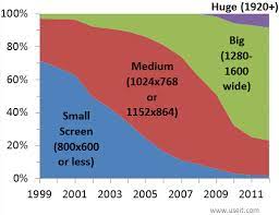
He recounts how email designers started designing 600-pixel wide emails when screens had a resolution of more than 1024 pixels, or more than 50% in 2002. Because before, designers had to choose a width that could fit smaller screens, and so, the width of emails oscillated between 550 and 600 pixels wide. That's small we tell you!
"It was largely down to the viewport size in the predominant email clients of the day, eg. [...] Emails used to be a touch narrower too - around 500-550px."
Elliot Ross, actionrocket.co
As our friend Elliot Ross, famous #emaildesigner, says so well (a kind of Usain Bolt of email design), the interest then lay in the size of the display window of the main email clients Hotmail, Yahoo and Outlook. Which finally ties in with my 1st hypothesis, the one I put forward to the customer: When an e-mail is viewed in Outlook, which divides the screen into three "parts (Folder / Inbox, Email list, Email view), the display window is actually quite narrow. Bim!
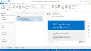
However, a width of 600 pixels will not guarantee that the email will be displayed in full. The proof is in the caption of the visual above! Ha ha! And this point is accentuated by the fact that each recipient can adjust the width of each column. So everyone will have their own configuration. The Yahoo webmail, on the other hand, includes ads on the right, which also reduces the display window of the email...
In 2016, however, it seems that Mailchimp, Campaign Monitor, Litmus or GetResponse use the default width of 600 pixels for their emailing template. In the usual widths mentioned by our friend Roland Priapik, we'll note the 640 pixel width: according to Elliot Ross, it allows us to simply calculate the resolutions of Retina images for 320 pixel wide screens (640 being a multiple of 320, if you ever stopped taking classes in third grade). But then again, if we go that way, 600 is also an adequate number, right?
I also have a habit of advising the client that a "Desktop" width of 600 pixels easily allows for the responsive version of the email (i.e. 300 pixels, probably one of the lowest resolutions on cell phones). Note: this applies, of course, if you're planning a responsive version that's not based on percentages, but on a fixed width. Nuance.
Chamaileon and Roland de Pornic conclude with some tests showing that emails that are more than 650 pixels wide have problems being viewed on Yahoo Mail or Outlook. So they were recommending, in 2016, to stay on a width of less than 650 pixels. And that was in 2016.
EDMdesigner, in 2017
So in 2017, what does it look like? 2017 is Ed Sheeran and "Shape of you", or Coldplay's "Something Just Like This"... But we don't care about that. In February 2017 especially, EDMdesigner post an article on his blog written by Gyula Németh (It's not much more pronounceable than the previous author Can't they be called Dominique Martin, like everyone else?) entitled "Overcoming the 600px limitation. And, as you might expect, they discuss the fact that newsletters or emails larger than 600 pixels are no longer a problem in email clients.
Why? Because there is the solution of the Hybrid/Fluid coding method (which I will discuss at the end of the article). So it's not really a solution in itself, since not every integrator is able to implement this alternative. No, believe me, it's not that simple... Next!
EmailOnAcid, in 2018
Well, let's make it simple : We take the same one and we start again, nothing new under the sun. In the form of a simple paragraph in their article "Email Development Best PracticesEmailOnAcid recommends to keep the maximum width of an email close to 600 pixels. The argument: it should give enough space to the content and will fit perfectly in most web and desktop clients. This width can be reduced to fit mobile screens using media queries or the Fluid / Hybrid coding method. Period. End.
2019, anything new?
In 2019, Campaign Monitor is introducing (ouh it hurts)through his article "How Wide Are HTML Emails Today?"that some "extra-large" email clients (exceeding 800 pixels wide, they specify, without naming names) may introduce scrollbars by mistake in the preview pane, or may be truncated horizontally. Well, okay.
Campaign Monitor, on the other hand, conducted an interesting survey a few years ago (although it is not scientific, it is addressed to readers of their blog, and there are only 467 votes counted) : 74% of voters apply a width between 550 and 650 pixels to their emailing. The "good practice" persists, and signs!
The remarkable thing about this survey is that only 2% of voters go through the Hybrid / Fluid method... When I told you that it is not for everyone... Be careful, it is not for that reason that you should not implement it! But in the end, it's a good thing: it shows that the competition on this subject is not hard, and that emailing agencies like Badsender who have mastered this technique are still in the minority! And Stephen Muchmore notes:
Although the average display is getting bigger, we find that B2B email still requires the 600px limit. It sucks when the whole agency has 1920px wide screens...
You surprise me Simone... Indeed, the width limitation is mainly defined by the preview panes of desktop clients like Outlook or Apple Mail. Webmails are more "lenient", says Campaign Monitor.
But Campaign Monitor says that the main advantage of limiting the width to between 550 and 650 pixels is... Readability: The larger the mail, the more difficult it is to read. According to them, emails become "unusable" when the horizontal scroll bars come into play...
I remember a time in my professional life at Cheetah Digital where we broke the codes, and Marie, our in-house designer, had fun designing horizontal emails: it became almost a game to browse the email and see its content appear as you scroll horizontally, like a nice surprise (especially since the whole thing was embellished with beautiful illustrations)... Perhaps this can also contribute to the success of the user experience? Or not... Maybe it was just us, #emailgeeks...
Stripo, in an article called "Dimensions of the e-mail template: width and height of the elements, published in October 2019, argues that the standards have changed: The 600 pixel email width is now a myth, although it is still the most optimal (so, in the end, not such a big myth...). But most importantly, Stripo sets out to debunk some false rumors, such as:
- An email wider than 650 pixels will not be displayed correctly on some email clients.
- Gmail does not display a background color if the email is larger than 640 pixels wide.
- Yahoo! Mail would not display emails wider than 650 pixels.
FAKE NEWS (it seems) ! On the other hand, Stripo (and us too, by the same token) Let us insist on the fact that we must not forget to TEST-TEST-TEST your email to make sure there are no rendering problems. Finally, and still according to Stripo, the average width of the emails of the most important American brands oscillates between 640 and 700 pixels.
And in 2020?
The only article that deals with the subject in 2020 for the moment, apart from ours, is the one from Klaviyo published on January 18. Nothing special, it is finally a small historical explanation of the good practice of 600 pixels wide for an email and a little self-promotion. But it's still interesting to see that things haven't changed that much, and that the good practices last, in spite of trials, attempts, experiments...
It's all about the mobile version
If you have the opportunity (and normally you have to) to plan a responsive version of the email, you can insert "breakpoints" to detect the resolutions of the consultation screens, and thus "adapt" the width of the email accordingly.
That's in an ideal world of course: media queries are not supported on all mail clients (but on a large part).
Wow! For the structural work, it would be better to call Bouygues! In this case, how to display a version adapted to the screen width?
The trick is to code your email using the "Fluid Hybrid, aka Spongy Method, developed by Nicole Merlin We apply percentage widths and max-width in the email to limit its width. This is a method of HTML coding of emails much more complex than simple responsive with media queries, because it requires Outlook conditional comments. If you manage well the inté with responsive, try your luck (yes, I'm on first-name terms with you!).
Conclusion
It's complicated... I feel like I'm going to fall into the pattern of all these articles, i.e. end up recommending to stay on 600 pixels wide max... At the same time, I never told you that there was going to be a revolution! But then again, considering what I see in my mailbox, and considering my previous professional experiences, I wonder if we can't sometimes allow ourselves to leave our comfort zone, to try new experiences (and you yourself know how quickly I am tempted!). As long as we're testing and looking upstream at the viewing statistics, why not try it, hm? And you, what are your habits and practices on the subject?
Leave a Reply