Table of contents
Performance indicators: from open rate to conversion rate
You've just pressed the "Send" button on your campaign. It's only natural that you should rush to the statistics to validate your campaign. emailing strategy. Of course, just a few minutes after you've sent off your superb campaign, the only relevant information you'll find is whether it's off to a good start, and whether there are any openings yet.
Let's take a closer look at what you need to analyze in order to measure a campaign's performance... and what those numbers mean.
I'm not going to talk in this guide about measuring the effectiveness of an emailing strategy deliverability rate. Of course, you have to keep track of it, and we've written a white paper on the subject: The guide to email deliverability. In general, when the advertiser's reputation is good, this rate remains stable over time.
The most watched KPI: the opening rate
The opening rate is one of the most closely watched indicators of an email campaign. This KPI is supposed to measure mainly the attractiveness of your object and theyour recipients' commitment with respect to your communications.
It is measured by dividing the number of openers by the number of emails delivered:
% opening = number of openers / number of emails delivered.
Attention, in some platforms, we distinguish the unique opening rate (or opener rate) of the absolute or cumulative opening rate (multiple openings from the same recipient are then counted).
In the big lines: We're used to saying that above 30% of openings, we've got a good result, whereas below that it's not so good. It's a bit of a caricature, but not far from the truth, even if some business sectors easily break through the 35/40% opening and others have difficulty reaching 15%. Also, we often see better open rates on editorial newsletters than on promotional emails. (I'm not talking here about automated emails, where you can easily reach 60/70% open rates).
Understand how aperture is calculated in routing tools: To know who opens an email, campaign management solutions introduce a tracking pixel in the emails sent. This is a small image of a square pixel that is automatically introduced in each campaign sent. In the link of this image, we will find an identifier that allows us to know who is the recipient and what is the campaign in question. When the recipient of the email will open it, the tracking pixel will be downloaded at the same time as the images, which will send a "signal" to your campaign management tool. The latter will then know which email was opened, by which recipient, at which time, by which IP address and possibly by which "user-agent" (web browser, application, ...). This means that :
- if the images in your mailbox are not loaded by default (which happens for example in the Outlook application), the user can browse the email and read it but he will not be considered as an opener since your email router does not know that the email has been opened and cannot deduce any of the above mentioned information.
- if the images load by default, the user can scroll through his emails (so the images load) without reading them but he will be counted as an opener...
And more! Since the arrival of iOS15's MPP (Mail Privacy Protection) feature, emails opened from Apple Mail and Mac OS Monterey are no longer reliable. This new feature makes it impossible to know when someone opens an e-mail. What's more, it hides the person's IP address, making it impossible to link it to their online activity or determine their location.
Since then, most platforms have adapted their dashboards (but not all!) 3 possibilities:
- Either, the tools exclude the openings detected with iOS15 MPP enabled. Considering them unreliable. In this case, we should expect opening rates to be lower than before September 2021.
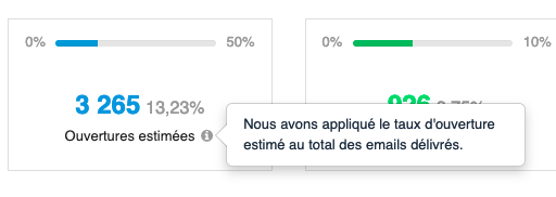
- Either, the tools differentiate between traceable and non-traceable openings. They display the traceable opening rate, thus "excluding" Apple Mail. Then, they extrapolate the open rate by applying the trackable open rate to the total number of delivered emails.
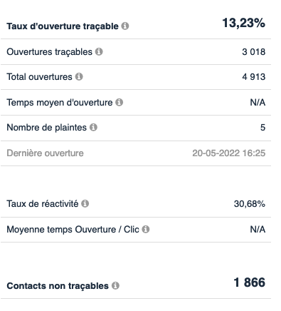
- Or, nothing is done. In this case, we should expect opening rates to increase compared to before September 2021.
Nevertheless, the opening is supposed to measure mainly the attractiveness of your object and the commitment of your recipients with respect to your communications.
The most reliable indicator: click-through rate
This is THE most reliable emailing KPI for measuring your email strategy. The click-through rate summarizes the overall performance of the email: object appeal, target commitment as well as the relevance and effectiveness of the message.
It is measured by dividing the number of clickers by the number of emails delivered:
% click = number of clickers / number of emails delivered.
It's important to distinguish between unique click-through rates and absolute/cumulated click-through rates. While the second figure may be interesting to look at to measure the impact of the various CTAs in your e-mail, it's above all the first that should be monitored to measure the effectiveness of your campaign.
So make sure you're talking about the rate of "satisfied" clicks, i.e. excluding clicks on the unsubscribe link. Today, most routing tools exclude clicks on the unsubscribe link, but not all. It's a good idea to make sure. Some also exclude clicks on the online version.
In a nutshell: It's difficult to say what a good or bad click-through rate is, because it's so volatile between different targets and activities. Nevertheless, we're used to saying that in BtoC for editorial newsletters, a good click-through rate is around 3/4%. For promotional emails, it's around 1.5/2%. On the other hand, BtoB can easily reach 7/8%. And this rate varies even more depending on the target: active customers, ex-customers, prospects...
The KPI for measuring engagement: the reactivity rate
The reactivity rate is a good indicator for measuring the design, the interest of the content and the tone used in your message. It's also known as CTOR, or Click-To-Open-Rate. But it is not 100% reliable, since it is based on openers...
It is measured by dividing the number of clickers by the number of openers:
% responsiveness = number of clickers/number of openers.
Again, care must be taken to distinguish between unique openers and clickers from the total number of opens and clicks.
In broad strokes: In general, a reactivity rate under 10% will have to be optimized by changes in the content: message layout, block structure, information hierarchy, content, communication style...
Profitability indicator: conversion rate
Conversions are used to measure the profitability of a campaign. The expected action differs from one business sector to another. It may be: the number of products or services sold, the number of respondents to a form, the number of appointments booked, the number of subscriptions....
It is often complex to enter these conversions directly into the routing tool. In this case, you'll have to open a nice spreadsheet, import your emailing KPIs, fetch the number of conversions from another tool and fill in your table 🙂
In short, that's a lot of manipulation, that's maybe why this rate is not well followed.
The conversion rate is most often measured by :
Number of target achievements / Number of emails delivered.
It is preferable here to follow the conversion rate per campaign and not the volume of conversions because the number of conversions depends strongly on the number of emails delivered. Or we can follow the evolution of the number of conversions per 1000 emails sent.
Get a grip on the other email KPIs
If the indicators seen above are those that will allow you to judge the pure performance of an email, there are others that can help you optimize the usability of your emails.
The hot zone map
The idea is to have a visual overview of the areas of your email that triggered the most clicks.

For example, in the email above (the hot zones are purely fictitious), we can see that the Openclassroom logo takes 30% of all the clicks in the email and the "I register" call to action only 20%. The latter is probably placed too low in the message (below the waterline). It's also worth noting that 15% of clicks go to unsubscribe. This is a significant score and highlights thedissatisfaction of the recipients regarding the message received (we will come back to this notion of dissatisfaction below).
The heat map allows you to understand a little better the behavior of the clicker, and therefore to start planning optimization actions on your email designs.
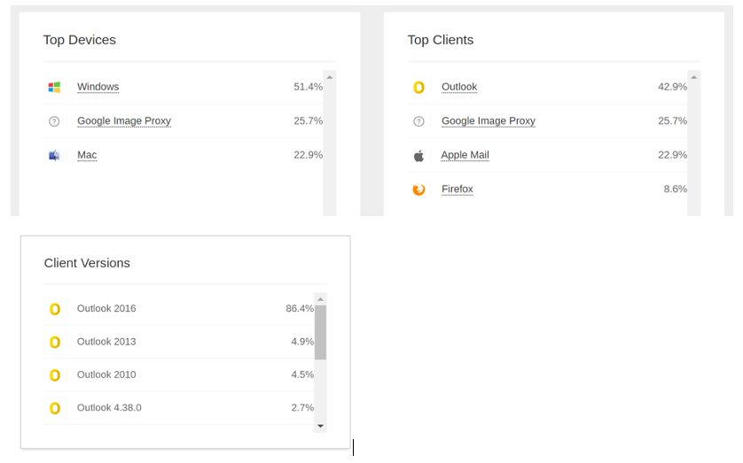
The opening environments
This is NOT to be confused with sending domains! And we detail the difference in this article: Email design: what counts is the opening environment for recipients, not the distribution of domain names!
Each opening environment has its own rules for displaying emails and understanding HTML for email. For example, an email opened from Live webmail will not render the same as the same email opened from the Gmail mobile application on my mobile.
It is therefore important to know the opening environments of your contact base in order to optimize the design and integration of your emails. It is possible (except for Gmail), to know the type of terminal on which the email was opened, the name of the email client or browser, and in some cases, the version of the email client. This information is very interesting to knowEspecially when you design and integrate your email templates. If a significant percentage of your target audience opens your emails on outlook, you will know that you will have to be very careful about the use of innovative blocks and background images in your email templates.
Some tools (but few) display these statistics. Otherwise, you will have to use specialized tools.
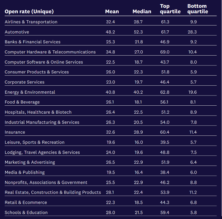
Benchmark your performance against the competition
As we saw above, the average ranges are quite wide when it comes to the results of your campaigns. On opening rates, we can have companies that have between 12% and 40% on average.
Most advertisers like to benchmark themselves against the competition to see if they are on track
Here are a few studies that can help you get your bearings:
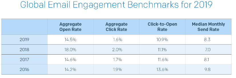
Sendgrid's Global Email Engagement Benchmarks for 2019
Discover the whole study (in English)
2019 Marketing Benchmark Report from Acoustic
Opening rates by industry (Mean, Median, 3rd quartile, 1st quartile)
In summary
- Track basic metrics: open, click and response rates
- Observe the hot zones of your emails to understand click behavior
- Take the time to understand your recipients' display environments
- Go beyond email metrics and calculate your conversion rates
- Find out about the market figures!
We will now take the time to analyze one rate, the dissatisfaction rate. A rate that allows you to understand the level of satisfaction of your campaigns.
Interpret the dissatisfaction rate of your email campaigns
This is THE rate to calculate to know if your campaign annoys your target.
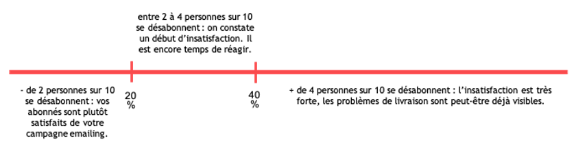
The dissatisfaction rate is a rate that you'll need to calculate using the statistics provided by your router. It does not (yet) exist by default in the management of emailing campaigns. It correlates the number of clicks on the unsubscribe link with the overall number of clicks of a campaign.
A high rate shows a strong dissatisfaction of your subscribers. They did not like your content! A high dissatisfaction rate very often leads to deliverability problems on your marketing campaigns in the short/medium term.
The dissatisfaction rate is very simple to calculate. You just have to take the cumulative number of clicks on the unsubscribe link and divide it by the cumulative number of clicks in the whole campaign (clicks on the different links + clicks on the unsubscribe link). Multiply the resulting figure by 100 and you have your dissatisfaction rate.
It is assumed that:
You will say to me but why to watch him if all is well or almost well... Simply because, thanks to him, you will be able to escape easily from a catastrophe. You only need one campaign to lose your reputation but it will take you several weeks (or even months) to regain it. This saves you a lot of time and energy.
The dissatisfaction rate allows you to set limits not to exceed. For example, if you're in a sales period and you want to target a little wider, you can tell yourself that beyond 40% of dissatisfaction, you stop expanding your target 😉
In summary
Little known and especially little followed, the dissatisfaction rate is a key indicator that deserves, just like the open and click rates, to be followed more closely. The calculation is simple (especially if your router provides you with the data directly) and the precision is effective. Get your calculators now!
Produce recurring reports
Sending email campaigns is something that many companies do more or less well ;-). But measuring the results of these campaigns is often a poorly treated point.
When you ask a marketer if they have any idea how their campaigns are performing and how profitable they are, they often shrug it off.
Why? Because routing tools offer, for the most part, a campaign view of results. Whereas a real analysis requires compiling results, aggregating data and comparing them against certain criteria of your business that are complicated to transcribe into standard tools. Marketers often end up extracting the raw results into an excel spreadsheet and compile the dashboards they want themselves thanks to the great 'Pivot Table' feature!
We are now going to see which reports you should make and maintain regularly to really measure the performance of your emailing strategy.
Time tracking
It is essential to know and follow the results of emailing campaigns. The lifespan of an emailing campaign lasts about 3 to 5 days. Beyond 5 days, the openings and clicks on the campaign become more rare.
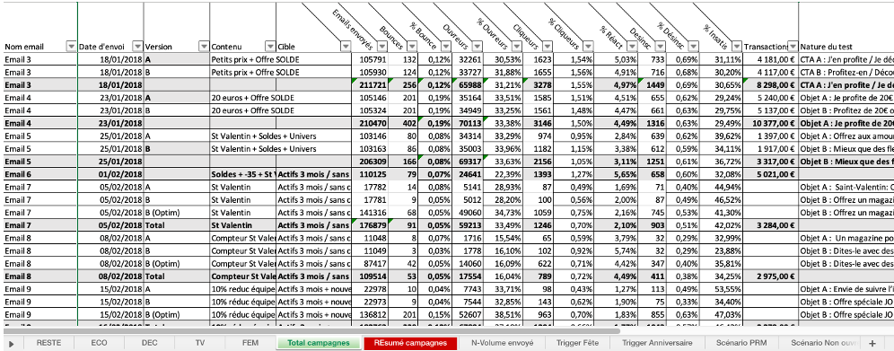
Every week, you can list the results of your campaigns in an excel file. On the line, you will write the names you gave to your campaign and then in the columns the different indicators in percentage and volume. Don't forget to include conversions in this table. Don't forget to include the results of your A/B tests to learn from it!
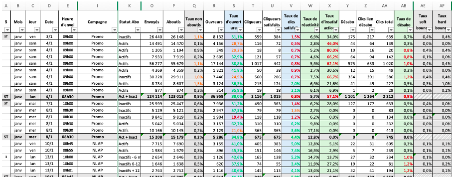
Then, on a quarterly basis (half-yearly is also fine ;-)), it is important to make an assessment the effectiveness of your emailing strategy. You can then, thanks to pivot tables if you use Excel, aggregate your results over time and make a temporal analysis, by type of campaign (promotional vs. relational), by target (prospects vs. customers, active vs. inactive...).
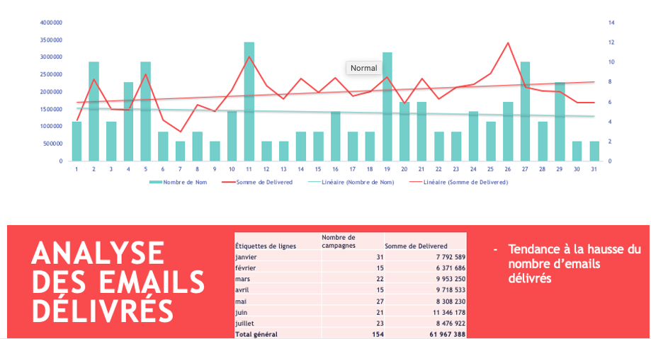
Volume of emails sent and number of campaigns
Measuring the volume of emails sent gives you an idea of the emailing activity. Is it globally on the rise? Decreasing?
The objective is to have a sending volume that is fairly stable, that does not vary greatly from one week to the next. If your sending volume varies too much, you risk waking up the anti-spam filters and encountering deliverability problems.
Monitoring the number of campaigns sent gives you an idea of the sales pressure exerted on your contacts and the level of targeting of the campaigns.
Openings and clicks, in volume
Marketers often look at campaign performance in rates. But in reality, it is much more interesting to measure its performance in volume.
The most important thing is not so much the open and click rates but the number of openers and clickers. Do you have more and more contacts who open your campaigns? Do you have more and more clickers?
Ideally, the evolution of the number of openers and clickers should follow the evolution of the number of emails sent.
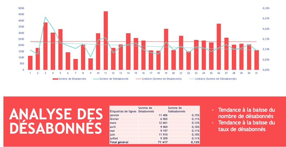
Unsubscribers, by volume
Tracking the number of unsubscribers allows you to check if you are losing too many contacts compared to the volume of emails sent. Sometimes contact acquisition problems can be raised. It is interesting to follow the number of clicks on the unsubscribe link and the number of unsubscribers. Sometimes the difference is huge when it should not be! This shows that the contacts are giving up, which may be linked to the difficulty of the process.
Never underestimate the unsubscribe process. It must be done in 1 click in a very clear way.
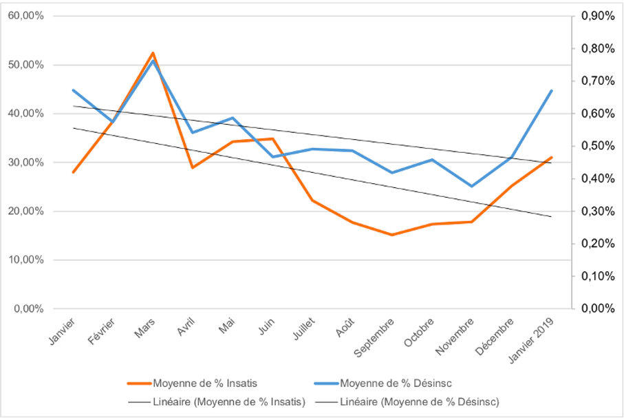
Dissatisfaction in rates
Just like unsubscribing, tracking dissatisfaction allows you to check if the content generated is really interesting for your contacts.
For dissatisfaction, we will keep the rate logic. Here, the objective is for this rate to be constantly decreasing.
A good dissatisfaction rate is less than 20%. Satisfaction comes first and foremost from good targeting. The brands that really maximize clicks and satisfaction are those that target their campaigns according to their contacts' centers of interest.
Conversions
Conversions are used to measure the profitability of a campaign. The expected action is different from one sector of activity to another, it can be: the number of products or services sold, the number of respondents to a form, the number of appointments made, the number of subscriptions .... It is sometimes complex for these conversions to be fed directly into the routing tool. In this case, the turnover generated for every 1000 emails sent can be tracked in the excel table.
Breakdown by message type
Another way to work with performance indicators is to analyze them through filters.
You can start by analyzing the performance by type of campaign.
As already mentioned above, there are often differences of a few points between editorial newsletters, promotional emails and service emails. The idea of this analysis is to know which types of messages generate the most opens, clicks and conversions.
You will then have to insert in your sending schedule a good mix of messages between those that generate opens and clicks (and that preserve your deliverability and your reputation) and those that generate sales (because that is the sinews of war...).
Breakdown by type of audience
You can then analyze the performance of your messages by segment type.
If we take the example of an airline, on a campaign sent out very widely to promote a new destination, it can be interesting to compare campaign results on different segments.
Most routing tools don't break down campaign results by segment. However, when sending a general campaign, it would be ideal to have this detail. If you want to view results by segment, you'll need to send as many times as there are segments to analyze.
Ventilation by ... everything that can be interesting!
We have just given 2 ways to break down your stats. But, depending on your industry and your strategy, it can be interesting to look at your stats from many other angles!
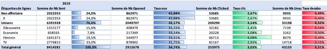
Example 1: If you're in the retail sector, it might be interesting to look at your stats by geographic area. How do you react?
- Those who live near a shopping mall
- Those who live in the city center
- Those who live in a white zone
Example 2: It might be interesting to look at your stats in terms of product universes. Which universes work best?
Example 3: in the subscription sector, the most active behaviors are often those with an expiry date of + or - 90 days.
In the next chapter, we will see which levers to activate to optimize opens and clicks. And logically, reduce unsubscribes and dissatisfaction.
Draw up a plan to optimize your KPIs
Once the analysis is done, you may find that your opens and clicks are down. And you want to boost these indicators.
So how do you increase the number of openers and clickers?
Work on the trinomial: sender, subject, preheader
Before you even open an email, the first thing you see in your inbox is the list of received emails. Your email box displays the sender, the subject and the preheader. It is by reading this trinomial that you will decide whether or not to open the email. It is therefore essential to play on these 3 levers to maximize the opening.
The sender's label
It must be known and stable. In general, there's very little creativity here: your recipients will open your e-mails if they trust the sender. This is usually the name of your company. Sender name should not vary from campaign to campaign. Changing the sender name for each campaign is a spamming practice.
The object
It must be short. A short subject is easier to remember. Beware: a subject too short is meaningless. The ideal subject is less than 10 words, less than 50 characters. Above all, it should arouse interest! If your target allows it, don't hesitate to use an offbeat, catchy tone, a play on words... The most important words should be placed at the beginning.
If we take the example of a company that sells alarms, the object "Increase in burglaries: protect yourself" will work better than the object "Equip your house with an alarm".
Another example with a company that sells magazine subscriptions. On Mother's Day, the "For you Mum, with all my love..." item did better than the "Mother's Day: give a magazine" item.
The preheader
is the sentence that appears just below the object. It must therefore provide additional information to the object.
If we use the example of alarms, we could write, "2 out of 3 homes equipped in the city, why not you?"
Do not repeat the sender's name in the subject line and preheader. It's a waste of space!
What works well:
- the numbers (4 reasons to ...),
- the question that begs to be asked (What to do with your moldy gifts?)
- and above all surprise and interest your recipients!
Perform A/B testing
One of the many advantages of emailing is the possibility to test every time you send a message! Testing allows you to optimize your clicks and therefore your conversions.
What is A/B testing? ?
A/B testing allows you to test 2 variants of an email sent randomly to a portion of the target. Then, the version that performed better will be sent to the rest of the target.
- 2 variants In fact, you can (and MUST) test EVERYTHING: subject line, preheader, sender, button positioning, call-to-action wording, button color, image, design, features or benefits to be highlighted, way of announcing a price, placement of elements, time of sending...
- on a portion of the target We generally take 10% from the contact base. In any case, we make sure we have at least 1000 contacts in each segment. 1000 being a fairly representative number.
- then We like to leave 24 hours, or at least 12 working hours (i.e. if I send an A/B test at 8 a.m., then the winning version will ideally go out the next day at 8 a.m. or, if we're in a hurry, in the evening at 8 p.m.). The aim is to give contacts time to open and click on the email, so as to have representative results before generalizing the test.
- the best performing opening rate, click rate, conversion rate, churn rate... which often leads to a little debate!
Warning: test only ONE variable at a time. If you are testing an object, ONLY change the object and not the preheader or the creative. You wouldn't know which variant really had an influence!
Take a strategic approach! Create a test program for yourselfInclude the tests in your mailing schedule.
For each test, describe: the objective, the approach and the indicators monitored.
For example:
- 1st month: test of several axes of objects (offbeat tone vs. factual tone, tutoiement vs. vouvoiement, promo vs. question...)
- 2nd month: preheader test
- 3rd month: test of the catchphrase in the emailing
- 4th month: CTA test (color, location, text, shape)
- 5th month: the optimal day of sending
- 6th month: the optimal sending time slot
- 7th month: target A vs target B
- 8th month: promotional content vs. relational content
Next, list the results of this test in your analysis table. Finally, create your teaching "bible.
Review your segmentation
Segmentation (and it is really this lever that will maximize your performance) can be basic at first: prospects, customers, ex-customers. You can then refine it according to what is important for your strategy: geolocation, product universe, a deadline...
But the segmentation that leads to better performance and the one that will target your recipients' interests.
There are several possibilities to detect the centers of interest:
- ask your contacts (via questionnaires well placed in your CRM scenarios),
- according to the purchases previously made,
- according to the pages seen on your website
- categorize the opens and clicks of your email campaigns
It is now possible, in most routing tools, to categorize all the links contained in your emails. For example, :
- all links that start with :
https://www.electrodepot.fr/gros-electromenager/... Then the category will be LARGE ELECTRONIC - All links that start with :
https://www.electrodepot.fr/cuisine-cuisson/... Then the category will be COOKING - Etc...
Set up the aggregates, each opening and clicking on a typical link https://www.electrodepot.fr/gros-electromenager/... will feed the GROS ÉLECTROMÉNAGER aggregate
Create your segments 'Focus=GROSS HOUSEHOLD', 'Focus=CUISINE-CUISSON'.
Then target your emailing campaigns on the target types centers of interest.
In summary
To maximize opens and clicks, and decrease unsubscribes and dissatisfaction, you need to :
- Work on your email content: editorial content brings more openers and clickers!
- Work on your objects and arouse interest. Don't hesitate to use offbeat approaches!
- Target according to the interests of your contacts
- Be clear, know what stories to tell your strategic targets.
