Did you know, you little rascals: at Badsender, we're committed to ecological, social and ethical values. And this commitment should also be reflected in a activist design in our communication methods. I'm also planning to rework the design of our communication materials. (websites, social networking sites, emailings...) in this respect.
At the request of the now famous but nonetheless modest Marion Duchatelet, I've been keeping an eye on activist designs and visual identities for brands and organizations that are committed to activism, whether in the ecological, social, freedom of information, political or even retail fields. It's time for me to share my results with you. Go for it!
Table of contents
Why is design important in activist movements?
- For effective visual communication Design can communicate sometimes complex messages in a simple, visual and direct way. In activism, where it's essential to convey ideas and values quickly and effectively, design can transform abstract concepts, such as values, into impactful, understandable "images".
- To generate "emotional commitment A well-conceived design can arouse a number of emotions, such as compassion, indignation, anger and hope, and motivate "readers" to get involved, invest and take action! It's like advertising after all: well-designed commercials are bound to create a special bond with the viewer. Here's an example: ever since I saw the 2018 30 million friends campaign (I'm still crying my eyes out watching it)I swear I've never been so committed to animal welfare and the fight against abandonment. Visuals always have a strong impact in committed campaigns !
- To create an identity (unique, if possible) A unique design helps create a unique visual identity. This enables members or sympathizers to quickly recognize, identify with and rally around common symbols, reinforcing a sense of belonging. In a world saturated with organizations and information, "striking" graphic codes help to stand out and stay in the public mind.
- To reinforce an argument Graphs, infographics and data visualizations can make complex arguments and figures more digestible and persuasive.
- To be able to communicate on different media To be effective and gather the largest possible following, committed brands often need to communicate on different types of media, as we'll see later. (digital or not) The design must be able to adapt to these multiple communication media and remain impactful.
Activist brands analyzed
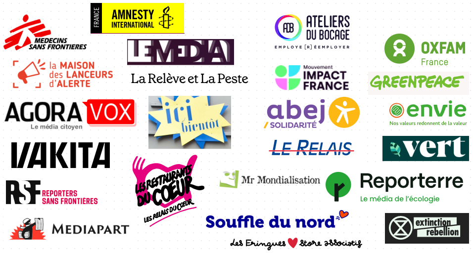
The list is impressive, but not exhaustive. Far from it. At the same time, I hope you'll understand that I can't list all the NGOs and associations, because there are so many of them! (unfortunately) far too many... So I'm basing my analysis on this list.
| Name | Typology | Website | Domains |
|---|---|---|---|
| Impact France | Movement | https://www.impactfrance.eco/ | ecology, social |
| BCorporation | Network | https://www.bcorporation.net/ | social |
| Exctinction Rebellion | Movement | https://extinctionrebellion.fr/ | ecology |
| Emmaüs | Association | https://emmaus-france.org/ | social, second life |
| Emmaüs label | Association | https://www.label-emmaus.co/fr/ | second life |
| Souffle du Nord | Movement | https://www.lesouffledunord.com/ | social, second life |
| Les Restaurants Du Coeur | Organization | https://www.restosducoeur.org/ | social |
| Greenpeace | Association | https://www.greenpeace.fr/ | ecology |
| Oxfam | Organization | https://www.oxfamfrance.org/ | social |
| WWF | Association | https://www.wwf.fr/ | ecology |
| Doctors Without Borders | Association | https://www.msf.fr/ | freedoms |
| Reporterre | Media | https://reporterre.net/ | ecology |
| Green | Media | https://vert.eco/ | ecology |
| Social Media | Media | https://www.lemediasocial.fr/ | social |
| Mediapart | Media | https://www.mediapart.fr/ | whistleblower, politics |
| Mr. Globalization | Organization | https://mrmondialisation.org/ | social, freedoms |
| Vakita | Media | https://www.vakita.fr/fr | ecology, politics, social, freedoms, whistleblower |
| AgoraVox | Media | https://www.agoravox.fr/ | policy |
| La Relève Et La Peste | Publishing house | https://lareleveetlapeste.fr/ | ecology |
| Reporters Sans Frontières | Organization | https://rsf.org/fr | whistleblower, freedoms |
| Amnesty International | Association | https://www.amnesty.fr/ | librties, social |
| La Maison Des Lanceurs D'Alerte | Organization | https://mlalerte.org/ | whistleblower |
| Le Media.tv | Media | https://www.lemediatv.fr/ | policy |
| Ateliers Du Bocage | Network | https://ateliers-du-bocage.fr/ | social, ecology |
| La Petite Rockette | Organization | https://www.lapetiterockette.org/ | second life, ecology |
| Abej Solidarité | Association | https://abej-solidarite.fr/ | social |
| Le Relais | Organization | https://www.lerelais.org/index.php | social, second life |
| Envie | Organization | https://www.envie.org/ | second life, social |
| Toms | Company | https://www.toms.com/fr/ | ecology, social |
| Les Fringues Associatif | Association | https://lesfringuesstoreassociatif.com/ | second life, social |
| The Good Goods | Media | https://www.thegoodgoods.fr/ | ecology, second life |
| La Vie Est Belt | Company | https://lavieestbelt.fr/ | second life |
| Patagonia | Company | https://eu.patagonia.com/fr/fr/home/ | sustainable design |
| La Fabrique Nomade | Network | https://lafabriquenomade.com/ | social, second life |
| Lush | Company | https://www.lush.com/fr/fr | sustainable design |
| Thrift | Company | https://thrift.plus/ | second life |
| Fairspace | Company | https://fairspace.fr/ | ecology |
| Tissons La Solidarité | Network | https://www.tissonslasolidarite.fr/ | social |
| Loom | Company | https://www.loom.fr/ | sustainable design |
| Asphalt | Company | https://www.asphalte.com/ | sustainable design |
| Ares | Network | https://www.groupeares.fr/ | social |
| Enercoop | Network | https://www.enercoop.fr/ | ecology |
| SOS Méditerrannée | Association | https://sosmediterranee.fr/ | social |
| Sea Shepherd | Association | https://seashepherd.fr/ | ecology |
| Secours Populaire | Association | https://www.secourspopulaire.fr/ | social |
Graphic recurrences in militant design
Typography
Size
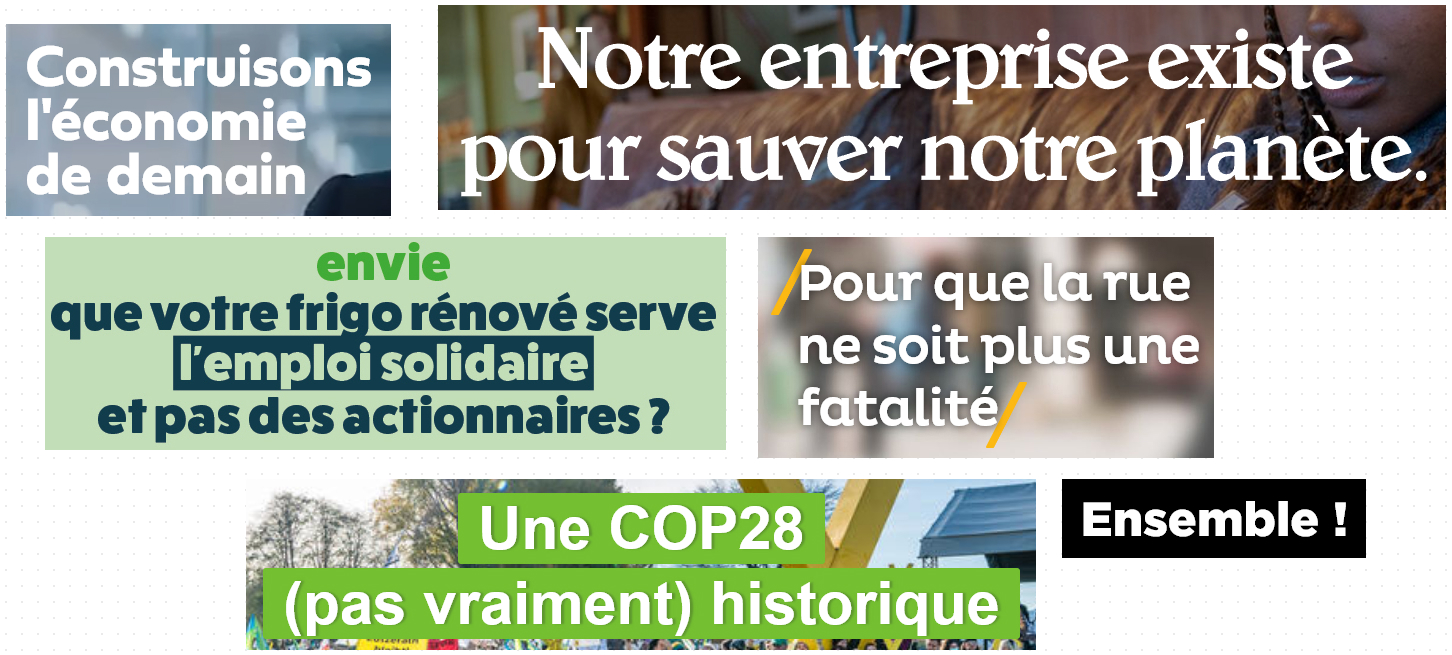
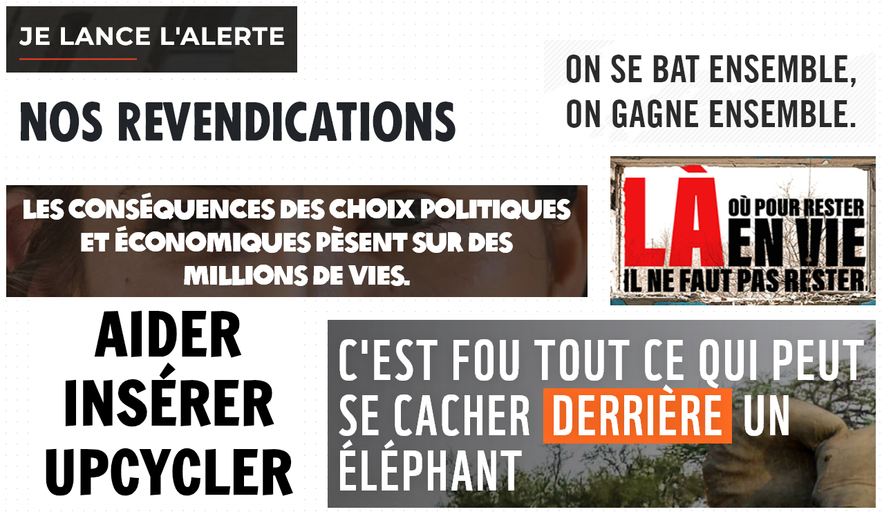
The size of the titles is very substantial between 40 pixels and 72 pixels if the unit is the pixel. When relative units are used, paragraph sizes are tripled or quadrupled! Clearly, you have to do it on purpose not to see it... This "extreme" formatting of headings is also made possible by the fact that headings are short.
Breaking
The title is generally capitalizedas if to add even more to the notion of warning, alert, danger. This is especially true of particularly active action organizations (Extinction Rebellion). You know what it reminds me of? Messages on freeway bridges. Like "POLLUTION AIR = 48000 MORT.E.S/AN" on the A1. Or the famous "NATHALIE JE TE COEUR" on the Tourcoing bypass... Well, to each his own, eh? No judging!
Grease and width
Many times, the typography of the titles is very thick (Extra-Bold or Black). To make it even more visible, of course. And I've also noticed that "condensed" typography is well represented: I don't know about you, but for me it evokes a certain stress, anguish, urgency... But then, all these feelings are subjective, by definition.
Family
Finally, the typeface family varies according to the type of structure: media will prefer a serif typefaceThis typeface is undoubtedly more rooted in the world of the press and publishing, while the others are oriented towards sans serif typography.
Highlighting in full force
I have the feeling that I've recuperated the notes of a friend from Terminale L (yes, I did "L". I'm talking about a time that people under 20 can't possibly knoweeuhhh... And I was the only guy in a class of 9 for the anecdote) : With a stabilo in hand, she highlighted everything! And in flashy colors, of course! But let's make no mistake: highlighting is used here for very specific purposes:
- Accentuate (through contrast) The emphasis: draws attention to a specific element in the text or image, indicating that it is important or worthy of attention. It highlights or emphasizes a particular element. It creates a strong visual contrast, making the highlighted element more visible and therefore memorable. In text, it can indicate the importance of a word or phrase, similar to the use of bold or italics.
- Revitalize visually, highlighting adds a dynamic, energetic dimension to a design (or to a concept, too, if you think about it).
- Last but not least, it's a strong reminder of how it can be used in demonstrations, on banners and signs. It's Extinction Rebellion's trademark, right down to the logo. As Monsieur Orel would say, "i'm in the protest" !
Highly visible calls to action
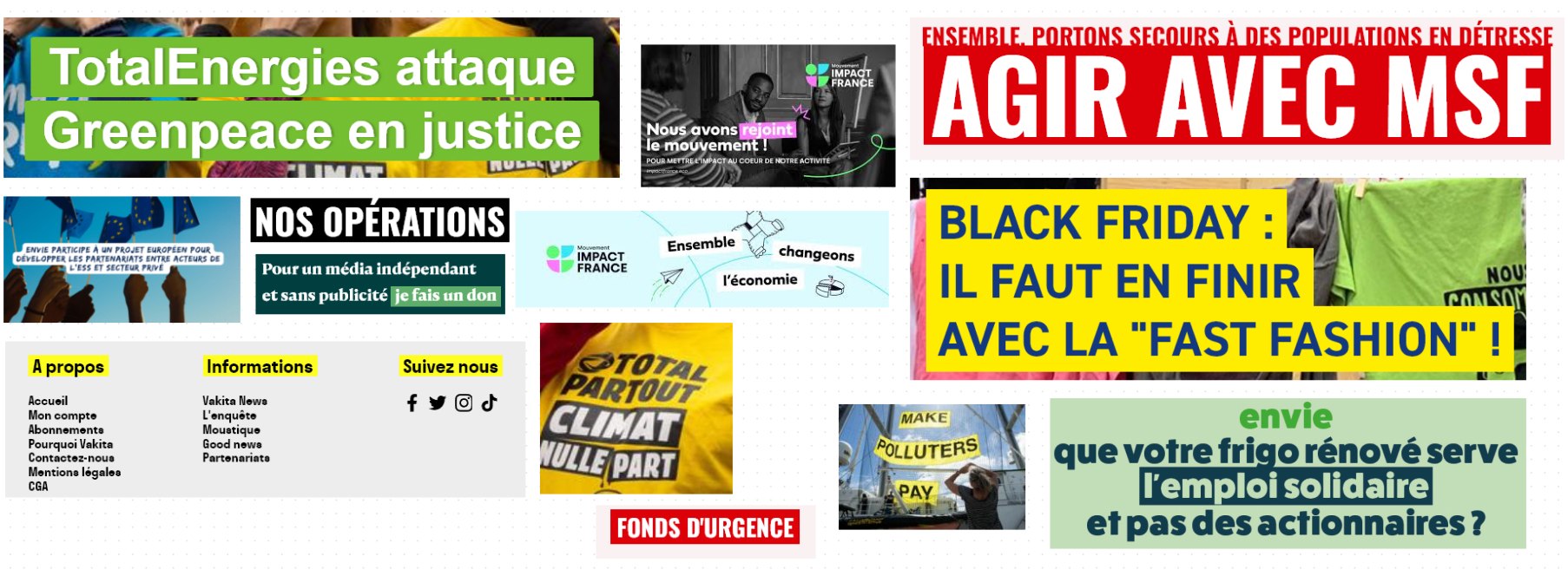
By the way they are shaped flashy colors often text in upper case and boldIn short, indicators of urgency and action!
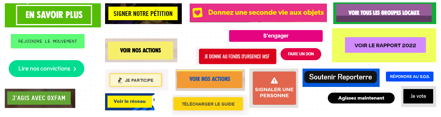
A few calls to action include pictograms, but this is quite rare. On the other hand, I notice the use of relatively "aggressive" hues visually speaking: red, black, yellow. You can't "miss" these buttons. Contrasts are also particularly strong, to catch the eye and, no doubt, enhance accessibility. (and the gift). Because most of these organizations live on your donations, don't forget that!
Illustrations with people at the center
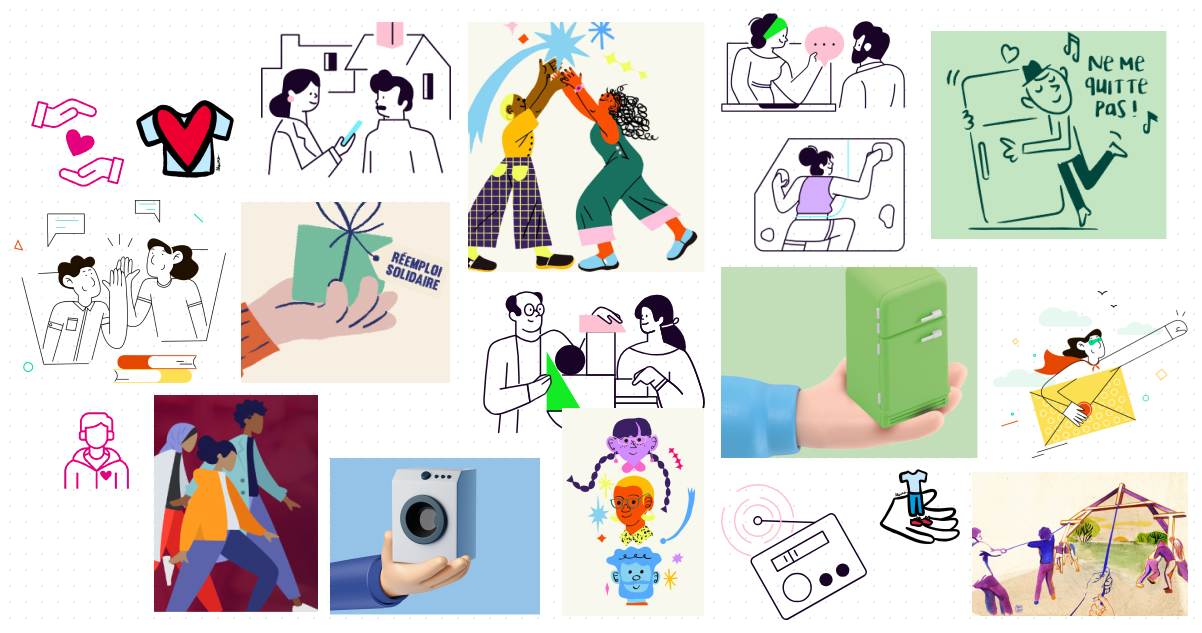
When illustrations are used (often in small quantities), they often present the human. Because that's what these brands are all about: encouraging mutual aid and solidarity. Their work is generally linear, with small, solid elements and a dynamic, pop, modern feel.
The power of images
Activism "works" with imagery, because imagery sums up a humanitarian, ecological or social cause in showing the need for change rather than explaining it. In short, "a picture is worth 1,000 words as Madame Prunhaut, my daughter's first-year teacher, so aptly puts it.
It's a bit of an old-fashioned method, but one that has proved its worth: "the weight of words, the shock of photos".. You see who I'm aiming at, don't you? It's a solution for making an impression, getting people moving, raising awareness: using strong, shocking visuals, for a well-informed audience.
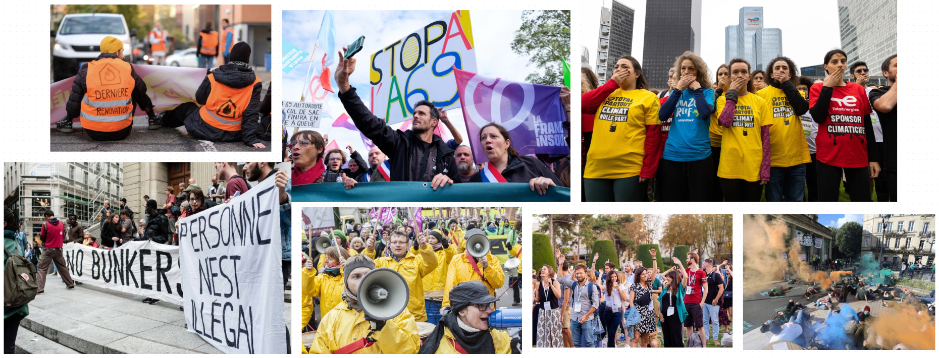
This includes photos of demonstrations, revolts and repression. (more or less aggressive)...
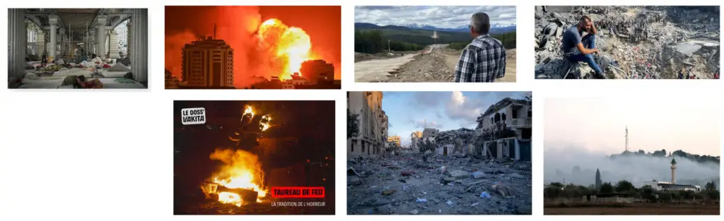
But also visuals of war, desolation, abuse, ecological disaster... These are investigative visuals, of the "war reporter" type. And at the same time, with so many sites ending up "wandering" like Reporters Sans Frontières, Médecins Sans Frontières, Reporterre, Secours Populaire, we can't be surprised... Nothing to see, single thread.
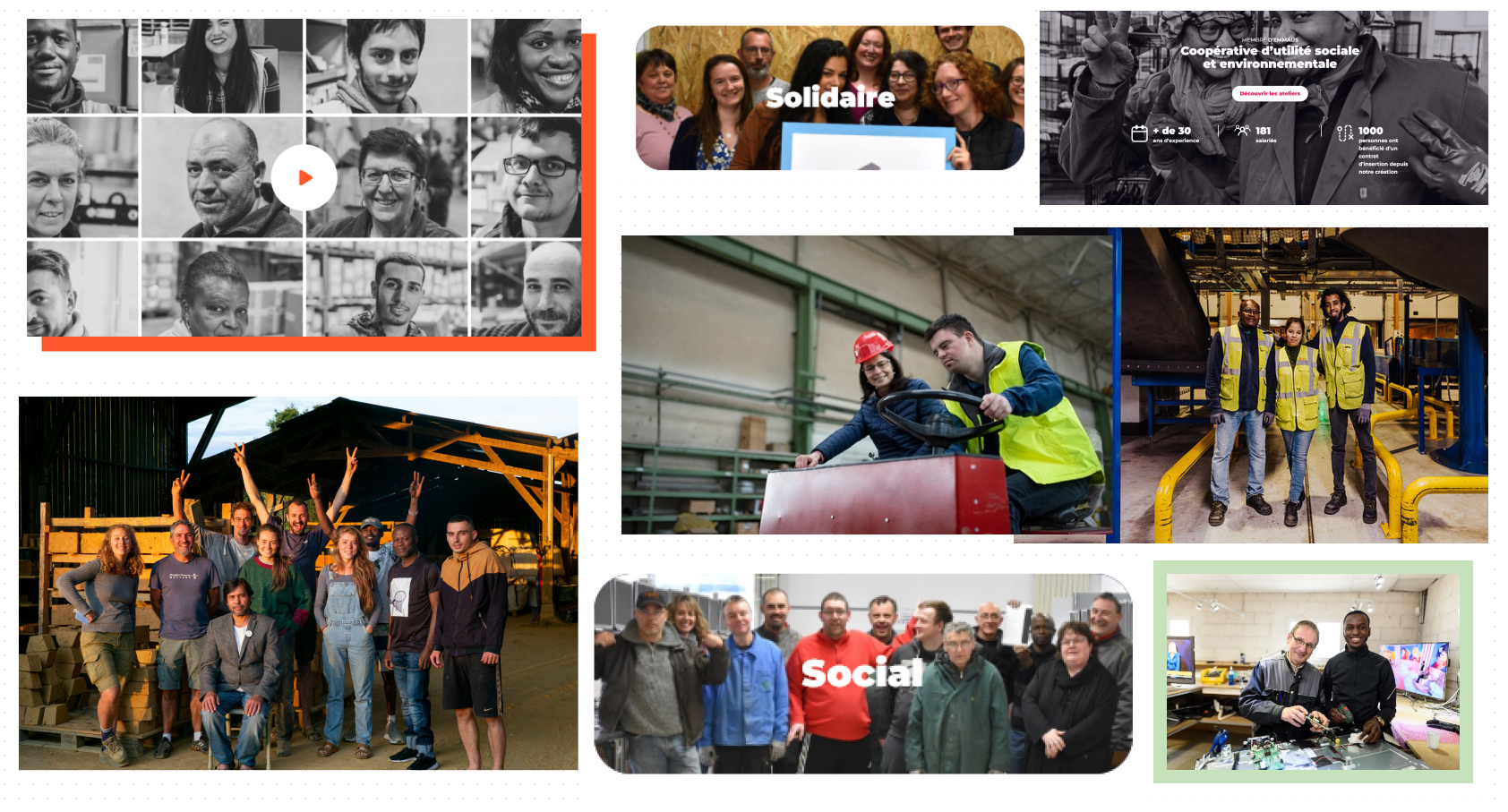
Of course, not all the sites analyzed follow this trend. Many of them focus on the human element, on groups, on movement, on solidarity. Very often, the human will not be alone, but in a community, smiling, warm.
Tighter iconography
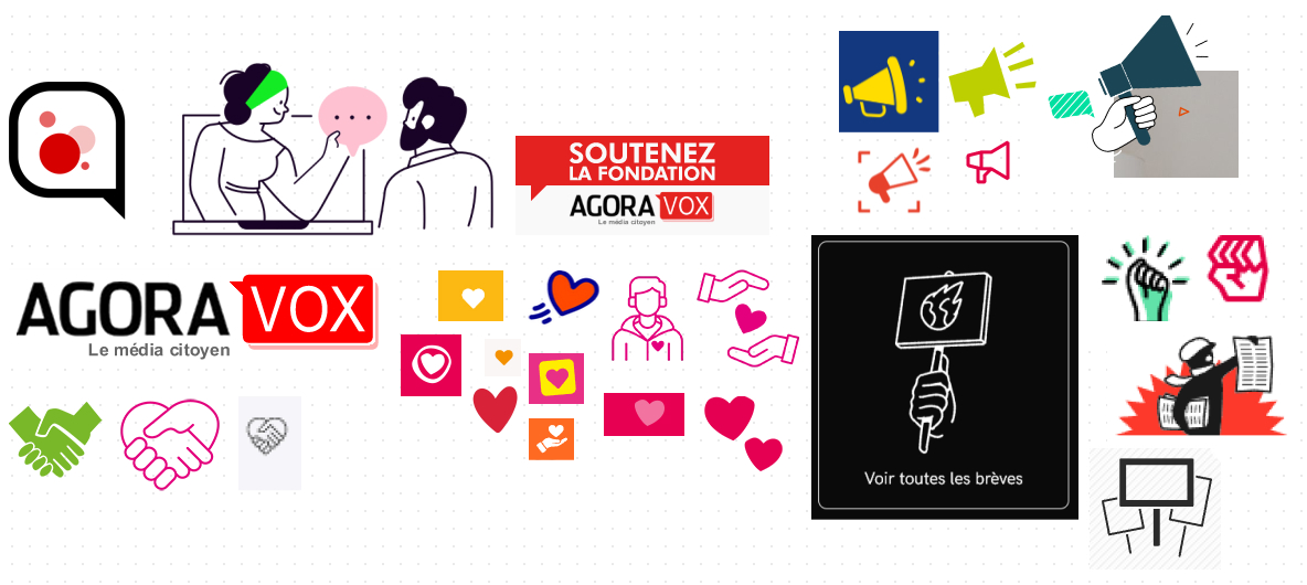
"Amiiiii do you hearuuu the souuuurd cries..." In the midst of a crowd of all ages and backgrounds, that's where I am! The iconography used here is a clear reference to protest symbols: Raised fist (fed upness, fist-fights, power struggles), signs, bubbles (message, discussion, talks, negotiations...) and of course... The megaphone ! TO SHOUT THE MESSAGE !!!! I was finally diagnosed with profound deafness in my left ear...
But the field of icons doesn't stop there. I have noticed a profuse use of heart For appeals for donations, of course. But also for hope. For humanity. We still believe in people. In the same vein, I note the regular appeal to icons of hands clasped, welded together: mutual aid, solidarity. This is also one of the strong themes of these institutions.
Powerful colors
You know how meaningful colors can be. I experienced this again with the game The Floor on France 2, where in the "Logos" category, you had to recognize famous brands without their names.
In militant design, colors are also extremely important, and sometimes even accentuated. (even if it means going to extremes) for further support this notion of extreme or emergency. And I've noticed that the colors used often have something to do with their use in road signs... Anyway, my interpretation of colors is entirely subjective and also specific to the graphic identities analyzed: you also have to take context into account! Get your Rousseau road codes out, and let's go Bertrand!
- From black The word: can evoke darkness, or resistance. Here, it's mainly used for themes of war and field journalism. Combined with red, it is particularly suited to denunciation journalism. Black also hides shades of gray, to position the company as a neutral player.
- From red The word: normally evokes strength, power, energy, activity, arousal, passion and dynamism. In the sites analyzed, it more specifically evokes blood, danger, anger and revolt. Used especially in themes of war, revolt, social alert, journalism or whistle-blowing. On road signs, it evokes prohibition and danger.
- From yellow Yellow is normally synonymous with optimism, joie de vivre, warmth, light, cheerfulness and youth. It can also evoke caution or deception. In Anglo-Saxon countries, it's associated with cowardice, outlaws, the persecuted, the excluded... So its choice is obvious for an organization like Amesty International, whose vocation is to denounce injustice and defend people's human rights. For me, it also instantly evokes the yellow vest movement, or the profession of garbage collector: a notion of visibility, of being in the spotlight, that is strongly anchored here. Yellow is also a hue that's ingrained in our minds as the color of a high-visibility warning on road signs.
- The green Green is nature, optimism, growth and hope. Of course, for ecological urgency and commitment, sustainability, activist retailing or responsible retailing in general, green is the most logical color. Green symbolizes nature by definition, vegetation (not the climate emergency) and also endurance, freshness, generosity and confidence. Its choice makes perfect sense for organizations that defend the living.
- The rose and the violet for their social value (the heart)and sharing. It will be used mainly for social themes, mutual aid and solidarity.
- L'orange Orange: usually evokes youth, creativity, exchange, vitality, ambition, enthusiasm, energy and action. It's the color of activity, of life.
I also notice the use of very pronounced color saturation (fluorescent) for more unusual colors: violet, orange, blue. Very regularly. For underlining, or for calls to action. To emphasize contrast, legibility and importance.
I would also remind you that the colors are chosen according to the missions of the various organizations (social, ecology, justice, information).
Strong logos
Varied, but strong. Varied, because our selection of activist brands encompasses many, many forms of activism. In fact, the way we communicate isn't always the same.
We can then find red-tinted logos (for alerts, media)logos tinged with green to reflect the ecological emergency, symbols, sometimes abstract or imbued with culture (Extinction Rebellion logo)nature or human/social icons (abej or Médecins sans frontières logo)and, very often, icons of signs or "bubbles", as in the case of alerts or the symbol of a demonstration sign.
What stands out most is the use of "bold", thick typefaces and brand-specific capital letters and typefaces. (WWF, Greenpeace, Vakita, Mediapart, vert) which allow immediate recognition of the entity without any other element required.
Similarities in activist design content
Numbers. Lots and lots of numbers.
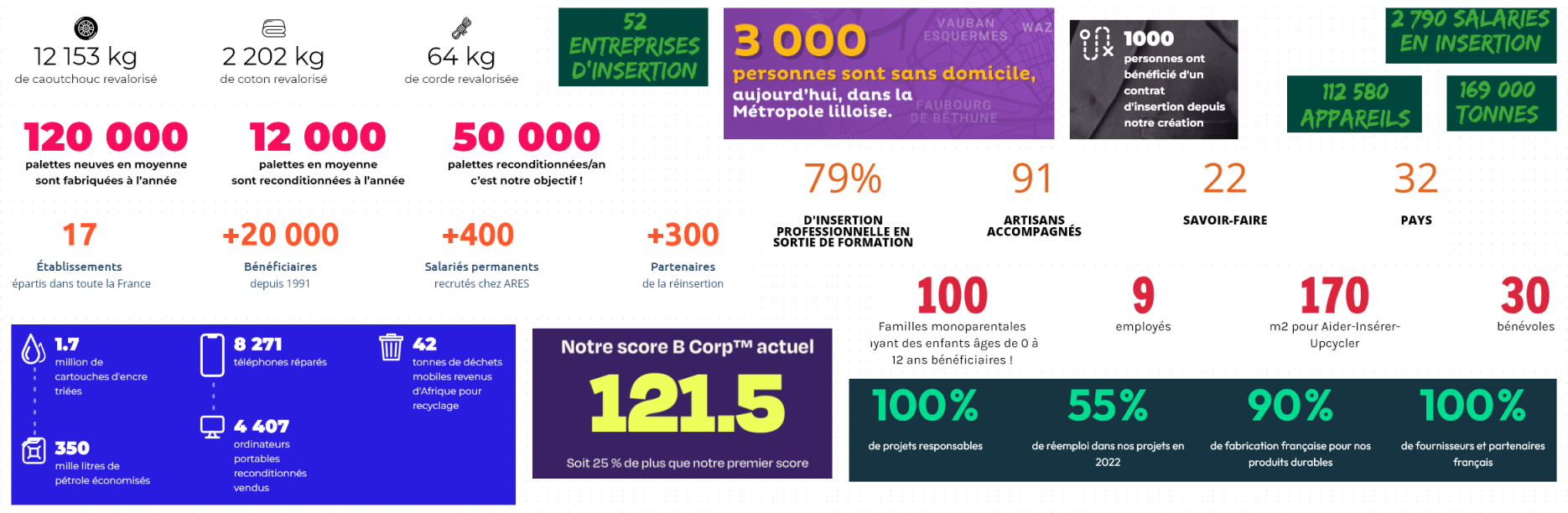
As if to materialize immaterial actions. Figures used to present criteria or results ecological balance sheet, or for equivalentsparticularly in retail (2202kg of recycled cotton). The figures speak for themselves, my good sir!
And the layout is often the same, whatever the entity using them: the number, very large, in very thick typography. (mostly), and a much smaller legend under each number.
A strong presence on the networks
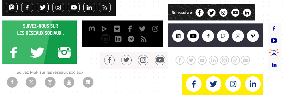
I'm noticing a stronger positioning on social networks: it's part of a communication strategy, a relay (no pun intended) information! On social networks, content is quickly relayed, as the immediacy of the platforms allowsextremely fast alerting. For some organizations, this also allows them to communicate discreetly, but also to reach an ever-wider audience. (international baby)but also younger and younger.
After all, social networks are all about community. And through social networks, activist brands also seek to "make" a community, to create a movement gathered around the same cause(s).
The Hashtag
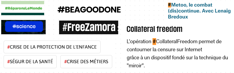
As if to launch a movement. Probably stemming from the #MeToo movement and the impact it had, it's a powerful tool for mobilizing around social, political and environmental causes. #BlackLivesMatter and #MeToo have played a central role in raising awareness and mobilizing international support. Originally used for ribbon-cutting (and still very much present in this sense in the brands analyzed)It is now possible to estimate the "strength" of a movement using this character. Twitter/X also uses this hashtag to measure the trend of a word.
Slogans
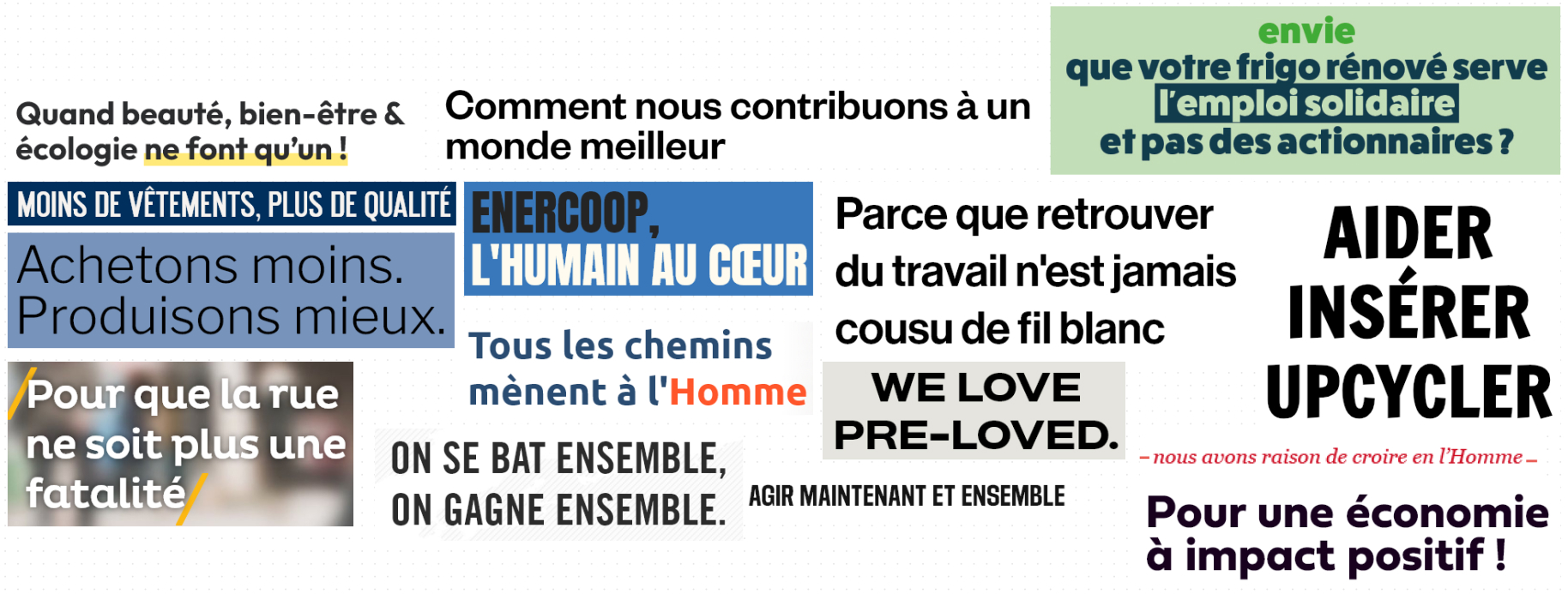
A militant headline is one that is generally short, punchy, striking, memorable, even shocking in its turn of phrase and content. Something easy to remember, like the organization's punchline. For this, of course, there's a lot of work involved in coming up with punchlines. (e.g.: "Pour que la rue ne soit plus une fatalité"). The words are not chosen at random.
Action verbs
Calls to action are distinguished by their content: real thought and editorial work are applied to include the reader in the brand's commitment and activism: "I'm taking part", "Join the movement", "Sign the petition", "Get involved", "Support"... These are verbs with a lot of meaning! A far cry from "I'm twiddling my thumbs or "I see"no no! Right now, all I want to do is grab my military jacket, my beat-up old jeans, my scarf in case I get gassed, and head down to Paname...
Live on the results of a survey of visual identities of committed organizations
Would you prefer to watch or listen to the freelance's conclusions?
Also available on our Sobriety & Marketing podcast:
This recording is also available on all podcast platforms:


What to remember about the graphic codes of militant design
It's time to sum up these bundles of text and visuals that may be unbearable and this article that is far too long for my (un)taste... So, in two words:
- VisibilityThat's the key word: highlighting, using bold typefaces, very large texts, capital letters... I must be able to see you from far away, despite my 2/10ths in both eyes!
- Return your highly visible calls to actionwith the possibility of using borders, flat drop shadows... and text in uppercase!
- Bring the human touch in your illustrations. Let's have faith in Man!
- A picture is worth a thousand words to show the need for change. Put on your helmet, get out there and hit the cobblestones with your best camera!
- The choice of your colors has great meaning. Make no mistake!
- Take the time to write your titles so that they're short and punchy. Like a slogan. But striking. And give ChatGPT a break: the best ideas are sometimes found around a table, with a drink in hand!
- Numbers are your friends to help flesh out sometimes vague or obscure themes. And to provide tangible results. You have to be able to measure things, to make them concrete!
- Invest in social networks. And not just for the fun of it: it should be a relay for your communications. Prepare a communication plan to stay effective and reach more people!
- Use action verbs to encourage (future) members to get involved, to get active, to give, to take action... You see, it's not that complicated!
Leave a Reply