Halloween is approaching people, that's a fact!
Over the past few weeks, I've started to see an awful lot of ghost-, pumpkin- and Saint-Frusquin-oriented creations! And then this morning, I received an e-mail from Sendinblue, with a link to a creepy campaign about Annabelle. (for All Saints' Day, there is nothing better).
I thought to myself, "Well, that's just the way it is, It would be nice if Badsender would also start to propose something for this so nice period.
But while we're at it, we might as well combine business with pleasure.
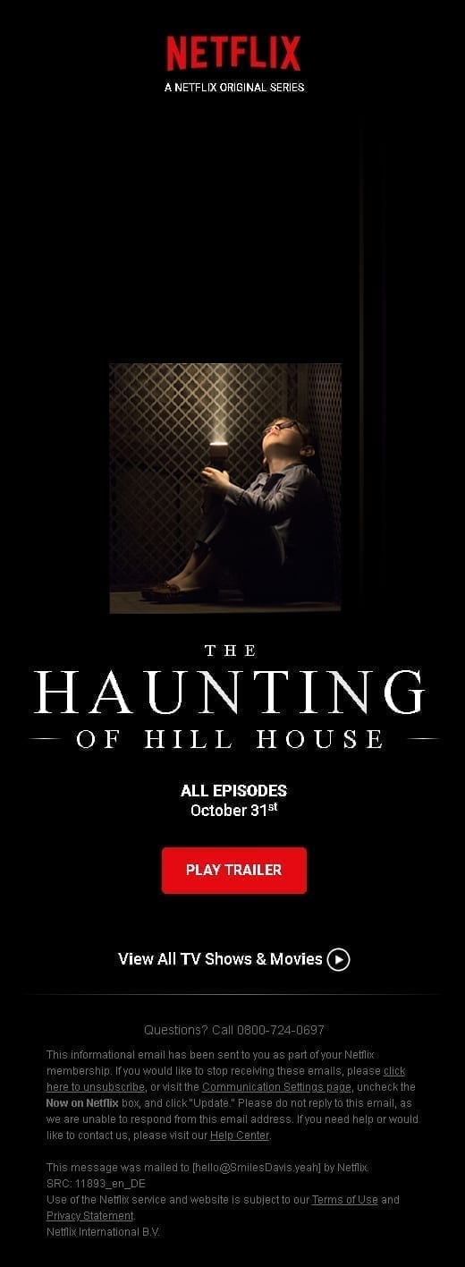
Let me explain: I'm a Netflix subscriber, and inevitably, I spend 10 minutes every night trying to find something to watch. And about ten days ago, I was intrigued by the new series: "The Haunting of Hill House. A killer, really (and sorry for the bad pun), that the master of horror Stephen King praised. And then I said to myself:
"Shit, Netflix emails, usually, it's more like killing themselvesBut I didn't see any of that..."
So you deduce that?
I've decided to intertwine the subjects and kill six birds with one stone: basically, I'd like to propose a Netflix e-mail on this series. (we are thus well on the theme of the horror and the horror) while reviewing some techniques that are still a little risky, hesitant, and incipient in the field of email marketing.
And the 1st mail I'm proposing to you, my good people, coded in a good number of hours all the same, tries out the :
Animations and keyframes in emailing
You want to see what it looks like ? It's over here.
And test results you might ask? Well, it's just the thing, we have a small share to the Litmus Builder...
I don't expect the support to be terrible, but I don't really care... It's also the principle of testing, of experimenting. It's all about having the time of your life! Don't hesitate to test your email addresses, to find out more about the support on physical devices, this is still the best way to test.
Let's be clear: the idea is not at all to advertise Netflix. (they don't need that by the way). But I realize that the media field has a percentage of viewing on mobile and iOS probably much more considerable than others (this is probably a misconception, but that's my reasoning)and in this case, I believe that we can try things that we don't dare to do. not try elsewhere...
So, in this proposal, I venture on :
- A exotic typography (Roboto, from the Google Font anyway, I'm not crazy)
- From hover and transition on cta (it's light, but it's there)
- Minimalism (I feel like Robert Morris)
- Animation and keyframes.
- Gradients in CSS (it's not flag', and yet!)
So don't look for an animated gif, it's closed on Sundays! Netflix regularly puts a little animated gif at the top of its emails. (not in the pejorative sense) video to promote a new series, film or program.
I think it's time to think outside the box, and be daring! The idea is to create effects that simulate video, with a single image and CSS animations. To give you an idea of what it's going to look like in design terms, here's a small screenshot:
And as a spoiler, it's because Steven dropped the trash can in episode 5... AAHHHH AAAAAAAAHHHHH, GO TO THE METRO SATANAAAAAASSSSSSS!!!!
Leave a Reply