Hey buddy! Have you noticed how often I talk to you about "full responsive" inté and emailing templates? Today, I've decided to show you without taboos (a bit like Bernard de la Villardière who smokes an oinj') what I'm talking about, and to proceed with the "technical" optimization of the "1,2,3" brand newsletter.
Brief aside: I've recently been led to believe that, for clothing as for other fields of activity, we sometimes make "made-to-measure" creations according to the products, the desires of the graphic artists and designers, the offers, and that it's therefore "quicker" in terms of productivity... So, fine, I'd like to say "Why not Monsieur Janvier!"but it still seems, er, well... a bit big!
It is always more interesting, in my opinion, to have ready-made emailing templates and all you have to do is change a few visuals, and modify HTML text directly. How about you? Oh well (dedication to Docteur Renaud, Mister Renard!).
As usual suspectshere's a screenshot of the relevant news item:
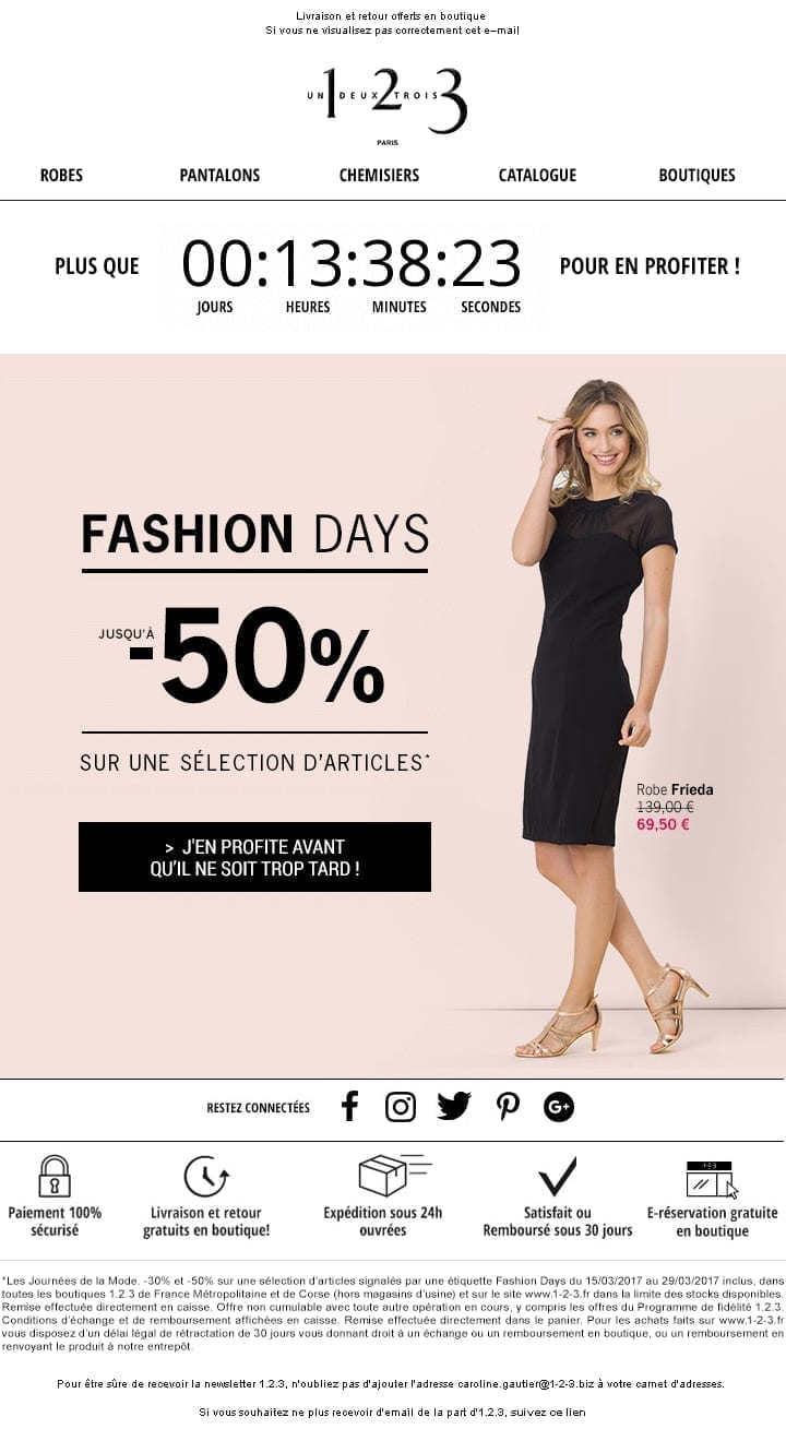
Analysis of existing email
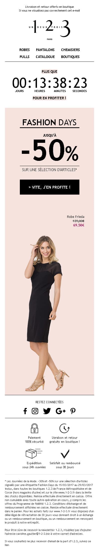
Well, in faaaaaiiittt, "1,2,3" gave us a little news in (kouaziment) full image. Now, if I say "full image", you immediately think "full contact". And so Jean-Claude in his best role, and I say to you: you're getting carried away, man!
I translate: "full image" = "complètement en image. In fact, I don't even know if this term is justified in email marketing, but I've always said that, so somewhere along the line, I do what I want... I'll tell you right now that I completely discourage this kind of practice.
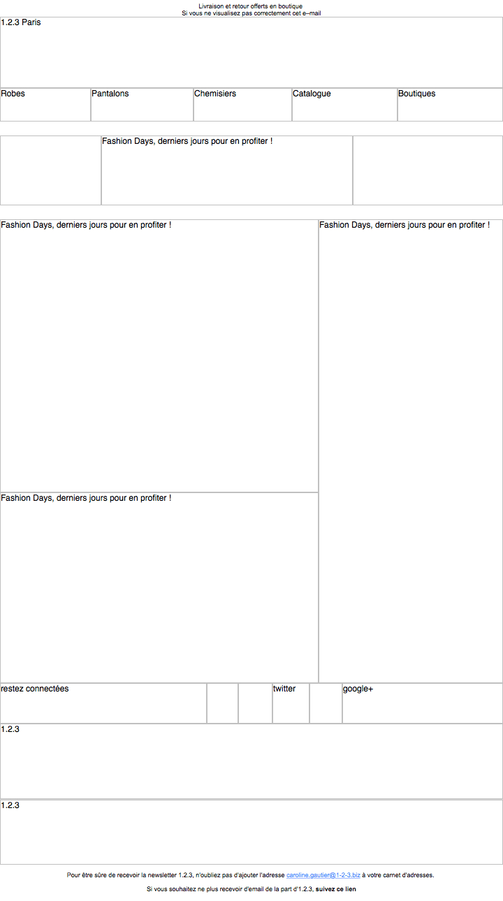
So, yes, if you want, it's easier to integrate later: yes, if you use automatic cutting and exporting. But when it comes to code cleanliness, responsive, or displaying info when images aren't downloaded, it really sucks maaann! By the way, here's a preview of an email preview with keblos images!
Don't tell me "Alternative texts are informed, that's cool!" because I might get red in the face, and on the count of three, I'll yell! NO BUT IT'S NOT ENOUGH BUDDIES ! In addition the alternative texts do not even have a graphic layoutIn fact, on this type of newsletter, we have a lot of recurring elements: preheader, logo, menu, social networks banner, reassurance, legal notices ... So there, the excuse of saving time on productivity, I do not do it!
Email template design
It would be much quicker, even if the layout is finalized at the last minute, to manage the news as an emailing template, that's obvious! So, we'll take this opportunity to propose a few graphic adjustments, nothing serious, just a few tweaks, as they say!
"Shall we do a little still life? Hm?"
Gérard Depardieu, Morzini, Inspector La Bavure
I'll just throw in the mock-up I've just finalized, it'll be quicker! No fuss!
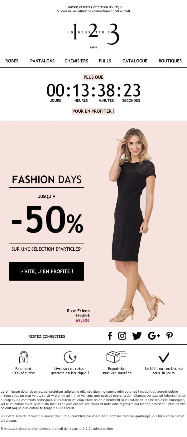
So, tell me, do you see any difference between the two models? Tick-tock, tick-tock... Oh dear, I can't hear a thing... 6-0, 6-0, over...
I have reduced the width of the email (we go from 720px to 600px wide)I passed most of the texts in a safe web typefaceand I made sure that the layout could be responsive and even better, full responsive (i.e. responsive on mobile devices that do not support media queries) in less time than it takes to read this sentence... And yet, yes and pourtaaaannntt, I haveii-aiii-meeeuuhh only you! Thank you, Charles! Farewell artist! And yet, the graphics remain virtually identical! So, anything's possible, with the right will.
"You're bluffing, Martoni! Y bluffing..."
Gérard Darmon, Commissioner Biales, City of Fear
You will be able to see that what I say is true (because if there's two things I can't stand, it's being questioned! The second thing? Circus people... cf Austin Powers). Here is a link to access the email previewand a second one to admire the beautiful HTML code of the email I wrote. It's a gift that you can use as a basis for your next inté... or to tease your HTML integrator!
And just to be sure, here's what my code looks like when the images are blocked:
Here, I leave you to admire, and I'll clarify my point: we only have a few images left in the email. The logo, the countdown in the emailThe visual of this pretty lady and some pictograms. Everything else in the email template is HTML. That's right, everything else! (I feel like I'm listening to a radio commercial: "Yes, you heard me right!!!! The tenth tire free with 9 tires purchased!!!").
Seriously: it means that when the recipient opens the email, they're getting something that looks good, with an identity and information they can read, without even downloading the images!
So, in terms of deliverability, it doesn't change much. Because the text/image ratio in an emailI'm not sure it still has any great importance or impact today. But in terms of user experience, content and offer visibility, and click optimization... it's hard to beat that, isn't it?
Full responsive with the Spongy Code method
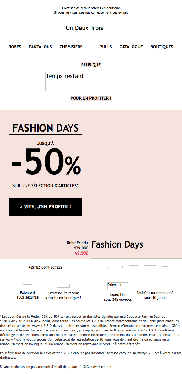
So, remember I talked to you at the beginning of this article about full responsive? Let's take a look at what it looks like on this type of support:
Well, I think that speaks for itself... We've got just the right rendering! Good responsive, well thought-out, on all media! It's a bit of work up front, but isn't it worth it, buddy? Well, I'll leave you to it, I've got to go to the Post Office (and not to talk about their inherited CSS styles in emails)... If I'm not back in 10 minutes... Wait longer!
Leave a Reply