Keeping things simple is complicated, and often the result of a great deal of thought. Especially in promotional campaigns. It's hard to stand out from the crowd, and the same logic often applies. It's always the same type of content block, and the heavy artillery is brought out: big cover image (with bonus animated gif, even better), huge headline with putaclic punchline, cta on several hierarchical levels (not always), products to complement the basket, reassurance elements, sometimes dark patterns to add a little extra pressure...
Even though I rarely order from Sticker Mule, I'm always pleasantly surprised by their emails. A single offer highlighted with an HTML email that imitates plain text. It's all good:
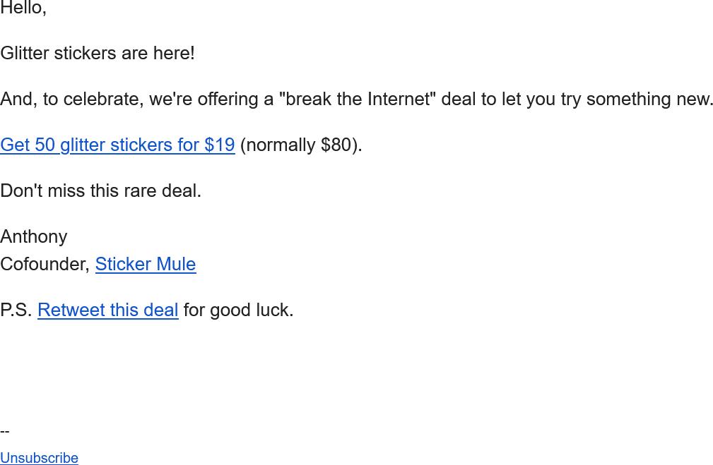
- ultra-light code, just paragraphs and links, not even a span to add styles to the links the mailbox rendering will do the job natively
- no image
- responsive? no need
- dark mode? it'll work in 100% of cases
- accessibility? only semantic tags and explicit links
- eco-design? not sure it's intentional, but it's hard to beat that.
- the only two coquetries:
- the emoji in the object each time. Shiny stickers here, so they sparkle
- the use of Google Workspace to display the logo in Gmail, but it's not BIMI!
- The only really "technical" element: the invisible preheader, also for display in the inbox.
All this for a crystal-clear, ultra-effective message. Once again, there's no need to open the email. You know the value proposition right from the start. And if you're not interested, just delete it and make room. I think it's so clever to dare such a counterpoint when you're mainly targeting designers who want to have their creations produced on different media.