Like every February, the family moves to the same place and we take advantage of being there, just before the braderie, to stock up on what the children need for the next season at a price that is, let's say, more accessible... This year, we're offered a loyalty card in exchange for an extra discount, so go!
And that's how I received this first email from the brand's welcome scenario. Now let's get down to business.
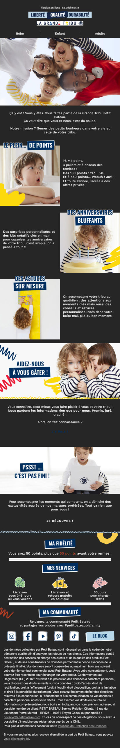
Content The various loyalty advantages are well chosen, and the information is clear.
Design : it's simple, airy, the visuals are well chosen, the brand image is respected, the rhythm is adapted... However, the legal notices are in a text size that's a little too large, nothing dramatic.
In email marketing, there's a lot of talk about darkmode, but few brands actually apply the best practices. This email is darkmode friendly. There's an obvious effort here.
Everyone's talking about it, but who's doing it? So : Well done! Images with transparent backgrounds are designed to remain legible, navy-blue text changes to white, and so on.
On the other hand, there's a major problem: the block with the first CTA becomes completely unreadable in Darkmode, which is a shame (nb: and here I'm talking about a Mac OS environment, which is relatively manageable for color switching).
In conclusion, Petit Bateau has done a good job, but it could go a little further to maintain the brand's ambiance while respecting the darkmode user's choice:
- replace the dark gray background of the email body with Petit Bateau navy blue
- play with the brand's light blue on certain texts instead of pure white
- don't use image separators: they're ugly, they don't work well in darkmode and they're easy to do in code.
- take good care to manage the status of CTAs in dark mode, it's better when you can see them.