Because I like their philosophy and their logo at Murphy's: hijacking Amazon with the upside-down smile to repair what's already there rather than order new, that appeals to me. Is it intentional? But I love it. And I'm pleasantly surprised by the newsletter confirmation email. I can feel your eagerness, so I'll tell you why:
- As soon as I sign up for the newsletter, I receive this email suggesting that I refine my content choices a little further. A sort of Preference Center in email. It's so cool!
- It's a welcome email that doesn't just say "Welcome". No. There's a purpose to this email, and all the texts in it have a reason, a vocation. There's just the right amount, without overloading.
- The shades used seem faithful to the brand, and are not too numerous. (5 in number) it makes for a good readability and a clarity of email!
- The three choices to the question "What would you prefer to receive?" are clickable, and lead to landing pages with urls (and tracking) different. After all, it's a multiple-choice questionnaire, with the possibility of retrieving the data behind it! It's a a false formand I'm all for it!
- A final weight of 74kb for the HTML file: bravo! Although I think it would be LAAAARGELY possible to simplify/reduce the code itself to reduce the final weight at the same time.
Now, if I go into more detail, you can imagine that there are a few points to be optimized, which I'm going to list below:
- For one thing, there's no need to make it visible. the preheader IN the email. The "Your device will tell you MURFY!" preheader is only there to complement the email subject line at the notification of receipt. So it's possible to save a few scroll pixels by hiding it.
- The font size used for the mirror page link and legal notice texts is too small:
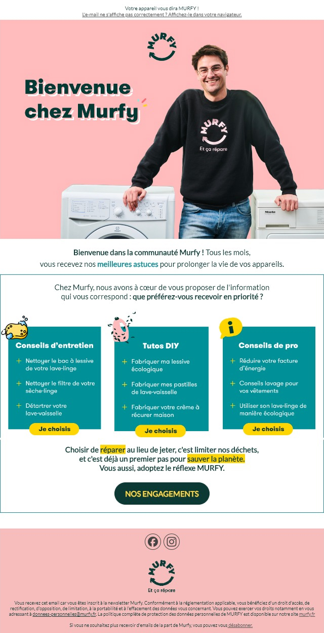
9px! You have to pucker up to understand what's inside. And when you feel like puckering up, you've got to... - The cover featuring the logo, the gentleman with the two appliances, and the title "Welcome to Murfy" is a big image: I'm disappointed. With such a lovely solid color background, it would have been so much better to dissociate textual content from graphic layout by splitting the cover into two columns: the first, containing the title in HTML and CSS (with a CSS drop shadow on the title, no matter if it doesn't go everywhere like Fort Boyard). And a second column with the visual.
- The titles, subtitles and texts lack a clearer hierarchy. In my opinion, all the texts are at the same level of importance, or almost. I think it would be a good idea to accentuate the title "What do you prefer to receive first?" to encourage people to respond to the choice of information to receive, just below it.
- The three choices "Maintenance Tips", "DIY Tutorials", "Pro Tips" and their associated bulleted lists are also images: no, no and no-no! This is how the e-mail looks when the images are not displayed. (fortunately, alternative texts have been added, a great initiative!). For this type of element, also with a plain background color, the texts had to be designed in HTML for immediate display! And what did I discover: on the mobile version, the three choices become buttons... IN HTML AND CSS! Well Murfy, if it's possible on mobile, why not on desktop?
I really like this type of email for a redesign for fun anyway... I'm just saying...