Because I like media that take risks, that swing the pendulum, that denounce. For me, that's what media is all about. And Green fully meets this objective in its editorial line: deciphering, investigating, denouncing, activism, justice... All completely independent and advertising-free. This newsletter is a striking example, in terms of editorial content, real choices are made.
First and foremost, an object that leaves no one indifferent: "He's a fascist, isn't he?". Ch'bim. When green claims to be a "a media that sets the toneI can only agree. Then a preheader in total coherence: "It's not just the temperatures that are extreme." Before I even open the newsletter, I already have an idea of what it's going to contain, and I find that particularly appreciable.
I won't go into the content of the newsletter itself. (this is not the subject of the email examples). However, I will note here what attracts my curiosity as a #EmailGeek :
First, the positives:
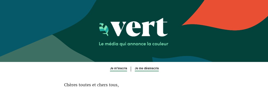
- Logo layout with a background image that takes up the entire width of the email body (i.e. much more than the 600px width of the email). Here's a structure and layout that's (slightly) innovative and eye-catching!
- The "Keeping emails produces CO2, so don't hesitate to delete your old issues." at the bottom of the email: bravo! It doesn't take much for green becomes a signatory to the project Email Expiration Date !
- The ability to retrieve past editions of the newsletter: I love this, it's rare enough to be worth mentioning!
- Spongy/Fluid code design for mobile newsletter display on all nomadic opening environments, including those that don't support media queries or tagging.
!important. Well thought out! - Content that's not self-focused, but promotes other content: that's beautiful!
Here are the areas for improvement, in my humble opinion:
- The mirror page link could perhaps be moved to the bottom of the page, I think, to raise the logo a little more. But in terms of accessibility, I'm not sure that's the best effect...
- The Baseline "the media that sets the tone is now managed as an image, the same image as the logo. It's easy to design in HTML and CSS, but it's a shame.
- The banner with the logo and baseline could be a little lower to reduce scrolling and get to the content a little more quickly.
- While the unsubscribe link deserves to be placed at the very top of the email, next to the mirror page link for example, the subscribe link deserves to be placed at the very bottom of the email. "I register could be placed at the end of the email: maybe I've already subscribed to this newsletter!
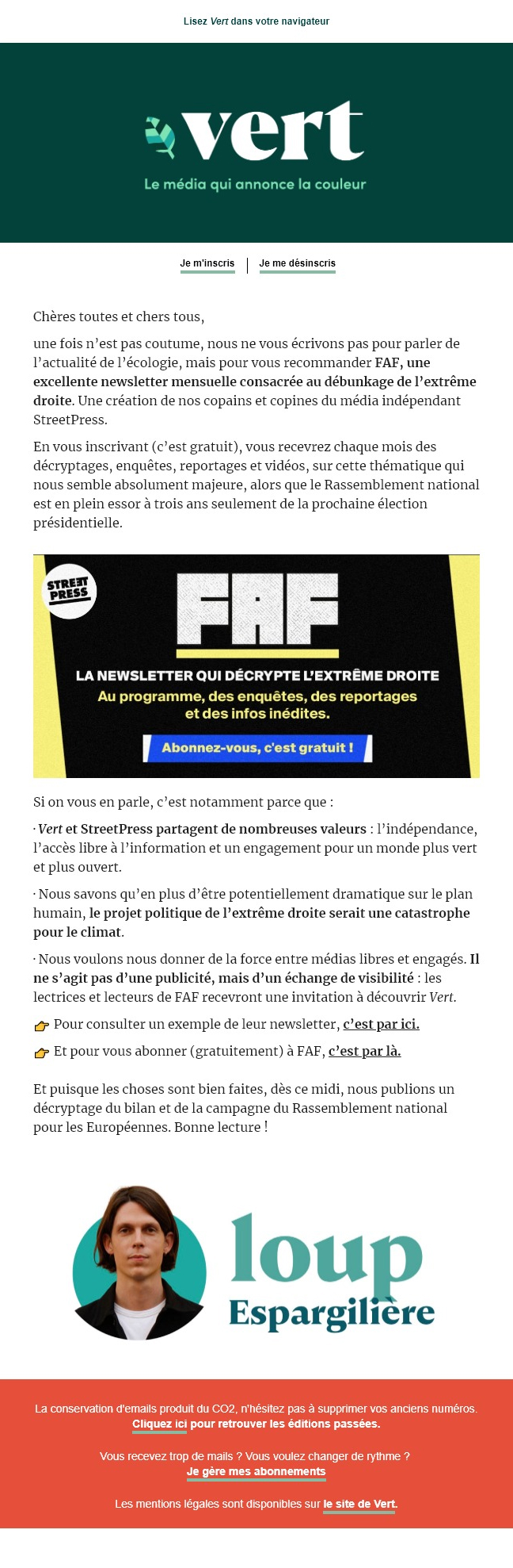
- The image to present the newsletter "FAF could finally be reproduced in HTML and CSS, couldn't it? A black background, white and yellow text, a blue button... I'll just keep the logo as an image, and remove the patch. "Street Press... and it's done!
- The signature "Loup Espargilière at the bottom of the email should be split into two columns: the first with the portrait image, the second with the first and last name in HTML and CSS.
- Repeating the media request
@media only screen and (max-width:480px)in the tag<style>HTML code: a single declaration including all the instructions would be sufficient and would reduce the weight of the final HTML file. - Tag contents
<meta>specific to X/Twitter and Facebook in the<head>are not consistent with the content of the email: a little oversight? 😉 - A few elements are missing from the code for optimize newsletter accessibility attribute
langon the tag<html>for example (with the valueenattribute), or theroleattribute with the value presentation to allpresentationon the<table>. - The text "Click here to find past editions of the newsletter is not very explicit. To optimize accessibility, it would be wise to rewrite the text "Back to past editions and make it fully clickable.
- As is often the case, the size of the HTML file could be reduced by designing the email in a way other than via an Email Builder. But we all have time and production constraints, so I understand.
Greenyou're this close to the perfect newsletter! 😀