Reading is a hobby that can quickly become expensive, so I decided to switch to second-hand books. So I received emails from the Recyclivre website, which lets you donate, sell and buy second-hand books.
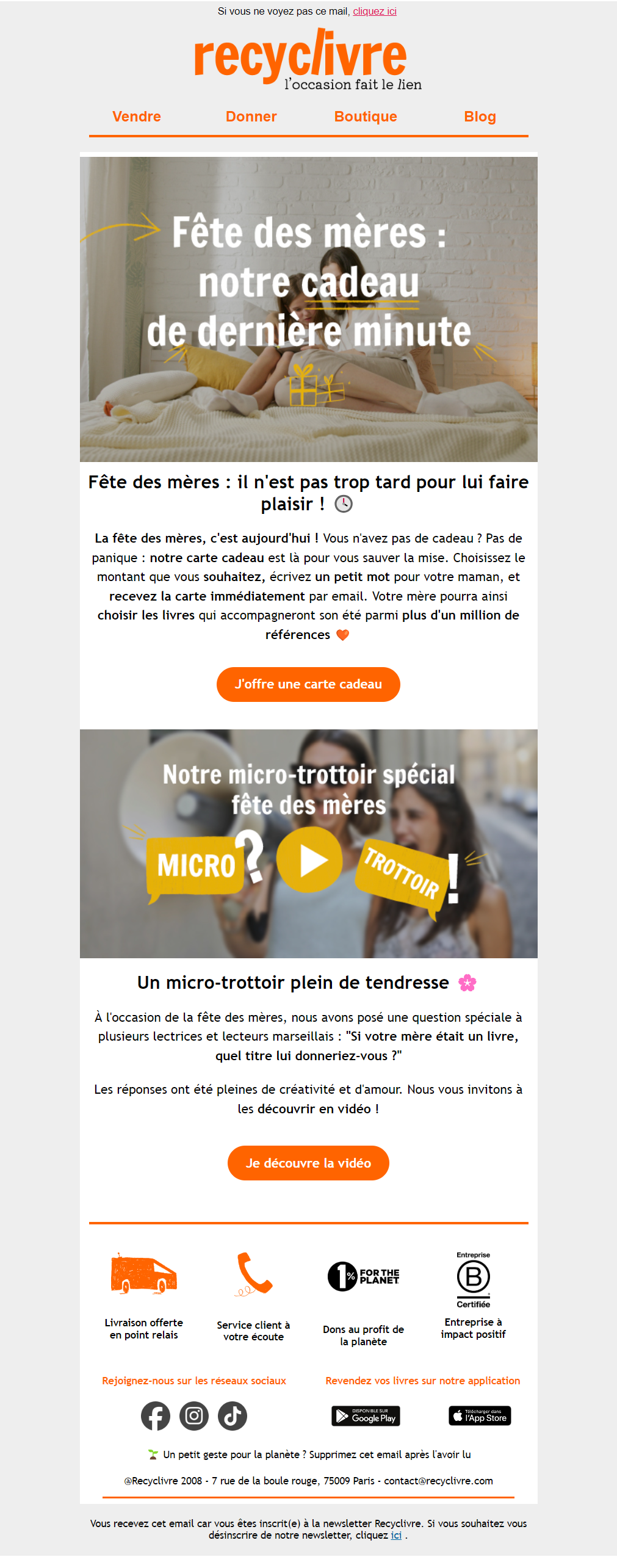
I received this email on Mother's Day, offering a last-minute gift card. From a design point of view, I think it's a shame that the text in the images hides the people's faces (not to mention theemail accessibilityyou already know that). The structure is simple, and apart from the footer, which could be reworked, and the texts, which would be more legible if they were left-ironed, the rendering of the email is correct.
For the introductory text, I would have proposed a column block to lighten the content and visualize the steps: I choose my amount / I write a short note / The gift card is sent to your mother / She chooses her books from over a million references.
I like the idea of the micro-trottoir, which balances out the promotional part of the email.
The reassurance banner provides information on the sale and the company's commitment. It's a pity there's no link to this content, even though there's a Delivery page, a Help & Support page, and one on their commitments.
Finally, the email contains some nonsense on the HTML side, but it displays well overall.
A few small changes are in order, but despite everything I liked this email, its content and Recyclivre's commitment.
