There are some "simplistic" email designs that work well. And I find this reactivation email particularly effective. And why? First of all, because the subject line and preheader chosen are very relevant: an alert about a subscription expiry, and at the same time an offer of a re-subscription discount.
In the content of the email itself, I simply find a large title and a text, with an associated call to action.. The title itself is very large, and immediately understandable. The slight highlighting of the time remaining in orange helps to emphasize the notion of urgency. The text, for its part, is basic but sums up the problem: as payment cannot be made, the subscription cannot be renewed.
Perfect transition to offer a 30% discount, directly in the Call to action.
The extra text, "out of the box", adds a little more human touch to this email, with a link to the support center. And the footer, very simple, very "light" graphically speaking, closes the email.
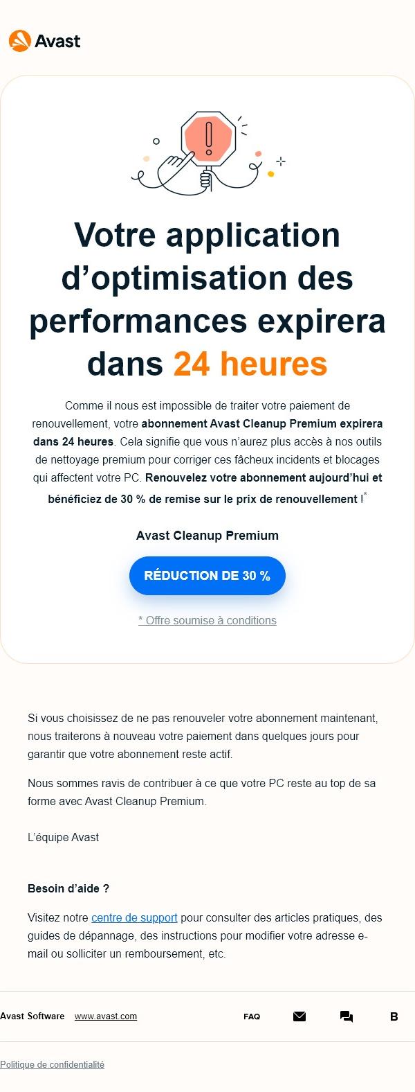
To recap, only two images are called up at the top of the email: the brand logo, and a discreet illustration. And that's more than enough, since the message is conveyed above all by the text and promotion, entirely designed in HTML and CSS, and therefore directly accessible without prior downloading of images. Why insist on adding large visuals and lots of text when a well-written headline, paragraph and call to action will do the job?
However, I won't dwell on the HTML code, which deserves a few optimizations. (use of empty cells to design margins, use of the colspanattribute, absence of semantic tags or the role="presentation" on the <table>...)