Dear compatriots. On February 23, 2021, I received an exclusive pre-sale e-mail from The Olympia for a concert of Balthazar. "But... This job is the opportunity of a lifetime... I believe in it to moooortt..." (The City of Fear). This Thursday, March 18, 2021, we are reconfined. So I have few hopes for this concert (life is a bitch). But why not! I remain optimistic.
But still, I have the rage. Besides, I love Balthazar, they are geniuses. Their latest album "Sand" is a killer. The track "On A Roll", damn it... Jinte Deprez, I'll make love to you anytime... But I digress. In case the mirror page mentioned above no longer works, here's a screenshot of the email in question.
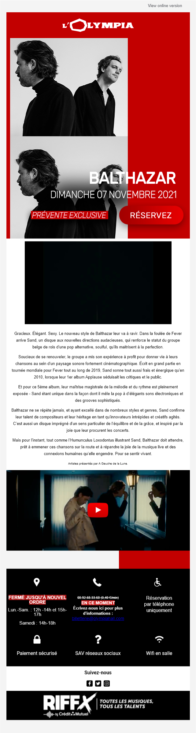
I admit that the subject of the email ("Balthazar ready to spread the joy at the Olympia!") I liked it a lot. "Balthazar" + "joy" in the same sentence, I had to open the email. Go ahead Balthazar, spread, spread, we need it. But on the creative side, I feel like we could do better. And on the innovation in email, clearly, there is something to do.
Analysis and constructive criticism (always) of the email design.
- I never understood the fact of putting mirror page links in English when the email is in French. Are we in France or not? Isn't it so? Well, at the same time, I say that I say nothing, you will see that in my proposal, I forgot to put this link...
- The cover is particularly "high", with two identical visuals one under the other, and a Call to Action that arrives very, very low.
- The texts designed in HTML also arrive very, very low in the email, because the whole cover is designed in image! That's unfortunate my friend! Therefore, we can imagine that when the images are not downloaded or displayed, you have to scroll a bit before you see any content...
- An animated gif is running in a loop, without any real logic, taken from the clip below in the email (cf black block under the cover in the screenshot above). This gif is not really in its place, it seems to float, and does not stop automatically. According to accessibility and W3C standards (and I discovered it at the same time as you), "For any moving, flashing or scrolling information that starts automatically, lasts longer than five seconds, and is presented in parallel with other content, there is a mechanism for the user to pause, stop, or hide. Unless the movement, flashing or scrolling is part of an activity where it is essential ". This gif is not considered essential, so it should stop automatically. But I'm not going to be too clever either...
- A text of presentation / focus of the group and their journey is added, without real formatting of the text, without life. It is small, not very readable. Unfortunately, there is no Call to Action at the end of the text, no title... And there is no hierarchy in the textual information present in this email.
- The reassurance banner is bland, cold, and the information gets tangled in it.
- The unsubscribe link is on the left side of the page (and not in the continuity of the email).
Did you see that? It was constructive, right?
Here's what I think is missing in this emailing design.
Animation, innovation in email.
Something that slams: it's the Olympia speaking, man! It must send a dream, like their frontage! (see cover of the article for those who have never been to the Olympia) We have a target audience of all ages, but probably mainly BtoC, with consultation media that can potentially accept or interpret innovation. When I think of Olympia, I think of Neon and big letters of fire!
A Call to Action that is "immediately visible".
If the goal is to get the recipient to make a reservation, the Call to Action must arrive much higher and much faster in the email. It must catch the eye, there must be something happening on the flyover (or even without a flyover for that matter). Presenting the artist is cool, but the principle is to be in the pit and enjoy the moment (it is beautiful to dream).
A cross sell with the next artists to come.
No presentation of the next artists scheduled at the Olympia? But why not? That's a shame! When I like a band, I like to be offered concerts that could also excite me. A bit like when I go to buy a lawnmower and I am offered items related to garden maintenance like a brushcutter or a chainsaw (the comparison is relevant and exciting, I feel). A kind of cross-selling with, if possible, a personalization according to the type of group: Yes, because if someone talks to me about Balthazar and offers me a concert of Zaz, frankly, I will unsubscribe directly...
An immersion.
The Olympia is a mythical place. A hall, a name (Bruno Coquatrix)an atmosphere. I remember attending at the Thom York concert with his song "Default. My God, I still get chills. The walls were shaking. People in a trance... You have to feel it, damn it! And then I think that a picture of the room, a panorama, to make us want to go back there, that would be damn good. That would be a nice innovation and interaction that I have never seen in an email until now...
Beautiful typos.
Because. Period.
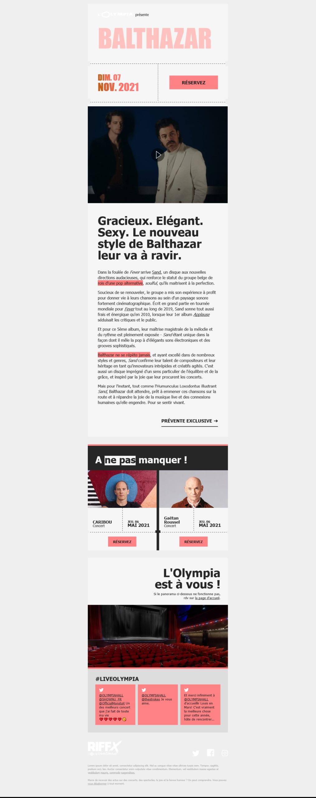
Proposal for a redesign of the email, and innovation.
I invite you to find the imagined model below.
And now, the HTML code.
It was necessary to honor the Olympia. I had to come up with something out of the ordinary, something innovative, something technical that spits. I hope you will not be disappointed (if you expect anything at all). But first of all, the results of the email preview tests.
See the Pen 20210308_olympia by DEFOSSEZ (@Badsender) on CodePen.
The svg in the email.
We know it well: in terms of support for images in an email, it is especially the JPEG, PNG and GIF formats that should be preferred; But I'm fed up with it, I want to go somewhere else. So I'm venturing into SVG and is strongly inspired by Mark Robbins' technique. It seems to work pretty well except for some link problems on the foreignobject. Moreover, duplicates appear on Free. Why is this? Which CSS property is not correctly interpreted? I don't have time to investigate (and then it would be the subject of another article).
The neon effect and typography in an email.
Let's go, I'm going to use "Anton" for the name of the group, replaced by Impact and Arial Narrow as backup fonts. Only Pixel Gmail seems to be a problem for the interpretation of these last two backup fonts... No problem for the rest. For the "Neon" effect, I apply a text-shadow (which will, of course, not be supported on all mail clients but I don't care, I'm having fun).
I also give the title a color that will still allow to distinguish it on mail clients that do not accept the property text-shadow. For the animation, I would like to add a Neon effect that flashes on two or three lettersand to limit this effect to three iterations in accordance with the W3C recommendations. This will be made possible with @keyframes.
Design created in HTML and CSS.
You won't believe your eyes (in any case, I am proud of myself) : the dashes and "notches" for the "tearable" or "cuttable" ticket effect are entirely designed in HTML and CSSwith border-radius and border:1px dashed. Yeahhhhh my man ! No problem of interpretation except the cell height to be doubled of the attribute height on Yahoo to ensure that the border is displayed. And rounded corners are not supported on Outlook but hey, that's what we'll call graceful degradation. You will see, in the results of the email preview tests, that the result is worth the time spent!
A continuous animated gif, and in loop.
We go on Youtube to watch the clip. A small video screenshot with " Screentogif "and hop! You switch to Ezgif to create, optimize, loop animated gifs. It's as simple as that!
Effect on hovering (or not) of Call to Action.
The hover effect is possible with the CSS selector :hover. It may not be supported everywherebut does not prevent the good understanding of the button when it does not work! This always brings a little extra animation to a design. Clearly, the animation on the text "Exclusive presale" may not work properly (since the linear gradient is included in CSS directly on the text) but balec! And then we are not obliged to be satisfied with animation at the :hover after all! I also added a little "halo" effect around the "Book" button at the top of the email, which also stops automatically after three iterations.
False gradient effect on the date at the top of the email. Now that's innovation for an email!
Ah ah! I love this little effect! You might be thinking, "Oh my gosh, how is that possible? Can you put a linear gradient on text? Let's take the question another way: what is a gradient? It is a set of tones of the same color, going from darkest to lightest (or here, from lightest to darkest). But in the end, it is an alternation of several colors. So why not simply assign a different color to each letter of the words? Well yeah, guys, it's as simple as that! To do this, I use <span> with color different. And pay attention to the <span> on LaPoste (and its cursed styles) who are suffering from display:none !
Interactive animation and panorama of the room.
Did you fly over the panorama of the room at the bottom of the email? Did you see that little scrolling effect depending on whether the mouse is positioned on the left or right? It's pretty cool, isn't it? I reassure you, this technique does not come from me but from the one whose name you always pronounce and from his article on interactive animation in an HTML email; So I pumped everything, and I'm proud of it, and yeah!
Particular typographies, or so-called "non-web safe", or so-called "exotic", in an email.
It is now 01:41 am. Oh, I drank some Redbull! Have you ever drunk Redbull? I never drank Redbull before, but I drank Redbull last night and now I love Redbull! You've probably already experienced it: limiting yourself to "websafe" typefaces in the design of an email is quickly off-putting: Arial, Tahoma, Trebuchet, Helvetica, Times New Roman, Georgia, Lucida, Palatino... This email needs great fonts! So it will be Anton, Rubik, and Work Sans... All Google Fonts.
But what's going on? But what's going on?
What solution can be proposed when a mail client does not interpret these fonts? The most sensible solution is still to propose relevant backup typographiesas close as possible to the desired rendering (to avoid preview inconveniences with texts on two lines for example, or breaks because the texts would be significantly longer). The Tahoma will be used everywhere where the Rubik and the Work Sans are present. Everywhere, except on Anton which will be replaced by Impact and Arial Narrow.
To do well it would have taken candied cherries just add a class on the relevant text, like this:
<p style="margin:0px; font-family:'Work Sans', Tahoma, Geneva, sans-serif; font-size:10px; line-height:14px; mso-line-height-rule:exactly; color:#696969; text-align:left;" class="fallbackfont01">Then, in the CSS styles at the top of the email, target Outlook with conditional comments and fill in the alternate tags :
.fallbackfont01 {font-family:Tahoma, Geneva, sans-serif !important;}PS: Attention, in the call to the class on the text. It is necessary to always call the class specific to the backup typeface first because Outlook for its software version only takes the first class into account.
The Dark Mode... Light version.
You know what? Dark Mode is boring me. Honestly. I don't like going "against" a recipient's choice of how to display their emails. So I don't make any fixes. And I won't talk about possible fixes for the Dark Mode here by the way, my colleague Fabien has already done it brilliantly (with whom? No it's too late...) On the other hand, with my colleague Marion, we did get stuck on the Dark Mode version of Outlook Office 365.
Did you like it? You haven't seen anything yet.
What I have presented here is what we can do for fun. Imagine when you get paid... Innovation in an email, we are very fond of it. We've got a lot of heads in the game. Maybe you need a little polish on your bodywork or to "pimp" your car? Badsender represents !
And I don't know, you probably have a lot of ideas to improve the support of some features, right? Or you want to give your opinion about this redesign and the HTML code? Or you have other ideas for innovation in an email? Did you see that we have a comment form below each article?
Sources
- Article by Hteumeuleu on innovation and interactive animation in an email https://www.hteumeuleu.com/2019/interactive-animation-in-html-email/
- Mark Robbins explains the implementation and support of SVG https://www.goodemailcode.com/email-enhancements/svg
- Fonts on Windows and their equivalent on Mac http://www.ampsoft.net/webdesign-l/WindowsMacFonts.html
- The web safe font collection https://www.cssfontstack.com/
- The Google Font Library https://fonts.google.com/
- Pause, stop, hide: the 2.2.2 success criterion by W3C https://www.w3.org/WAI/WCAG21/Understanding/pause-stop-hide.html
Leave a Reply