It's a very good title for an article, don't you think? No ? Well, it's the center of what we're talking about today, the landing pages! And I really wanted to tell you about our umbilicals because definitely, you shouldn't bend over to look at yours when imagining what your next landing page will be made of.
When you have managed to move a user to one of your landing pages, he doesn't care who you are, what your brand stands for, he doesn't care about your solutions, the name of your products, what he wants is a solution to his need. I'll moderate what I just said later, but really, think about PROVIDING A SOLUTION TO A NEED, more than showing off your head, saying you're tall, handsome, and strong (at least, that's not the main topic).
The goal of a landing page is to convert, and to convert, you must put all the assets on your side. Here are some tips on the subject of landing pages!
The visitor to your landing page comes from somewhere!
If I wanted to push the envelope a little further, I could tell you that your landing page is connected by a cord to ... but it's not my style to use strange images throughout my articles ... especially since I just said there should be no belly button.
Let's go back, so, as I was saying, your landing page is fed ( 😀 ) by a source, this source, it can be SEO, SEA, email, a display campaign, other pages of your site ... These sources will bring you various visitors, but above all, who have lived a very different experience in the step that precedes. If you are probably used to tracking visitors to your landings based on their origin, it is also imperative to modify the content of these landings based on the information contained in the previous step.
For example, a visitor coming from SEA will have only seen 3 lines of info on Google before going to your landing page while someone coming from an emailing will probably have received a lot more information (at least the subject line, a title, a main image, a first call to action, and maybe even a little more text and reassurance). In addition, the context, the state of mind in which they are in will be very different.
For these reasons, you should consider creating different landing pages (at least on some variables) depending on the source of visitors.
Keep the focus!
Here, we can consider two points of view, that of the main subject, of the objective you have, but we will keep this point for later. When we talk about focus here, we're talking about keeping the user's attention captive so that there's no risk of him losing focus.
Here is an example. While visiting the website of New Holland, a famous manufacturer of agricultural machines (like everyone else, I love agricultural machines...), I was attacked by a pop-in (a pop-in is like a pop-up, but it stays in the same web page).
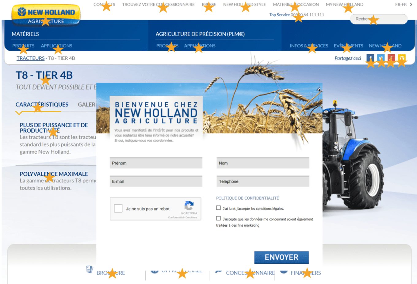
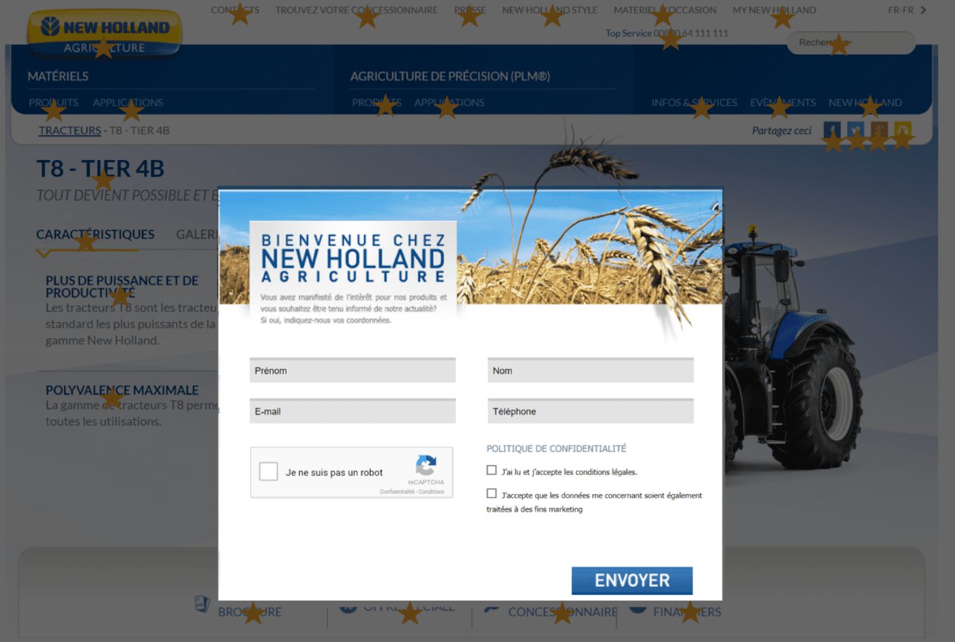
Unfortunately for New Holland, it took me a few seconds to realize that we were dealing with a pop-in and not with the content of the page that had slightly "messed up". The little stars are obviously not original but were added by me to underline all the distractions I was facing. However, this problem could have been solved very easily by darkening the content of the page in the background, like this for example:
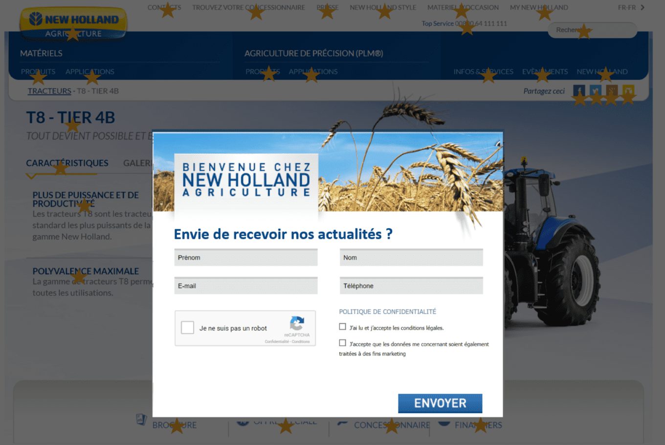
It's easy to see what the word focus means! So, on the other hand, from where you are standing, you probably haven't seen what New Holland wants from us. Below the title "Welcome to New Holland Agriculture" is the most important text of this pop-in: "You have expressed interest in our products and would like to be kept informed of our news? If so, please provide us with your contact information." You had to squint intensely to get to read it. Here's what would have been more effective here (and I didn't even take the time to edit the button):
Want another example? Here is a very classic menu deletion ... of course, we will never do this without a good AB test to validate the result.
And without the menu:
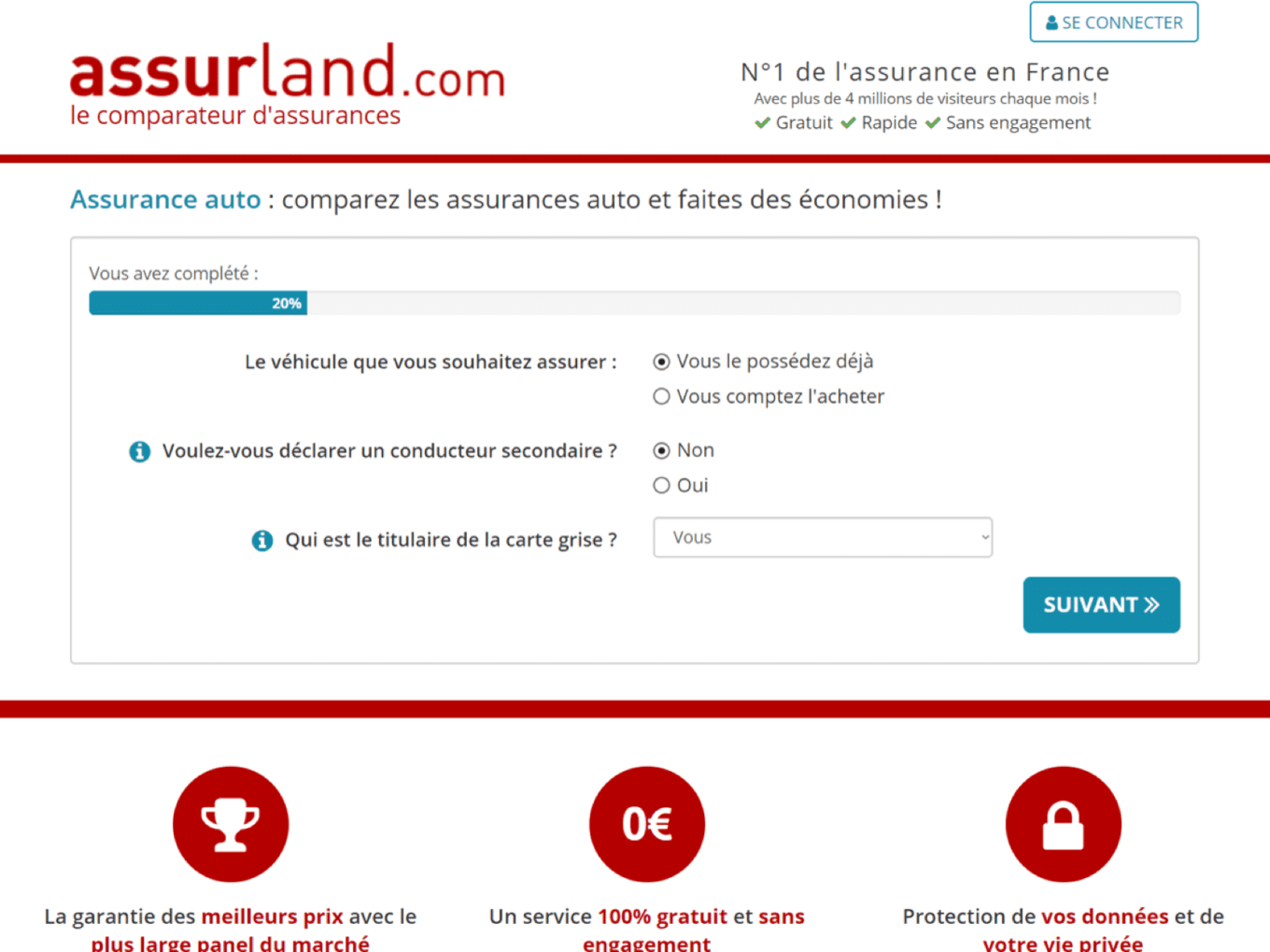
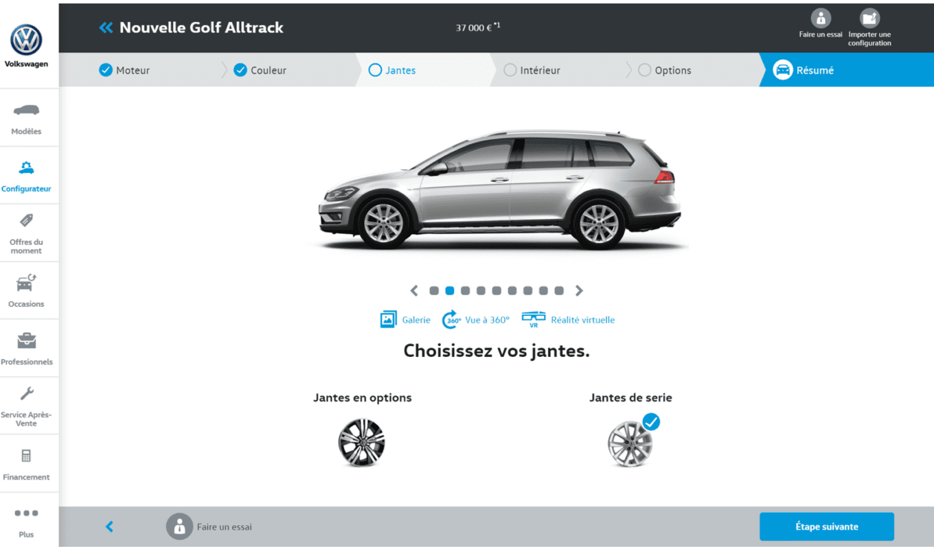
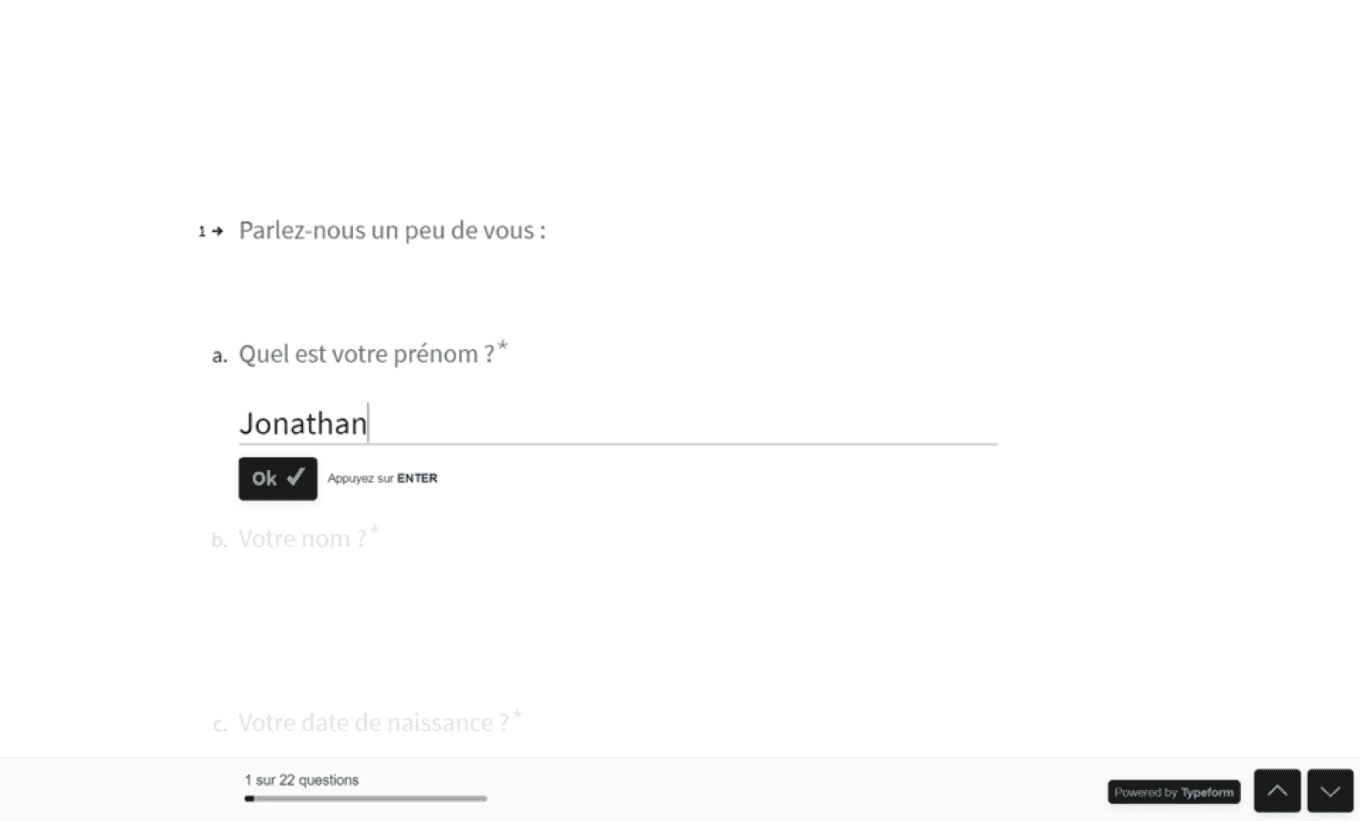
Use smart forms
The first rule, make the task less painful for your visitor. If the task is likely to remain tedious, give him the impression that it is not.
Some examples:
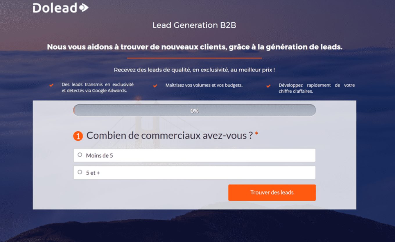
- Break down your forms into steps
- Show a progress bar to indicate where they are at
- Ask for contact information (email and phone mainly) at the beginning of the form to allow you to follow up if they have not completed the process
- Suggest pre-filling or input assistance techniques
- Ask only one question at a time in forms where a simple choice allows you to validate the page you are on
- Make your forms didactic, if you have to make choices, use illustrations, gauges, ... and not only text
Here are some examples:
Think motivation, and prove "aptitude
Gni? This idea of "aptitude" comes from the Behavior Model, a concept developed by BJ Fogg.
In this model, Dr. Fogg develops a theory according to which behavior is determined by motivation, aptitude and a trigger. Without motivation, you cannot have a successful trigger, and without ability, you cannot have a successful trigger. In most of our landing pages, we put a lot of emphasis on the notion of motivation, but we too often neglect aptitude.
This concept of ability includes a scale that goes from "difficult to achieve" to "simple to achieve". So in order for your trigger to be successful, you need to demonstrate simplicity, the fact that there is little effort required to get to the next step... and that takes some brain juice.
Play on the urgency, the scarcity
In the main principles of improving the conversion rate of our landing pages, this is probably the one I like the least... because it is very very very marketing (a shame)... playing on the urgency, the scarcity, is also playing on the credulity of our audience, and sometimes be at the limit of lying. But what do you want, the conversion rate is king!
Here's an example you're probably very familiar with (and for which I don't need to put a source, you know who we're talking about):
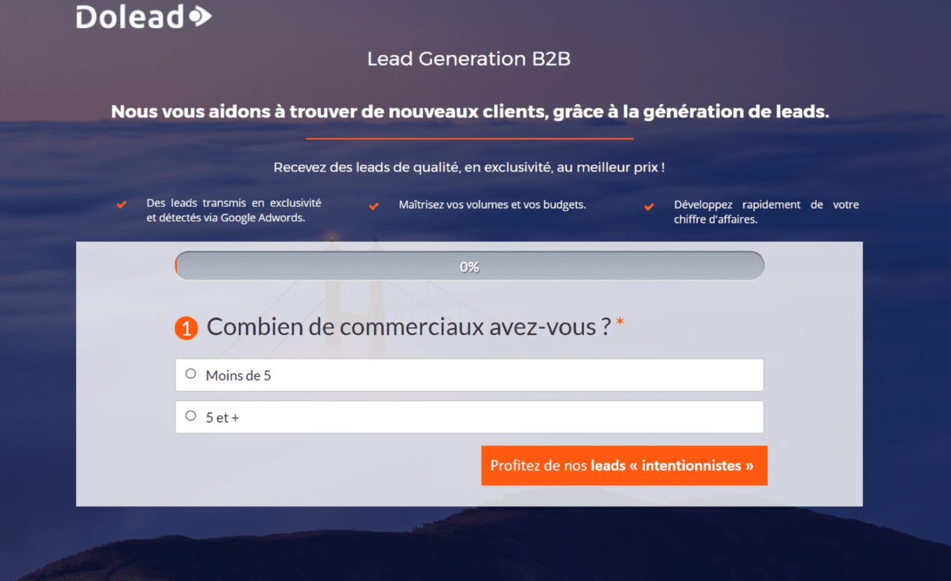
Work on your calls to action / value
It's a concept I've never put a name to, but have come across a few times in the last while, the notion of "call to value". Still too often, the call to action is a poor "Validate" or "Go to the next step", and even if many of us try to make these practices evolve, by putting more meaning in our buttons, it is undoubtedly with the notion of call to value that we will succeed in doing so.
What does it involve? Simply to put our UVP (Unique Value Proposition) directly in our CTA (or CTV if you want). Here is a small example (if you want to work on it, we can have fun in the comments).
Original:
Suggestion:
Combine several types of evidence
I talk about him at each of the emailing training I had a colleague (hello Florent) who loved (and probably hasn't changed since) to read a lot of dodgy studies coming from researchers lost at the other end of the world. I never had the courage to read those studies, but there is one that caught my attention, the one that deals with the different reasons why the human mind makes a decision. The researchers in question had isolated 4 of them:
- Value: what is the value (often monetary) that I receive?
- Change: do I want to go elsewhere?
- The social+: do I need to belong to a community?
- The social : do I need to feel unique ?
These different principles obviously apply very well to marketing. In emailing, for example, we use this principle to create objects with very different axes when we design AB tests.
Here, it will rather be a question of "diversifying" our argument when we develop a landing page, whether it is in the titles or in the reassurance, we will make sure to work at least once each of these axes of decision making.
Test
No kidding!
By the way, when doing your tests, don't forget that, just like your sources, your audience may not be homogeneous. It can sometimes be interesting (if you have the technical and financial capacity) to choose several winners in a test, but to generalize it only on certain segments of your audience.
What about the colors of the buttons?
Uh, actually, no, nothing.
Have fun!
(This article is from an emailing training offered by Badsender 😉 )
Leave a Reply