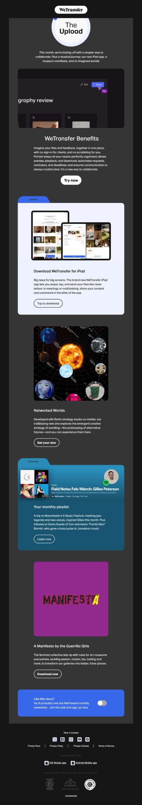
Let's get straight to the point. In general, Wetransfer newsletters are visually appealing. Consistent with a designers, visual artists and others digital nomads...
In a sense, this is the case here:
- gifs galore,
- a mobile-first layout,
- rounded edges galore,
- effects of hover (element hover animation)
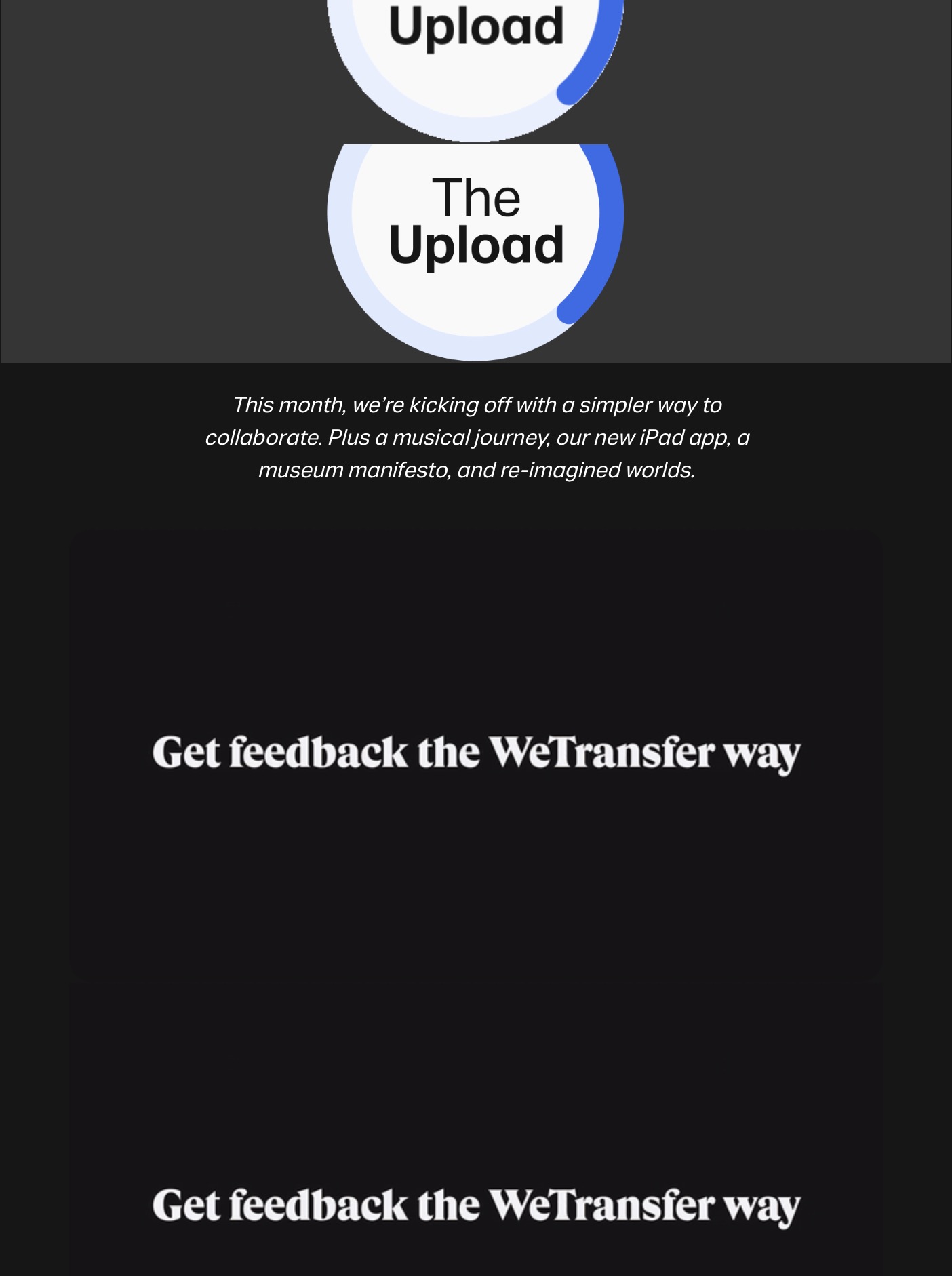
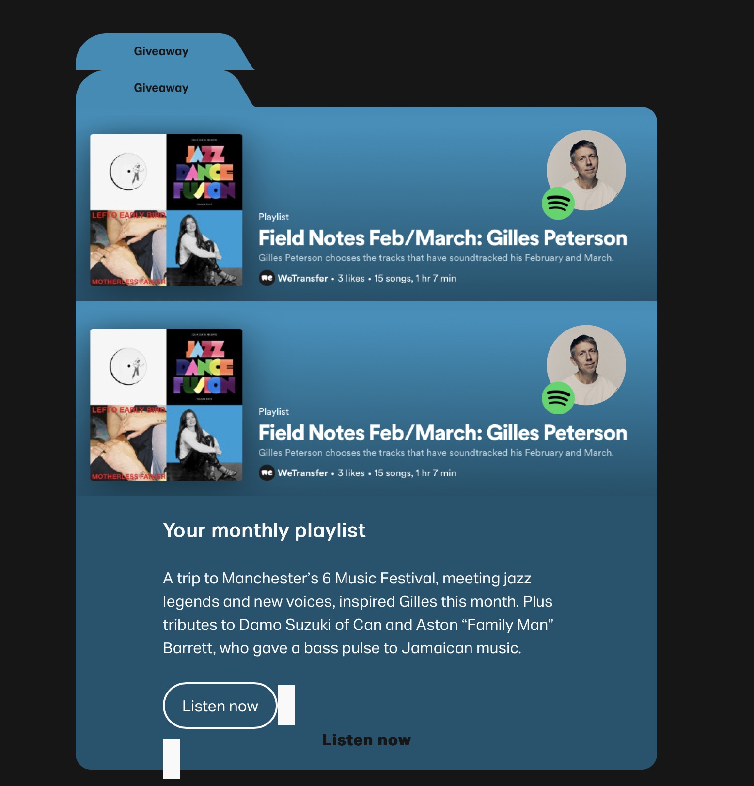
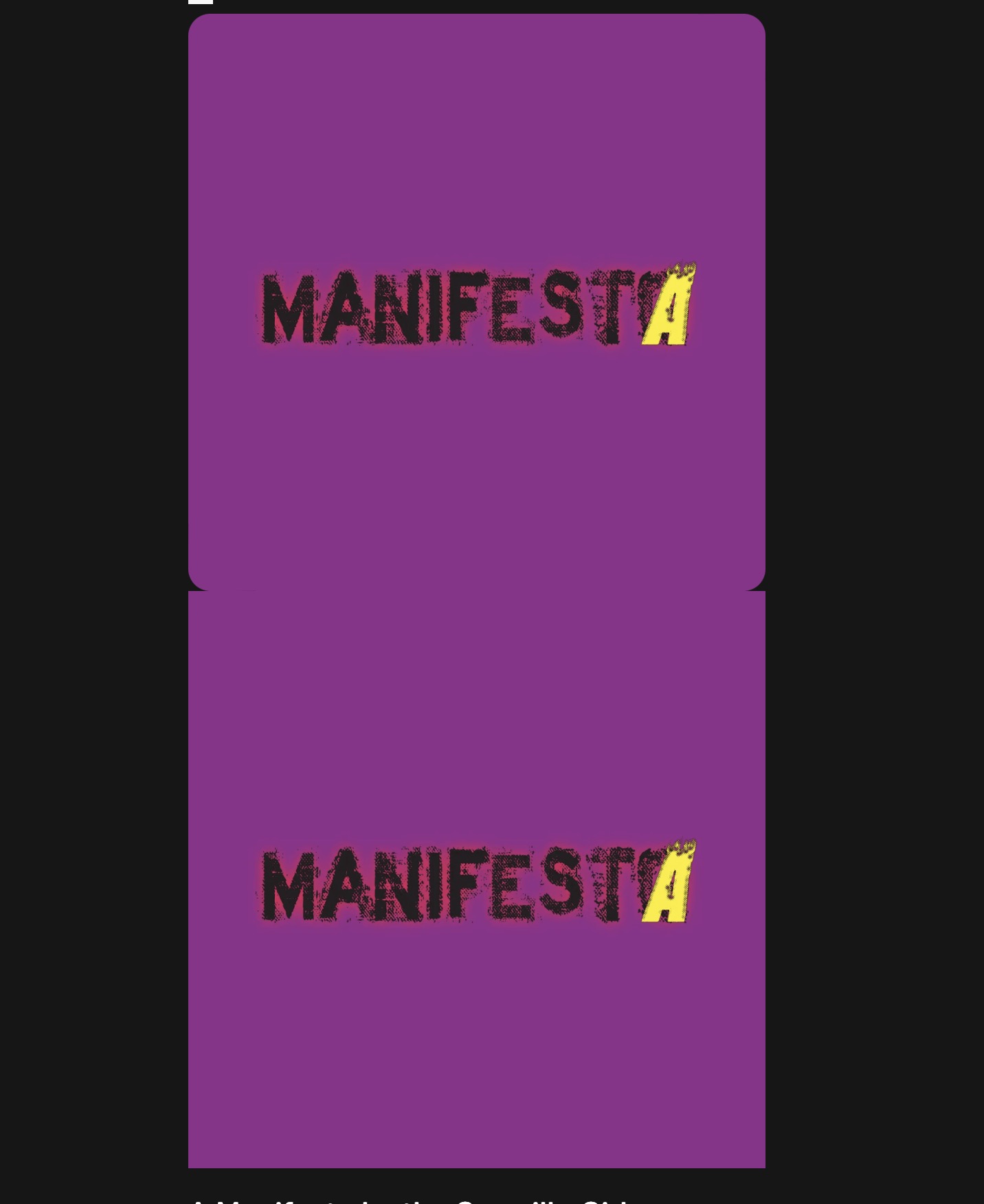
But I didn't choose this editorial newsletter for these reasons. Arrived in inbox, the design is exploded :
- all the images are doubled (probably badly managed fallback),
- flashing all over the place,
- rounded corners not always rounded to the right angle,
- the effects of hover on cta are ...
- forgotten margins...
The online version is okay. But who consults it?
So don't forget to testing, testing and more testing.