Because Sandro, when you come from Nord-Pas-de-Calais, automatically makes you think of your girlfriend from 4th grade B, aka "Sandra" for the well-spoken. And also to realize that not only is clothing not great for the environment, it's not great for HTML code either. Note the tone sarcastic in the following analysis.
In m-a-on bon-ne ami-e order:
- Here, we don't bother with a preheader: Old-fashioned, with a good old "see online version" - that's what we want, baby!
- No attribute
langwith the language set to facilitate accessibility and reading of the content by a screen reader. No, not there, no. - In the same non-objective: no content for the
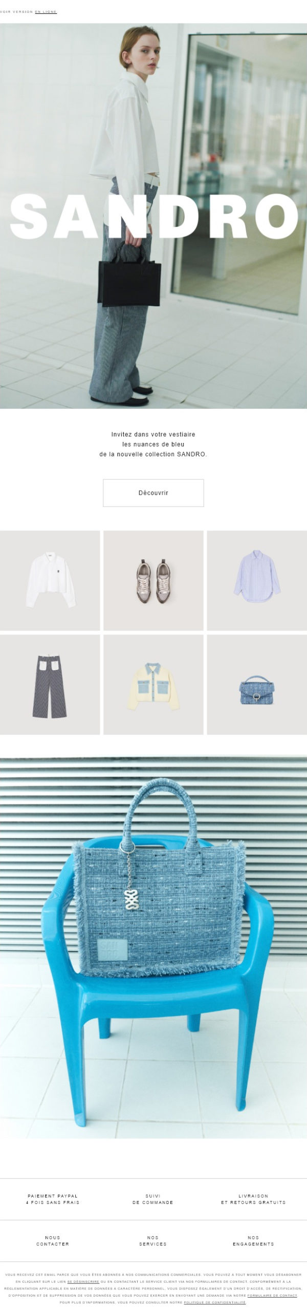
</code>. <strong>What for?</strong></li>


<li>We call them exotic typefaces (agaramond), but we don't use them. Funnily enough, it overloads the number of useless resources to be downloaded! That's just great!</li>


<li>Media queries galore! To change line spacing values, internal margins, text sizes... Even though the mobile version of the email is exactly the same as the desktop version... Freestyle cop-ain-ine!</li>


<li>Tables with empty rows and cells <em>(and attributes <code>height</code>CSS properties <code>height</code>, <code>font-size</code>, <code>line-height</code> in profusion)</em> to create spacing, margins or borders. I love this way of looking at things! It's not for lack of writing an article on <a href="https://www.badsender.com/en/2022/08/04/empty-cell-margins-email/">internal and external margins in emails</a> !</li>


<li>Attributes <code>width</code> on HTML elements <code><a></code> I've rarely seen anything like it!</li>


<li>A <code><img></code> in a <code><a></code>in a <code><td></code>in a <code><tr></code>in a <code><table></code>in a <code><td></code>in a <code><tr></code>in a <code><table></code>... It's HTML tags time! It's for me, it's a gift!</li>


<li>Formatting on images but <strong>no alternative text entered</strong> It's a shame, because the intention was good!</li>


<li>Cells that are supposed to stack one on top of the other, but - surprise - nothing happens on the move.</li>


<li>Paintings <code><table></code> A single table with rows inside to separate the contents would have been more than enough!</li>


<li>Text written directly in cells, without using semantic tags such as the <code><p></code> : bah ouiiiii, allons-yyyyyy !!!!!</li>


<li>CSS properties <code>vertical-align</code> on cells <code><td></code> when there are no sister cells: I'm appalled...</li>


<li>Spongy Code with ghost cells for Outlook, but fixed widths for the <code><table></code> instead of maximum widths <code>max-width</code>. <strong>Nonsense!</strong></li>
</ul>


<p>And then we're surprised to hear that the weight of the email is too heavy and that it's cut off on Gmail! Bravo, vingt-sur-vingt, vive la France! Well, okay, I'm exaggerating a bit: in this case, the weight of the code (tidied up) is 48kb. But that's no reason! Hey, Sandrô, girlfriend, take the time to browse our <a href="https://www.badsender.com/en/guides/eco-design-email/">guide to email eco-design</a>it won't be lost!</p>


<p>I'm harsh, I think this email was designed from a Builder. But here's my chance to express my reservations about <a href="https://www.badsender.com/en/guides/industrialize-create-emails/">Email builders on the market</a> Take the time to check the generated code to avoid this type of (un)pleasant surprise!</p>


<p>I also understand that the "luxury" and fashion sectors are more graphic when there's a lot of visuals and little text. But a little title with a price underneath the visual (especially when the visual has no alternative text) wouldn't go amiss! I'd like to point out that I can be charming in places other than sanitary facilities...</p>


<p>Finally, I'd like to take this opportunity to point out that I can't find (at all) <a href="https://fr.sandro-paris.com/fr/engagement-responsable-sandro/sandro-for-the-future.html">commitments announced by the brand</a> in this email! Where's the mention of environmental responsibility? And let's talk about respect for people: the model (whom we'll call Sandra) is a little pale in her 37 kilos for 1m87, isn't she? She's on the verge of a nervous breakdown... Hey, hô, Sandrô lô, vins minger eun américain-fricadelle sauce shamouraï à l'baraque lô: t'as qu'eul peau sur tin os! Qu'est-qu'ch'timage qu'tu donnes à l'jeunesse lô!</p>
				</div>
				</div>
				<div class="elementor-element elementor-element-0aebe99 elementor-widget elementor-widget-text-editor" data-id="0aebe99" data-element_type="widget" data-widget_type="text-editor.default">
				<div class="elementor-widget-container">
									This email was selected by Thomas Defossez								</div>
				</div>
				<div class="elementor-element elementor-element-73efcd7 elementor-widget elementor-widget-button" data-id="73efcd7" data-element_type="widget" data-widget_type="button.default">
				<div class="elementor-widget-container">
									<div class="elementor-button-wrapper">
					<a class="elementor-button elementor-button-link elementor-size-md" href="https://www.badsender.com/en/contact/">
						<span class="elementor-button-content-wrapper">
									<span class="elementor-button-text">Send us your ideas!</span>
					</span>
					</a>
				</div>
								</div>
				</div>
		<div class="elementor-element elementor-element-c417936 e-con-full e-flex e-con e-child" data-id="c417936" data-element_type="container" data-settings="{"background_background":"classic"}">
		<div class="elementor-element elementor-element-00d428d e-con-full e-flex e-con e-child" data-id="00d428d" data-element_type="container">
				<div class="elementor-element elementor-element-39a566d elementor-widget elementor-widget-heading" data-id="39a566d" data-element_type="widget" data-widget_type="heading.default">
				<div class="elementor-widget-container">
					<p class="elementor-heading-title elementor-size-default">Need help?</p>				</div>
				</div>
				<div class="elementor-element elementor-element-db2e0dc elementor-widget elementor-widget-text-editor" data-id="db2e0dc" data-element_type="widget" data-widget_type="text-editor.default">
				<div class="elementor-widget-container">
									<p>Reading content isn't everything. The best way is to talk to us.</p>								</div>
				</div>
				</div>
				<div class="elementor-element elementor-element-077467c elementor-widget__width-inherit elementor-widget elementor-widget-wp-widget-forminator_widget" data-id="077467c" data-element_type="widget" data-widget_type="wp-widget-forminator_widget.default">
				<div class="elementor-widget-container">
					<div class="forminator-ui forminator-custom-form forminator-custom-form-564970   forminator_ajax" data-forminator-render="0" data-form="forminator-module-564970" data-uid="68658b7a2b6ef"><br/></div><form
				id="forminator-module-564970"
				class="forminator-ui forminator-custom-form forminator-custom-form-564970   forminator_ajax"
				method="post"
				data-forminator-render="0"
				data-form-id="564970"

				data-design="none"


				data-grid="open"


				style="display: none;"

				data-uid="68658b7a2b6ef" action=""
			><div role="alert" aria-live="polite" class="forminator-response-message forminator-error" aria-hidden="true"></div><div class="forminator-row"><div id="email-1" class="forminator-field-email forminator-col forminator-col-12"><div class="forminator-field"><input type="email" name="email-1" value="" placeholder="E-mail" id="forminator-field-email-1_68658b7a2b6ef" class="forminator-input forminator-email--field" data-required="1" aria-required="true" /></div></div></div><div class="forminator-row forminator-hidden"><input type="hidden" id="hidden-1_68658b7a2b6ef" name="hidden-1" value="Sandro" /></div><input type="hidden" name="referer_url" value="" /><div class="forminator-row forminator-row-last"><div class="forminator-col"><div class="forminator-field"><button class="forminator-button forminator-button-submit">Get in touch</button></div></div></div><input type="hidden" id="forminator_nonce" name="forminator_nonce" value="2050742dff" /><input type="hidden" name="_wp_http_referer" value="/en/newsletter/examples/sandro/" /><input type="hidden" name="form_id" value="564970"><input type="hidden" name="page_id" value="568925"><input type="hidden" name="form_type" value="default"><input type="hidden" name="current_url" value="https://www.badsender.com/en/newsletter/examples/sandro/"><input type="hidden" name="render_id" value="0"><input type="hidden" name="action" value="forminator_submit_form_custom-forms"><input type="hidden" name="trp-form-language" value="en"/></form>				</div>
				</div>
				</div>
				</div>
					</div>
				</div>
				</div>
				<footer data-elementor-type="footer" data-elementor-id="14487" class="elementor elementor-14487 elementor-location-footer" data-elementor-post-type="elementor_library">
			<div class="elementor-element elementor-element-24ba4e8 e-flex e-con-boxed e-con e-parent" data-id="24ba4e8" data-element_type="container" data-settings="{"background_background":"classic"}">
					<div class="e-con-inner">
		<div class="elementor-element elementor-element-1144a85 e-con-full e-flex e-con e-child" data-id="1144a85" data-element_type="container">
				<div class="elementor-element elementor-element-c3f1376 elementor-widget elementor-widget-image" data-id="c3f1376" data-element_type="widget" data-widget_type="image.default">
				<div class="elementor-widget-container">
																<a href="https://www.badsender.com/en/">
							<img width="192" height="48" src="https://www.badsender.com/wp-content/uploads/2023/06/Logo.svg" class="attachment-full size-full wp-image-559948" alt="Badsender" />								</a>
															</div>
				</div>
				<div class="elementor-element elementor-element-3ed2e47 elementor-widget elementor-widget-text-editor" data-id="3ed2e47" data-element_type="widget" data-widget_type="text-editor.default">
				<div class="elementor-widget-container">
									<p>Disruptor of More Responsible Marketing.</p>								</div>
				</div>
		<!-- dce invisible element b91c24c -->		</div>
		<div class="elementor-element elementor-element-788e8cc e-con-full e-flex e-con e-child" data-id="788e8cc" data-element_type="container">
				<div class="elementor-element elementor-element-8da28b5 elementor-widget elementor-widget-text-editor" data-id="8da28b5" data-element_type="widget" data-widget_type="text-editor.default">
				<div class="elementor-widget-container">
									Follow us <a href="https://www.badsender.com/en/newsletter/registration/">via our newsletter</a>on <a href="https://www.linkedin.com/company/badsender/" target="_blank" rel="noopener">Linkedin</a>, <a href="https://www.youtube.com/channel/UCgRBfIEah50OIsdXlYclZxw" target="_blank" rel="noopener">Youtube</a>, <a href="https://www.badsender.com/en/articles/feed/">in RSS feed</a><br />
Podcast Badsender (<a href="https://open.spotify.com/show/3YZTeq2TpICcNByyXZdd3n">Spotify</a>, <a href="https://podcasts.apple.com/us/podcast/badsender-agitateurs-demails/id1504855049">Apple Podcast</a>, <a href="https://www.deezer.com/fr/show/991392">Deezer</a>)<br />Non mais concrètement podcast (<a href="https://open.spotify.com/show/4zQjgAEaOBLvDHtKU3YHUz">Spotify</a>, <a href="https://podcasts.apple.com/fr/podcast/non-mais-concr%C3%A8tement-comment-on-fait-la-transition/id1647802411">Apple Podcast</a>, <a href="https://www.deezer.com/fr/show/4703327">Deezer</a>)<br />2025 - Badsender								</div>
				</div>
				<div class="elementor-element elementor-element-a92a3c9 elementor-widget elementor-widget-text-editor" data-id="a92a3c9" data-element_type="widget" data-widget_type="text-editor.default">
				<div class="elementor-widget-container">
									<p>Website illustrations sourced from <a href="https://icones8.fr/illustrations/style--3d-flame" target="_blank" rel="noopener">Icons8 (Flame 3D library)</a> and thanks to <a href="https://dribbble.com/thierryfousse" target="_blank" rel="noopener">the wonderful work by Thierry Fousse</a> ! Images highlighting the articles, most of them from the website <a href="https://unsplash.com/">Unsplash.com</a>. </p>								</div>
				</div>
				</div>
		<div class="elementor-element elementor-element-f43e598 e-con-full e-flex e-con e-child" data-id="f43e598" data-element_type="container">
				<div class="elementor-element elementor-element-7c5338b elementor-nav-menu--dropdown-none elementor-nav-menu__align-end elementor-widget elementor-widget-nav-menu" data-id="7c5338b" data-element_type="widget" data-settings="{"layout":"vertical","submenu_icon":{"value":"<i class=\"\"><\/i>","library":""}}" data-widget_type="nav-menu.default">
				<div class="elementor-widget-container">
								<nav aria-label="Menu" class="elementor-nav-menu--main elementor-nav-menu__container elementor-nav-menu--layout-vertical e--pointer-none">
				<ul id="menu-1-7c5338b" class="elementor-nav-menu sm-vertical"><li class="menu-item menu-item-type-post_type menu-item-object-page menu-item-privacy-policy menu-item-508446"><a rel="privacy-policy" href="https://www.badsender.com/en/private-life/" class="elementor-item">Privacy Policy</a></li>
<li class="menu-item menu-item-type-post_type menu-item-object-page menu-item-508444"><a href="https://www.badsender.com/en/endorsements/" class="elementor-item">Legal information</a></li>
</ul>			</nav>
						<nav class="elementor-nav-menu--dropdown elementor-nav-menu__container" aria-hidden="true">
				<ul id="menu-2-7c5338b" class="elementor-nav-menu sm-vertical"><li class="menu-item menu-item-type-post_type menu-item-object-page menu-item-privacy-policy menu-item-508446"><a rel="privacy-policy" href="https://www.badsender.com/en/private-life/" class="elementor-item" tabindex="-1">Privacy Policy</a></li>
<li class="menu-item menu-item-type-post_type menu-item-object-page menu-item-508444"><a href="https://www.badsender.com/en/endorsements/" class="elementor-item" tabindex="-1">Legal information</a></li>
</ul>			</nav>
						</div>
				</div>
				</div>
					</div>
				</div>
				</footer>

<template id="tp-language" data-tp-language="en_US"></template><script type="speculationrules">
{"prefetch":[{"source":"document","where":{"and":[{"href_matches":"\/en\/*"},{"not":{"href_matches":["\/wp-*.php","\/wp-admin\/*","\/wp-content\/uploads\/*","\/wp-content\/*","\/wp-content\/plugins\/*","\/wp-content\/themes\/badsender\/*","\/wp-content\/themes\/hello-elementor\/*","\/en\/*\\?(.+)"]}},{"not":{"selector_matches":"a[rel~=\"nofollow\"]"}},{"not":{"selector_matches":".no-prefetch, .no-prefetch a"}}]},"eagerness":"conservative"}]}
</script>

<!-- Consent Management powered by Complianz | GDPR/CCPA Cookie Consent https://wordpress.org/plugins/complianz-gdpr -->
<div id="cmplz-cookiebanner-container"><div class="cmplz-cookiebanner cmplz-hidden banner-1 bottom-right-view-preferences optin cmplz-bottom-right cmplz-categories-type-view-preferences" aria-modal="true" data-nosnippet="true" role="dialog" aria-live="polite" aria-labelledby="cmplz-header-1-optin" aria-describedby="cmplz-message-1-optin">
	<div class="cmplz-header">
		<div class="cmplz-logo"></div>
		<div class="cmplz-title" id="cmplz-header-1-optin">Yes, we use cookies too</div>
		<div class="cmplz-close" tabindex="0" role="button" aria-label="Close dialog" data-no-translation-aria-label="">
			<svg aria-hidden="true" focusable="false" data-prefix="fas" data-icon="times" class="svg-inline--fa fa-times fa-w-11" role="img" xmlns="http://www.w3.org/2000/svg" viewbox="0 0 352 512"><path fill="currentColor" d="M242.72 256l100.07-100.07c12.28-12.28 12.28-32.19 0-44.48l-22.24-22.24c-12.28-12.28-32.19-12.28-44.48 0L176 189.28 75.93 89.21c-12.28-12.28-32.19-12.28-44.48 0L9.21 111.45c-12.28 12.28-12.28 32.19 0 44.48L109.28 256 9.21 356.07c-12.28 12.28-12.28 32.19 0 44.48l22.24 22.24c12.28 12.28 32.2 12.28 44.48 0L176 322.72l100.07 100.07c12.28 12.28 32.2 12.28 44.48 0l22.24-22.24c12.28-12.28 12.28-32.19 0-44.48L242.72 256z"></path></svg>
		</div>
	</div>

	<div class="cmplz-divider cmplz-divider-header"></div>
	<div class="cmplz-body">
		<div class="cmplz-message" id="cmplz-message-1-optin">We don't use them for advertising or retargeting, but to make your browsing easier (for example, to watch our live shows, we need you to accept Youtube cookies). That's all we do.<br />
<br />
We use Matomo with anonymized audience tracking and that's cool.</div>
		<!-- categories start -->
		<div class="cmplz-categories">
			<details class="cmplz-category cmplz-functional" >
				<summary>
						<span class="cmplz-category-header">
							<span class="cmplz-category-title">Functional</span>
							<span class='cmplz-always-active'>
								<span class="cmplz-banner-checkbox">
									<input type="checkbox"
										   id="cmplz-functional-optin"
										   data-category="cmplz_functional"
										   class="cmplz-consent-checkbox cmplz-functional"
										   size="40"
										   value="1"/>
									<label class="cmplz-label" for="cmplz-functional-optin" tabindex="0"><span class="screen-reader-text">Functional</span></label>
								</span>
								Toujours activé							</span>
							<span class="cmplz-icon cmplz-open">
								<svg xmlns="http://www.w3.org/2000/svg" viewbox="0 0 448 512"  height="18" ><path d="M224 416c-8.188 0-16.38-3.125-22.62-9.375l-192-192c-12.5-12.5-12.5-32.75 0-45.25s32.75-12.5 45.25 0L224 338.8l169.4-169.4c12.5-12.5 32.75-12.5 45.25 0s12.5 32.75 0 45.25l-192 192C240.4 412.9 232.2 416 224 416z"/></svg>
							</span>
						</span>
				</summary>
				<div class="cmplz-description">
					<span class="cmplz-description-functional">The storage or technical access is strictly necessary for the purpose of legitimate interest to enable the use of a specific service explicitly requested by the subscriber or user, or for the sole purpose of carrying out the transmission of a communication over an electronic communications network.</span>
				</div>
			</details>

			<details class="cmplz-category cmplz-preferences" >
				<summary>
						<span class="cmplz-category-header">
							<span class="cmplz-category-title">Preferences</span>
							<span class="cmplz-banner-checkbox">
								<input type="checkbox"
									   id="cmplz-preferences-optin"
									   data-category="cmplz_preferences"
									   class="cmplz-consent-checkbox cmplz-preferences"
									   size="40"
									   value="1"/>
								<label class="cmplz-label" for="cmplz-preferences-optin" tabindex="0"><span class="screen-reader-text">Preferences</span></label>
							</span>
							<span class="cmplz-icon cmplz-open">
								<svg xmlns="http://www.w3.org/2000/svg" viewbox="0 0 448 512"  height="18" ><path d="M224 416c-8.188 0-16.38-3.125-22.62-9.375l-192-192c-12.5-12.5-12.5-32.75 0-45.25s32.75-12.5 45.25 0L224 338.8l169.4-169.4c12.5-12.5 32.75-12.5 45.25 0s12.5 32.75 0 45.25l-192 192C240.4 412.9 232.2 416 224 416z"/></svg>
							</span>
						</span>
				</summary>
				<div class="cmplz-description">
					<span class="cmplz-description-preferences">Technical access or storage is necessary for the legitimate purpose of storing preferences not requested by the subscriber or Internet user.</span>
				</div>
			</details>

			<details class="cmplz-category cmplz-statistics" >
				<summary>
						<span class="cmplz-category-header">
							<span class="cmplz-category-title">Statistics</span>
							<span class="cmplz-banner-checkbox">
								<input type="checkbox"
									   id="cmplz-statistics-optin"
									   data-category="cmplz_statistics"
									   class="cmplz-consent-checkbox cmplz-statistics"
									   size="40"
									   value="1"/>
								<label class="cmplz-label" for="cmplz-statistics-optin" tabindex="0"><span class="screen-reader-text">Statistics</span></label>
							</span>
							<span class="cmplz-icon cmplz-open">
								<svg xmlns="http://www.w3.org/2000/svg" viewbox="0 0 448 512"  height="18" ><path d="M224 416c-8.188 0-16.38-3.125-22.62-9.375l-192-192c-12.5-12.5-12.5-32.75 0-45.25s32.75-12.5 45.25 0L224 338.8l169.4-169.4c12.5-12.5 32.75-12.5 45.25 0s12.5 32.75 0 45.25l-192 192C240.4 412.9 232.2 416 224 416z"/></svg>
							</span>
						</span>
				</summary>
				<div class="cmplz-description">
					<span class="cmplz-description-statistics">Storage or technical access that is used exclusively for statistical purposes.</span>
					<span class="cmplz-description-statistics-anonymous">Technical storage or access that is used exclusively for anonymous statistical purposes. In the absence of a subpoena, voluntary compliance by your Internet service provider, or additional records from a third party, the information stored or retrieved for this sole purpose generally cannot be used to identify you.</span>
				</div>
			</details>
			<details class="cmplz-category cmplz-marketing" >
				<summary>
						<span class="cmplz-category-header">
							<span class="cmplz-category-title">Marketing</span>
							<span class="cmplz-banner-checkbox">
								<input type="checkbox"
									   id="cmplz-marketing-optin"
									   data-category="cmplz_marketing"
									   class="cmplz-consent-checkbox cmplz-marketing"
									   size="40"
									   value="1"/>
								<label class="cmplz-label" for="cmplz-marketing-optin" tabindex="0"><span class="screen-reader-text">Marketing</span></label>
							</span>
							<span class="cmplz-icon cmplz-open">
								<svg xmlns="http://www.w3.org/2000/svg" viewbox="0 0 448 512"  height="18" ><path d="M224 416c-8.188 0-16.38-3.125-22.62-9.375l-192-192c-12.5-12.5-12.5-32.75 0-45.25s32.75-12.5 45.25 0L224 338.8l169.4-169.4c12.5-12.5 32.75-12.5 45.25 0s12.5 32.75 0 45.25l-192 192C240.4 412.9 232.2 416 224 416z"/></svg>
							</span>
						</span>
				</summary>
				<div class="cmplz-description">
					<span class="cmplz-description-marketing">The storage or technical access is necessary to create user profiles to send advertisements, or to track the user across a website or multiple websites for similar marketing purposes.</span>
				</div>
			</details>
		</div><!-- categories end -->
			</div>

	<div class="cmplz-links cmplz-information">
		<a class="cmplz-link cmplz-manage-options cookie-statement" href="#" data-relative_url="#cmplz-manage-consent-container" data-no-translation="" data-trp-gettext="">Gérer les options</a>
		<a class="cmplz-link cmplz-manage-third-parties cookie-statement" href="#" data-relative_url="#cmplz-cookies-overview" data-no-translation="" data-trp-gettext="">Gérer les services</a>
		<a class="cmplz-link cmplz-manage-vendors tcf cookie-statement" href="#" data-relative_url="#cmplz-tcf-wrapper" data-no-translation="" data-trp-gettext="">Manage {vendor_count} vendors</a>
		<a class="cmplz-link cmplz-external cmplz-read-more-purposes tcf" target="_blank" rel="noopener noreferrer nofollow" href="https://cookiedatabase.org/tcf/purposes/" data-no-translation="" data-trp-gettext="">En savoir plus sur ces finalités</a>
			</div>

	<div class="cmplz-divider cmplz-footer"></div>

	<div class="cmplz-buttons">
		<button class="cmplz-btn cmplz-accept">Accept</button>
		<button class="cmplz-btn cmplz-deny">Refuse</button>
		<button class="cmplz-btn cmplz-view-preferences">View preferences</button>
		<button class="cmplz-btn cmplz-save-preferences">Save preferences</button>
		<a class="cmplz-btn cmplz-manage-options tcf cookie-statement" href="#" data-relative_url="#cmplz-manage-consent-container">View preferences</a>
			</div>

	<div class="cmplz-links cmplz-documents">
		<a class="cmplz-link cookie-statement" href="#" data-relative_url="">{title}</a>
		<a class="cmplz-link privacy-statement" href="#" data-relative_url="">{title}</a>
		<a class="cmplz-link impressum" href="#" data-relative_url="">{title}</a>
			</div>

</div>
</div>
					<div id="cmplz-manage-consent" data-nosnippet="true"><button class="cmplz-btn cmplz-hidden cmplz-manage-consent manage-consent-1">Yes, we use cookies too</button>

</div>			<script>
				const lazyloadRunObserver = () => {
					const lazyloadBackgrounds = document.querySelectorAll( `.e-con.e-parent:not(.e-lazyloaded)` );
					const lazyloadBackgroundObserver = new IntersectionObserver( ( entries ) => {
						entries.forEach( ( entry ) => {
							if ( entry.isIntersecting ) {
								let lazyloadBackground = entry.target;
								if( lazyloadBackground ) {
									lazyloadBackground.classList.add( 'e-lazyloaded' );
								}
								lazyloadBackgroundObserver.unobserve( entry.target );
							}
						});
					}, { rootMargin: '200px 0px 200px 0px' } );
					lazyloadBackgrounds.forEach( ( lazyloadBackground ) => {
						lazyloadBackgroundObserver.observe( lazyloadBackground );
					} );
				};
				const events = [
					'DOMContentLoaded',
					'elementor/lazyload/observe',
				];
				events.forEach( ( event ) => {
					document.addEventListener( event, lazyloadRunObserver );
				} );
			</script>
			<link rel='stylesheet' id='forminator-module-css-564970-css' href='https://www.badsender.com/wp-content/uploads/forminator/564970_17b9f230ce1ec866801057c935db0b56/css/style-564970.css' media='all' />
<link rel='stylesheet' id='forminator-icons-css' href='https://www.badsender.com/wp-content/plugins/forminator/assets/forminator-ui/css/forminator-icons.min.css' media='all' />
<link rel='stylesheet' id='forminator-utilities-css' href='https://www.badsender.com/wp-content/plugins/forminator/assets/forminator-ui/css/src/forminator-utilities.min.css' media='all' />
<link rel='stylesheet' id='forminator-grid-default-css' href='https://www.badsender.com/wp-content/plugins/forminator/assets/forminator-ui/css/src/grid/forminator-grid.open.min.css' media='all' />
<link rel='stylesheet' id='buttons-css' href='https://www.badsender.com/wp-includes/css/buttons.min.css' media='all' />
<script id="trp-dynamic-translator-js-extra">
var trp_data = {"trp_custom_ajax_url":"https:\/\/www.badsender.com\/wp-content\/plugins\/translatepress-multilingual\/includes\/trp-ajax.php","trp_wp_ajax_url":"https:\/\/www.badsender.com\/wp-admin\/admin-ajax.php","trp_language_to_query":"en_US","trp_original_language":"fr_FR","trp_current_language":"en_US","trp_skip_selectors":["[data-no-translation]","[data-no-dynamic-translation]","[data-trp-translate-id-innertext]","script","style","head","trp-span","translate-press","[data-trp-translate-id]","[data-trpgettextoriginal]","[data-trp-post-slug]"],"trp_base_selectors":["data-trp-translate-id","data-trpgettextoriginal","data-trp-post-slug"],"trp_attributes_selectors":{"text":{"accessor":"outertext","attribute":false},"block":{"accessor":"innertext","attribute":false},"image_src":{"selector":"img[src]","accessor":"src","attribute":true},"submit":{"selector":"input[type='submit'],input[type='button'], input[type='reset']","accessor":"value","attribute":true},"placeholder":{"selector":"input[placeholder],textarea[placeholder]","accessor":"placeholder","attribute":true},"title":{"selector":"[title]","accessor":"title","attribute":true},"a_href":{"selector":"a[href]","accessor":"href","attribute":true},"button":{"accessor":"outertext","attribute":false},"option":{"accessor":"innertext","attribute":false},"aria_label":{"selector":"[aria-label]","accessor":"aria-label","attribute":true},"video_src":{"selector":"video[src]","accessor":"src","attribute":true},"video_poster":{"selector":"video[poster]","accessor":"poster","attribute":true},"video_source_src":{"selector":"video source[src]","accessor":"src","attribute":true},"audio_src":{"selector":"audio[src]","accessor":"src","attribute":true},"audio_source_src":{"selector":"audio source[src]","accessor":"src","attribute":true},"picture_image_src":{"selector":"picture image[src]","accessor":"src","attribute":true},"picture_source_srcset":{"selector":"picture source[srcset]","accessor":"srcset","attribute":true},"image_alt":{"selector":"img[alt]","accessor":"alt","attribute":true},"meta_desc":{"selector":"meta[name=\"description\"],meta[property=\"og:title\"],meta[property=\"og:description\"],meta[property=\"og:site_name\"],meta[property=\"og:image:alt\"],meta[name=\"twitter:title\"],meta[name=\"twitter:description\"],meta[name=\"twitter:image:alt\"],meta[name=\"DC.Title\"],meta[name=\"DC.Description\"],meta[property=\"article:section\"],meta[property=\"article:tag\"]","accessor":"content","attribute":true},"page_title":{"selector":"title","accessor":"innertext","attribute":false},"meta_desc_img":{"selector":"meta[property=\"og:image\"],meta[property=\"og:image:secure_url\"],meta[name=\"twitter:image\"]","accessor":"content","attribute":true}},"trp_attributes_accessors":["outertext","innertext","src","value","placeholder","title","href","aria-label","poster","srcset","alt","content"],"gettranslationsnonceregular":"8d6ea9d108","showdynamiccontentbeforetranslation":"","skip_strings_from_dynamic_translation":[],"skip_strings_from_dynamic_translation_for_substrings":{"href":["amazon-adsystem","googleads","g.doubleclick"]},"duplicate_detections_allowed":"100","trp_translate_numerals_opt":"no","trp_no_auto_translation_selectors":["[data-no-auto-translation]"]};
</script>
<script src="https://www.badsender.com/wp-content/plugins/translatepress-multilingual/assets/js/trp-translate-dom-changes.js" id="trp-dynamic-translator-js"></script>
<script src="https://www.badsender.com/wp-content/plugins/elementor/assets/js/webpack.runtime.min.js" id="elementor-webpack-runtime-js"></script>
<script src="https://www.badsender.com/wp-content/plugins/elementor/assets/js/frontend-modules.min.js" id="elementor-frontend-modules-js"></script>
<script src="https://www.badsender.com/wp-includes/js/jquery/ui/core.min.js" id="jquery-ui-core-js"></script>
<script id="elementor-frontend-js-before">
var elementorFrontendConfig = {"environmentMode":{"edit":false,"wpPreview":false,"isScriptDebug":false},"i18n":{"shareOnFacebook":"Share on Facebook","shareOnTwitter":"Share on Twitter","pinIt":"Pin it","download":"Download","downloadImage":"Download image","fullscreen":"Fullscreen","zoom":"Zoom","share":"Share","playVideo":"Play Video","previous":"Previous","next":"Next","close":"Close","a11yCarouselPrevSlideMessage":"Previous slide","a11yCarouselNextSlideMessage":"Next slide","a11yCarouselFirstSlideMessage":"This is the first slide","a11yCarouselLastSlideMessage":"This is the last slide","a11yCarouselPaginationBulletMessage":"Go to slide"},"is_rtl":false,"breakpoints":{"xs":0,"sm":480,"md":769,"lg":1057,"xl":1440,"xxl":1600},"responsive":{"breakpoints":{"mobile":{"label":"Mobile Portrait","value":768,"default_value":767,"direction":"max","is_enabled":true},"mobile_extra":{"label":"Mobile Landscape","value":880,"default_value":880,"direction":"max","is_enabled":false},"tablet":{"label":"Tablet Portrait","value":1056,"default_value":1024,"direction":"max","is_enabled":true},"tablet_extra":{"label":"Tablet Landscape","value":1200,"default_value":1200,"direction":"max","is_enabled":false},"laptop":{"label":"Laptop","value":1366,"default_value":1366,"direction":"max","is_enabled":false},"widescreen":{"label":"Widescreen","value":2400,"default_value":2400,"direction":"min","is_enabled":false}},"hasCustomBreakpoints":true},"version":"3.30.0","is_static":false,"experimentalFeatures":{"e_font_icon_svg":true,"container":true,"theme_builder_v2":true,"nested-elements":true,"home_screen":true,"global_classes_should_enforce_capabilities":true,"cloud-library":true,"e_opt_in_v4_page":true,"mega-menu":true},"urls":{"assets":"https:\/\/www.badsender.com\/wp-content\/plugins\/elementor\/assets\/","ajaxurl":"https:\/\/www.badsender.com\/wp-admin\/admin-ajax.php","uploadUrl":"https:\/\/www.badsender.com\/wp-content\/uploads"},"nonces":{"floatingButtonsClickTracking":"0f78a62139"},"swiperClass":"swiper","settings":{"page":[],"editorPreferences":[]},"kit":{"viewport_mobile":768,"viewport_tablet":1056,"active_breakpoints":["viewport_mobile","viewport_tablet"]},"post":{"id":568925,"title":"Exemple%20d%27email%20pour%20du%20pr%C3%AAt%20%C3%A0%20porter%20et%20la%20Mode","excerpt":"","featuredImage":"https:\/\/www.badsender.com\/wp-content\/uploads\/2024\/03\/image-5-240x1024.jpg"}};
</script>
<script src="https://www.badsender.com/wp-content/plugins/elementor/assets/js/frontend.min.js" id="elementor-frontend-js"></script>
<script src="https://www.badsender.com/wp-content/plugins/elementor-pro/assets/lib/smartmenus/jquery.smartmenus.min.js" id="smartmenus-js"></script>
<script src="https://www.badsender.com/wp-content/plugins/elementor-pro/assets/lib/sticky/jquery.sticky.min.js" id="e-sticky-js"></script>
<script src="https://www.badsender.com/wp-content/plugins/elementor/assets/lib/swiper/v8/swiper.min.js" id="swiper-js"></script>
<script id="cmplz-cookiebanner-js-extra">
var complianz = {"prefix":"cmplz_","user_banner_id":"1","set_cookies":[],"block_ajax_content":"0","banner_version":"69","version":"7.4.1","store_consent":"","do_not_track_enabled":"1","consenttype":"optin","region":"eu","geoip":"","dismiss_timeout":"","disable_cookiebanner":"","soft_cookiewall":"","dismiss_on_scroll":"","cookie_expiry":"365","url":"https:\/\/www.badsender.com\/en\/wp-json\/complianz\/v1\/","locale":"lang=en&locale=en_US","set_cookies_on_root":"0","cookie_domain":"","current_policy_id":"32","cookie_path":"\/","categories":{"statistics":"statistics","marketing":"marketing"},"tcf_active":"","placeholdertext":"Cliquez pour accepter les cookies {category} et activer ce contenu","css_file":"https:\/\/www.badsender.com\/wp-content\/uploads\/complianz\/css\/banner-{banner_id}-{type}.css?v=69","page_links":{"eu":{"cookie-statement":{"title":"Politique de cookies ","url":"https:\/\/www.badsender.com\/en\/policy-of-cookies-eu\/"},"privacy-statement":{"title":"Vie priv\u00e9e","url":"https:\/\/www.badsender.com\/en\/private-life\/"}}},"tm_categories":"","forceEnableStats":"","preview":"","clean_cookies":"","aria_label":"Cliquez pour accepter les cookies {category} et activer ce contenu"};
</script>
<script defer src="https://www.badsender.com/wp-content/plugins/complianz-gdpr/cookiebanner/js/complianz.min.js" id="cmplz-cookiebanner-js"></script>
<script id="cmplz-cookiebanner-js-after">
		if ('undefined' != typeof window.jQuery) {
			jQuery(document).ready(function ($) {
				$(document).on('elementor/popup/show', () => {
					let rev_cats = cmplz_categories.reverse();
					for (let key in rev_cats) {
						if (rev_cats.hasOwnProperty(key)) {
							let category = cmplz_categories[key];
							if (cmplz_has_consent(category)) {
								document.querySelectorAll('[data-category="' + category + '"]').forEach(obj => {
									cmplz_remove_placeholder(obj);
								});
							}
						}
					}

					let services = cmplz_get_services_on_page();
					for (let key in services) {
						if (services.hasOwnProperty(key)) {
							let service = services[key].service;
							let category = services[key].category;
							if (cmplz_has_service_consent(service, category)) {
								document.querySelectorAll('[data-service="' + service + '"]').forEach(obj => {
									cmplz_remove_placeholder(obj);
								});
							}
						}
					}
				});
			});
		}


			document.addEventListener("cmplz_enable_category", function(consentData) {
				var category = consentData.detail.category;
				var services = consentData.detail.services;
				var blockedContentContainers = [];
				let selectorVideo = '.cmplz-elementor-widget-video-playlist[data-category="'+category+'"],.elementor-widget-video[data-category="'+category+'"]';
				let selectorGeneric = '[data-cmplz-elementor-href][data-category="'+category+'"]';
				for (var skey in services) {
					if (services.hasOwnProperty(skey)) {
						let service = skey;
						selectorVideo +=',.cmplz-elementor-widget-video-playlist[data-service="'+service+'"],.elementor-widget-video[data-service="'+service+'"]';
						selectorGeneric +=',[data-cmplz-elementor-href][data-service="'+service+'"]';
					}
				}
				document.querySelectorAll(selectorVideo).forEach(obj => {
					let elementService = obj.getAttribute('data-service');
					if ( cmplz_is_service_denied(elementService) ) {
						return;
					}
					if (obj.classList.contains('cmplz-elementor-activated')) return;
					obj.classList.add('cmplz-elementor-activated');

					if ( obj.hasAttribute('data-cmplz_elementor_widget_type') ){
						let attr = obj.getAttribute('data-cmplz_elementor_widget_type');
						obj.classList.removeAttribute('data-cmplz_elementor_widget_type');
						obj.classList.setAttribute('data-widget_type', attr);
					}
					if (obj.classList.contains('cmplz-elementor-widget-video-playlist')) {
						obj.classList.remove('cmplz-elementor-widget-video-playlist');
						obj.classList.add('elementor-widget-video-playlist');
					}
					obj.setAttribute('data-settings', obj.getAttribute('data-cmplz-elementor-settings'));
					blockedContentContainers.push(obj);
				});

				document.querySelectorAll(selectorGeneric).forEach(obj => {
					let elementService = obj.getAttribute('data-service');
					if ( cmplz_is_service_denied(elementService) ) {
						return;
					}
					if (obj.classList.contains('cmplz-elementor-activated')) return;

					if (obj.classList.contains('cmplz-fb-video')) {
						obj.classList.remove('cmplz-fb-video');
						obj.classList.add('fb-video');
					}

					obj.classList.add('cmplz-elementor-activated');
					obj.setAttribute('data-href', obj.getAttribute('data-cmplz-elementor-href'));
					blockedContentContainers.push(obj.closest('.elementor-widget'));
				});

				/**
				 * Trigger the widgets in Elementor
				 */
				for (var key in blockedContentContainers) {
					if (blockedContentContainers.hasOwnProperty(key) && blockedContentContainers[key] !== undefined) {
						let blockedContentContainer = blockedContentContainers[key];
						if (elementorFrontend.elementsHandler) {
							elementorFrontend.elementsHandler.runReadyTrigger(blockedContentContainer)
						}
						var cssIndex = blockedContentContainer.getAttribute('data-placeholder_class_index');
						blockedContentContainer.classList.remove('cmplz-blocked-content-container');
						blockedContentContainer.classList.remove('cmplz-placeholder-' + cssIndex);
					}
				}

			});


</script>
<script src="https://www.badsender.com/wp-content/plugins/forminator/assets/js/library/jquery.validate.min.js" id="forminator-jquery-validate-js"></script>
<script src="https://www.badsender.com/wp-content/plugins/forminator/assets/forminator-ui/js/forminator-form.min.js" id="forminator-form-js"></script>
<script id="forminator-front-scripts-js-extra">
var ForminatorFront = {"ajaxUrl":"https:\/\/www.badsender.com\/wp-admin\/admin-ajax.php","cform":{"processing":"Soumission du formulaire, veuillez patienter","error":"Une erreur s\u2019est produite lors du traitement du formulaire. Veuillez r\u00e9essayer.","upload_error":"Une erreur de t\u00e9l\u00e9versement s\u2019est produite lors du traitement du formulaire. Veuillez r\u00e9essayer.","pagination_prev":"Pr\u00e9c\u00e9dent","pagination_next":"Suivant","pagination_go":"Envoyer","gateway":{"processing":"Traitement du paiement, veuillez patienter","paid":"Succ\u00e8s\u00a0! Paiement accept\u00e9. Soumission du formulaire, veuillez patienter\u2026","error":"Erreur\u00a0! Une erreur s\u2019est produite lors de la v\u00e9rification du paiement."},"captcha_error":"CAPTCHA non valide","no_file_chosen":"Aucun fichier s\u00e9lectionn\u00e9","intlTelInput_utils_script":"https:\/\/www.badsender.com\/wp-content\/plugins\/forminator\/assets\/js\/library\/intlTelInputUtils.js","process_error":"Veuillez r\u00e9essayer","payment_failed":"Payment failed. Please try again.","payment_cancelled":"Payment was cancelled"},"poll":{"processing":"Soumission du vote, veuillez patienter","error":"Une erreur s\u2019est produite lors de l\u2019enregistrement du vote. Veuillez r\u00e9essayer."},"quiz":{"view_results":"Voir les r\u00e9sultats"},"select2":{"load_more":"Chargement de plus de r\u00e9sultats\u2026","no_result_found":"Aucun r\u00e9sultat trouv\u00e9","searching":"Recherche en cours\u2026","loaded_error":"Les r\u00e9sultats n\u2019ont pas pu \u00eatre charg\u00e9s."}};
</script>
<script src="https://www.badsender.com/wp-content/plugins/forminator/build/front/front.multi.min.js" id="forminator-front-scripts-js"></script>
<script src="https://www.badsender.com/wp-content/plugins/elementor-pro/assets/js/webpack-pro.runtime.min.js" id="elementor-pro-webpack-runtime-js"></script>
<script src="https://www.badsender.com/wp-includes/js/dist/hooks.min.js" id="wp-hooks-js"></script>
<script src="https://www.badsender.com/wp-includes/js/dist/i18n.min.js" id="wp-i18n-js"></script>
<script id="wp-i18n-js-after">
wp.i18n.setLocaleData( { 'text direction\u0004ltr': [ 'ltr' ] } );
</script>
<script id="elementor-pro-frontend-js-before">
var ElementorProFrontendConfig = {"ajaxurl":"https:\/\/www.badsender.com\/wp-admin\/admin-ajax.php","nonce":"c098beba40","urls":{"assets":"https:\/\/www.badsender.com\/wp-content\/plugins\/elementor-pro\/assets\/","rest":"https:\/\/www.badsender.com\/en\/wp-json\/"},"settings":{"lazy_load_background_images":true},"popup":{"hasPopUps":false},"shareButtonsNetworks":{"facebook":{"title":"Facebook","has_counter":true},"twitter":{"title":"Twitter"},"linkedin":{"title":"LinkedIn","has_counter":true},"pinterest":{"title":"Pinterest","has_counter":true},"reddit":{"title":"Reddit","has_counter":true},"vk":{"title":"VK","has_counter":true},"odnoklassniki":{"title":"OK","has_counter":true},"tumblr":{"title":"Tumblr"},"digg":{"title":"Digg"},"skype":{"title":"Skype"},"stumbleupon":{"title":"StumbleUpon","has_counter":true},"mix":{"title":"Mix"},"telegram":{"title":"Telegram"},"pocket":{"title":"Pocket","has_counter":true},"xing":{"title":"XING","has_counter":true},"whatsapp":{"title":"WhatsApp"},"email":{"title":"Email"},"print":{"title":"Print"},"x-twitter":{"title":"X"},"threads":{"title":"Threads"}},"facebook_sdk":{"lang":"en_US","app_id":""},"lottie":{"defaultAnimationUrl":"https:\/\/www.badsender.com\/wp-content\/plugins\/elementor-pro\/modules\/lottie\/assets\/animations\/default.json"}};
</script>
<script src="https://www.badsender.com/wp-content/plugins/elementor-pro/assets/js/frontend.min.js" id="elementor-pro-frontend-js"></script>
<script src="https://www.badsender.com/wp-content/plugins/elementor-pro/assets/js/elements-handlers.min.js" id="pro-elements-handlers-js"></script>
<!-- Statistics script Complianz GDPR/CCPA -->
						<script 							data-category="functional">var _paq = window._paq || [];
_paq.push(['trackPageView']);
_paq.push(['enableLinkTracking']);
_paq.push(['requireCookieConsent']);

(function() {
	var u="https://analytics.badsender.com/";
	_paq.push(['setTrackerUrl', u+'matomo.php']);
	_paq.push(['setSiteId', '2']);
	_paq.push(['setSecureCookie', window.location.protocol === "https:" ]);
	var d=document, g=d.createElement('script'), s=d.getElementsByTagName('script')[0];
	g.type='text/javascript'; g.async=true; g.src=u+'matomo.js'; s.parentNode.insertBefore(g,s);
})();

document.addEventListener("cmplz_fire_categories", function (e) {
	var consentedCategories = e.detail.categories;
	if (!cmplz_in_array( 'statistics', consentedCategories )) {
		_paq.push(['forgetCookieConsentGiven']);
	} else {
		_paq.push(['rememberCookieConsentGiven']);
	}
});

</script><script type="text/javascript">jQuery(function() {jQuery.ajax({url: 'https://www.badsender.com/wp-admin/admin-ajax.php',type: "POST",data: {action: "forminator_get_nonce",form_id: "564970",},success: function (response) {jQuery('#forminator-module-564970 #forminator_nonce').val( response.data );}});})</script>		<script type="text/javascript">
			jQuery(function () {
				window.Forminator_Cform_Paginations = window.Forminator_Cform_Paginations || [];
								window.Forminator_Cform_Paginations[564970] =
						{"has-pagination":false,"pagination-header-design":"show","pagination-header":"nav","last-steps":"Termin\u00e9","last-previous":"Pr\u00e9c\u00e9dent","pagination-labels":"default","has-paypal":false};

				var runForminatorFront = function () {
					jQuery('#forminator-module-564970[data-forminator-render="0"]')
						.forminatorFront({"form_type":"custom-form","inline_validation":true,"print_value":false,"rules":"\"email-1\": {\n\"required\": true,\"emailWP\": true,},\n","messages":"\"email-1\": {\n\"required\": \"Ce champ est obligatoire. Veuillez saisir un e-mail valide.\",\n\"emailWP\": \"Veuillez vérifier votre adresse email.\",\n\"email\": \"Veuillez vérifier votre adresse email.\",\n},\n","conditions":{"fields":[],"relations":{"email-1":[],"hidden-1":[],"submit":[]}},"calendar":"{\"days\":[\"Dim\",\"Lun\",\"Tu\",\"Mer\",\"Jeu\",\"Fr\",\"Sam.\"],\"months\":[\"Janv.\",\"F\\u00e9v.\",\"Mars\",\"Avr.\",\"Mai\",\"Juin\",\"Juil.\",\"Ao\\u00fbt\",\"Sept.\",\"Oct.\",\"Nov.\",\"D\\u00e9c.\"]}","paypal_config":{"live_id":"","sandbox_id":"","redirect_url":"https:\/\/www.badsender.com\/en\/newsletter\/exemples\/sandro","form_id":564970},"forminator_fields":["address","calculation","captcha","consent","currency","custom","date","email","gdprcheckbox","group","hidden","html","checkbox","name","number","page-break","password","paypal","phone","postdata","radio","rating","section","select","slider","stripe-ocs","stripe","text","textarea","time","upload","url"],"general_messages":{"calculation_error":"\u00c9chec du calcul du champ.","payment_require_ssl_error":"SSL obligatoire pour envoyer ce formulaire, veuillez v\u00e9rifier votre URL.","payment_require_amount_error":"Le montant PayPal doit \u00eatre sup\u00e9rieur \u00e0 0.","form_has_error":"Veuillez corriger les erreurs avant d\u2019envoyer le formulaire."},"payment_require_ssl":false,"has_loader":true,"loader_label":"Soumission en cours\u2026","calcs_memoize_time":300,"is_reset_enabled":true,"has_stripe":false,"has_paypal":false,"submit_button_class":""});
				}

				if (window.elementorFrontend) {
					if (typeof elementorFrontend.hooks !== "undefined") {
						elementorFrontend.hooks.addAction('frontend/element_ready/global', function () {
							runForminatorFront();
						});
					}
				} else {
					runForminatorFront();
				}

										if (typeof ForminatorValidationErrors !== 'undefined') {
					var forminatorFrontSubmit = jQuery(ForminatorValidationErrors.selector).data('forminatorFrontSubmit');
					if (typeof forminatorFrontSubmit !== 'undefined') {
						forminatorFrontSubmit.show_messages(ForminatorValidationErrors.errors);
					}
				}
				if (typeof ForminatorFormHider !== 'undefined') {
					var forminatorFront = jQuery(ForminatorFormHider.selector).data('forminatorFront');
					if (typeof forminatorFront !== 'undefined') {
						jQuery(forminatorFront.forminator_selector).find('.forminator-row').hide();
						jQuery(forminatorFront.forminator_selector).find('.forminator-pagination-steps').hide();
						jQuery(forminatorFront.forminator_selector).find('.forminator-pagination-footer').hide();
					}
				}
			});
		</script>

</body>
</html>
<!-- Cached by WP-Optimize (gzip) - https://getwpo.com - Last modified: 02/07/2025 21h41 (Europe/Paris UTC:2) -->