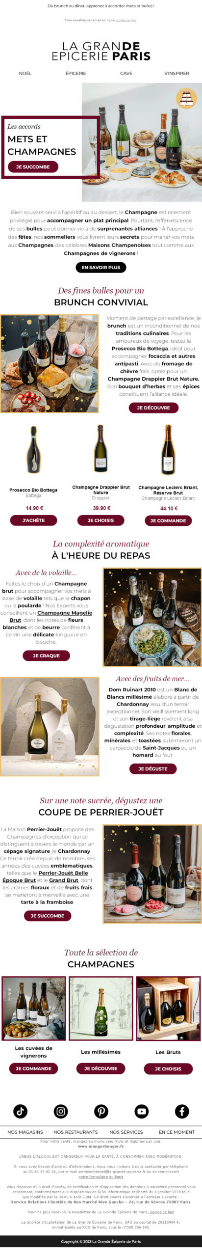
It's rare enough to mention it, so here's an e-mail that respects a principle very dear to me: dissociation of textual content from design. In other words, texts are designed from the outset to be written in HTML in the email, and not as images. And I mean ALL text! Menu tabs, titles, buttons and calls to action, editorial, product description, prices... Do you see those headlines made of serif and sans-serif typefaces in red and black? Well, that's HTML code, not an image... Even the text in the cover surrounded by the red border is HTML! All text, I tell you!
What are the advantages of this method? If you can ask yourself this question, then you've never read one of my articles 😀 :
- Improving accessibility of the campaign: screen readers will be able to browse this textual content more easily and render it to recipients
- Offer almost the entire DI-REC-TE-MENT email visible and readable as soon as the email is opened, without the need to download images. This saves the recipient an action, allowing them to concentrate their interactions on the clicks of the calls to action.
- Simplify updating content: you don't need to create images every time, and you don't need design skills either, just change the text in the HTML code.
I can't stress this enough, but I think it's vital to stop designing emails in full image, with text within images. It's a waste of time, and makes no sense in terms of accessibility. It's like shooting your own campaign in the foot. Accept that email is a special fieldwhere your own brand typography will not be supported. Find an equivalent in websafe typefaces. Accept the fact that color gradients aren't supported everywhere either. Nor rounded corners. Nor video. Nor forms. Nor all kinds of things. Write a design system once and for all EMAILING (specific to email) and your emailing templates with your HTML texts! Sorry, I insist...
That's it! I could (and will) push things a little too far by saying that, at this point, you at La Grande Epicerie De Paris could have accepted the fact that your logo is also in a "different" typeface, so that you could design it the same way... In full HTML and CSS 😉