Hello hello! I've already told you about my passion for music and drums. here ! Keeping with the same theme. Don't panic! I'm not going to bore you with the textual content, which is in English, but with the substance of this message. So here goes.
Why this choice?
- Because I subscribe to what I like and this won't be the last on the zic'.
- Because it represents efficiency and simplicity.
- Because it's eco-friendly and darkmode-friendly
Efficiency & simplicity
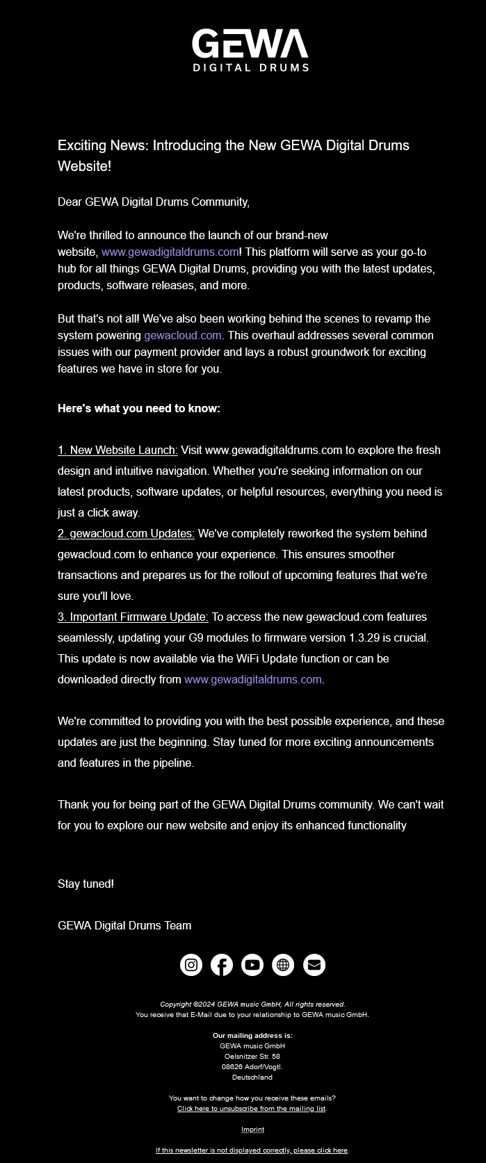
This type of email is straight to the point. There's a logo, a headline, text in the form of well-arranged, hierarchical paragraphs, social network logos and the legal notice/desabo link/mirror link.
We've got an email that's almost all text. No illustrative images or frills, we have 3 news items to announce. Prominent links are provided to find out more. We're dealing here with impactful minimalism. We could have had an image of the new site and the features to check out, but the choice was made to keep only text.
Note the mirror link present only at the bottom of the email. With this space at the top of the message, the information is immediately easier to read.
Eco-friendly & darkmode-friendly
Of course, there are no images. So this email weighs just about... nothing! So you can communicate important news with a minimalist impact. What's more, the black background and white typeface will also consume less luminosity when reading the email. So you consume less on your own medium. As a result, we're perfect for darkmode with black/white or white/black.
Conclusion
Fast to produce, lightweight and with a limited carbon footprint, this email has many advantages. Why load and illustrate? This quote from Antoine de Saint-Exupéry is fully applicable here:
"Perfection is achieved, not when there is no no more to add, but when there's no no more to remove." Or if you're bilingual: "Less is more."
On the other hand, it's your graphic designer who's going to have some time on his hands 😉
2 minor drawbacks: the size of the object and the absence of a preheader.