I'm going to diagnose this emailing in real reading conditions.
Do the subject line and preheader make me want to open the email?
When someone looks at their mailbox, they see several emails one below the other. They'll start by scanning their screen and looking at the sender (often in bold), then the subject and then the pre-header. If she knows the sender, she's more likely to scan the subject line. If the object piques her curiosity, she's more likely to browse the preheader.
Here, reading the subject line and the preheader, I don't understand the main subject of the email. The preheader is long, it's not seen in its entirety. With the date in the preheader, I understand that there's an offer with a deadline of March 30, but I don't know any more than that. At this stage, my curiosity isn't piqued. I'm not likely to open the email (although I admit the pun in the subject line titillated me).
When I open the email, do I understand what it's about in less than 3 seconds?
Why 3 seconds? Because, once opened, most readers skim through the email to form an opinion before deciding to go any further. In less than 3 seconds, you need to grab their attention so they'll deign to read your content.
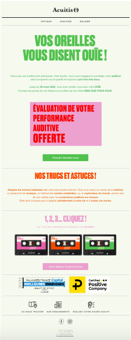
So, was my attention grabbed in the very first few seconds? No. My mobile opening environment doesn't load images by default. When I open the email, there's nothing that jumps out at me. All the text is the same size. The main title of the email, "Your ears are listening", is in image format. So it's unreadable in my opening conditions. In fact, in 3 seconds, I read: "Your Logo" (the alternative text behind the Acuitis logo) and the menu. Plouf.
Scrolling quickly, I understand that the purpose of this email is for me to make an appointment. But I'm still not quite sure why. At this point, I close my mailbox and move on.
What if images are loaded by default?
This changes a lot of things. In less than 3 seconds, I can clearly see the main title. On the other hand, it repeats the object, so I learn nothing more. It's a shame. Scrolling quickly, I'm attracted by the animated gif (which scrolls a bit fast for my taste) and I finally understand the email offer.
As far as the text is concerned, I would have liked to have been told quickly (in the first block of the email) what this email was about. If I swim regularly, can my ears get damaged? If I listen to music too loudly, can my ears get damaged? If I'm used to sleeping with commercial earplugs, do I risk them becoming ineffective? Why do I need to go to the store? Will they measure the size of my earholes?
In short, when writing content, you should always put yourself in the recipient's shoes. What words should we use to make them feel concerned? And yet, Acuitis has everything it takes to write convincing content. When I read the landing page, I learn a lot of interesting information! Why not use this information directly in the email?
From a design and information hierarchy point of view, the "Our tips and tricks!" and "1 2 3... click!" blocks seem to be 2 different blocks. The 3 cassettes give the impression that there are 3 different tips, when in fact there is only one.
The "Your nearest house" CTA doesn't belong in this part of the email. It should be placed next to the "Make an appointment" CTA.
There are a lot of colors used in this email. It's a bit hard on the eyes. Color-blind or visually impaired people should not be comfortable reading this email. You have to think of everyone when you design and code an email.
What we could have written
- Subject: Sleep, swimming, music: protect your ears!
- Preheader : Make an appointment for customized protection.
- Main title : Your ears are unique, your protection must be tailor-made
- CTA : I make an appointment with a hearing aid specialist
Summary of optimization points
- Write an honest subject line and preheader in line with the emailing objective.
- Write alternative text behind images when useful.
- Write important texts (essential for comprehension) in text format, not image format.
- Put yourself in the reader's shoes and provide information that will make a difference. Describing a commercial offer is not enough.
- Avoid animated gifs in emailing. Especially when they don't add value.
- Use black for paragraphs.
- Respect accessibility in the email design and code.
- Optimize logo and pictograms for darkmode reading