This newsletter caught my interest as soon as I opened my inbox (and not just because of its subject). What stood out for me was the lack of text content when images are deactivated (see screenshot below). As you can see, only the menu and footer are in text, the rest being text. alternative text. What's more, some of these alternative texts repeat themselves, and don't provide any context. They may even be poorly informed, displaying text that bears no relation to the images. Images, by the way, group together several contents, which doesn't make the task any easier.
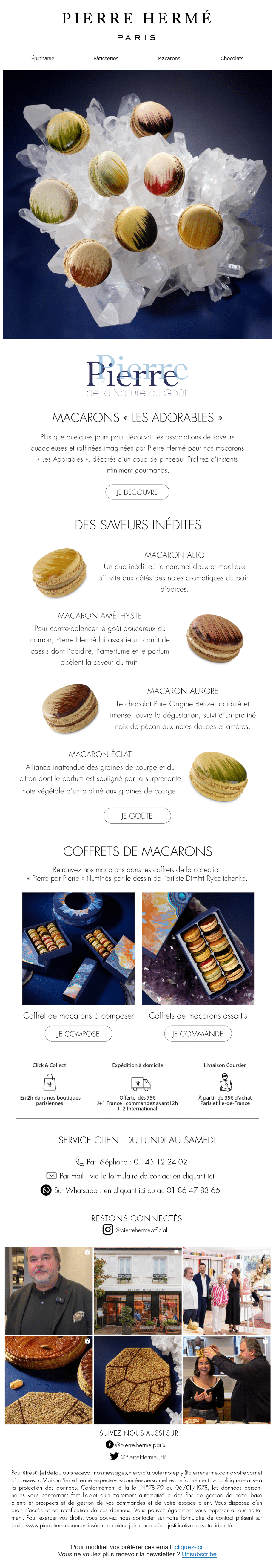
Obviously the email is about macaroons, so little gourmet curious professionally, I activate the images. In all transparency, I was hoping to find a design as twirling as the perfumes sold by Pierre Hermé, which would justify (and even then...) a full-image design. And there it was!
I won't draw you a picture, you're looking at the email rendering. Nothing! In this email, there's no justification for a totally image-based design. The structure is feasible at 100% in HTML code: cover, editorial, zigzag product, two columns, I don't see any complexity. So okay, the Futura font used throughout the email isn't a safe web font or a Google font. But forgive me if I'm shocking you, but let me tell you that if in 2025 a font is more important than the display and accessibility of content for you, then there's nothing I can do! Leave this article now... No, come back, we can help you!
According to my little investigation, this email is sent from Kalviyo, a tool that features an email builder 🙂 So Mr Hermé, know that if your teams need a helping hand to create a template in your mailing platform, It's one of our specialties. What's more, at Badsender we accept payment in macaroons ^^.
Below, the email without the images: