I'm not going to lie to you and say that I'm crazy about running, I do a hundred meters and I cough up my lungs! No-no, I simply noticed several points of graphic design in this promotional email that I like, and I'm going to list them for you. I'll also take this opportunity to review the technical points that bother me a little more...
First of all, what about the design of the email?.
I'll start with the positive points
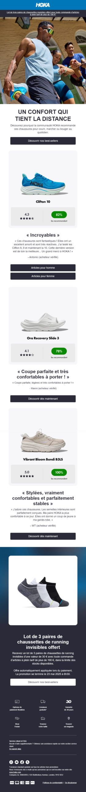
- I love the «uncluttered» look» of the email: it's relatively sober, and completely in keeping with the field of sports and running. The colors are bright without being too flashy. The rest is more neutral... it does the job very well and implicitly highlights the product visuals.
- The the brand's graphic charter is fully respected ! No unpleasant surprises either in the email or on the landing pages. Background colors, typography, text colors, banners, product layout... Every element of this email is part of a harmonious overall Design System.
- I particularly appreciate the use of websafe Arial typography: it just goes to show that, even with a fairly basic font, it's possible to achieve a very aesthetic result by playing with size, weight and case!
- What a great idea’use customer testimonials to highlight your bestsellers. I really like this approach, with the quotes from the community: it's as good an opportunity as any to talk about your star products, but it's something you should have thought of!
- The cross-sell on the pairs of socks offered is judicious and coherent with the products presented just before. Great!
And now, the optimization points for the design of this running email
- A link to the mirror page and an unsubscribe link at the top of the email are missing. As far as the mirror page is concerned, this is probably a professional misrepresentation on my part - although it is generally recommended in good email accessibility practices.
- I'm inclined to anticipate the hazardous behavior of certain email opening environments in Dark Mode by adding a drop shadow - or border - in the same color as the background on the HOKA logo at the beginning of the email.
- This is the kind of email where you could easily integrate a bit of interactivity: rollover effects on product visuals for example - with another view of the product -, hover effect on buttons, 3D view of a pair of sneakers - okay, I may be getting a bit carried away, but that would be classy! After all, you have to be aware the ins and outs of interactivity in email marketing, but that's another matter...
- Finally, a point that concerns the editorial part more than the design: the main title of the email - «Comfort that goes the distance» - is a "comfort that goes the distance". object repetition... And that's a shame! It would have been a good idea to reinforce interest in the brand and its products with other words...
And what about the technical side?
Let's start with the highlights
- The button-type calls to action are fully clickable, bravo! It may seem trivial, but not everyone can do it. And above all, it's also best practice in email accessibility !
- Some of the alternative texts are particularly well informed! The proof is in the main visual of people warming up, with the alternative text «A group of people stretching in the sun in running clothes.» respects to the letter accessibility principles for alternative texts in emails.
Are there any areas for improvement in the development of this running email?
- The gradient behind the image of the 3 pairs of socks deserves to be produced in CSS, so that the shades can be adapted in Dark Mode (if this were ever possible, I haven't tested it). It's true that we won't be able to reproduce the material effect and gradient identically, but is that the most important thing? And if ever the gradient isn't supported, we anticipate with a solid background color as a back-up. Acceptable degradation, baby!
- The resources called up - the visuals produced - seem a little heavy to me. I think it would be possible to reduce the weight while maintaining sufficient quality. I did the test on squoosh I've gone from 254kb to 202kb by lowering the quality to 80. And I'm still on a retina visual! Clearly, there are ways of optimizing all this.
- The product titles - Clifton 10, Ora Recovery Slide 3, Vibrant Bloom Bondi B3LS - are included in the product image... I confess I don't understand: why bother designing all the other textual content in HTML if you don't respect best practice for these titles? After all, wouldn't it be more graphically coherent to design them in Arial with a 700-point font?
- Similarly, the product rating is included in the product image. And so is the recommendation percentage... However, this last element could easily be developed in HTML and formatted using CSS!
- Empty cells are used to create margins, and I don't like it much at all... Why not use the CSS property
padding, dedicated to this purpose? - No semantic tags in the HTML code of the email... Not even a small
<p>. Texts are inserted directly into cells, the old-fashioned way. And email accessibility best practices on titles so what do we do with it? It is strongly recommended to insert at least one title<h1>, and choose the right level for the following titles... - The HTML code is too complex for the simplicity of the design. To give you an example, the preheader - the invisible sentence that complements the subject line - alone represents 27 lines of code. And a section - a line in the email - is designed for each block. Whereas a single section with a
bgcolor="#FFFFFF"would have been enough. - I'm having trouble understanding why the email modules are set to 640px wide, but in the end empty margins are added on each side so that the email is only 600px wide. Why not set the email width to 600px from the start?
Voilàààààà. After rereading, I realize that the feeling that emerges from this email analysis is not necessarily the most positive, but I'm still seduced by this campaign, I swear! Madam, I've never slept with a boy...