- Because I've had enough of gels from a brand I won't name (Axe) that give you allergic skin reactions and other contact dermatitis because they're so aggressive.
- Because from now on, only the most basic solid soaps are allowed in my shower room.
- Because I've had enough of plastic packaging cluttering up my shower.
- And because I love both names, Clémence, Vivien...
- And because made-in-France and eco-responsible cosmetics are alive and well!
However, if I like their products, the graphic design of their emailing communications leaves me more perplexed. Here, then, is an analysis of the existing positives and possible areas for improvement.
Design
Positive points
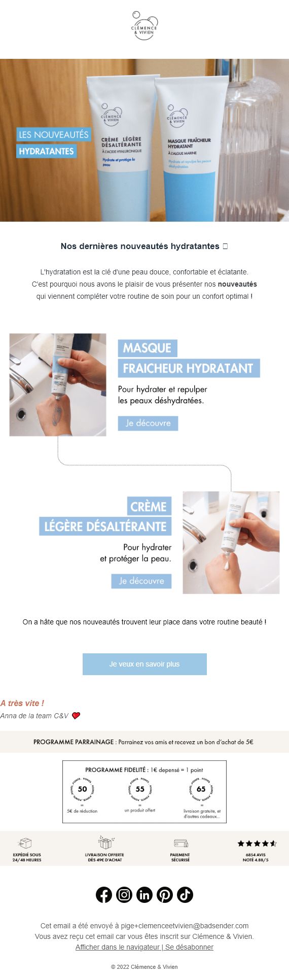
- The hero-cover's main visuals remain identical in desktop and mobile versions: a good practice that avoids the need to call on external resources.
Areas for improvement
- On the Desktop version, in the email header, the brand logo is tiny and blurred what's more. On the other hand, on the mobile version, its width increases to 100%: it takes up an excessive amount of space. A version optimized for both supports, with a fixed size, would be preferable.
- In my opinion, this logo could be adapted specifically for emailing: for example, the text «Clémence & Vivien» in HTML with two complementary images of the bubbles, or a horizontal version with the bubbles on the left as an image, and the name on the right, in HTML: this would at least make it possible to immediate brand display when the email is opened.
- «New moisturizers», the main title of the email, is in duplicate It's included both in the hero-cover of the image email, and in the HTML just below it. Not necessary! A better approach would be to integrate the title in HTML with a plain background via the attribute
bgcolor, and only display the product image next to it. All the more so as the context around these two visuals is not particularly interesting and would therefore be worth «cropping». - The hierarchy of information is not sufficiently pronounced Titles and texts are too uniform in appearance, lacking contrast and differentiation. More emphasis on the main title would enhance legibility.
- Emoji in HTML title not displayed correctly (but I'm not 100% sure it's an emoji). It's important to test your campaign before sending to make sure all the information is displayed correctly!
- What's missing is a button/call to action below the editorial text or, why not, directly in the hero/cover to convert or lead more quickly to the list of new products on the brand's site.
- The product visuals with associated texts (under the editorial) are the same for the Desktop and Mobile versions. Although I said earlier that I prefer this method, I'd like to point out that, on the Mobile version, these product visuals are clearly far too small and illegible. The same goes for the «Sponsorship Program», «Loyalty Program» and "Reassurance" banners.
- Graphically, I'll try to differentiate between the Refer a Friend program and the Loyalty program which today are all too similar. Incidentally, the texts in the Loyalty Program are illegible, because they are far too small.
Writing
Areas for improvement
- I can't see Nowhere are brand values mentioned. Yet Clémence & Vivien is 100% products of natural origin, an entirely vegan range, Cosmos Organic certification, eco-designed products... So okay, this could be the subject of a newsletter or dedicated communication, but why not consider a relatively short module evoking these strengths at the bottom or in the middle of the email? It's also a form of reassurance!
Accessibility
Positive points
- There is a link to the mirror page at the very bottom of the email: top! Although I would have preferred to see it in the email header...
Areas for improvement
- The logo is invisible in Dark Mode The header logo is designed in png (transparent background), so the header's white background becomes black (or at least dark) in Dark Mode. As the logo is black, it becomes virtually invisible. It's important to anticipate this type of problem and add, for example, a border or drop shadow in the same color as the background in Light Mode, so that the logo remains «visible» in Dark Mode.
- The titles, texts and buttons of the two (only) products presented in the email are designed as images: this is unfortunate, because if the images aren't displayed, then the associated titles, texts and buttons won't be displayed either. Keep textual and visual content as separate as possible Take the time to design text content in raw HTML (with CSS formatting).
- The images (
<img>) have no alternative text (attributealtwith a relevant value on the elements<img>): alternative texts are displayed when an image is not displayed (because the link is broken, because it's heavy and takes a long time to display, or because images are disabled) and are also there to inform disabled readers of the content of the visual. It's imperative that thealtof these images on the images that are not decorative images: in other words, the visuals in this campaign are laaaaargely worthy of alternative texts! - The main title of the «New moisturizers» email is designed as an image...
- The entire content of the sponsorship program is designed with images in mind...
- The entire content of the loyalty program is designed in images...
- And the entire content of the reassurance banner is designed in images. In short, I'm not going to repeat what I said about the dissociation of text and visual content, but I don't think any less of it!
- The language of the email content is not specified, attribute, as recommended in the best practices for emailing accessibility, in a
langon the tag<html>Describing the language will enable screen readers to read the email content in the «right» language. In other words, to have a «French» robot that will correctly read the content in French (and not with an English accent). - An attribute
direlement must be entered in addition to the<html>to specify the writing direction of the text if ever the<html>was deleted on an opening environment. Similarly, thelangmust also be entered for an element other than, or in addition to, the element<html>. - Insufficient contrast white text on a pastel blue background for product titles and calls to action, according to the WebAIM Contrast Checker.
Code
Positive points
- The attribute
roleattribute with the value presentation to allpresentationis well represented on<table>used for graphic formatting, not for data tables; bravo! - Semantic tags (<h4>, <p>) are used for text content: great! This will give screen reader users a proper explanation of the different text levels.
Areas for improvement
- The file is 159kb once indented and 40kb minified. This is huge, the code is far too heavy given the simplicity of the email's graphic design.
- The tags
<style>and media queries are far too numerous. Admittedly, the email was undoubtedly developed using an Email Builder, but there's nothing to prevent a little reworking afterwards to lighten up the output code a bit! - HTML attributes and CSS properties are present, but unnecessary:
valignon orphan cells, for example, or the use of<th>instead of<td>(which implies CSS reset)... Simplify your HTML code and take care of it! - Some spacing and margins are generated via empty cells and tables: I strongly recommend using the dedicated CSS property
padding, to reduce the weight of the final HTML code.
Conclusion
An email that highlights interesting products, but whose graphic and technical design could be optimized. Better practices in terms of responsive design, accessibility and HTML structuring would improve the user experience and ensure better conversion.