In 2025, we analyzed the design of over 150 emails. And the same problems keep recurring.
To analyze emails, we use a criteria grid that covers the essential points of email marketing: structure, hierarchy, reading logic, readability, visibility, CTAs, clarity, modern visual rendering, accessibility, brand consistency, mobile rendering, darkmode rendering, semantic quality, multi-messenger compatibility, weight optimization, and many more.
So here it is the 10 design advice we've given the most this past year.
Olivier Fredon, interviewed by Marion Duchatelet, gave a live presentation of the 10 reco's listed below.
Olivier is the design and email production expert at Badsender. He is also our UX, accessibility and eco-design referent. He helps companies improve their email design and development practices.
If you prefer video to reading articles, don't hesitate to watch this live video.
Access link : https://www.youtube.com/watch?v=XvrM8L7TgnQ
Before going into detail, let's recall a few simple principles.
A few useful reminders before talking about email design
You're not a designer
If your business is marketing, communications or CRM, your value is not in producing graphic effects.
Your role is to get a message across and provoke action.
Good email marketing is based above all on :
- clarity of message
- information hierarchy
- legibility
- the ability to act quickly
Design must serve these objectives, not become a field for graphic experimentation.
You are not your audience
When you produce emails every day, you end up getting bored of your own design. That's when you feel like changing things up, testing things out, adding effects, modernizing.
But your audience doesn't see your emails every day.
What seems repetitive to you is often a useful cue for your readers.
Constantly changing design can therefore damage brand recognition and legibility.
Email is not print
Entrusting the design of an email to a branding or print agency can quickly become frustrating.
Why? Because email is a technically highly constrained medium:
- very different rendering engines
- HTML and CSS limitations
- behavior varies by messaging service
- high mobile constraints
A design conceived for web or print can become very complicated to produce or impossible to render correctly in email.
This article is freely available.
It took time and expertise!
This month, thanks to our customer-sponsors: Actito, BPI France, Cardif, Citeo, Clarins, CMI France, Editis, Engie, France Télévisions, Le Parisien, Les Echos, Les Furets, Pierre Fabre, UMR, Voyageurs du monde... Thanks to the missions they entrust to us, we can write and share free content. They support our educational work to promote more responsible email. Become a customer and benefit from our expertise while supporting the production of open knowledge.
UX reminder: without openness, design is pointless
Even before talking about design, it's important to remember the obvious: if the email isn't opened, its design is useless. Put the email in its context of consultation and use.
Three elements therefore play a decisive role: the sender and the object, the pre-header
They are the ones that determine whether the email is opened, by introducing the subject of your communication.
And no, copying and pasting the email title into the subject line doesn't add any value.
This topic will be the subject of a future live broadcast dedicated to email copywriting.
The 10 design tips we give most often
Brands evolve, tools change, teams are renewed... but we're not the only ones. certain design errors are systematically repeated. Not because the teams don't work well, but because email is a deceptive medium. It looks simple to produce, when in fact it's a mixture of design, technical, marketing and display constraints.
Here are the ten design tips we've given the most over the past year.
The sample emails presented in this article are for educational purposes only. to illustrate certain design points. They are not intended to point the finger at any particular brand. Furthermore, some of these examples may be older, and the practices or templates of the brands concerned may have evolved since then.
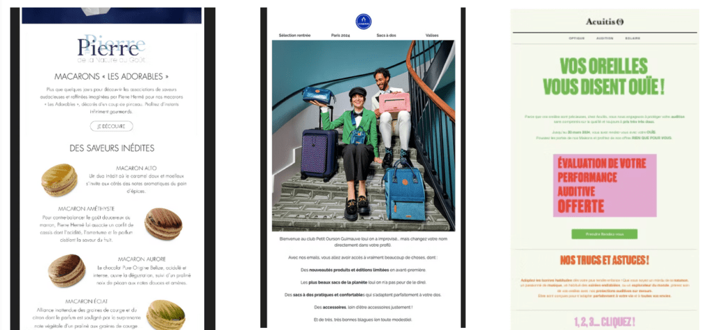
1. Prioritize information
One email must be understandable in a matter of seconds. When someone opens your message, they should immediately identify the campaign's intention. What is this email about? Why am I receiving it? What is expected of me?
When these elements aren't obvious, it's almost always a problem of visual hierarchy.
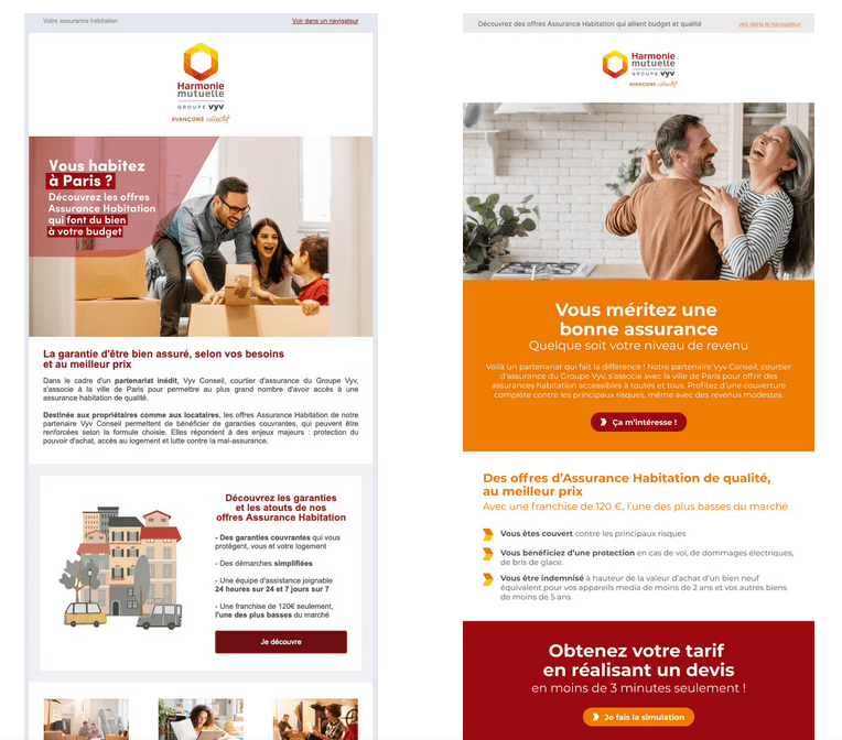
A good email is generally based on a simple idea: one clear intention per campaign.. The role of design is then to organize the information so that this intention is immediately apparent. Headings, blocks, spacing and focal points must guide the eye.
A very revealing exercise is to hide all images. If an email becomes incomprehensible, it's often because the structure of the message depends too much on the visuals and not enough on the content.
2. Prioritize accessibility
Accessibility is often perceived as an additional constraint. In practice, it's more an indicator of maturity.
Accessible email is almost always a better-designed email. The content is more readable, the structure clearer and the code more robust..
This starts with the simple basics: declaring the language correctly, structuring the HTML, ensuring sufficient contrast and avoiding purely visual content. These elements obviously benefit people with disabilities, but they also enhance the experience for everyone.
Accessibility often acts as an indicator When a template is poorly structured, it's one of the first subjects to deteriorate.
3. Take care of the responsive
The majority of emails are designed for the desktop, but a large proportion (even the majority in BtoC) are opened on mobile devices.. This discrepancy explains why some campaigns, however well designed, become difficult to read once opened on a smartphone.
Responsive email is not simply a matter of reducing the width of a design. It often involves rethinking the flow of information. The order of content may change, certain blocks may be simplified, and elements that are highly visible on desktop may become secondary on mobile.
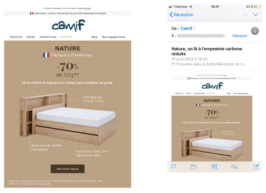
In fact, some page layouts that look very attractive on a widescreen display become totally illegible on a cell phone. This is often the case with complex structures or highly graphic compositions.
Thinking mobile right from the design stage helps avoid these problems.
4. Give rhythm to your email
An email is not a document that you read carefully from beginning to end. It's content you skim through quickly. The design must therefore help the reader move forward effortlessly.
Visual rhythm plays an essential role here. Alternating blocks, breathing space between sections and managing the spacing between them make it possible to structuring this journey.
Margins and paddings are often considered details. In reality, they contribute directly to overall readability. An email that's too dense quickly tires the reader, while’well-paced content naturally guides the eye from one block to the next.
5. Promote legible typography
An email can look great, yet be difficult to read. Email typography must remain at the service of understanding.
In many of the campaigns we analyze, the problems stem from fairly simple typographic choices : texts entirely in capital letterss, the sizes too small or contrasts insufficient.
Custom fonts also pose difficulties. They can reinforce a brand identity, but they are not supported everywhere. When they are used, a consistent fallback is essential to preserve legibility.
In email, the priority is always the same: to make the text easy to read.
6. Facilitate action
Email links and buttons are the elements that concretize the campaign objective. Their visibility and accessibility therefore have a direct impact on performance.
A button must be immediately identifiable and sufficiently close to the content it completes. If the user has to search for where to click, the design isn't doing its job.
Size of click zones is also an important topic, especially on mobile. A button that's too small or poorly positioned can make the action more difficult and reduce the overall effectiveness of the campaign.
The design must therefore make the action obvious.
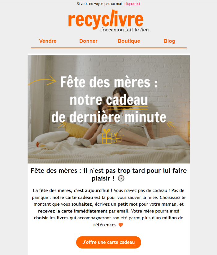
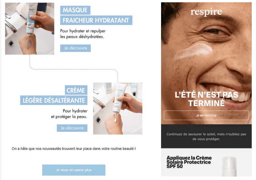
7. Use images intelligently
Images add personality and reinforce the visual identity of an email. But they should never carry the essential message.
Text embedded in images remains one of the most frequent problems. This practice poses several difficulties: images can be blocked, they are not always accessible to screen readers, and they sometimes adapt poorly to different screen sizes.

When images are not displayed, the email must remain comprehensible. This is often the best test of the balance between textual and visual content.
Animated GIFs and background images can also enrich a design, but they must be used with due consideration for their technical implications.
8. Optimize your assets
Images and fonts are often the heaviest resources in an e-mail. Yet their optimization is sometimes neglected.
Adapt correctly visit image dimensions, choose the good file format and limit their weight can have a significant impact on the user experience. Lighter emails load faster and consume less data.
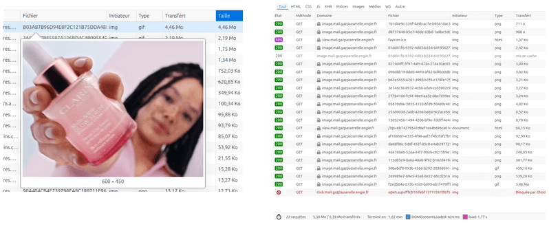
The number of resources called also plays a role. Multiplying images or fonts can slow down display and make rendering more complex in certain environments.
Optimizing these elements is an integral part of the design process.
9. Don't hide the essentials
The pre-header, the footer, unsubscribe link or legal notices are sometimes treated as constraints. They are reduced, concealed or rendered almost invisible.
But that's a mistake.
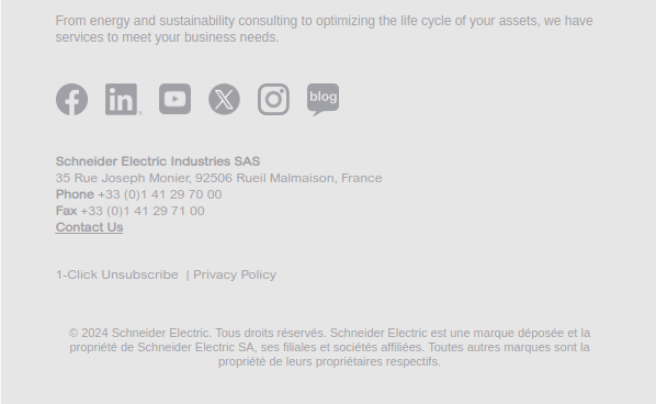
A clear, transparent email builds reader confidence. It also reduces spam complaints and contributes to maintain a good reputation as a shipper.
These elements must remain visible and understandable. They are an integral part of the reading experience.
10. Test, test and test again
Email is a particularly fragmented environment. Between webmails, mobile applications, desktop clients and dark modes, the same message can be displayed in many different ways.
Testing is therefore essential.
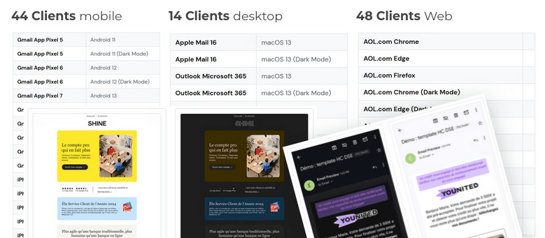
It's not just a question of checking the overall appearance, but also of how email behaves in different situations. The HTML weightthe dark mode management or the dynamic content can produce unexpected effects.
Tests must also be carried out with real data, as some problems only become apparent in real-life situations.
An untested email is often an email that holds surprises once sent.
Need a design audit or coaching?
Taking a step back from our practices can often put things back in order.. A design audit or template redesign clarifies email structure, improves readability and ensures reliable rendering in different environments.
If you feel that your templates are beginning to show their limits, It's probably a good time to ask yourself this question. At Badsender, this is precisely the kind of support we regularly provide to CRM and marketing teams.
Leave a Reply