Interactive carousels are a marketing chestnut. For several years now, they've been regularly touted as the “innovation” that will transform emailing and boost your conversions. Let's face it: in a sales demo, it works. Transitions are fluid, images glide elegantly, buttons react with hover effects. Finally some interactivity in our old emails!
Before diving into the technical, UX and strategic implications, let's start by recalling exactly what we're talking about.
What's a carousel?
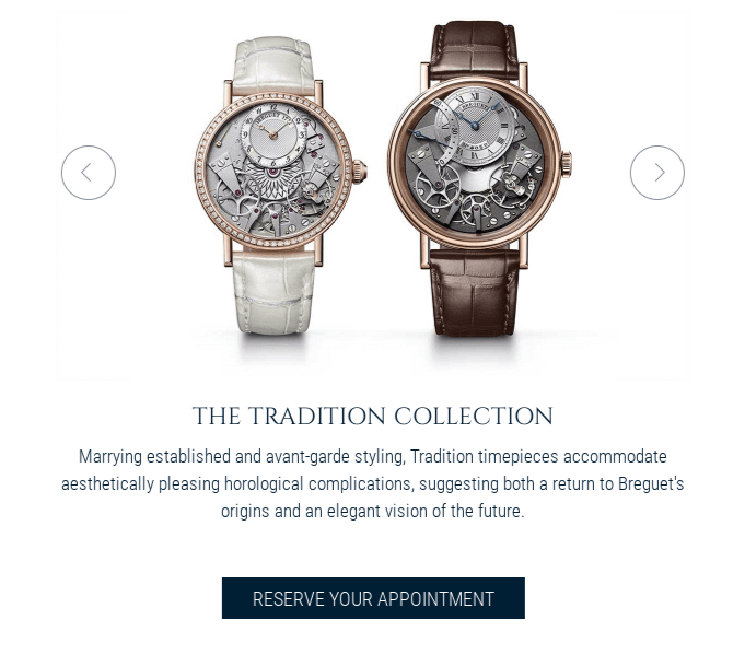
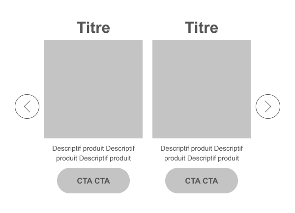
A carousel, also known as a slider, image rotator, slideshow or, in the most ambitious presentations, “interactive hero module”, is an interface component for displaying several items of content in the same space (zoning), by scrolling them horizontally.
On a website, in addition to HTML and CSS, you have access to JavaScript. Coupled with a good use of ARIA, you can quite easily have this type of technically robust component.
In an email, it's a different matter.
Still no JavaScript (security breach, deliverability problem...). No event detection. No dynamic DOM. We'll come back to ARIA support later.
So, to create the illusion of a carousel, our rockstar integrators take advantage of what HTML alone has to offer form elements (inputs, labels) and a few CSS pseudo-classes. It's ingenious, it's creative, some would say it's innovative..., But it's anything but good design practice.
How does a carousel work in an email?
To recreate an interaction that doesn't exist in email support, we're going to have to use several techniques:
- of inputs (radio/checkbox) masked,
- of labels used as buttons,
- the pseudo-class
:checkedto alternate views, - CSS transitions to simulate animation, with limited support,
- and finally many layers of «fallback» (additional code for cases in which all this doesn't work) to keep the content consumable (yes, I wouldn't dare say accessible, because these considerations are far, far away).
It's not “do-it-yourself”, it's a coding concept based on bypassing.
A technical feat that may impress less seasoned integrators, but above all decision-makers or marketing teams weary of seeing the same emails over and over again.
Impressive... at least, until the email test is performed live on their own inbox.
Compatibility: a module for a minority
Let's be clear and transparent: an interactive carousel, in its functional version, only really exists in the Apple ecosystem. (and mostly on Apple Mail). And others for which you'll have to be even more cunning, like Orange.
Other environments, with Gmail at the top of the list, will ignore all or part of the interactivity and animations.. This requires static versions (the famous fallback), or redirection to a web version (handy! Where's the wow effect when you open the email?).
Know your opening environments is going to be crucial, and this is unfortunately difficult information to consolidate. It depends greatly on your positioning, your sector of activity... but clearly if it concerns 25% of your audience, it's already enormous.
The rest (the majority) will never see the interactive device, only an image or a simplified alternative (gradual deterioration).
When you're working on performance and streamlining practices, this figure suggests caution. So if you're also interested in accessibility or eco-design, don't bother.
UX: is the carousel a good idea?
The real problem is that even in contexts where carousels work perfectly, that is, on the web with a modern browser, their effectiveness is highly contested.
So we can learn from our mistakes and take advantage of the experiments we've already carried out, rather than simply trying to mimic them.
The data compiled by DoisJeUtiliser.fr, based on studies by the Nielsen Norman Group, Erik Runyon and ConversionXL, are unambiguous:
- 80 % to 90 % of interactions are concentrated on the first slide.
- The users hardly ever scroll slides.
- CTAs placed after the first slide are statistically invisible.
- Carousels divert attention more than they guide it.
- On mobile, friction is even greater (clickable zones too small, competition with scrolling).
In email, a more constrained, less standardized medium where attention spans are fragile (you know how long it takes to read your emails?), these problems don't disappear: they amplify!
Accessibility: a real problem
As an accessibility consultant, I have to be direct: an interactive carousel in an email cannot be fully accessed.
The reasons are structural:
- Behaviors are based on input detour: keyboard navigation sometimes becomes unpredictable.
- ARIA support is extremely limited in email clients.
- Screen readers have difficulty interpreting structure, state changes and logical order.
- Fallbacks introduce discrepancies between versions: risk of information loss.
You can try to reduce the damage as much as you like, but never solve it.
And this will have side effects on many other aspects: hello the weight of your HTML and hello the truncated mail on gmail. Which already can't display your carrouse properly).
If you are committed to accessibility or directly concerned by legal obligations, this should already disqualify the use of an email carousel.
Eco-design and economy of means: the great forgotten
When it comes to digital sobriety, the interactive carousel ticks all the boxes... of what's best to avoid.
- Specific code for the carousel itself (HTML and CSS)
- Images often duplicated (provided they're not optimized either)
- Multiple fallbacks, so even heavier code
- More energy-intensive testing and maintenance
- Low yields (percentage of users actually exposed to the component)
Eco-design is based on a simple principle: make the slightest effort to achieve the expected result.
If the aim is to send the lightest, clearest and most efficient email possible, we're a long way from that. A carousel is the perfect example of an expenditure of resources disproportionate to the real benefit.
Costs and technical debt: an underestimated investment
A carousel is not just a “creative module”. It imposes direct and indirect costs:
Design
Several graphical variants, fallback versions, accessibility constraints, micro-interactions... Each step requires additional to-ing and fro-ing.
Integration
This is one of the most complex modules to code properly: Apple conditions, duplications, interactive structure, anti-bug optimizations, click zone management.
Tests and maintenance
Unlike a static module, a carousel requires: a complete interaction test and validation of the static fallback version.
With every update, every change in content, every new campaign, it's essential to prevent possible regression.
This is exactly what fuels technical debt in a design system :
we maintain a heavy component whose real use is marginal.
But why all the hype? Are there any cases where a carousel might be relevant? ?
By dint of deconstructing the tool, one might think that it is useless on principle. This is not the case: there are situations where the carousel remains defensible.
- Very Apple-dominant bases (certain premium sectors or creative communities)
- Event campaigns where the visual effect is central
- Product demonstrations in a controlled environment
- Proof-of-concepts to validate technical maturity
- Internal communication on standardized environment
These cases are still in the minority, but they do exist. The trick is to know why we do it and for whom.
Our email carousel developed with Rémi Parmentier
The design of this carousel was based on a very specific brief : We'd like to offer our customers a «Carousel» module. It must be able to contain at least two slides« (and more). Ideally, it would also be possible to choose the number of thumbnails in each slide (one, two, three products). The fallback solution must be relevant.
Constraints and complexities to be taken into account
- A responsive version that adapts in width to the screen resolution. Priority 1.
- Optimal feature support and a fallback version that holds its own. Priority 1.
- Left" and "right" navigation arrows. Priority 1.
- Different links on the products. Priority 1.
- Navigation arrows that position themselves as well as possible in responsive mode. Priority 2.
- The possibility of rotating the carousel "ad infinitum". Priority 2.
- Possibility to add a customizable call to action at the bottom of each product. Priority 3.
- If possible, be able to add content "before" the product visual. Priority 3.
And what do you know? We don't regret our choice. All our constraints and wishes have been respected. Without a doubt, we've ended up with a brand-new carousel, that offers acceptable support and a particularly innovative email experience.
The advantages of this carousel
- Each slide can contain HTML images, text, buttons...
- This also means that you can put different links on each slide, on each product, on each text...
- You can easily change the order of content in the slides: title, image, button. The possibilities are endless!
- The responsive version adapts to all screen widths.
- If the carousel is not active, only the first slide appears, to avoid scrolling too long in the email. No need for a specific fallback solution.
- The carousel turns "ad infinitum"..
What's more, it's available in our in-house email builder LePatron
Industrialization: in an email design system? in LePatron?
At Badsender, we design design systems email designed to last, to be adopted, and to minimize technical debt. In this context, an interactive carousel is rarely a good candidate.
Nevertheless, ThePatron, our open source email builder, is perfectly capable of hosting this type of module in a controlled context.
The message is simple:
- We know how to do it.
- We know how to industrialize.
- We know how to optimize.
But we also know how to say: not the best idea to industrialize into a design system designed to serve your entire organization.
A design system is used to do it better, faster, simpler, It's not about multiplying technical exceptions.
For other builders, it depends. Many have chosen to offer carousels via Google's AMP4email technology. Clearly, this is another matter, both technically and in terms of limitations and support (only Google in application, to cut a long story short).
Conclusion: technical prowess is not always a good strategy
At Badsender, we master the entire email chain: design, integration, accessibility, performance, industrialization, design system architecture, deliverability.
The carousel?
Yes, we know how to design, integrate and industrialize it.
But our role as expert email marketing consultants is not to choose “what shines brightest”, but what works best and meets an objective for the greatest number of people.
By the way, what's your objective in setting up a carousel?
Leave a Reply