Pauline Ballet / FFT
As I write these lines, the biggest tennis tournament in France (after Roland Garros) is over. The Rolex Paris Masters saw Novak Djokovic win against Canadian Denis Shapovalov on Sunday, November 3... And if we have nothing to do with this outcome, on the other hand, we are responsible for redesign of the emails specific to this event!
What did we originally have?
It's quite simple: we had until then a declination of a template made in 2017. This template tried to respect all the good practices of the Design and conception in email marketingnamely :
- A width of 600 pixels.
- Responsive, and we would even say Fluid for the coding technique to propose a mobile rendering on the consultation supports or e-mail clients that do not support media queries.
- The majority of the textual information in HTML text.
- A link to a mirror page, an unsubscribe link, and a possible language switch for the email content.
- Call-to-Action designed in HTML and CSS.
- Safe web typography.
- Clean, indented code, limited to what is necessary.
- And of course, a visual identity inspired by the graphic charter of the tournament.
At the time, we were strongly inspired by the logo and the graphic charter established by the brand to define the colors of the email.
This led us to use shades of green, white, grey and yellow, as well as Calibri typography, with Arial. Nothing too crazy, so maybe we were betting on safety!

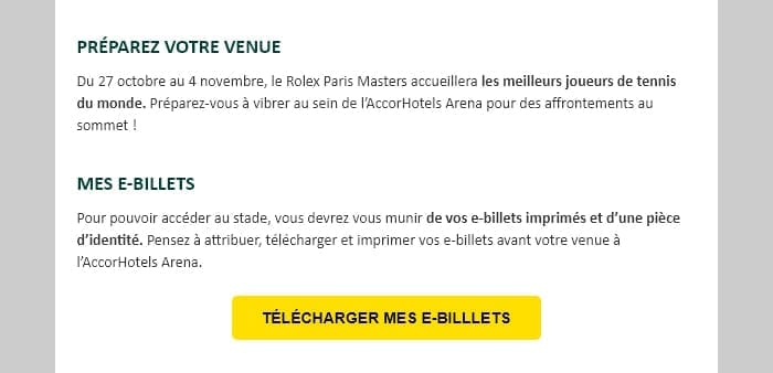
This led us, therefore, with the different declinations, to achieve this result in 2018:
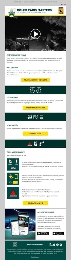
Good, but not great...
When the French Tennis Federation decided to entrust us with the design and HTML integration of the emailing template 2019, we have decided (once the joy has passed) to proceed to a real redesign. Because the template seemed to us to be dull, and not very representative of the vitality, of the craze that this type of event and sport can arouse.
We started from the beginning. We first proceeded to a design freelance on the site Really Good Emails. It's an opportunity for us to review our fundamentals, to look at things totally differently. Methods and designs evolve in two years. Strongly. So we could only offer our loyal client a design representative of the image of the Rolex Paris Masters, and the height of their expectations. Something more "Sport".
So what changes have been made?
- First of all, we wanted to completely rethink the header of the email: until then, it grouped together, in a jumble, the mirror page link, the "France" and "United Kingdom" flags (for the language switch)the RPM logo, the date of the event, and the ATP Masters 1000 logo. But each element had its own identity, its own colors.
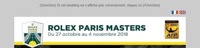
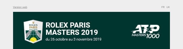
We then rethought the coherence of this element (as well as the whole email). The mirror page and language switch links will now be side by side. No more unsightly flags. The RPM and ATP logos will be declined to obtain a real unity.
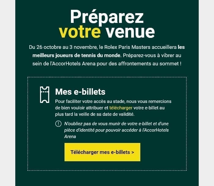
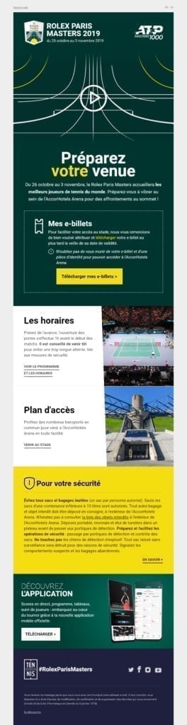
- The cover, for its part, will remain identical. On the other hand, we are taking the decision to put much more emphasis on the editorial by applying a plain background color: the same shade of green as the header. This will ensure continuity between the elements. The main title is now much more pronounced, the texts centered, and the e-ticket download module incorporated.
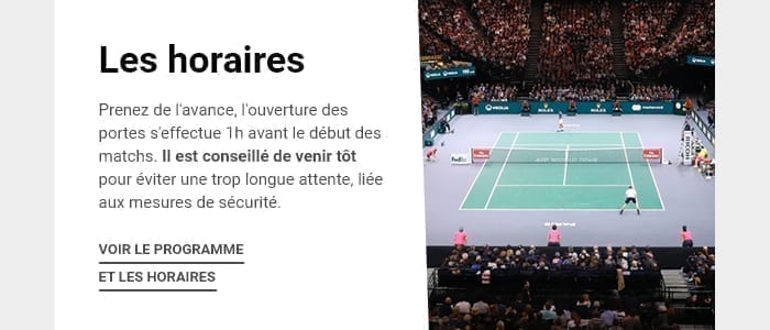
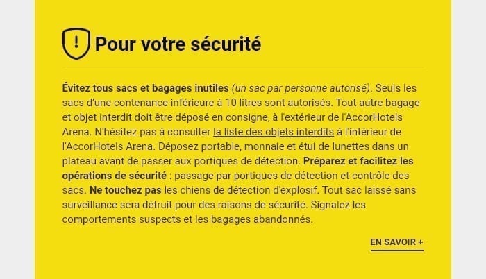
- Then come the "Timetable", "Access Map" and "Security" modules. In previous years, these modules were accompanied by pictograms. However, over time, these pictograms have deteriorated: it was necessary to find pictograms that explicitly represented the subjects concerned (backpack, bottle, camera...) There was no coherence between these elements.
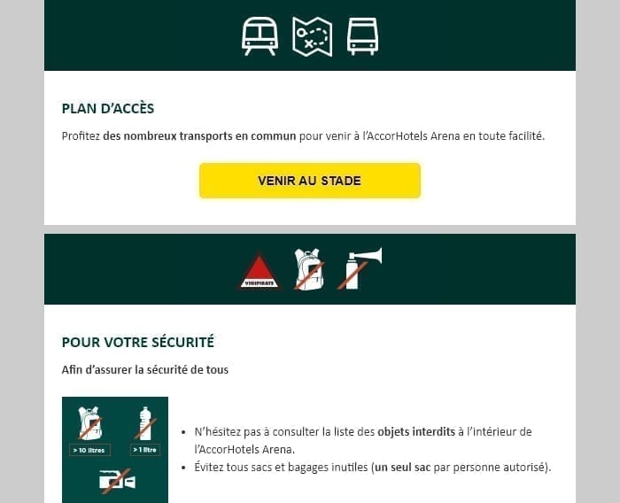
- After reflection, we thought it would be wise to further hierarchization the importance of these elements. We have therefore dissociated the "Schedules" and "Access Map" modules from the "Security" module in the layout. A little work has been done on the visuals of the first two modules, while the third one is now with a solid color background (yellow, secondary color). Only one pictogram remains, for a better understanding. No more pictograms in all directions, with completely different styles...
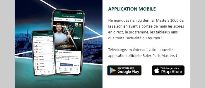
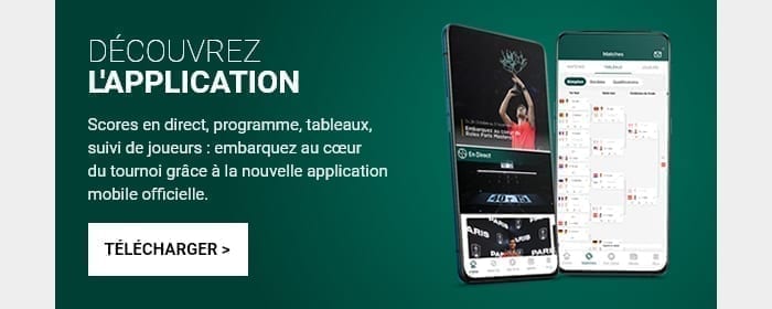
- It should also be noted that the "Mobile Application" module has really benefited from a good makeover in terms of graphic design, but also in terms of text and Call-to-Action: in agreement with the French Tennis Federation, we have implemented a single Call-to-Action, with a Landing detecting the consultation support to propose either a Landing presenting the application in detail, or a possibility to download the application directly. A redesign can also be applied to the content, not only to the design!
Is that all? The redesign stops here?
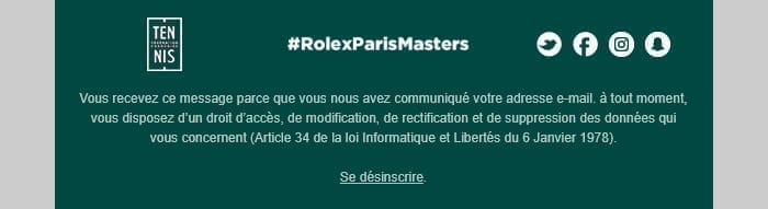
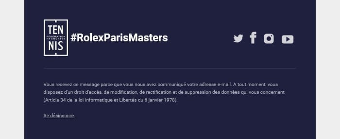
Hey, ho, take it easy maggot! The foot of the email (or footer) has also benefited from this "new look for a new life If we want to remain consistent, it was logical to apply some modifications to it... On the whole, the structure remains almost identicalThe background color has changed, the social network pictograms are no longer in circles, and the legal notices will now be left-ironed and slightly smaller. Nothing extraordinary, but the general harmony is well there.
The final result.
And you are wondering if it is possible for you to do a redesign...
But-but-but-but-but of course! That's why we're here! Don't hesitate to contact us to discuss it, we would be delighted to accompany you on this subject!
Leave a Reply