Most likely, you are already aware of it: HTML coders hate working with emails - except maybe for a few masochists in the field -. During the past few years, the 'old-fashioned' web has underwent major standardizing progress, like most web browsers have. Nonetheless, email remains the black ship in the cattle.
The question here is: Why? The answer is that most of the times, web browsers are quickly updated - though it is not unusual to find an old rusty Internet explorer version in some corporations-. In the email arena, there are some who still carry a rusty burden, sometimes a 10-year-old out-of-date version.
Such is the case of our old buddy Outlook, which has been since 2007 winding it back to use the HTML-rendering from the Office suite - personally speaking, quite a deviance -. It also the case of Lotus Notes, prevailing among many companies, sometimes running versions dating back to 15 years old (though, this is starting to fade away). And the list goes on. We are aware of several companies behaving strangely: because they are archaic or just because of security reasons. It comes to my mind the example of Gmail, which blocks almost all CSS in the HTML header, as well as many other webmails changing randomly - for the most - the HTML code of your emails to render them alike to their image.
On the other hand, classic websites count at least 4 or 5 browsers, each one with 2 or 4 different versions. When testing emails, it is common to pass through more than 30 different email clients.
The table dictatorship ... and responsive.
One of the biggest issues that your email HTML coder will face is the content-placing, which is utterly done through tables.
Laying out by following the DIVs and the CSS criteria is not possible in the email universe. If you want your emails to be properly-displayed at least 90% of the times, you will have to reach for tables on its HTML code. The deployment of this technique has been vanished from the web for over more than 10 years.
However, as of many years from now, HTML coding was pushed to take into account the increasing presence of mobile devices. After Apple's iPhone release, it became possible to send an HTML-formated email out from the pocket of hundreds of thousands. Nonetheless, we do not send an email the same way we do on a 4-inched screen than we do on a 12 inches or 27 inches one - email display was to be adapted as much as possible -. Once again, classic website demands little expertise to perform with ease. However, if you want to create email compatibility among the newest iPhone and the 15-year old email versions, as well as with the tablets and its many different technical specifications, the only thing I can come up to is: Good luck with that my fellow.
Email designers may attempt to reduce the workload of HTML coders: This is what you need to know!
To render email-HTML-coding chores less complex to the designer, one may count up a few useful rules. If you think these are much more of a problem, try to see them from a different angle, for instance: as a creative challenge!
1. Width shall not exceed 600 pixels.
Regarding the desktop-like terminals, we can say there is a kind of convention - created long time ago and currently up-to-date-. Despite the over-sized screens, preview email areas are often surrounded by other tabs such as email lists, in-boxes, files, etc. This shrinks the space available in width. If you do not want to surprise your coder with this issue at the very last stage of the process, you should take this into consideration when laying out the design.
2. Remember the boundaries of your email when engaging in design conception.
This is a reminder to all designers who are used to work paper-based. When designing a brochure, the surrounding space around it is often forgotten... maybe because it is all air! However, when working with emails (just as with web if you work on fixed sizes) when you have a window larger than 600 pixels, there would be some inevitable empty space on your window. So, if you don't want that your email coder feels left behind, it is imperative that such space takes part in the design you will hand-out.
3. It shouldn't be necessary to slice images
A few years ago, it was still possible to cut out images in the middle of the screen during the HTML coding of an email design. This enabled - for instance - to set different links throughout many different spaces of an image. However, with the outset of mobile email and responsive, it is impossible to keep following the same path. When shifting to a smaller screen size, the different slices displayed may lead to undesirable side effects such as the outcome of white margins between images, mid-separation of these onto the next line, among others.
4. Do not place relevant text on background images, textures or shade-off.
It is truth that some email clients renders correctly background images. Yet, this is not the rule of thumb. If you want to spare your HTML coder with juggling the many tools and tricks to render proper email display more randomly at each time, it is recommended to place texts below images. However, this text will not be visualized if customers block images.
5. Use standardized fonts such as Arial, Helvetica, Georgia, Times.
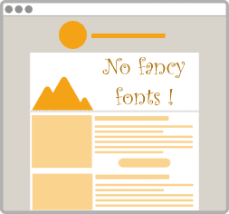
As of many years ago, classic web enhances the use of fonts which are not present on PCs nor viewer terminals. CSS gives us the possibility to look for a remote-server font. Unfortunately, most of email users disable this feature. Hence, it will be necessary to restrain yourself to use the fonts universally present on all PCs. However, if you have a strong desire to use some special font, you can still do it by inserting it on an image. Though, as explained before, it is not recommended.
6. Think mobile first
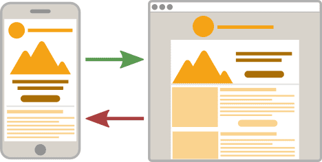
Are you in charge of an email design project? Start by laying out the mobile version before the desktop one! This will give you a much simpler approach of the email and will show you the basic features to be implemented. This way, it is less likely to have huge HTML-coding gaps between the 2 versions.
7. When talking about responsive, from left-to-right will become the new from top-to-bottom!
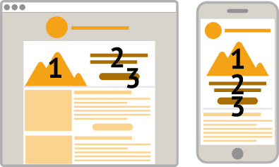
As a matter of fact, the subject line of this paragraph might not be completely accurate. In real life we can do what it pleases us, but sadly this all-mightiness slows down HTML coding time frames and increases the need of template maintenance. The most 'natural' way to create responsive-emails is to consider the following approach: let it naturally flow from top to bottom instead of from left to right. It is important to keep in mind that we can make appear or disappear certain items from one screen-size to another. Compatibility risks increase consequently, though.
8. Be aware of your images' aspect ratio
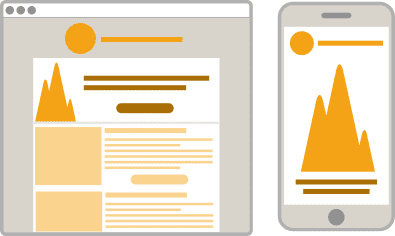
Unless you neglect image selection for mobile and desktop versions accordingly, it is important to remember that the image's aspect ratio between these 2 will remain the same. So, what exactly does it mean? It means that a rather narrow image - longer than that larger - once it is rendered mobile-friendly and standing alone on its line, it is likely to take over all the space of the screen. The same problem comes when you have a large image taking over all the email-desktop width, for where it will become extremely small on the mobile version due to minor height.
9. Think rectangularly
When designing, our imagination breaks free. We love breaking the rules... and it is all Ok! Unfortunately, the life of an HTML coder is made of cell tables helplessly rectangular. In such scenario, no wonder that creativity gets killed first thing. This is the example of all texts which are to be displayed by following an oblique or curbed line: this is impossible to perform- full stop. The only way out would be to code it within a huge image. However this would be far-distant from what is recommended for a clean HTML-email coding.
10. Think of an imageless display
This is a plague for all emails. Most of email client and Webmails do not display images by default due to security reasons - at the base, this measure was deployed only when poor broadband connection-. We are aware of the extremely short attention spare given to a commercial email when opening it, for where it is imperative to optimize it by using an imageless display in order to deliver understandable and efficient emails.
11. Give columns a shortage
Throughout time, bumping into an complete column-but-in email is becoming less and less likely, and if you feel melancholic enough to star doing so: please stop right now! This would mean an instant heart-attack to your HTML coder (although he will do whatever it takes to pull it off). Moreover, when engaging in responsive coding, chances are high that items placed on top of your 2nd and 3rd column - quite noticeable on the desktop version -are to be found at the lowest bottom of your email. To sum up: in terms of efficiency for your subscribers, this is not so interesting (yet, test it yourself off work).
Photo by RhondaK Native Florida Folk Artist on Unsplash
Leave a Reply