Good morning ladies and gentlemen! So... Well... Well... GOOD! There is one thing you should know: The team entrusted me with the superb but nevertheless complex mission of rethinking the Badsender newsletter. So I went to bed at ten past midnight, and I was so tired! Like the dwarf in front of the urinal, I had to set the bar very high... I've been in this business for 7 years, webdesigner from father to son, son of a baker, I've never seen that: I've never taken as long to present a model as I did this time. I had a lot of ideas, I wanted to try, experiment, test, innovate... And the result is here! (there are still things to read below the template)
"We still didn't come here to butter the sandwiches!"
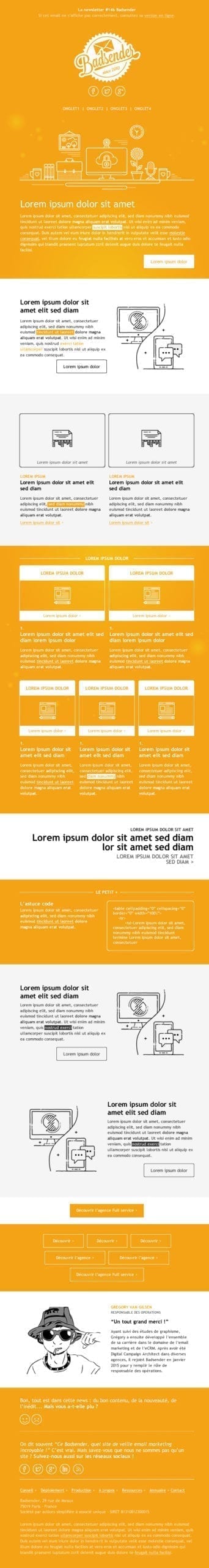
Until now, let's be honest, Badsender's news was already pretty good. Right? Yes, yes, it must be said ! Well, we agree, that's what I thought... But I thought it lacked a little... How to say... "alternatives"... The structure was often identical (One rarely changes a winning team except with Raymond Domenech, poin poin poin poin)and the graphics, although relevant and in the image of the site, remained relatively basic and a little light.
So I wanted, afterwards (that's priapism... React, after)We are going to propose new modules and make the news live as a single entity, as a machine in deployment! Wake up campers and hearts up! Let's go for a brainstorming session!
"What would your Montaigne say?"
To make a machine live, you need mechanics, cogs! So I had the idea of illustrations mutated into animated curly gifs! You will tell me "But what kind of gif, heuuuuu... Rather Braque? Uh... Vasarely?" Attention, not the big fat animated gif that stains! I mean this little trend of animated gif where only one element of the gif is animated... Do you understand? No of course you can't understand, it's not clear... Here is an example!
So, here is a first Roche Posay (humor, humor, I specify!). It was also necessary to establish a certain identity to this news, a certain style! Something chic, a little original but still readable on all media and email software. So I thought all the modules in "Full responsive". Well, a little technical explanation is necessary: Ok, Gmail announced that new adaptations were coming for the support of responsive and media queries. But for the moment, if we stick to the email preview tests, not really new... So we had to design the email so that it fits correctly on Gmail App or Android 5.1.0 ! So I start with a column system, either full width, 50/50 or 33%! Are you still following me? Clearly, we have to organize things so that the contents can easily go under each other, without having to use media queries!
"I don't understand this juice thing"
If responsive without media queries is still not clear to you, I warmly invite you to consult the article written by my dear colleague Grégory Van Gilsen. Take your time... Now that it's done, I continue to work on my little modules: a new insert dedicated to small pieces / tips of code is born and there you say "And look how deadly that idea sounds!" Yes, we know a lot about html emailing integration, so why not share it with our loyal subscribers?
But we won't lie to ourselves, the work of a graphic design often goes through a phase of monitoring, consulting, peeling what is done by our colleagues and draw the right conclusions! Not being interested in this is like pushing granny into the nettles, it's rather frowned upon... So I went on many bloggers' sites, routers... There are such horrors on the internet, I'm not telling you... And I'm approaching an age where men like me have only one thing on their mind... Email marketing, you rascals! I subscribe to new newsletters, I search, no choice, it's like that, I have to search or else they'll take away my unemployment benefits, it's the El Khomri law! I search in my favorites and my monitoring database (So be careful, eh, verbotten! from there on it's a secret area, area 51, like pastis!)
And there are good ideas abounding! I draw the conclusions by retiring from political life (no, I'm getting off track) and I'm taking this opportunity to incorporate a new subscriber feedback module to get some feedback on the satisfaction of our followers! A new article signature module, with an illustration / portrait (still in animated gif format, ah well yeah but it all makes sense! It's my little crazy side) The idea is to create a concrete template that can be used from the new Builder Badsender. Some pictos here and there, it's useless but I think it's nice! For the footer, we stay on something relatively simple and practical to set up: a reminder of our presence on social networks, small links to the expertise and services Badsender, and legal notices.
"It's always the same gestures: first the left leg... Always... socks, shoes..."
Of course, you will note that we remain on a single typeface on the whole email (here, the Trebuchet MS). It goes without saying that we use a websafe typeface, because support for specific fonts in emailingGod forbid, it's still not that! And for the color, we will simply stay on the rule of "2-3 colors, paplu-paplus"! So, the orange tint specific to Badsender, pure white, and shades of gray for the texts and illustrations. After that, everything is played out in the text formatting games: italic, bold, underlined, highlighted... That's where the text comes to life too!
So, yes, you are right to point out, there are one or two very light background images in the email! Little golden fireflies, seemingly twirling in the wind! You're thinking, "Well, isn't it inadvisable to use background images in an email?" Yep, but you'll admit that these images don't play any role in the understanding of the email or its readability! So no worries, it's just decoration, which won't be a problem if these images don't display on webmails that don't support background images correctly!
I hope you enjoyed this little article! Don't hesitate to share it, there's everything you need to share it! Next week we'll talk about Freud and why he used to shoot cocaine to kill a horse.
Leave a Reply