Someone said to me recently: "The main thing when you prepare an article is that you want to do it!" Special dedication to Greg, ouaich cousin ! It's an understatement to mention this one! I was impatient like a dog in front of his ball, I was stomping in front of my keyboard, I was like a madman! And I cracked! Well yeah, I admit, I cracked! Little guilty pleasure of the evening! I started on the heavy stuff! Very heavy stuff: Lancel (yep, that's all there is to it, buddy... Bah what?)
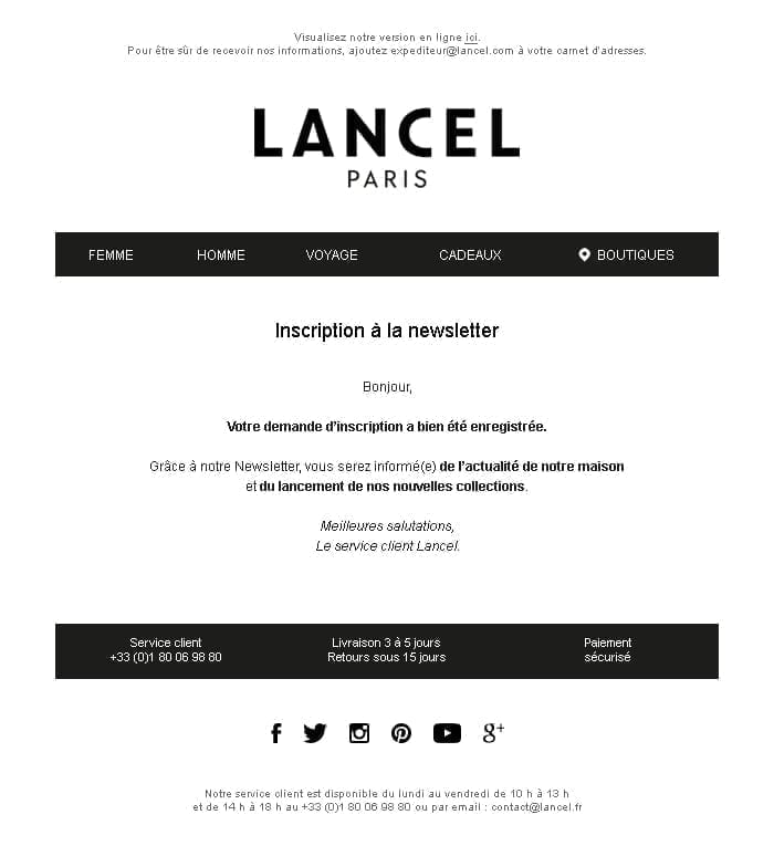
The last newsletter I received from the brand can be viewed below. I'll put a little capture of it to make it more heartwarming.
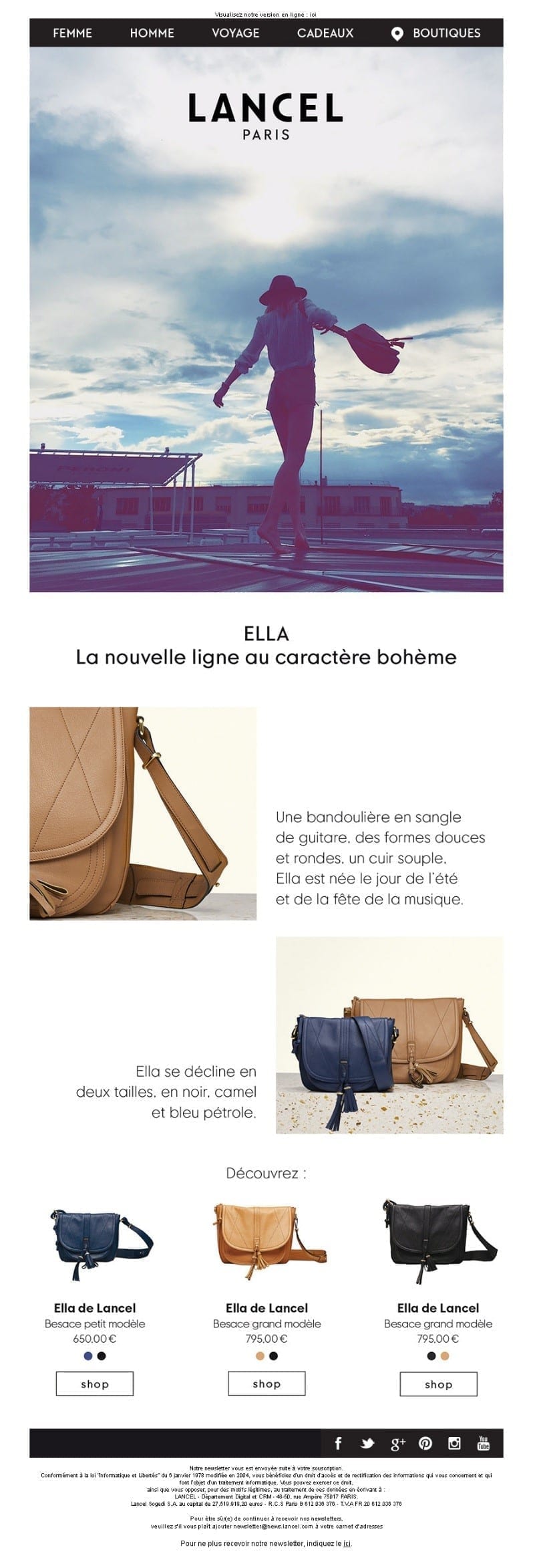
Well, graphically, it is clear that there is nothing to say ... it has style, it is classy, it kicks ass!
BUT! (Because there is a "but", because there is a meat) ! I'm an email marketer who wonders, an email marketer who doubts! I see a few small flaws that need to be corrected:
- It starts well, it's enooooooorrrme! The preheader is non-existent! The preheader, you know, is that little summary that follows the subject line when the email is received in the mailbox on mobile devices. It is first of all an overview of the subject of your email for your recipients, but it is also a direct link between your subject and your brand (Yes, it's possible)! It is therefore imperative that it exists and is optimized!
- The email is 800px wide. And as you know, it is advised not to exceed a width of 600px to promote an optimized display in the preview windows of webmails! (What, you didn't know?? Noooo ? I didn't either a few years ago...)
- The integration is almost in full image... There I say "Not good"! Menu, title, texts, product descriptions, ctas... Everything is in images and there I say: "Bibi disappointed!" (And if Bibi disappointed, money back :D) Well, okay, it doesn't impact the deliverability of the campaign as much as before, but in terms of accessibility and content displayed without uploaded images, it's bofi bofou! So, always make sure to optimize this point, no matter what we say!
- The cover is very beautiful eh, that, there is nothing to say, I would like to be this bag Ella to twirl on a roof of building with this charming lady with the hat... Yes but the passion makes deaf but not blind to realize that we are on a cover of 920px height and that well, eh... Well, that's a bit much, isn't it? Legally, I can't let it go!
- What about the CTA? Where is the CTA at the top of the email? Well, do they have a soul, I don't know ! But it's not very sporty, it's not the Coubertin spirit ! Well ok there are three ctas at the bottom of the mail, but they are in imaaaaaaaggge !!! (It will never end! It's a kind of resistance to the system by the absurd) Doesn't that tell you anything? Well, it does... It does! HTML vs images !
No, but I'm taking it upon myself... No, that's it, it's over! But it's nothing, it's just a psychosomatic reaction... I somatize a lot... NO BUT IT'S NOT REAL!
- AND THE RESPONSIVE VERSION ??? No, but this is negationism! You are miscreants, you are infidels! No responsive version planned... While the percentage of recipients consulting their emails on iPhone, tablet or mobile support is constantly growing and 20% of emails were opened from a mobile device already in 2011? Well, let's not quibble either... It's not much, you might not even realize it...
Well, someone has to intervene here... You think I waited for you! ;D Come on, on good sound, a little Ratatat... Please ladies and gentlemen, please! Let me concentrate! I already know where to start... I feel the inspiration coming ! A little dance in front of my PC... (a sort of grigri, a sort of custom, I don't know... I appeal to the gods of design and email marketing!) Yeah no it's true it's nice but it's tiring after a while...
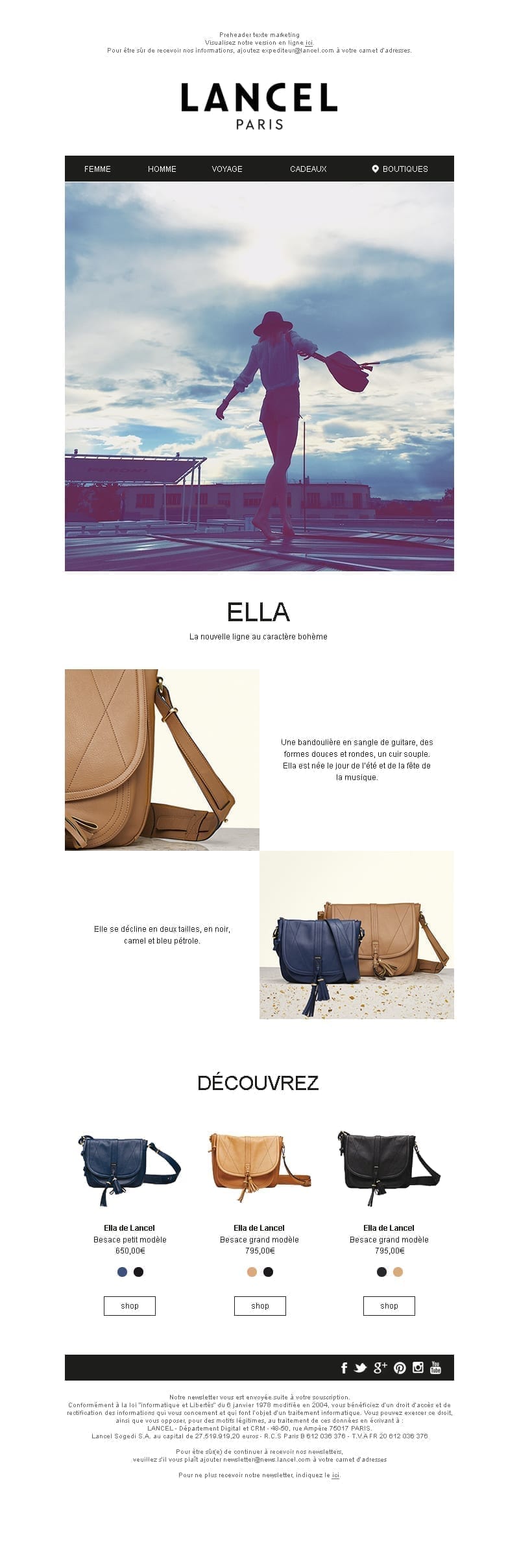
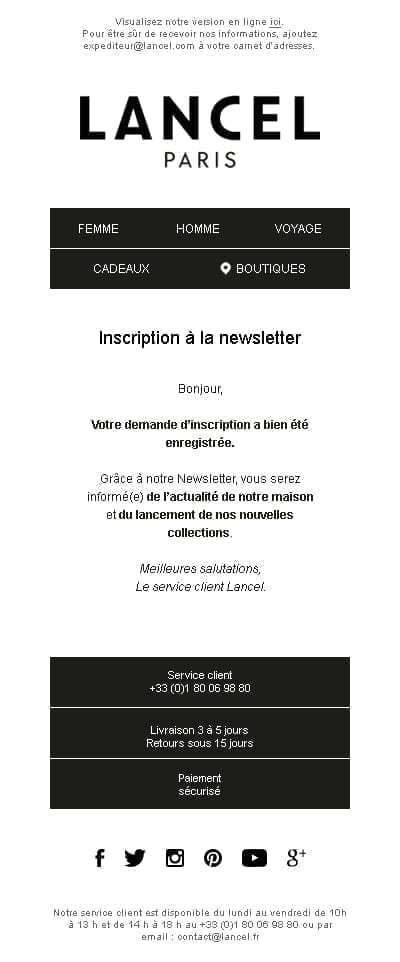
Well then, as I know the web well (Google map is one of my favorite sites)I put in place all the good practices without touching too much the content. So we have a first version, a first draft in a way! The important thing is to establish a cordial contact... But I can't stop there! (Ah well, I was contaminated when I was young and it's like asbestos, it's incurable!)
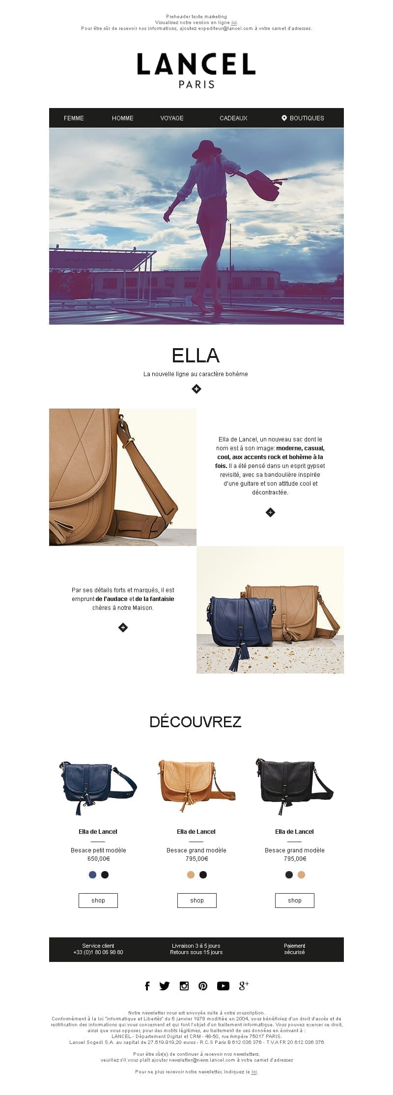
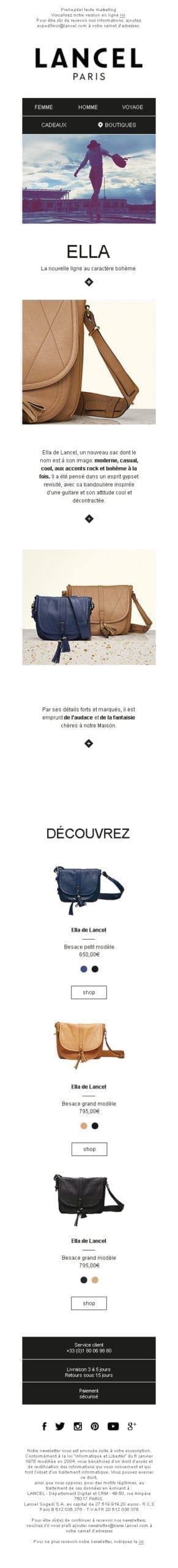
Damn it! Here it is, I have put together a final version! Everything is there! The texts are in HTML, we have a pure text/image ratio, a reminder of the reassurances available on the site, the ctas are in HTML, the cover is reduced and light CTAs have appeared in the title and on the first two product descriptions! And it's inevitable... The responsive version is thought beforehand (let's even talk about " Responsive of the future ", without media queries, let's not be afraid of words!) It allows you to have a responsive result on Gmail app for example, which is not negligible eh, think about it!
What a beautiful gesture, what a beautiful soul! @Lancel, rate your satisfaction on a scale of 1 to 10. Misunderstanding: '3'. Repeat. 😀 And to get to the bottom of it (I am young, rebellious... perfectionist...)I also looked at the service emails from the brand after I received the newsletter subscription confirmation.
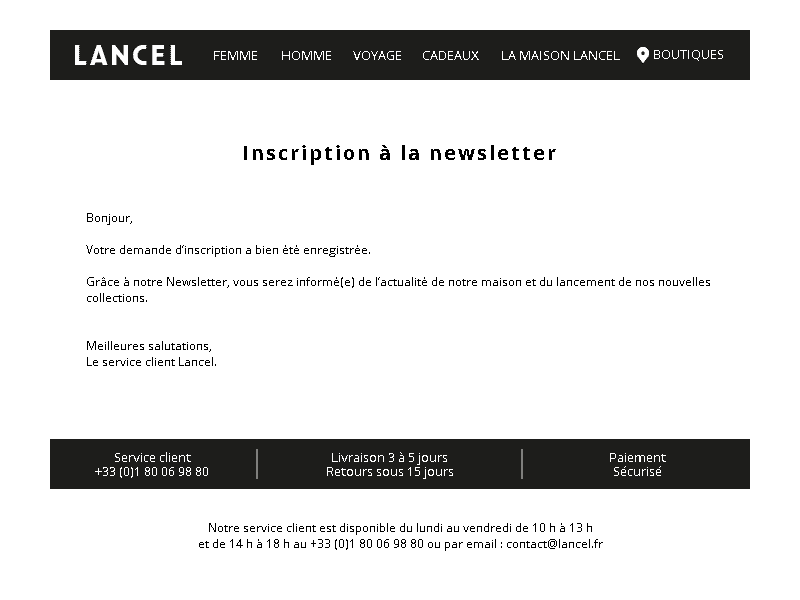
Oh well, you're going to tell me "It's easy, you just have to apply the styles suggested above"? You are right! Well yes, we might as well stay consistent with the redesign and propose a fully responsive service email template too! Here is what it looks like:
Leave a Reply