And here is the first "#PimpMyEmail of the week" to inaugurate this year of emailing optimization ! The concept will temporarily replace the "Badsender of the week" (even if in some emergency cases we will not hesitate to raise the red flag ;-)).
For this first article, we will focus on the Greetings sent by Accor to the members of its loyalty program. This analysis will address both the positive points (to keep) and the negative points (to improve) on 6 different axes:
- Object line
- Ergonomics
- Editorial content
- HTML integration
- Sending technique and deliverability
- Links and landing pages
Obviously there is more to say than what I wrote in this article 😉
Email:
Header:
from: The Accorhotels Club
reply-to: The Accorhotels Club
to: xxx@example.com
date: Fri, Jan 3, 2014 at 5:36 AM
subject: Good news for a GOOD YEAR!
mailed-by: mid.accor-mail.com
signed-by: accor-mail.com
La créa:
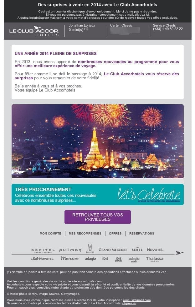
The diagnosis
1. Object line
Positive points to keep
- The object is short
- There is a direct link to the content of the email
Areas for improvement
- There is either a clue missing regarding this good news, or an element that will create a stronger expectation on the part of the reader
- The object is not at all action-oriented
- The use of capital letters on the words "HAPPY NEW YEAR" does indeed make the subject stand out in the list of emails, but remains a bad practice with regard to spam filters (to be put into perspective: if this is the only alert in terms of content filtering, the impact will probably be zero)
- Suggested subject line: "More and more privileges for a happy 2014".
2. Ergonomics
Positive points to keep
- Presence of a pre-header, even if it could have been highlighted
- Reminder of the number of points accumulated directly in the upper part of the email
- The presence of the customer service phone number (however, this appears in blue when the phone number is automatically transformed into a link by the email client, to be changed in the HTML code)
Areas for improvement
- There are too many elements present in the pre-header. There is no need for a mirror link when a call to action is present in the pre-header and the sentence "This is a send only email. Please do not respond" should not exist.
- You have to wait more than 600 pixels before you see the main call-to-action of the email (the one directly linked to the subject line).
- The size of the text in the footer makes it very difficult to read, even though it contains important information such as the unsubscribe link (don't forget that the subscriber will tend to click on the spam button if he doesn't find the unsubscribe link)
3. Editorial content
Positive points to keep
- Nothing
Areas for improvement
- The email keeps talking about privileges, surprises, new features, ... without ever mentioning any concrete element. You absolutely have to click to find something concrete, but the calls to action remain dull and therefore not very effective. This could have worked if the editorial content was oriented towards surprise, with for example a title like: "Can't wait to discover what we have prepared for you for 2014? But it doesn't.
4. HTML integration
Positive points to keep
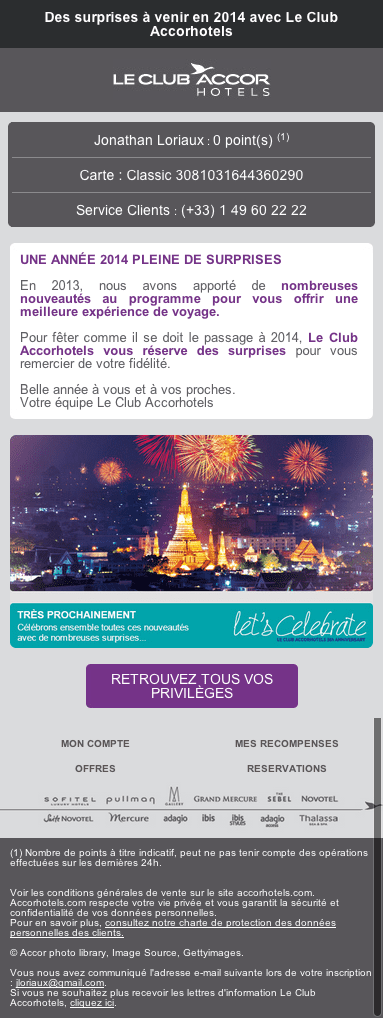
- The email is designed to be adapted on mobile devices (see screenshot at the end of the article), but I didn't take the time to do any compatibility tests.
Areas for improvement
- Nothing
5. Sending technique and deliverability
Positive points to keep
- The ratio text/image is correct, but not more.
- SPF and DKIM are configured correctly
Areas for improvement
- A text version is present, but it is too far from the text present in the HTML version.
- Using a sub-domain of accorhotels.com as the email sender would probably have been a good choice.
- The IP address that sent me the email is listed at Spamhaus.
- The link/no link ratio is very bad, there are links almost everywhere.
6. Links and landing pages
List of links and landing pages
- Pre-header: https://www.accorhotels.com/fr/leclub/benefits/offers.shtml
- Logo : https://secure.accorhotels.com/fr/leclub/index-no-connect.shtml
- Text box: https://www.accorhotels.com/fr/leclub/benefits/offers.shtml
- Large image: https://www.accorhotels.com/fr/leclub/benefits/offers.shtml
- Let's celebrate" banner: https://www.accorhotels.com/fr/leclub/benefits/offers.shtml
- Call to action: https://www.accorhotels.com/fr/leclub/benefits/offers.shtml
Positive points to keep
- The landing page is very well done! We would have liked to find these elements directly in the email, it would have allowed to skip a step in the conversion funnel.
Areas for improvement
- Nothing (or so little)
7. Other areas for improvement
- It should be possible to reply directly to the email to contact customer services and therefore remove the phrase "This is a sending email only. Please do not reply to it." (especially since a phone number is available to contact customer service).
Leave a Reply