Email accessibility diagnostics: Case study with WWF
published on ,
updated on
WWF has been a Badsender customer since 2021. We recently offered to diagnose the accessibility of their emails and update their HTML template based on the results obtained. For the past 4 years, we have supported them in their choice and migration to the Selligent/Marigold platform, as well as in their email production via the LePatron email builder. Our expertise now covers the writing of marketing automation emails and newsletters, the creation of a preference center, and deliverability issues. In short, we're their point of reference for everything to do with emailing and CRM.
This article is freely available.
It took time and expertise!
This month, thanks to our customer-sponsors: Actito, BPI France, Cardif, Citeo, Clarins, CMI France, Editis, Engie, France Télévisions, Le Parisien, Les Echos, Les Furets, Pierre Fabre, UMR, Voyageurs du monde... Thanks to the missions they entrust to us, we can write and share free content. They support our educational work to promote more responsible email. Become a customer and benefit from our expertise while supporting the production of open knowledge.
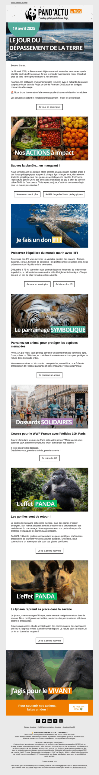
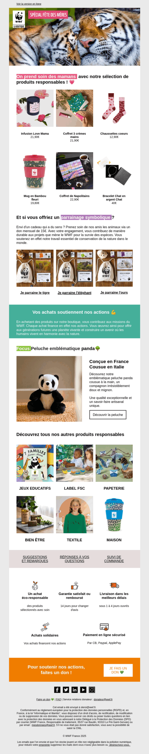
We analyzed two emails created with the LePatron email builder and distributed via the Selligent platform. These emails were evaluated according to our analysis grid comprising 57 accessibility criteria.
Email Newsletter
Product email type
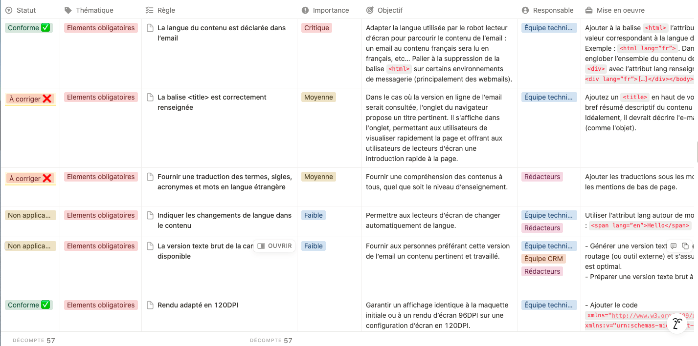
Our email accessibility evaluation grid :
There is no standard for email accessibility, as there is for the web with the RGAA (Référentiel Général d'Amélioration de l'Accessibilité). It's a gap we'd like to fill (but that's another subject ;).
To fill this gap and still educate our community about email accessibility issues, we at Badsender have developed our own grid inspired by web standards.
Our grid is made up of 57 criteria. Like web reference systems, they are organized into themes Information: consultation, colors, data, mandatory elements, images, links, navigation, information presentation, copywriting, information structure and tables.
Each criterion therefore includes the thematic to which it belongs, therule statementhis objectivehis level of importance (critical, medium, low) and the team in charge implementation (design, integrator, copywriting, marketing team).
Main results of the WWF email accessibility diagnosis
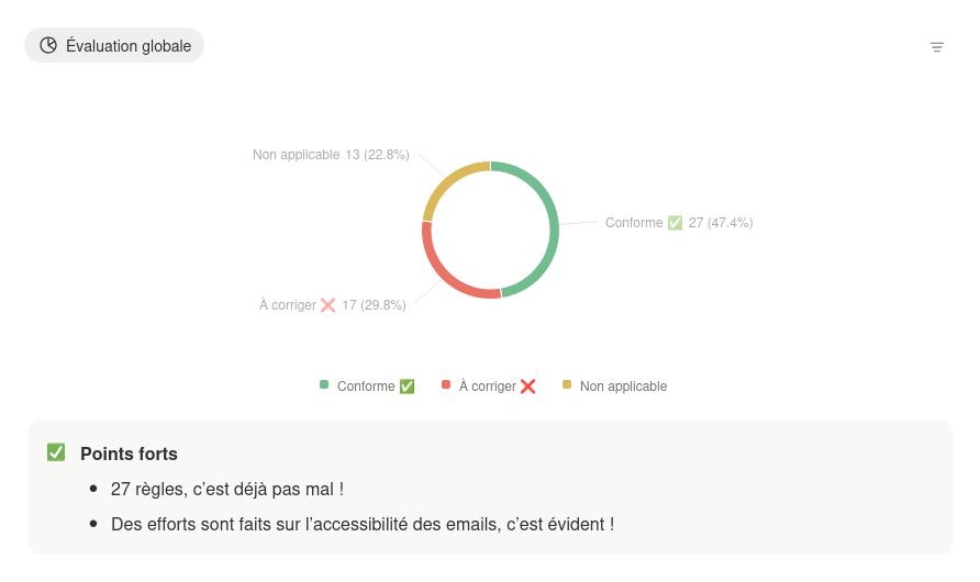
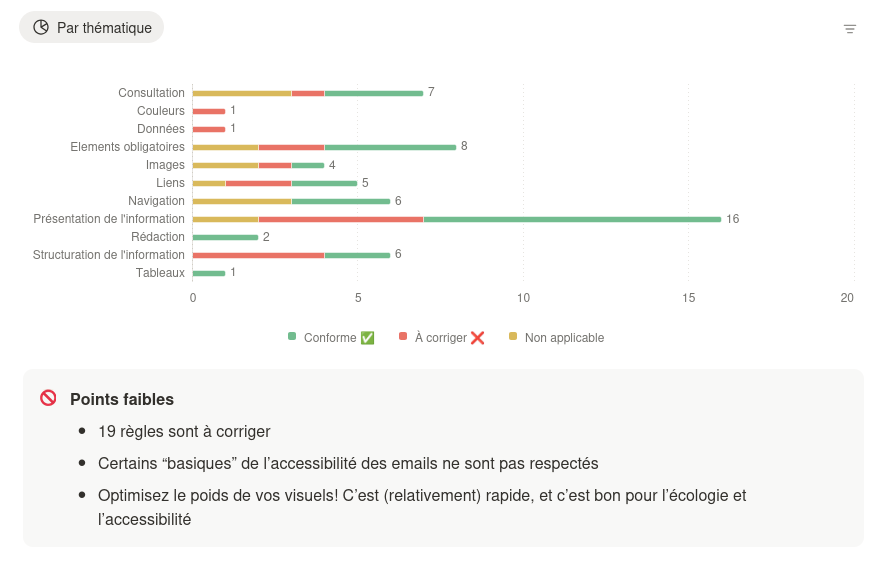
The "Newsletter" email received 27 out of 57 rules respected.
The "Product" email received 29 out of 57 rules respected.
For each email, the grid is filled in and an overall summary is produced for greater clarity.
Example of an email accessibility measurement gridExample of a global accessibility evaluation for an email - Part 1Example of a global accessibility evaluation for an email - Part 2
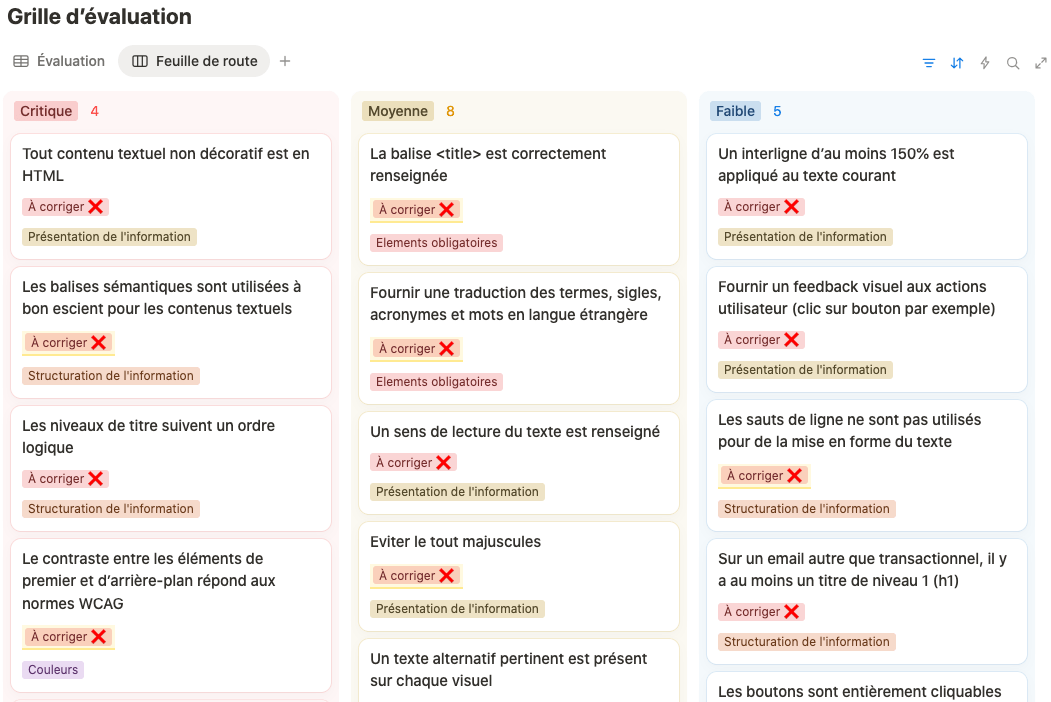
The analysis of the two emails highlights recurring anomalies which have been compiled in a summary document and prioritized according to their importance: critical, medium or low. This organization makes it possible to identify at a glance the roadmap to follow.
Example of a roadmap
Below is a selection of representative criteria. We can't detail all 57 criteria evaluated, so we've chosen the most relevant from our work with WWF 😉
Some texts are not in HTML but in images
Importance Review
Category Information presentation
Manager : Studio Design, Copywriters
Objective To ensure that all text content can be browsed and read easily by a screen reader. Ensure that information is accessible even when images are disabled. In particular, titles and buttons
This is one of the most frequent errors we observe in our diagnoses.
HTML structure often lacks semantics
Importance : Review
Theme: Structuring information
Manager : Technical team, Editors
Objective Enable screen readers to distinguish text hierarchies: headings, subheadings, paragraphs, bulleted lists, etc.
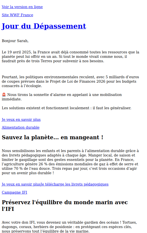
By removing the style (CSS), we can see that the HTML document has no title structure and therefore no hierarchy of information: the titles are simple paragraphs👇
This is what the email should have looked like by adding semantic tags to the HTML code 👇
The color contrasts frequently prove insufficient
Importance : Review
Theme: Colors
Manager: Studio Design
Objective: Optimize text legibility by ensuring sufficient contrast between foreground and background elements. Aim for a ratio of at least 4.5:1 for standard text and 3:1 for large text, in accordance with the Web Content Accessibility Guidelines (WCAG).
This is one of the major errors we most frequently observe in our email accessibility diagnostics. This point is often the subject of debate concerning the graphic charter. In fact, the colors used are part of the graphic charter which, in principle, should have been designed with accessibility criteria in mind, "in principle".
This puts into tension the aesthetic decisions made by a small group of people and the objective reality of the contrast measures required for accessibility.
The tag </code> is not correctly filled in</h3><ul
class="wp-block-list"><li><strong>Importance :</strong> Average</li><li><strong>Themes</strong> Mandatory elements</li><li><strong>Manager:</strong> Technical team</li><li><strong>Objective:</strong> This is the title of your HTML document, and must be present for the document to be valid. In the event that the online version of the e-mail is consulted, the browser tab proposes a relevant title. It is displayed in the tab, allowing users to quickly visualize the page and providing screen reader users with a quick introduction to the page.</li></ul><figure
class="wp-block-image size-full"><a
href="https://www.badsender.com/wp-content/uploads/2025/09/balise-title.png"><img
loading="lazy" decoding="async" width="646" height="230" src="https://www.badsender.com/wp-content/uploads/2025/09/balise-title.png" alt="" class="wp-image-573908" srcset="https://www.badsender.com/wp-content/uploads/2025/09/balise-title.png 646w, https://www.badsender.com/wp-content/uploads/2025/09/balise-title-300x107.png 300w, https://www.badsender.com/wp-content/uploads/2025/09/balise-title-18x6.png 18w" sizes="(max-width: 646px) 100vw, 646px" /></a><figcaption
class="wp-element-caption">The title tag is filled in here. It was not in the analyzed email.</figcaption></figure><h3 class="wp-block-heading" id="h-les-images-ne-disposent-pas-systematiquement-d-alternatives-textuelles-appropriees">The <strong>images do not always have suitable text alternatives</strong></h3><ul
class="wp-block-list"><li><strong>Importance</strong> : Average</li><li><strong>Themes</strong> : Images</li><li><strong>Manager</strong> Editors</li><li><strong>Objective</strong> Provide a text alternative that can be read by a screen reader on useful visuals. Do not provide one for decorative visuals.</li></ul><p>This is also a common mistake. The question remains as to which images are considered useful or decorative. This may seem straightforward at first glance, but debates can sometimes arise on this issue.</p><figure
class="wp-block-image size-full"><a
href="https://www.badsender.com/wp-content/uploads/2025/09/text-alternatif-non-approprie.png"><img
loading="lazy" decoding="async" width="578" height="399" src="https://www.badsender.com/wp-content/uploads/2025/09/text-alternatif-non-approprie.png" alt="" class="wp-image-573909" srcset="https://www.badsender.com/wp-content/uploads/2025/09/text-alternatif-non-approprie.png 578w, https://www.badsender.com/wp-content/uploads/2025/09/text-alternatif-non-approprie-300x207.png 300w, https://www.badsender.com/wp-content/uploads/2025/09/text-alternatif-non-approprie-18x12.png 18w" sizes="(max-width: 578px) 100vw, 578px" /></a><figcaption
class="wp-element-caption">In this example, the textual information should have been written as text and not as an image. If this is not the option chosen, the alternative text must repeat word for word the text contained in the visual. In the example above, the date information is lost.</figcaption></figure><figure
class="wp-block-image size-full is-resized"><a
href="https://www.badsender.com/wp-content/uploads/2025/09/texte-alt-non-appropriee-2.png"><img
loading="lazy" decoding="async" width="578" height="335" src="https://www.badsender.com/wp-content/uploads/2025/09/texte-alt-non-appropriee-2.png" alt="" class="wp-image-573910" style="width:720px;height:auto" srcset="https://www.badsender.com/wp-content/uploads/2025/09/texte-alt-non-appropriee-2.png 578w, https://www.badsender.com/wp-content/uploads/2025/09/texte-alt-non-appropriee-2-300x174.png 300w, https://www.badsender.com/wp-content/uploads/2025/09/texte-alt-non-appropriee-2-18x10.png 18w" sizes="(max-width: 578px) 100vw, 578px" /></a><figcaption
class="wp-element-caption">Same thing here: the title should have been taken out of the image and written in HTML. As a result, the actual image would have been purely decorative. And a decorative image doesn't require the alternative text to be filled in. In this case, it should be left empty.</figcaption></figure><h3 class="wp-block-heading" id="h-certains-textes-titres-sont-en-tout-majuscule">Some texts (titles) are in ALL CAPS</h3><ul
class="wp-block-list"><li><strong>Importance</strong> : Average</li><li><strong>Themes</strong> Information presentation</li><li><strong>Manager</strong> Studio design, copywriters</li><li><strong>Objective</strong> : Screen readers are not very good at distinguishing capital letters from abbreviations.</li></ul><p>A common error we see in our diagnostics: titles, sometimes more than 2 or 3 lines long, entirely in uppercase. If you still wish to capitalize a short title, do so by applying a style (CSS) and not by typing it in.</p><h3 class="wp-block-heading" id="h-et-bien-d-autres-criteres-evalues">And many other evaluated criteria:</h3><ul
class="wp-block-list"><li>Typography is not always adapted to the needs of visually impaired users.</li><li>Avoid all-caps text</li><li>The wording of CTAs (Call To Action) sometimes lacks clarity and generates non-explicit links (e.g.: to find out more, click here).</li><li>Reading direction</li><li>...</li></ul><h2 class="wp-block-heading" id="h-une-fois-les-diagnostics-accesibilite-email-faits-que-fait-on">Once the accesibility email diagnostics have been carried out, what happens next?</h2><p>Three main areas for improvement have been identified:</p><ol
class="wp-block-list"><li>Technical template optimization</li><li>Setting up a production methodology</li><li>Team training</li></ol><h3 class="wp-block-heading" id="h-optimisation-technique-du-template"><strong>Technical template optimization</strong></h3><p>A revision of the HTML code was necessary to reinforce semantics, improve language attribute management and ensure better compatibility with screen readers. The WWF HTML template implemented in the LePatron email builder has been optimized for this purpose.</p><p>Several accessibility issues have been corrected:</p><ul
class="wp-block-list"><li>The title tag</li><li>Language declaration</li><li>Semantic markup</li><li>The presence of at least one entry-level qualification (h1)</li><li>The addition of a "level" option on blocks or elements with titles to ensure that the appropriate semantic tag is used in the HTML code.</li></ul><figure
class="wp-block-image size-full"><a
href="https://www.badsender.com/wp-content/uploads/2025/09/level-email-builder.png"><img
loading="lazy" decoding="async" width="673" height="288" src="https://www.badsender.com/wp-content/uploads/2025/09/level-email-builder.png" alt="" class="wp-image-573911" srcset="https://www.badsender.com/wp-content/uploads/2025/09/level-email-builder.png 673w, https://www.badsender.com/wp-content/uploads/2025/09/level-email-builder-300x128.png 300w, https://www.badsender.com/wp-content/uploads/2025/09/level-email-builder-18x8.png 18w" sizes="(max-width: 673px) 100vw, 673px" /></a><figcaption
class="wp-element-caption">Option Level selects the corresponding semantic title tag. It is completely dissociated from the other style options for its formatting.</figcaption></figure><h3 class="wp-block-heading" id="h-mise-en-place-d-une-methodologie-de-production"><strong>Setting up a production methodology</strong></h3><p>Implementing systematic processes for managing accessible content (text alternatives, color contrast, content hierarchy) will significantly improve email quality. Teams have access to the analysis grid and can refer to it as a checklist. In addition, the document contains a list of online tools and resources, so they can carry out more in-depth checks if required.</p><h3 class="wp-block-heading" id="h-formation-des-equipes"><strong>Team training</strong></h3><p>A program of awareness-raising and training in digital and email accessibility best practices will enhance the skills of production teams and ensure that these issues are taken into account on a daily basis.</p><p>These improvements will enable WWF to move towards compliance with legal obligations while offering a better user experience to all its recipients.</p><h2 class="wp-block-heading" id="h-conclusion">Conclusion</h2><p>The major advantage of this diagnostic is that it generates a clear roadmap of anomalies to be corrected, organized in order of priority. It identifies precisely which team needs to intervene for each correction. This approach is both rapid and particularly effective. Don't hesitate to <a
href="https://www.badsender.com/en/contact/">contact us</a> if you would like to benefit from such a diagnosis!</p>
</div><div
class="wp-block-template-part"><div
class="wp-block-group has-yellow-background-color has-background has-global-padding is-layout-constrained wp-container-core-group-is-layout-3c5fb580 wp-block-group-is-layout-constrained" style="padding-top:var(--wp--preset--spacing--24);padding-right:var(--wp--preset--spacing--24);padding-bottom:var(--wp--preset--spacing--24);padding-left:var(--wp--preset--spacing--24)"><div
class="wp-block-columns alignwide is-layout-flex wp-container-core-columns-is-layout-28f84493 wp-block-columns-is-layout-flex"><div
class="wp-block-column is-vertically-aligned-center is-layout-flow wp-block-column-is-layout-flow"><h2 class="wp-block-heading has-title-4-font-size">Support the "<span
lang="en">Email Expiration Date</span>"</h2></div><div
class="wp-block-column is-layout-flow wp-container-core-column-is-layout-6be150da wp-block-column-is-layout-flow"><p>
<strong><a
href="https://www.brevo.com/fr/">Brevo</a> and <a
href="https://www.cofidis.fr/fr/index.html">Cofidis</a> financially support the project.</strong> Join the movement and together, let's make the email industry take responsibility for the climate emergency.</p><div
class="wp-block-buttons is-layout-flex wp-block-buttons-is-layout-flex"><div
class="wp-block-button"><a
class="wp-block-button__link wp-element-button" href="https://www.badsender.com/en/support-expiration-date-email/">I want to know more</a></div></div></div></div></div></div></div><div
class="wp-block-template-part"><div
class="wp-block-group badsender-parts-share has-global-padding is-layout-constrained wp-container-core-group-is-layout-82681d98 wp-block-group-is-layout-constrained" style="padding-top:var(--wp--preset--spacing--24);padding-bottom:var(--wp--preset--spacing--24);"><p
class="has-text-align-center has-large-font-size">
<strong>Share</strong></p><ul
class="wp-block-social-links has-icon-color has-icon-background-color is-horizontal is-content-justification-center is-layout-flex wp-container-core-social-links-is-layout-a4fb9466 wp-block-social-links-is-layout-flex"><li
style="color:#FFFFFF;background-color:#000000;" class="wp-social-link wp-social-link-facebook has-base-color has-contrast-background-color wp-block-social-link"><a
href="https://www.facebook.com/sharer.php?u=https://www.badsender.com/en/2025/09/04/diagnostic-accessibilite-email-cas-wwf/" class="wp-block-social-link-anchor"><svg
width="24" height="24" viewbox="0 0 24 24" version="1.1" xmlns="http://www.w3.org/2000/svg" aria-hidden="true" focusable="false"><path
d="M12 2C6.5 2 2 6.5 2 12c0 5 3.7 9.1 8.4 9.9v-7H7.9V12h2.5V9.8c0-2.5 1.5-3.9 3.8-3.9 1.1 0 2.2.2 2.2.2v2.5h-1.3c-1.2 0-1.6.8-1.6 1.6V12h2.8l-.4 2.9h-2.3v7C18.3 21.1 22 17 22 12c0-5.5-4.5-10-10-10z"></path></svg><span
class="wp-block-social-link-label screen-reader-text">Facebook</span></a></li><li
style="color:#FFFFFF;background-color:#000000;" class="wp-social-link wp-social-link-twitter has-base-color has-contrast-background-color wp-block-social-link"><a
href="https://twitter.com/intent/tweet?text=https://www.badsender.com/en/2025/09/04/diagnostic-accessibilite-email-cas-wwf/" class="wp-block-social-link-anchor"><svg
width="24" height="24" viewbox="0 0 24 24" version="1.1" xmlns="http://www.w3.org/2000/svg" aria-hidden="true" focusable="false"><path
d="M22.23,5.924c-0.736,0.326-1.527,0.547-2.357,0.646c0.847-0.508,1.498-1.312,1.804-2.27 c-0.793,0.47-1.671,0.812-2.606,0.996C18.324,4.498,17.257,4,16.077,4c-2.266,0-4.103,1.837-4.103,4.103 c0,0.322,0.036,0.635,0.106,0.935C8.67,8.867,5.647,7.234,3.623,4.751C3.27,5.357,3.067,6.062,3.067,6.814 c0,1.424,0.724,2.679,1.825,3.415c-0.673-0.021-1.305-0.206-1.859-0.513c0,0.017,0,0.034,0,0.052c0,1.988,1.414,3.647,3.292,4.023 c-0.344,0.094-0.707,0.144-1.081,0.144c-0.264,0-0.521-0.026-0.772-0.074c0.522,1.63,2.038,2.816,3.833,2.85 c-1.404,1.1-3.174,1.756-5.096,1.756c-0.331,0-0.658-0.019-0.979-0.057c1.816,1.164,3.973,1.843,6.29,1.843 c7.547,0,11.675-6.252,11.675-11.675c0-0.178-0.004-0.355-0.012-0.531C20.985,7.47,21.68,6.747,22.23,5.924z"></path></svg><span
class="wp-block-social-link-label screen-reader-text">Twitter</span></a></li><li
style="color:#FFFFFF;background-color:#000000;" class="wp-social-link wp-social-link-linkedin has-base-color has-contrast-background-color wp-block-social-link"><a
href="https://www.linkedin.com/sharing/share-offsite/?url=https://www.badsender.com/en/2025/09/04/diagnostic-accessibilite-email-cas-wwf/" class="wp-block-social-link-anchor"><svg
width="24" height="24" viewbox="0 0 24 24" version="1.1" xmlns="http://www.w3.org/2000/svg" aria-hidden="true" focusable="false"><path
d="M19.7,3H4.3C3.582,3,3,3.582,3,4.3v15.4C3,20.418,3.582,21,4.3,21h15.4c0.718,0,1.3-0.582,1.3-1.3V4.3 C21,3.582,20.418,3,19.7,3z M8.339,18.338H5.667v-8.59h2.672V18.338z M7.004,8.574c-0.857,0-1.549-0.694-1.549-1.548 c0-0.855,0.691-1.548,1.549-1.548c0.854,0,1.547,0.694,1.547,1.548C8.551,7.881,7.858,8.574,7.004,8.574z M18.339,18.338h-2.669 v-4.177c0-0.996-0.017-2.278-1.387-2.278c-1.389,0-1.601,1.086-1.601,2.206v4.249h-2.667v-8.59h2.559v1.174h0.037 c0.356-0.675,1.227-1.387,2.526-1.387c2.703,0,3.203,1.779,3.203,4.092V18.338z"></path></svg><span
class="wp-block-social-link-label screen-reader-text">LinkedIn</span></a></li><li
style="color:#FFFFFF;background-color:#000000;" class="wp-social-link wp-social-link-mail has-base-color has-contrast-background-color wp-block-social-link"><a
href="mailto:?body=https://www.badsender.com/en/2025/09/04/diagnostic-accessibilite-email-cas-wwf/" class="wp-block-social-link-anchor"><svg
width="24" height="24" viewbox="0 0 24 24" version="1.1" xmlns="http://www.w3.org/2000/svg" aria-hidden="true" focusable="false"><path
d="M19,5H5c-1.1,0-2,.9-2,2v10c0,1.1.9,2,2,2h14c1.1,0,2-.9,2-2V7c0-1.1-.9-2-2-2zm.5,12c0,.3-.2.5-.5.5H5c-.3,0-.5-.2-.5-.5V9.8l7.5,5.6,7.5-5.6V17zm0-9.1L12,13.6,4.5,7.9V7c0-.3.2-.5.5-.5h14c.3,0,.5.2.5.5v.9z"></path></svg><span
class="wp-block-social-link-label screen-reader-text">Mail</span></a></li></ul></div></div><div
class="wp-block-template-part"></div></div><div
class="wp-block-group alignfull has-grey-background-background-color has-background has-global-padding is-layout-constrained wp-container-core-group-is-layout-c6c95727 wp-block-group-is-layout-constrained" style="padding-top:3.75rem;padding-bottom:3.75rem;margin-top:0;margin-bottom:0;"><div
class="wp-block-group has-global-padding is-layout-constrained wp-container-core-group-is-layout-2815f435 wp-block-group-is-layout-constrained"><h2 class="wp-block-heading has-title-4-font-size" style="margin-bottom:var(--wp--preset--spacing--24)">The author</h2><div
class="wp-block-columns is-layout-flex wp-container-core-columns-is-layout-19b4936f wp-block-columns-is-layout-flex"><div
class="wp-block-column is-layout-flow wp-block-column-is-layout-flow" style="flex-basis:7.5rem;"><div
class="wp-block-avatar"><a
href="https://www.badsender.com/en/author/marion-duchatelet/" target="_self" class="wp-block-avatar__link"><img
alt='Marion Duchatelet Avatar' src='https://secure.gravatar.com/avatar/bc9f200f31a36dbdcfad6cabd9934ab9f3382ad111e7f7a36ef5320416453fd7?s=120&d=mm&r=g' srcset='https://secure.gravatar.com/avatar/bc9f200f31a36dbdcfad6cabd9934ab9f3382ad111e7f7a36ef5320416453fd7?s=240&d=mm&r=g 2x' class='avatar avatar-120 photo wp-block-avatar__image' height='120' width='120' decoding='async'/></a></div></div><div
class="wp-block-column is-layout-flow wp-block-column-is-layout-flow"><div
class="wp-block-post-author-name"><a
href="https://www.badsender.com/en/author/marion-duchatelet/" target="_self" class="wp-block-post-author-name__link">Marion Duchatelet</a></div><div
style="margin-top:0;margin-bottom:var(--wp--preset--spacing--16);" class="wp-block-post-author-biography">Coming from a commercial background, Marion has been working for Cabestan for almost 10 years, where she accompanied the evolution of the solution in terms of marketing and communication before becoming Marketing Director. After a two-year stint in a data agency, Marion now assists Badsender's clients in the evolution of their emailing and eCRM strategies.</div><div
class="wp-block-buttons is-layout-flex wp-block-buttons-is-layout-flex"><div
class="wp-block-button is-style-fill"><a
href="https://www.badsender.com/en/author/marion-duchatelet/" class="wp-block-button__link has-base-color has-contrast-background-color has-text-color has-background has-link-color wp-element-button">All publications<span
class="screen-reader-text"> by Marion Duchatelet</span></a></div></div></div></div></div><div
class="wp-block-columns is-layout-flex wp-container-core-columns-is-layout-6a93bd4a wp-block-columns-is-layout-flex" style="border-top-color:var(--wp--preset--color--grey-border);border-top-style:solid;border-top-width:1px;margin-top:var(--wp--preset--spacing--48);padding-top:var(--wp--preset--spacing--24)"><div
class="wp-block-column is-layout-flow wp-block-column-is-layout-flow"><div
class="post-navigation-link-previous wp-block-post-navigation-link"><span
class="post-navigation-link__label">Previous</span> <a
href="https://www.badsender.com/en/2025/08/16/b2b-delivery-blocked-emails/" rel="prev">B2B Deliverability: Why your business emails aren't reaching the inbox (and what to do about it)?</a></div></div><div
class="wp-block-column is-layout-flow wp-block-column-is-layout-flow"><div
class="post-navigation-link-next wp-block-post-navigation-link"><span
class="post-navigation-link__label">Next</span> <a
href="https://www.badsender.com/en/2025/09/08/user-notice/" rel="next">User.com: A new multi-channel marketing automation platform arrives in France</a></div></div></div></div><div
class="wp-block-group alignfull has-base-background-color has-background has-global-padding is-layout-constrained wp-container-core-group-is-layout-c6c95727 wp-block-group-is-layout-constrained" style="padding-top:3.75rem;padding-bottom:3.75rem;margin-top:0;margin-bottom:0;"><div
class="wp-block-group has-global-padding is-layout-constrained wp-container-core-group-is-layout-2815f435 wp-block-group-is-layout-constrained"><div
id="respond" class="comment-respond wp-block-post-comments-form"><h3 id="reply-title" class="comment-reply-title">Leave a Reply <small><a
rel="nofollow" id="cancel-comment-reply-link" href="/en/2025/09/04/diagnostic-accessibilite-email-cas-wwf/#respond" style="display:none;">Cancel reply</a></small></h3><form
action="https://www.badsender.com/wp-comments-post.php" method="post" id="commentform" class="comment-form" data-trp-original-action="https://www.badsender.com/wp-comments-post.php"><p
class="comment-notes"><span
id="email-notes">Your email address will not be published.</span> <span
class="required-field-message">Required fields are marked <span
class="required">*</span></span></p><p
class="comment-form-comment"><label
for="comment">How <span
class="required">*</span></label><textarea id="comment" name="comment" cols="45" rows="8" maxlength="65525" required></textarea></p><p
class="comment-form-author"><label
for="author">Name <span
class="required">*</span></label> <input
id="author" name="author" type="text" value="" size="30" maxlength="245" autocomplete="name" required /></p><p
class="comment-form-email"><label
for="email">Email <span
class="required">*</span></label> <input
id="email" name="email" type="email" value="" size="30" maxlength="100" aria-describedby="email-notes" autocomplete="email" required /></p><p
class="comment-form-url"><label
for="url">Website</label> <input
id="url" name="url" type="url" value="" size="30" maxlength="200" autocomplete="url" /></p><p
class="comment-form-cookies-consent"><input
id="wp-comment-cookies-consent" name="wp-comment-cookies-consent" type="checkbox" value="yes" /> <label
for="wp-comment-cookies-consent">Save my name, email, and website in this browser for the next time I comment.</label></p><p
class="form-submit"><input
name="submit" type="submit" id="submit" class="submit" value="Post Comment" /> <input
type='hidden' name='comment_post_ID' value='573898' id='comment_post_ID' />
<input
type='hidden' name='comment_parent' id='comment_parent' value='0' /></p><p
style="display: none;"><input
type="hidden" id="akismet_comment_nonce" name="akismet_comment_nonce" value="e36c6fb1a0" /></p><p
style="display: none !important;" class="akismet-fields-container" data-prefix="ak_"><label>Δ<textarea name="ak_hp_textarea" cols="45" rows="8" maxlength="100"></textarea></label><input
type="hidden" id="ak_js_1" name="ak_js" value="145"/><script>document.getElementById("ak_js_1").setAttribute("value",(new Date()).getTime())</script></p><input type="hidden" name="trp-form-language" value="en"/></form></div></div></div></main><div
class="wp-block-template-part"><footer
data-elementor-type="footer" data-elementor-id="14487" class="elementor elementor-14487 elementor-location-footer" data-elementor-post-type="elementor_library"><div
class="elementor-element elementor-element-24ba4e8 e-flex e-con-boxed e-con e-parent" data-id="24ba4e8" data-element_type="container" data-settings="{"background_background":"classic"}"><div
class="e-con-inner"><div
class="elementor-element elementor-element-1144a85 e-con-full e-flex e-con e-child" data-id="1144a85" data-element_type="container"><div
class="elementor-element elementor-element-c3f1376 elementor-widget elementor-widget-image" data-id="c3f1376" data-element_type="widget" data-widget_type="image.default"><div
class="elementor-widget-container">
<a
href="https://www.badsender.com/en/">
<img
loading="lazy" decoding="async" width="192" height="48" src="https://www.badsender.com/wp-content/uploads/2023/06/Logo.svg" class="attachment-full size-full wp-image-559948" alt="Badsender" /> </a></div></div><div
class="elementor-element elementor-element-3ed2e47 elementor-widget elementor-widget-text-editor" data-id="3ed2e47" data-element_type="widget" data-widget_type="text-editor.default"><div
class="elementor-widget-container"><p>Committed experts in emailing, deliverability and CRM</p></div></div></div><div
class="elementor-element elementor-element-788e8cc e-con-full e-flex e-con e-child" data-id="788e8cc" data-element_type="container"><div
class="elementor-element elementor-element-8da28b5 elementor-widget elementor-widget-text-editor" data-id="8da28b5" data-element_type="widget" data-widget_type="text-editor.default"><div
class="elementor-widget-container"><p>Follow us <a
href="https://www.badsender.com/en/newsletter/registration/">via our newsletter</a>on <a
href="https://www.linkedin.com/company/badsender/" target="_blank" rel="noopener">Linkedin</a>, <a
href="https://www.youtube.com/channel/UCgRBfIEah50OIsdXlYclZxw" target="_blank" rel="noopener">Youtube</a>, <a
href="https://www.badsender.com/en/articles/feed/">in RSS feed</a><br
/>Podcast Badsender (<a
href="https://open.spotify.com/show/3YZTeq2TpICcNByyXZdd3n">Spotify</a>, <a
href="https://podcasts.apple.com/us/podcast/badsender-agitateurs-demails/id1504855049">Apple Podcast</a>, <a
href="https://www.deezer.com/fr/show/991392">Deezer</a>)<br
/>Non mais concrètement podcast (<a
href="https://open.spotify.com/show/4zQjgAEaOBLvDHtKU3YHUz">Spotify</a>, <a
href="https://podcasts.apple.com/fr/podcast/non-mais-concr%C3%A8tement-comment-on-fait-la-transition/id1647802411">Apple Podcast</a>, <a
href="https://www.deezer.com/fr/show/4703327">Deezer</a>)<br
/>2025 - Badsender</p></div></div><div
class="elementor-element elementor-element-a92a3c9 elementor-widget elementor-widget-text-editor" data-id="a92a3c9" data-element_type="widget" data-widget_type="text-editor.default"><div
class="elementor-widget-container"><p>Website illustrations sourced from <a
href="https://icones8.fr/illustrations/style--3d-flame" target="_blank" rel="noopener">Icons8 (Flame 3D library)</a> and thanks to <a
href="https://dribbble.com/thierryfousse" target="_blank" rel="noopener">the wonderful work by Thierry Fousse</a> ! Images highlighting the articles, most of them from the website <a
href="https://unsplash.com/">Unsplash.com</a>.</p></div></div></div><div
class="elementor-element elementor-element-f43e598 e-con-full e-flex e-con e-child" data-id="f43e598" data-element_type="container"><div
class="elementor-element elementor-element-7c5338b elementor-nav-menu--dropdown-none elementor-nav-menu__align-end elementor-widget elementor-widget-nav-menu" data-id="7c5338b" data-element_type="widget" data-settings="{"layout":"vertical","submenu_icon":{"value":"<i class=\"\"><\/i>","library":""}}" data-widget_type="nav-menu.default"><div
class="elementor-widget-container"><nav
aria-label="Menu" class="elementor-nav-menu--main elementor-nav-menu__container elementor-nav-menu--layout-vertical e--pointer-none"><ul
id="menu-1-7c5338b" class="elementor-nav-menu sm-vertical"><li
class="menu-item menu-item-type-post_type menu-item-object-page menu-item-privacy-policy menu-item-508446"><a
rel="privacy-policy" href="https://www.badsender.com/en/private-life/" class="elementor-item">Privacy Policy</a></li><li
class="menu-item menu-item-type-post_type menu-item-object-page menu-item-508444"><a
href="https://www.badsender.com/en/endorsements/" class="elementor-item">Legal information</a></li></ul></nav><nav
class="elementor-nav-menu--dropdown elementor-nav-menu__container" aria-hidden="true"><ul
id="menu-2-7c5338b" class="elementor-nav-menu sm-vertical"><li
class="menu-item menu-item-type-post_type menu-item-object-page menu-item-privacy-policy menu-item-508446"><a
rel="privacy-policy" href="https://www.badsender.com/en/private-life/" class="elementor-item" tabindex="-1">Privacy Policy</a></li><li
class="menu-item menu-item-type-post_type menu-item-object-page menu-item-508444"><a
href="https://www.badsender.com/en/endorsements/" class="elementor-item" tabindex="-1">Legal information</a></li></ul></nav></div></div></div></div></div></footer></div></div>
<template
id="tp-language" data-tp-language="en_US"></template><script type="speculationrules">
{"prefetch":[{"source":"document","where":{"and":[{"href_matches":"/en/*"},{"not":{"href_matches":["/wp-*.php","/wp-admin/*","/wp-content/uploads/*","/wp-content/*","/wp-content/plugins/*","/wp-content/themes/badsender/*","/wp-content/themes/hello-elementor/*","/en/*\\?(.+)"]}},{"not":{"selector_matches":"a[rel~=\"nofollow\"]"}},{"not":{"selector_matches":".no-prefetch, .no-prefetch a"}}]},"eagerness":"conservative"}]}
</script> <div
id="cmplz-cookiebanner-container"><div
class="cmplz-cookiebanner cmplz-hidden banner-1 bottom-right-view-preferences optin cmplz-bottom-right cmplz-categories-type-view-preferences" aria-modal="true" data-nosnippet="true" role="dialog" aria-live="polite" aria-labelledby="cmplz-header-1-optin" aria-describedby="cmplz-message-1-optin"><div
class="cmplz-header"><div
class="cmplz-logo"></div><div
class="cmplz-title" id="cmplz-header-1-optin">Yes, we use cookies too</div><div
class="cmplz-close" tabindex="0" role="button" aria-label="Close dialog" data-no-translation-aria-label="">
<svg
aria-hidden="true" focusable="false" data-prefix="fas" data-icon="times" class="svg-inline--fa fa-times fa-w-11" role="img" xmlns="http://www.w3.org/2000/svg" viewbox="0 0 352 512"><path
fill="currentColor" d="M242.72 256l100.07-100.07c12.28-12.28 12.28-32.19 0-44.48l-22.24-22.24c-12.28-12.28-32.19-12.28-44.48 0L176 189.28 75.93 89.21c-12.28-12.28-32.19-12.28-44.48 0L9.21 111.45c-12.28 12.28-12.28 32.19 0 44.48L109.28 256 9.21 356.07c-12.28 12.28-12.28 32.19 0 44.48l22.24 22.24c12.28 12.28 32.2 12.28 44.48 0L176 322.72l100.07 100.07c12.28 12.28 32.2 12.28 44.48 0l22.24-22.24c12.28-12.28 12.28-32.19 0-44.48L242.72 256z"></path></svg></div></div><div
class="cmplz-divider cmplz-divider-header"></div><div
class="cmplz-body"><div
class="cmplz-message" id="cmplz-message-1-optin">We don't use them for advertising or retargeting, but to make your browsing easier (for example, to watch our live shows, we need you to accept Youtube cookies). That's all we do.<br
/>
<br
/>
We use Matomo with anonymized audience tracking and that's cool.</div><div
class="cmplz-categories">
<details
class="cmplz-category cmplz-functional" >
<summary>
<span
class="cmplz-category-header">
<span
class="cmplz-category-title">Functional</span>
<span
class='cmplz-always-active'>
<span
class="cmplz-banner-checkbox">
<input
type="checkbox"
id="cmplz-functional-optin"
data-category="cmplz_functional"
class="cmplz-consent-checkbox cmplz-functional"
size="40"
value="1"/>
<label
class="cmplz-label" for="cmplz-functional-optin"><span
class="screen-reader-text">Functional</span></label>
</span>
Toujours activé </span>
<span
class="cmplz-icon cmplz-open">
<svg
xmlns="http://www.w3.org/2000/svg" viewbox="0 0 448 512" height="18" ><path
d="M224 416c-8.188 0-16.38-3.125-22.62-9.375l-192-192c-12.5-12.5-12.5-32.75 0-45.25s32.75-12.5 45.25 0L224 338.8l169.4-169.4c12.5-12.5 32.75-12.5 45.25 0s12.5 32.75 0 45.25l-192 192C240.4 412.9 232.2 416 224 416z"/></svg>
</span>
</span>
</summary><div
class="cmplz-description">
<span
class="cmplz-description-functional">The storage or technical access is strictly necessary for the purpose of legitimate interest to enable the use of a specific service explicitly requested by the subscriber or user, or for the sole purpose of carrying out the transmission of a communication over an electronic communications network.</span></div>
</details><details
class="cmplz-category cmplz-preferences" >
<summary>
<span
class="cmplz-category-header">
<span
class="cmplz-category-title">Preferences</span>
<span
class="cmplz-banner-checkbox">
<input
type="checkbox"
id="cmplz-preferences-optin"
data-category="cmplz_preferences"
class="cmplz-consent-checkbox cmplz-preferences"
size="40"
value="1"/>
<label
class="cmplz-label" for="cmplz-preferences-optin"><span
class="screen-reader-text">Preferences</span></label>
</span>
<span
class="cmplz-icon cmplz-open">
<svg
xmlns="http://www.w3.org/2000/svg" viewbox="0 0 448 512" height="18" ><path
d="M224 416c-8.188 0-16.38-3.125-22.62-9.375l-192-192c-12.5-12.5-12.5-32.75 0-45.25s32.75-12.5 45.25 0L224 338.8l169.4-169.4c12.5-12.5 32.75-12.5 45.25 0s12.5 32.75 0 45.25l-192 192C240.4 412.9 232.2 416 224 416z"/></svg>
</span>
</span>
</summary><div
class="cmplz-description">
<span
class="cmplz-description-preferences">Technical access or storage is necessary for the legitimate purpose of storing preferences not requested by the subscriber or Internet user.</span></div>
</details><details
class="cmplz-category cmplz-statistics" >
<summary>
<span
class="cmplz-category-header">
<span
class="cmplz-category-title">Statistics</span>
<span
class="cmplz-banner-checkbox">
<input
type="checkbox"
id="cmplz-statistics-optin"
data-category="cmplz_statistics"
class="cmplz-consent-checkbox cmplz-statistics"
size="40"
value="1"/>
<label
class="cmplz-label" for="cmplz-statistics-optin"><span
class="screen-reader-text">Statistics</span></label>
</span>
<span
class="cmplz-icon cmplz-open">
<svg
xmlns="http://www.w3.org/2000/svg" viewbox="0 0 448 512" height="18" ><path
d="M224 416c-8.188 0-16.38-3.125-22.62-9.375l-192-192c-12.5-12.5-12.5-32.75 0-45.25s32.75-12.5 45.25 0L224 338.8l169.4-169.4c12.5-12.5 32.75-12.5 45.25 0s12.5 32.75 0 45.25l-192 192C240.4 412.9 232.2 416 224 416z"/></svg>
</span>
</span>
</summary><div
class="cmplz-description">
<span
class="cmplz-description-statistics">Storage or technical access that is used exclusively for statistical purposes.</span>
<span
class="cmplz-description-statistics-anonymous">Technical storage or access that is used exclusively for anonymous statistical purposes. In the absence of a subpoena, voluntary compliance by your Internet service provider, or additional records from a third party, the information stored or retrieved for this sole purpose generally cannot be used to identify you.</span></div>
</details>
<details
class="cmplz-category cmplz-marketing" >
<summary>
<span
class="cmplz-category-header">
<span
class="cmplz-category-title">Marketing</span>
<span
class="cmplz-banner-checkbox">
<input
type="checkbox"
id="cmplz-marketing-optin"
data-category="cmplz_marketing"
class="cmplz-consent-checkbox cmplz-marketing"
size="40"
value="1"/>
<label
class="cmplz-label" for="cmplz-marketing-optin"><span
class="screen-reader-text">Marketing</span></label>
</span>
<span
class="cmplz-icon cmplz-open">
<svg
xmlns="http://www.w3.org/2000/svg" viewbox="0 0 448 512" height="18" ><path
d="M224 416c-8.188 0-16.38-3.125-22.62-9.375l-192-192c-12.5-12.5-12.5-32.75 0-45.25s32.75-12.5 45.25 0L224 338.8l169.4-169.4c12.5-12.5 32.75-12.5 45.25 0s12.5 32.75 0 45.25l-192 192C240.4 412.9 232.2 416 224 416z"/></svg>
</span>
</span>
</summary><div
class="cmplz-description">
<span
class="cmplz-description-marketing">The storage or technical access is necessary to create user profiles to send advertisements, or to track the user across a website or multiple websites for similar marketing purposes.</span></div>
</details></div></div><div
class="cmplz-links cmplz-information"><ul><li><a
class="cmplz-link cmplz-manage-options cookie-statement" href="#" data-relative_url="#cmplz-manage-consent-container" data-no-translation="" data-trp-gettext="">Gérer les options</a></li><li><a
class="cmplz-link cmplz-manage-third-parties cookie-statement" href="#" data-relative_url="#cmplz-cookies-overview" data-no-translation="" data-trp-gettext="">Gérer les services</a></li><li><a
class="cmplz-link cmplz-manage-vendors tcf cookie-statement" href="#" data-relative_url="#cmplz-tcf-wrapper" data-no-translation="" data-trp-gettext="">Manage {vendor_count} vendors</a></li><li><a
class="cmplz-link cmplz-external cmplz-read-more-purposes tcf" target="_blank" rel="noopener noreferrer nofollow" href="https://cookiedatabase.org/tcf/purposes/" aria-label="Read more about TCF purposes on Cookie Database" data-no-translation="" data-trp-gettext="" data-no-translation-aria-label="">En savoir plus sur ces finalités</a></li></ul></div><div
class="cmplz-divider cmplz-footer"></div><div
class="cmplz-buttons">
<button
class="cmplz-btn cmplz-accept">Accept</button>
<button
class="cmplz-btn cmplz-deny">Refuse</button>
<button
class="cmplz-btn cmplz-view-preferences">View preferences</button>
<button
class="cmplz-btn cmplz-save-preferences">Save preferences</button>
<a
class="cmplz-btn cmplz-manage-options tcf cookie-statement" href="#" data-relative_url="#cmplz-manage-consent-container">View preferences</a></div><div
class="cmplz-documents cmplz-links"><ul><li><a
class="cmplz-link cookie-statement" href="#" data-relative_url="">{title}</a></li><li><a
class="cmplz-link privacy-statement" href="#" data-relative_url="">{title}</a></li><li><a
class="cmplz-link impressum" href="#" data-relative_url="">{title}</a></li></ul></div></div></div><div
id="cmplz-manage-consent" data-nosnippet="true"><button
class="cmplz-btn cmplz-hidden cmplz-manage-consent manage-consent-1">Yes, we use cookies too</button></div><script type="importmap" id="wp-importmap">
{"imports":{"@wordpress/interactivity":"https://www.badsender.com/wp-includes/js/dist/script-modules/interactivity/index.min.js?ver=66c613f68580994bb00a"}}
</script> <script type="module" src="https://www.badsender.com/wp-content/plugins/activitypub/build/reactions/view.js?ver=90dd4cf5b4bec20ca908" id="activitypub-reactions-view-script-module-js-module" fetchpriority="low" data-wp-router-options="{"loadOnClientNavigation":true}"></script> <link
rel="modulepreload" href="https://www.badsender.com/wp-includes/js/dist/script-modules/interactivity/index.min.js?ver=66c613f68580994bb00a" id="@wordpress/interactivity-js-modulepreload" fetchpriority="low"> <script>const lazyloadRunObserver=()=>{const lazyloadBackgrounds=document.querySelectorAll(`.e-con.e-parent:not(.e-lazyloaded)`);const lazyloadBackgroundObserver=new IntersectionObserver((entries)=>{entries.forEach((entry)=>{if(entry.isIntersecting){let lazyloadBackground=entry.target;if(lazyloadBackground){lazyloadBackground.classList.add('e-lazyloaded')}
lazyloadBackgroundObserver.unobserve(entry.target)}})},{rootMargin:'200px 0px 200px 0px'});lazyloadBackgrounds.forEach((lazyloadBackground)=>{lazyloadBackgroundObserver.observe(lazyloadBackground)})};const events=['DOMContentLoaded','elementor/lazyload/observe',];events.forEach((event)=>{document.addEventListener(event,lazyloadRunObserver)})</script> <style id='core-block-supports-inline-css'>.wp-elements-cc86b9e16453901c05eb568d074f1664 a:where(:not(.wp-element-button)){color:var(--wp--preset--color--base)}.wp-elements-d6cd143b475b1f5c7fdff6b90ecc882d a:where(:not(.wp-element-button)){color:var(--wp--preset--color--base)}.wp-elements-40e4fbaddbf3e30ec9ad2a7ff7fede3e a:where(:not(.wp-element-button)){color:var(--wp--preset--color--base)}.wp-container-core-group-is-layout-48b67e92{gap:.2em;justify-content:center}.wp-container-core-group-is-layout-63f47342>:where(:not(.alignleft):not(.alignright):not(.alignfull)){max-width:60rem;margin-left:auto!important;margin-right:auto!important}.wp-container-core-group-is-layout-63f47342>.alignwide{max-width:60rem}.wp-container-core-group-is-layout-63f47342 .alignfull{max-width:none}.wp-container-core-group-is-layout-63f47342>.alignfull{margin-right:calc(var(--wp--preset--spacing--32) * -1);margin-left:calc(var(--wp--preset--spacing--32) * -1)}.wp-container-core-group-is-layout-63f47342>*{margin-block-start:0;margin-block-end:0}.wp-container-core-group-is-layout-63f47342>*+*{margin-block-start:12px;margin-block-end:0}.wp-container-core-group-is-layout-3c5fb580>.alignfull{margin-right:calc(var(--wp--preset--spacing--24) * -1);margin-left:calc(var(--wp--preset--spacing--24) * -1)}.wp-container-core-columns-is-layout-28f84493{flex-wrap:nowrap}.wp-container-core-column-is-layout-6be150da>*{margin-block-start:0;margin-block-end:0}.wp-container-core-column-is-layout-6be150da>*+*{margin-block-start:var(--wp--preset--spacing--16);margin-block-end:0}.wp-container-core-group-is-layout-df878a08>*{margin-block-start:0;margin-block-end:0}.wp-container-core-group-is-layout-df878a08>*+*{margin-block-start:var(--wp--preset--spacing--32);margin-block-end:0}.wp-container-core-social-links-is-layout-a4fb9466{gap:var(--wp--preset--spacing--10) .5em;justify-content:center}.wp-container-core-group-is-layout-82681d98>*{margin-block-start:0;margin-block-end:0}.wp-container-core-group-is-layout-82681d98>*+*{margin-block-start:var(--wp--preset--spacing--10);margin-block-end:0}.wp-container-core-columns-is-layout-19b4936f{flex-wrap:nowrap;gap:2em var(--wp--preset--spacing--32)}.wp-container-core-group-is-layout-2815f435>:where(:not(.alignleft):not(.alignright):not(.alignfull)){max-width:45rem;margin-left:auto!important;margin-right:auto!important}.wp-container-core-group-is-layout-2815f435>.alignwide{max-width:45rem}.wp-container-core-group-is-layout-2815f435 .alignfull{max-width:none}.wp-container-core-columns-is-layout-6a93bd4a{flex-wrap:nowrap}.wp-container-core-group-is-layout-c6c95727>:where(:not(.alignleft):not(.alignright):not(.alignfull)){max-width:960px;margin-left:auto!important;margin-right:auto!important}.wp-container-core-group-is-layout-c6c95727>.alignwide{max-width:960px}.wp-container-core-group-is-layout-c6c95727 .alignfull{max-width:none}</style> <script src="https://www.badsender.com/wp-includes/js/dist/hooks.min.js?ver=dd5603f07f9220ed27f1" id="wp-hooks-js"></script> <script src="https://www.badsender.com/wp-includes/js/dist/i18n.min.js?ver=c26c3dc7bed366793375" id="wp-i18n-js"></script> <script id="wp-i18n-js-after">wp.i18n.setLocaleData({'text direction\u0004ltr':['ltr']})</script> <script src="https://www.badsender.com/wp-includes/js/dist/url.min.js?ver=9e178c9516d1222dc834" id="wp-url-js"></script> <script src="https://www.badsender.com/wp-includes/js/dist/api-fetch.min.js?ver=3a4d9af2b423048b0dee" id="wp-api-fetch-js"></script> <script id="wp-api-fetch-js-after">wp.apiFetch.use(wp.apiFetch.createRootURLMiddleware("https://www.badsender.com/en/wp-json/"));wp.apiFetch.nonceMiddleware=wp.apiFetch.createNonceMiddleware("ffe4dd5dae");wp.apiFetch.use(wp.apiFetch.nonceMiddleware);wp.apiFetch.use(wp.apiFetch.mediaUploadMiddleware);wp.apiFetch.nonceEndpoint="https://www.badsender.com/wp-admin/admin-ajax.php?action=rest-nonce"</script> <script defer src="https://www.badsender.com/wp-content/plugins/akismet/_inc/akismet-frontend.js?ver=1763021231" id="akismet-frontend-js"></script> <script src="https://www.badsender.com/wp-includes/js/comment-reply.min.js?ver=d66d91a19f74769960d26f311980a29c" id="comment-reply-js" async data-wp-strategy="async" fetchpriority="low"></script> <script id="trp-dynamic-translator-js-extra">var trp_data={"trp_custom_ajax_url":"https://www.badsender.com/wp-content/plugins/translatepress-multilingual/includes/trp-ajax.php","trp_wp_ajax_url":"https://www.badsender.com/wp-admin/admin-ajax.php","trp_language_to_query":"en_US","trp_original_language":"fr_FR","trp_current_language":"en_US","trp_skip_selectors":["[data-no-translation]","[data-no-dynamic-translation]","[data-trp-translate-id-innertext]","script","style","head","trp-span","translate-press","[data-trp-translate-id]","[data-trpgettextoriginal]","[data-trp-post-slug]"],"trp_base_selectors":["data-trp-translate-id","data-trpgettextoriginal","data-trp-post-slug"],"trp_attributes_selectors":{"text":{"accessor":"outertext","attribute":!1},"block":{"accessor":"innertext","attribute":!1},"image_src":{"selector":"img[src]","accessor":"src","attribute":!0},"submit":{"selector":"input[type='submit'],input[type='button'], input[type='reset']","accessor":"value","attribute":!0},"placeholder":{"selector":"input[placeholder],textarea[placeholder]","accessor":"placeholder","attribute":!0},"title":{"selector":"[title]","accessor":"title","attribute":!0},"a_href":{"selector":"a[href]","accessor":"href","attribute":!0},"button":{"accessor":"outertext","attribute":!1},"option":{"accessor":"innertext","attribute":!1},"aria_label":{"selector":"[aria-label]","accessor":"aria-label","attribute":!0},"video_src":{"selector":"video[src]","accessor":"src","attribute":!0},"video_poster":{"selector":"video[poster]","accessor":"poster","attribute":!0},"video_source_src":{"selector":"video source[src]","accessor":"src","attribute":!0},"audio_src":{"selector":"audio[src]","accessor":"src","attribute":!0},"audio_source_src":{"selector":"audio source[src]","accessor":"src","attribute":!0},"picture_image_src":{"selector":"picture image[src]","accessor":"src","attribute":!0},"picture_source_srcset":{"selector":"picture source[srcset]","accessor":"srcset","attribute":!0},"image_alt":{"selector":"img[alt]","accessor":"alt","attribute":!0},"meta_desc":{"selector":"meta[name=\"description\"],meta[property=\"og:title\"],meta[property=\"og:description\"],meta[property=\"og:site_name\"],meta[property=\"og:image:alt\"],meta[name=\"twitter:title\"],meta[name=\"twitter:description\"],meta[name=\"twitter:image:alt\"],meta[name=\"DC.Title\"],meta[name=\"DC.Description\"],meta[property=\"article:section\"],meta[property=\"article:tag\"]","accessor":"content","attribute":!0},"page_title":{"selector":"title","accessor":"innertext","attribute":!1},"meta_desc_img":{"selector":"meta[property=\"og:image\"],meta[property=\"og:image:secure_url\"],meta[name=\"twitter:image\"]","accessor":"content","attribute":!0}},"trp_attributes_accessors":["outertext","innertext","src","value","placeholder","title","href","aria-label","poster","srcset","alt","content"],"gettranslationsnonceregular":"0d58b03c7d","showdynamiccontentbeforetranslation":"","skip_strings_from_dynamic_translation":[],"skip_strings_from_dynamic_translation_for_substrings":{"href":["amazon-adsystem","googleads","g.doubleclick"]},"duplicate_detections_allowed":"100","trp_translate_numerals_opt":"no","trp_no_auto_translation_selectors":["[data-no-auto-translation]"]}</script> <script src="https://www.badsender.com/wp-content/plugins/translatepress-multilingual/assets/js/trp-translate-dom-changes.js?ver=3.1.4" id="trp-dynamic-translator-js"></script> <script src="https://www.badsender.com/wp-content/plugins/elementor-pro/assets/lib/smartmenus/jquery.smartmenus.min.js?ver=1.2.1" id="smartmenus-js"></script> <script src="https://www.badsender.com/wp-content/plugins/elementor/assets/js/webpack.runtime.min.js?ver=4.0.1" id="elementor-webpack-runtime-js"></script> <script src="https://www.badsender.com/wp-content/plugins/elementor/assets/js/frontend-modules.min.js?ver=4.0.1" id="elementor-frontend-modules-js"></script> <script src="https://www.badsender.com/wp-includes/js/jquery/ui/core.min.js?ver=1.13.3" id="jquery-ui-core-js"></script> <script id="elementor-frontend-js-before">var elementorFrontendConfig={"environmentMode":{"edit":!1,"wpPreview":!1,"isScriptDebug":!1},"i18n":{"shareOnFacebook":"Share on Facebook","shareOnTwitter":"Share on Twitter","pinIt":"Pin it","download":"Download","downloadImage":"Download image","fullscreen":"Fullscreen","zoom":"Zoom","share":"Share","playVideo":"Play Video","previous":"Previous","next":"Next","close":"Close","a11yCarouselPrevSlideMessage":"Previous slide","a11yCarouselNextSlideMessage":"Next slide","a11yCarouselFirstSlideMessage":"This is the first slide","a11yCarouselLastSlideMessage":"This is the last slide","a11yCarouselPaginationBulletMessage":"Go to slide"},"is_rtl":!1,"breakpoints":{"xs":0,"sm":480,"md":769,"lg":1057,"xl":1440,"xxl":1600},"responsive":{"breakpoints":{"mobile":{"label":"Mobile Portrait","value":768,"default_value":767,"direction":"max","is_enabled":!0},"mobile_extra":{"label":"Mobile Landscape","value":880,"default_value":880,"direction":"max","is_enabled":!1},"tablet":{"label":"Tablet Portrait","value":1056,"default_value":1024,"direction":"max","is_enabled":!0},"tablet_extra":{"label":"Tablet Landscape","value":1200,"default_value":1200,"direction":"max","is_enabled":!1},"laptop":{"label":"Laptop","value":1366,"default_value":1366,"direction":"max","is_enabled":!1},"widescreen":{"label":"Widescreen","value":2400,"default_value":2400,"direction":"min","is_enabled":!1}},"hasCustomBreakpoints":!0},"version":"4.0.1","is_static":!1,"experimentalFeatures":{"e_font_icon_svg":!0,"container":!0,"theme_builder_v2":!0,"nested-elements":!0,"global_classes_should_enforce_capabilities":!0,"e_variables":!0,"e_opt_in_v4_page":!0,"e_components":!0,"e_interactions":!0,"e_widget_creation":!0,"import-export-customization":!0,"e_pro_atomic_form":!0,"mega-menu":!0,"e_pro_variables":!0,"e_pro_interactions":!0},"urls":{"assets":"https:\/\/www.badsender.com\/wp-content\/plugins\/elementor\/assets\/","ajaxurl":"https:\/\/www.badsender.com\/wp-admin\/admin-ajax.php","uploadUrl":"https:\/\/www.badsender.com\/wp-content\/uploads"},"nonces":{"floatingButtonsClickTracking":"a3c2df9485","atomicFormsSendForm":"a975cb61e9"},"swiperClass":"swiper","settings":{"page":[],"editorPreferences":[]},"kit":{"viewport_mobile":768,"viewport_tablet":1056,"active_breakpoints":["viewport_mobile","viewport_tablet"]},"post":{"id":573898,"title":"Analyse%20de%20l%27accessibilit%C3%A9%20de%20deux%20emails%20de%20WWF%20France","excerpt":"","featuredImage":"https:\/\/www.badsender.com\/wp-content\/uploads\/2025\/09\/Group-4.png"}}</script> <script src="https://www.badsender.com/wp-content/plugins/elementor/assets/js/frontend.min.js?ver=4.0.1" id="elementor-frontend-js"></script> <script src="https://www.badsender.com/wp-content/plugins/elementor-pro/assets/lib/sticky/jquery.sticky.min.js?ver=4.0.1" id="e-sticky-js"></script> <script id="cmplz-cookiebanner-js-extra">var complianz={"prefix":"cmplz_","user_banner_id":"1","set_cookies":[],"block_ajax_content":"0","banner_version":"70","version":"7.4.5","store_consent":"","do_not_track_enabled":"1","consenttype":"optin","region":"eu","geoip":"","dismiss_timeout":"","disable_cookiebanner":"","soft_cookiewall":"","dismiss_on_scroll":"","cookie_expiry":"365","url":"https://www.badsender.com/en/wp-json/complianz/v1/","locale":"lang=en&locale=en_US","set_cookies_on_root":"0","cookie_domain":"","current_policy_id":"32","cookie_path":"/","categories":{"statistics":"statistics","marketing":"marketing"},"tcf_active":"","placeholdertext":"Cliquez pour accepter les cookies {category} et activer ce contenu","css_file":"https://www.badsender.com/wp-content/uploads/complianz/css/banner-{banner_id}-{type}.css?v=70","page_links":{"eu":{"cookie-statement":{"title":"Politique de cookies ","url":"https://www.badsender.com/en/policy-of-cookies-eu/"},"privacy-statement":{"title":"Vie priv\u00e9e","url":"https://www.badsender.com/en/private-life/"}}},"tm_categories":"","forceEnableStats":"","preview":"","clean_cookies":"","aria_label":"Cliquez pour accepter les cookies {category} et activer ce contenu"}</script> <script defer src="https://www.badsender.com/wp-content/plugins/complianz-gdpr/cookiebanner/js/complianz.min.js?ver=1773821256" id="cmplz-cookiebanner-js"></script> <script id="cmplz-cookiebanner-js-after">if('undefined'!=typeof window.jQuery){jQuery(document).ready(function($){$(document).on('elementor/popup/show',()=>{let rev_cats=cmplz_categories.reverse();for(let key in rev_cats){if(rev_cats.hasOwnProperty(key)){let category=cmplz_categories[key];if(cmplz_has_consent(category)){document.querySelectorAll('[data-category="'+category+'"]').forEach(obj=>{cmplz_remove_placeholder(obj)})}}}
let services=cmplz_get_services_on_page();for(let key in services){if(services.hasOwnProperty(key)){let service=services[key].service;let category=services[key].category;if(cmplz_has_service_consent(service,category)){document.querySelectorAll('[data-service="'+service+'"]').forEach(obj=>{cmplz_remove_placeholder(obj)})}}}})})}
document.addEventListener("cmplz_enable_category",function(consentData){var category=consentData.detail.category;var services=consentData.detail.services;var blockedContentContainers=[];let selectorVideo='.cmplz-elementor-widget-video-playlist[data-category="'+category+'"],.elementor-widget-video[data-category="'+category+'"]';let selectorGeneric='[data-cmplz-elementor-href][data-category="'+category+'"]';for(var skey in services){if(services.hasOwnProperty(skey)){let service=skey;selectorVideo+=',.cmplz-elementor-widget-video-playlist[data-service="'+service+'"],.elementor-widget-video[data-service="'+service+'"]';selectorGeneric+=',[data-cmplz-elementor-href][data-service="'+service+'"]'}}
document.querySelectorAll(selectorVideo).forEach(obj=>{let elementService=obj.getAttribute('data-service');if(cmplz_is_service_denied(elementService)){return}
if(obj.classList.contains('cmplz-elementor-activated'))return;obj.classList.add('cmplz-elementor-activated');if(obj.hasAttribute('data-cmplz_elementor_widget_type')){let attr=obj.getAttribute('data-cmplz_elementor_widget_type');obj.classList.removeAttribute('data-cmplz_elementor_widget_type');obj.classList.setAttribute('data-widget_type',attr)}
if(obj.classList.contains('cmplz-elementor-widget-video-playlist')){obj.classList.remove('cmplz-elementor-widget-video-playlist');obj.classList.add('elementor-widget-video-playlist')}
obj.setAttribute('data-settings',obj.getAttribute('data-cmplz-elementor-settings'));blockedContentContainers.push(obj)});document.querySelectorAll(selectorGeneric).forEach(obj=>{let elementService=obj.getAttribute('data-service');if(cmplz_is_service_denied(elementService)){return}
if(obj.classList.contains('cmplz-elementor-activated'))return;if(obj.classList.contains('cmplz-fb-video')){obj.classList.remove('cmplz-fb-video');obj.classList.add('fb-video')}
obj.classList.add('cmplz-elementor-activated');obj.setAttribute('data-href',obj.getAttribute('data-cmplz-elementor-href'));blockedContentContainers.push(obj.closest('.elementor-widget'))});for(var key in blockedContentContainers){if(blockedContentContainers.hasOwnProperty(key)&&blockedContentContainers[key]!==undefined){let blockedContentContainer=blockedContentContainers[key];if(elementorFrontend.elementsHandler){elementorFrontend.elementsHandler.runReadyTrigger(blockedContentContainer)}
var cssIndex=blockedContentContainer.getAttribute('data-placeholder_class_index');blockedContentContainer.classList.remove('cmplz-blocked-content-container');blockedContentContainer.classList.remove('cmplz-placeholder-'+cssIndex)}}})</script> <script src="https://www.badsender.com/wp-content/plugins/elementor-pro/assets/js/webpack-pro.runtime.min.js?ver=4.0.1" id="elementor-pro-webpack-runtime-js"></script> <script id="elementor-pro-frontend-js-before">var ElementorProFrontendConfig={"ajaxurl":"https:\/\/www.badsender.com\/wp-admin\/admin-ajax.php","nonce":"5296d6f8cd","urls":{"assets":"https:\/\/www.badsender.com\/wp-content\/plugins\/elementor-pro\/assets\/","rest":"https:\/\/www.badsender.com\/en\/wp-json\/"},"settings":{"lazy_load_background_images":!0},"popup":{"hasPopUps":!1},"shareButtonsNetworks":{"facebook":{"title":"Facebook","has_counter":!0},"twitter":{"title":"Twitter"},"linkedin":{"title":"LinkedIn","has_counter":!0},"pinterest":{"title":"Pinterest","has_counter":!0},"reddit":{"title":"Reddit","has_counter":!0},"vk":{"title":"VK","has_counter":!0},"odnoklassniki":{"title":"OK","has_counter":!0},"tumblr":{"title":"Tumblr"},"digg":{"title":"Digg"},"skype":{"title":"Skype"},"stumbleupon":{"title":"StumbleUpon","has_counter":!0},"mix":{"title":"Mix"},"telegram":{"title":"Telegram"},"pocket":{"title":"Pocket","has_counter":!0},"xing":{"title":"XING","has_counter":!0},"whatsapp":{"title":"WhatsApp"},"email":{"title":"Email"},"print":{"title":"Print"},"x-twitter":{"title":"X"},"threads":{"title":"Threads"}},"facebook_sdk":{"lang":"en_US","app_id":""},"lottie":{"defaultAnimationUrl":"https:\/\/www.badsender.com\/wp-content\/plugins\/elementor-pro\/modules\/lottie\/assets\/animations\/default.json"}}</script> <script src="https://www.badsender.com/wp-content/plugins/elementor-pro/assets/js/frontend.min.js?ver=4.0.1" id="elementor-pro-frontend-js"></script> <script src="https://www.badsender.com/wp-content/plugins/elementor-pro/assets/js/elements-handlers.min.js?ver=4.0.1" id="pro-elements-handlers-js"></script> <script data-category="functional">var _paq=window._paq||[];_paq.push(['trackPageView']);_paq.push(['enableLinkTracking']);_paq.push(['requireCookieConsent']);(function(){var u="https://analytics.badsender.com/";_paq.push(['setTrackerUrl',u+'matomo.php']);_paq.push(['setSiteId','2']);_paq.push(['setSecureCookie',window.location.protocol==="https:"]);var d=document,g=d.createElement('script'),s=d.getElementsByTagName('script')[0];g.type='text/javascript';g.async=!0;g.src=u+'matomo.js';s.parentNode.insertBefore(g,s)})();document.addEventListener("cmplz_fire_categories",function(e){var consentedCategories=e.detail.categories;if(!cmplz_in_array('statistics',consentedCategories)){_paq.push(['forgetCookieConsentGiven'])}else{_paq.push(['rememberCookieConsentGiven'])}})</script></body></html>
<!-- Cached by WP-Optimize (gzip) - https://teamupdraft.com/wp-optimize/ - Last modified: 04/04/2026 6h43 (Europe/Paris UTC:2) -->