A new challenge for the Badsender and Déjà-demain team: reinventing a purely promotional email that encourages consumption. Apparently incompatible with the transition. In a communication geared towards "new narratives", how to use promotional spring to avoid commercial urgency and irrational pleasure buying? That's the challenge we've set ourselves: to maintain the promotion while avoiding the incentive to over-consume. Here's a Before/After design and writing a promotional email !
Note: This article was co-written with Anne-Laure, Carine and Charlotte of theDéjà Demain agencyan agency entirely dedicated to new narratives, with whom we collaborated completely on this email.
Table of contents
Live! Explaining the process in person
Carine Negroni (Déjà-Demain), Marion Duchatelet and Olivier Fredon (Badsender) presented their approach and the editorial and design choices that guided the redesign.
The link to the live site is : https://www.youtube.com/watch?v=KAWZZ9gO7S0
A brief overview of the cosmetics sector
The cosmetics sector has a key role to play in this transition because of its impact on biodiversity, its influence on our consumption patterns and the representations it conveys:
- Biodiversity The cosmetics industry is both a user (as the majority of ingredients come from this sector) and a potential threat (as many substances incorporated into formulations end up polluting watercourses once the products have been used).
- Consumption This sector is dominated by hyper-consumption: on social networks, the layering trend encourages people to apply 15 different products to their skin every morning!
- Representation Cosmetic brands cultivate a normative vision of beauty, and nurture cults of youth and slimness.
For a committed brand, it's not enough to be a better manufacturer. communication that makes you want to consume differently and a more inclusive vision of beauty.
Why did you choose an email from Yves Rocher?
Because it's a tough job!
- Difficult because the angle is promotional. Promotions are the driving force behind hyper-consumption, which is incompatible with the transition.
- Difficult because the commercial pressure is quite aggressive Yves Rocher newsletter: subscribers to the Yves Rocher newsletter receive an average of one email every 2-3 days, mainly with promotional messages urging them to buy.
- Difficult but exciting! Because there are so many things we can draw on to enrich our discourse:
- Yves Rocher is a brand at the cutting edge of botanical research, preserving and studying 1,500 plant species in its garden in Brittany.
- Yves Rocher cultivates its ingredients on 60 hectares of agro-ecological land.
- Yves Rocher manufactures 93 % of its products in its three French plants.
Yves Rocher is therefore a player with a very concrete commitment, but one that is not limited to its products. its emailing strategy is not aligned with these commitments.
Gold Alexandra Ferré, Director of Impact and CSR, says :
"We believe that a better-informed consumer can make better choices by choosing more responsible beauty and wellness products".
Better information? You can do it, even in newsletter format, but how can you do it when your message is 100 % promotional? How do you begin to take a step to the side?
Result: Before / After
We deliver the results directly to you. In-depth analysis follows.
BEFORE

AFTER
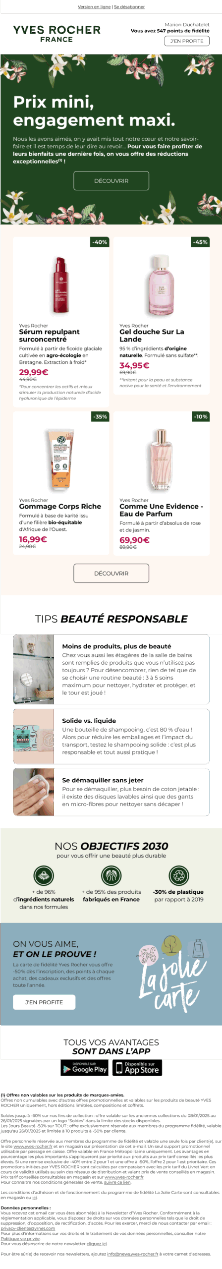
Previously : Reinventing email
Sender: Yves Rocher
Subject: 👋🏼 They say goodbye
Preheader: Take advantage of our end-of-collection sales*.
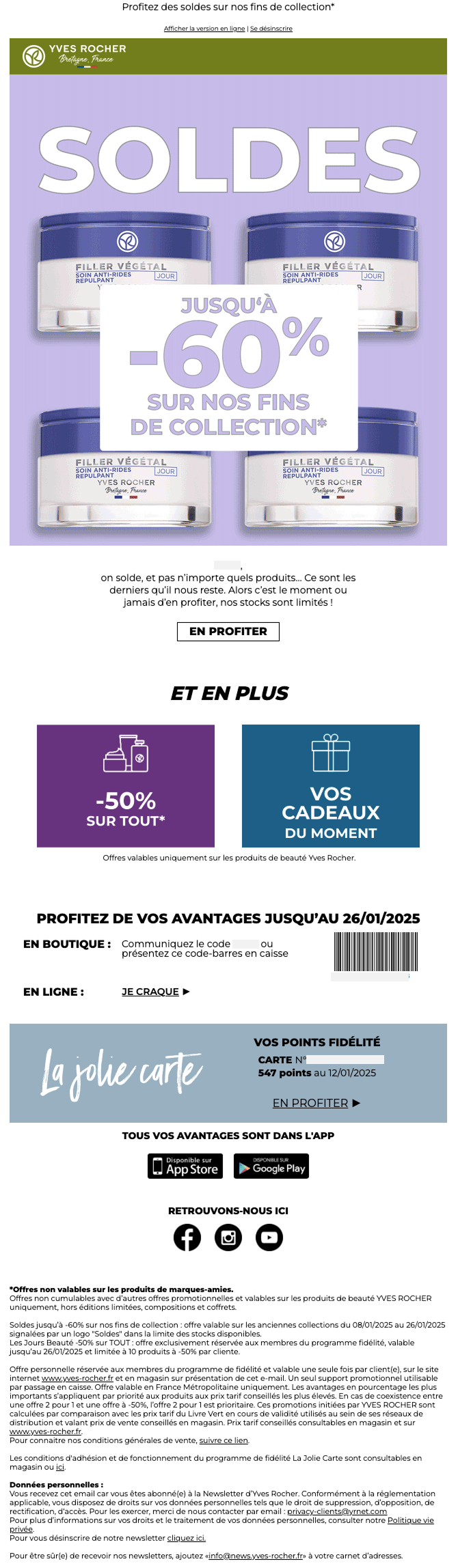
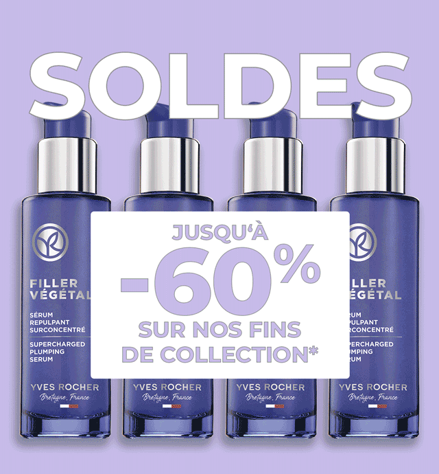
The animated gif of the main block :
Speech and writing analysis
In the speechThe product and promotional angle is not enriched by the brand's committed dimension. Organic, made in France, inspired by nature, encouraging the use of less plastic... none of this is reflected in the product message.
- The "They say goodbye" arouses curiosity and makes you want to open. This creates an attachment, a close relationship between customers and the brand via its products. This is reflected in the caption: "not just any products".
- The main message is promotional When you scan the email diagonally, the elements that stand out are "down to -60%"., "-50% on all", "Your gifts of the moment. That's all readers will remember.
- The secondary message would have deserved more emphasis if the brand were to assert its singularity: the fact that this is the promotion of end-of-collection products.
So it would have been interesting to pull the thread: why are we going to miss these particular products? Tell their story, say how long they've been on the market, talk about the flagship ingredient grown at La Gacilly, etc.
Through this product story, show the extent to which the brand is an expert in botanicals, committed to Made in France, organic, and so on. It's also important to explain why these ranges are renewed, the benefits of discontinuing them, and to reassure customers about the "loss" of products they've become accustomed to.
- Loyalty program points balance is relegated to the bottom of the email. To enhance the value of your customers and thank them, it would be wiser to place it at the top of the email, in the header, for better visibility.
Analysis of imaginary images
Email conjures up imaginary worlds that are incompatible with transition. Promotion feeds the engine of hyper-consumption by creating multiple reasons to buy: buy now or it will be too late, buy because it would be unreasonable not to, buy because it will bring pleasure, etc.
In detail, the imaginary worlds involved are :
- The emergency commercial urgency is a springboard commonly used in promotion. Here, urgency is created through the "threat" of scarcity: "limited stocks", "the last ones left".
- Speed via hyperbolic formulas such as "now or never".
- The desire CTAs: the imaginary of desire (vs. need): very present in CTAs to induce that this purchase is a vector of pleasure. CTAs "take advantage", "I'm crackingIn fact, the term "pleasure" is often used to describe the idea that we consume these products for pleasure, without really needing them (whereas need and pleasure are perfectly compatible).
- Abundance The same product packshot is repeated via animated gif, as if you were in the aisle, facing a hyper-choice.
- The bargain A very large number to rationalize a non-rational purchase. The aim is for the consumer to say to himself: "I'd be a fool to miss out on this bargain, it wouldn't be reasonable not to buy".
Is it possible to promote without resorting to commercial urgency or the illusion of a bargain not to be missed?
Yes, it is! It's possible and even necessary, especially for a brand that claims to be committed.
Analysis of email design
- Preheader It appears when the email is opened, even though this is not its purpose: hide the preheader in the emailit's only there as a complement to the object.
- Header :
- An unsubscribe link is available in the email header. That's great!
- Unless we've made a mistake, the logo and header color do not comply with the graphic charter: it would appear from the website that the logo is no longer the same, and neither is the color: the update has not been applied to email communications?
- The logo is very small, the baseline "Brittany, France"illegible
- The logo should be centered horizontally in the header, but the HTML and CSS code dedicated to this purpose doesn't work. A
margin:0px autoon the image itself.
- Block "dissociations" are missing: everything seems to float once you're past the cover, between the "Et en plus" and social networks.
- There is a lack of consistency in the way elements are formatted: should titles be in italics? Always bold? Always capitalized?
- The "I'm cracking"next to the textOn line"is strange. Why not put a link directly on a text "Take advantage of my online benefits"
- The Loyalty Card block (La Jolie Carte) could clearly be formatted in a much more aesthetic way, and right from the header of the email, to be seen.
- In the end, no product is really highlighted in this crea: why not offer a few products with the new price, crossed-out price, percentage discount and unique arguments specific to Yves Rocher such as the %?
Analysis of email accessibility
The e-commerce sector (among others) will have to comply with good accessibility practices from June 28, 2025. On this date, the European Accessibility Act (EAA), a European directive, will come into force. Its aim is to make digital product processes accessible to people with disabilities. This includes e-mails, brands must ensure that their emails comply with the EAA.
Positives:
- Setting up attributes
roleattribute with the value presentation to allpresentationon the elements<table> - Alternative texts for images are well informedtop!
- Contrasts (text color / background color) are well respected
- A few workarounds for the 120DPI email rendering are provided in the HTML code (attributes
xmlnsconditional comments for Outlook...) - The
langis correctly set on the<html>with the relevant value :en
Areas for improvement :
- Semantic tag No semantic tags are used for text insertion. Where are the different levels of titles, the
<p>for paragraphs? - Text in image format Additional offers-50% on all" and "Your gifts of the moment"are in image format. They should be in text format
- Non-explicit wording The text of the only button is not explicit.Take advantage". We could be more precise "Take advantage of the -60%" discount". The same goes for the button under loyalty points: you could put "Use my loyalty points"
- Animated gif : The animated gif for the main offer should stop automatically. It is quite heavy in terms of weight: over 500kb. The title and percentage reduction are included in the image: less easy for screen readers to navigate.
- 120DPI management Assign table and cell heights and widths using HTML attributes
widthandheight. As a result, the email rendering is totally broken on Outlook in 120DPI. It's better to use the CSS propertieswidthandheightfor better 120DPI management. - Alternative texts all have the same CSS layout. However, they are not all equally important. Why not try to reproduce the rendering of the headline in CSS, or choose the right color for displaying the logo's alternative text?
Analysis of HTML code and email eco-design
As we saw in calculating the carbon footprint of an emailing strategyBy reducing the weight of emails, we can reduce the CO2 emissions generated. Committed brands should therefore focus on comply with best practices in email eco-design.
- Spacing management (sometimes) via CSS property
paddingrather than via empty cells: bravo! - In the code, the Nunito Sans typeface is called, even though it's not used anywhere in the email. This increases the external resources to be called, and therefore the time taken to display the email.
- Media queries are far too numerous: we could offer a mobile version of the email with far fewer media queries, and without as many breakpoints. We could also opt for a Spongy design and coding to display a mobile version even on opening environments that don't support media queries. Especially since the current design makes this possible. And it's quite astonishing, as you can find bits of Spongy coding in a few places.
- There are many empty "blocks" in the HTML code. It's as if the HTML code had been modified without any real knowledge. As a result, the code is heavy compared to what it should contain.
- Some unnecessary HTML or CSS elements could be removed, such as the CSS property
vertical-alignon cells that don't have sister cells, or attributeswidthon elements<a>including an image, which itself has a specified width. - Spaces are created with empty cells: this makes the code unnecessarily cumbersome. Use dedicated CSS properties instead:
padding. - In general, the code is far too heavy and complex for the simplicity of the email.
- The preheader text doesn't seem to be in the right place, since a dedicated element exists in the HTML code, but it's empty.
After : Email after redesign
How can we give the message another dimension to build brand loyalty? How can we use imaginary worlds that don't feed hyperconsumption (as much)? How can we awaken consumers' consciences?
In short, how to take a step to the side without confusing or disappointing customers who only expect promotions?
Shipper : Yves Rocher
Object You'll miss them...
Preheader : Low prices to enjoy one last time
Conclusion
Are you convinced? In any case, we think the challenge has been met! Promo and new stories are compatible, provided the brand doesn't forget who it is and stays true to itself and its commitments.
Here are a few tips if Yves Rocher wants to go one step further:
Let's recall the fundamentals of the sobriety marketing chain :
- Supporting consumption
This is what we propose in this article with the new stories. Yves Rocher has a role to play in the choice of products highlighted in its communications, giving priority to those with a lower environmental and social impact. - Send fewer messages
Target opt-in contacts only, keep out the inactive and adapt the frequency of mailings according to reader engagement. In a customer case study, we demonstrated that adaptation of sending frequency based on RFM segmentation reduces email volume while maintaining revenues. - Making messages accessible and inclusive
This is the approach we present in this article, with Accessibility in mind right from the email design stage. - Eco-design messages
This is also the approach we're proposing here, with eco-design in mind right from the email design stage. The main constraint lies in the use of an email builder to produce the emails. Coding an email "by hand" or using a specialized email builder is still the most eco-friendly way. - Add an expiry date to messages
To reduce CO2 emissions from emails stored indefinitely on servers, Yves Rocher teams could add an end-of-life date to their emails if they use one of the routing tools that offers this feature. Alternatively, they can support the project Email Expiration Date to encourage their router to integrate it.
Leave a Reply