Among the Email Builders that I've been able to analyze, Salesforce Marketing Cloud stands out for its sober, functional interface. No frills, we're here to work. The approach is clear: templates, structures, content blocks. But is it relevant? Let's see what it's like in practice.
How does the builder work?
SFMC's builder is based on a model of templates which is injected with structures (prefabricated columns and compositions) as well as content blocks text, images, HTML, advanced blocks (dynamic content, A/B testing, etc.), and custom blocks.
These custom-made blocks are worth a closer look. If you build them using the builder's native elements, they remain editable. But if you use custom HTML, these blocks are no longer editable; ; even when copying and pasting the code from a native block into a «free» block. This means that, regardless of the HTML code injected, an HTML-type block will never be editable in WYSIWYG.

Layouts
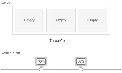
The colonnage system is solid. You can manage from one to five columns, play with widths as a percentage, and - an appreciable point - control the display order on the mobile (stacking or not, reading direction). Pre-fabricated compositions are also available to speed things up. Clean and modular.

Content blocks (Blocks)
Basic Content
The basic blocks cover the essentials: text, image, button, HTML, Free Form, Code Snippet. The button block offers management of rounded corners, internal margins and borders - it's functional. However, the button text cannot be bolded. This limitation is difficult to understand.
The HTML block allows custom code to be injected, offering flexibility. But as mentioned above, the editability is lost.
Advanced Content
The Reference Content (synchronized content) is useful for recurring elements such as headers or footers: it calls up a block that has already been saved. Too bad it's locked and you can't detach the instance to modify its content from time to time.
The Dynamic Content allows you to display content according to rules and conditions, which is the least you can do for the builder of such an important platform. A/B testing is also available in block form, for testing content variations.
Interactive Content
Two blocks: Email Form (AMP4email) and Image Carousel. AMP4email is poorly supported by current email clients (Outlook.com has even backtracked). In practice, these blocks have limited value for the majority of use cases. It's anecdotal and a bit of a shame that there's energy and time in these modules and not elsewhere. For those interested, Olivier has already published an article about this kind of “technical prowess”.

Design
The Design tab is the logical starting point for any creation: choice of template, background colors, default styles (texts, titles, links, buttons) and mobile behavior via media queries. I recommend configuring it at the start of a project, to avoid having your styles overwritten if you come back to it afterwards.
On titles, you can use <h1>, <h2> and <h3>, but there's no management of <p>. Everything goes directly into <td>. This is lacking in terms of accessibility and semantics.
Highlights
- Tool responsiveness no latency, interface responds well.
- Tree View It lists all structures and blocks in a concise manner, making it easy to reorder, duplicate or delete. A real time-saver.

- «Restore to Global Styles» This is a handy way of reverting to default styles after modifications have gone all over the place.
- Separate margin management You can define different values for each side of a block or layout. Sounds basic, but not all builders do it.
- Access to full source code via Code View: useful for evaluating code quality without having to send a proof.
- HTML editor on Basic Content blocks You can directly modify the code generated for buttons, texts and images. This is a double-edged sword - great flexibility, but also the freedom to break everything. It should also be noted that not everything is editable. In some cases, the builder accepts modifications, in others not. But it's not clear what the criteria are for accepting or rejecting modifications.

The limits
Typography and custom fonts
The builder is limited to web-safe fonts (Arial, Tahoma, Trebuchet, etc.). Injection of custom fonts is technically possible via the template, but their use requires non-inlined CSS:
@font-face {
    font-family: 'MyCustomFont';
    src: url('') format('woff2');
  }
  body, table, td { font-family: 'MyCustomFont', Arial, sans-serif !important; }
As a direct consequence, some e-mail clients will not take this into account. This option does exist, but users need to be made aware of its limitations.
Background images and rounded corners
No management of background images via native blocks. The only option is to use directly injected HTML. It would be technically possible to create editable blocks with background images or rounded corners, but only via workarounds: visual options (rounding, background images) would be in the code and therefore not editable via the interface, and native options like margins or background color could interfere with this custom code.
In practice, in a multi-user environment, this kind of solution is unrealistic. You'd have to educate each user as to which options they shouldn't touch, otherwise the rendering would break. This is not viable on a large scale.
Mobile management
There is no mobile-specific management at block level. It is possible to inject custom CSS at template level, but modifying the HTML code in prefabricated components only partially works. In a button, for example, you can modify what's inside the <td>, but not the <td> nor what's above it in the tree.
And while it's possible to hide a block on mobile, it's not possible to hide a block on desktop. So you can imagine desktop-specific content, but not mobile-specific content. Which, at the moment, is a major weakness.
Accessibility and code quality
No attribute lang on the <html>, no fixes for 120DPI, widths managed via the width rather than CSS. Semantic tags <h1>, <h2>, <h3> are available in the Text block, but no <p> - everything goes through <td>. And to make matters worse, attributes title are automatically added to links, which is counterproductive in terms of accessibility, and cannot be modified. In short, nothing works. Clearly, accessibility at the technical level is not not taken into account at all with this builder.
Conclusion
SFMC's builder is functional and does a decent job for standard needs. If the email to be produced is simple - classic structure, text/image content, basic buttons - the builder does well.
But as soon as you tackle more specific needs - advanced system design, background images, fine typography management, meticulous accessibility - and especially as soon as you involve non-technical users, the builder shows its limitations. Workarounds do exist, but they require rigor and user training that are not compatible with an environment with many contributors. Particularly if the latter lack a minimum of technical knowledge of HTML.
This is particularly unfortunate for SFMC, which is a platform designed for very large accounts, with often large teams and high demands in terms of system design. In this context, the builder is clearly not up to scratch. In another context, a platform designed for more modest customers with simpler needs, it could fit right in.
We are of course available to help you evaluate or set up your email builder. Don't hesitate to contact us.
Leave a Reply