Want to improve your digital marketing? Email marketing is the channel most likely to increase your conversions! But to do so, you need to know how to create your own emails and newsletters (editorial, transactional...) in html.
You've come to the right place learn to code an html email template responsive for free, with impeccable rendering on outlook, gmail, android and all other email clients... And if it's too complicated for you, our integrators are here to help.
Table of contents
- HTML email coding basics
- Mobile, why create a responsive email template?
- Email integration: content to be used with care
- Email code, content not to use
- Eco-design and accessibility
- Inboxes: mail clients and OS
- Email code tips and best practices
- Increasing efforts of email clients
- Email Integrator Mantra
- What tools do you need to create your emails?
- Conclusion: how difficult it is to code HTML email these days
- Resources
HTML email coding basics
L'HTML email integration is the method by which a developer transforms a graphic design (Photoshop, Figma, Sketch, etc... for the source file, with a JPEG file for confirmation) in HTML format.
To the question: "Is it more complex to code an email or a web page?"we will answer this: "It depends on the point of view." It also depends on the developer. The email integration is not so complex in the sense that it consists of "dumb and nasty". It is limited to the design of a single HTML file, designed via nested tables, with "inline" styles, and a folder of attached images, when the development of a web page will involve multiple files, multiple language types, multiple HTML tags and CSS properties, etc.
The techniques are radically different. And this is where the nested array construction makes things slightly more complex for the lambda developer used to using semantic elements: div, section, p, hn, footer, header, nav, etc... Designing as tabular HTML (nested tables) allows to guarantee, in principle, an identical result on all the mail clients.
Moreover, where the design of a web page will be validated on a few browsers, an email will be tested on many more email clients, with their own interpretation, their multiple versions, on webmails also subject to the vagaries of browsers ... When a web page is "tested" on 4 or 5 browsers (Chrome, Firefox, Internet Explorer, Opera, Safari) and their different resolutions, an email is viewed on Thunderbird, Outlook (and its multiple versions)Gmail, Yahoo Mail !, Free, Orange.fr, Office 365, Google App, Apple Mail, Lotus Notes, AOL, Free.fr, Outlook.com, but also on the "variations" of versions, browsers, resolutions ...
It is therefore different from the HTML integration of web pages because it must take into account the difficulties of interpreting the code by email interfaces. Because it is important to know thatthere are no internationally standardized technical conventions for HTML email integration (when there is the W3C, World Wide Web Consortium, for the web pages). But what exactly is HTML?
HTML
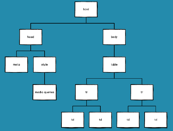
HTML (for HyperText Markup Language) is a markup language that allows you to frame elements in a page (images, titles, paragraphs) by tags to allow them to be formatted in a second time (via the CSS language). It is therefore not strictly speaking a programming language. Viewing an HTML file can be done in a browser. HTML documents have a tree structure, with a root element containing all other elements.
Tags
HTML tags allow you to insert or create, within an HTML document, elements: texts, visuals, data... The list is long. A tag to create an HTML element starts with the acronym < and ends with the symbol >. As with the creation of an element, it will also be necessary to close the creation of this element. To do this, the closing tag must begin with the < and end with the acronym >.
<p>Contenu</p>An HTML element therefore consists mostly of a start tag, and an end tagwith the content inserted between them. Some HTML tags are self-closing. In this case, the syntax is as follows:
<img src="nomdelimage.jpg" />or
<img src="nomdelimage.jpg">with the HTML5 doctype.
HTML tags are not case sensitive. However, it is recommended to write them in lower case. HTML elements can be nested (elements contain other elements). Any HTML document consists of a nesting of HTML elements.
<!DOCTYPE html>
<html>
<body>

<table width="100%" border="0" cellspacing="0" cellpadding="0" role="presentation">
  <tr>
    <td>
      <p>Contenu</p>
    </td>
  </tr>
</table>

</body>
</html>
Note that some tags have specific behaviors: either they will behave as block elements, or as inline elements:
- A block element will always start on a new line and will take up the entire available width of the page. In addition, it can contain other block elements, as well as inline elements.
- Unlike block elements, inline elements do not start on a new line, but are inserted into the current line. They take only the width that is necessary for them (i.e. the width of their content).
The knowledge of the type of an HTML element and the differences in behavior between inline and block elements will be essential to create a functional email: it will not be possible to act in the same way in CSS to manipulate block and inline elements.
doctype
Must be on the first line of the HTML code, and must start any HTML emailing integration. It is not strictly speaking a tag but a declaration, an instruction dedicated to the browser on the HTML version in which the code is written. There are several possible declarations:
HTML 5 : <!DOCTYPE html>
HTML 4.01 Strict : <!DOCTYPE HTML PUBLIC "-//W3C//DTD HTML 4.01//EN" "http://www.w3.org/TR/html4/strict.dtd">
HTML 4.01 Transitional : <!DOCTYPE HTML PUBLIC "-//W3C//DTD HTML 4.01 Transitional//EN" "http://www.w3.org/TR/html4/loose.dtd">
HTML 4.01 Frameset : <!DOCTYPE HTML PUBLIC "-//W3C//DTD HTML 4.01 Frameset//EN" "http://www.w3.org/TR/html4/frameset.dtd">
XHTML 1.0 Strict : <!DOCTYPE html PUBLIC "-//W3C//DTD XHTML 1.0 Strict//EN" "http://www.w3.org/TR/xhtml1/DTD/xhtml1-strict.dtd">
XHTML 1.0 Transitional : <!DOCTYPE html PUBLIC "-//W3C//DTD XHTML 1.0 Transitional//EN" "http://www.w3.org/TR/xhtml1/DTD/xhtml1-transitional.dtd">
XHTML 1.0 Frameset : <!DOCTYPE html PUBLIC "-//W3C//DTD XHTML 1.0 Frameset//EN" "http://www.w3.org/TR/xhtml1/DTD/xhtml1-frameset.dtd">
XHTML 1.1 : <!DOCTYPE html PUBLIC "-//W3C//DTD XHTML 1.1//EN" "http://www.w3.org/TR/xhtml11/DTD/xhtml11.dtd">
Depending on the declaration, differences in code interpretation may appear on some webmails. The truth is that in the world of email marketing, we must distinguish between several types of email clients: those that respect the indicated doctype, those that use an HTML5 doctype, those that do not have a doctype, and clients that use another doctype.
html
Tells the browser that it is an HTML document. It represents the root of any HTML document. The tag html is the container for all other HTML elements (except for the doctype).
<!DOCTYPE html>
<html>
</html>
head
Can contain the title of the document, scripts (banned in emailing)These data can be specified directly in the head of the document : title, style, meta, link. It is rather a structural element (in the same way as the tags html or body).
<!DOCTYPE html>
<html>
<head>
</head>

<body>
</body>
</html>
meta
Allows to provide metadata on the HTML document. The metadata are not visible on the page and can be used by browsers to know, for example, how to display the content of a page. They allow, among other things, to take control over the viewport (the visible part of a page)to specify the type of encoding of special characters, to allow a responsive behavior on some mobile devices... meta are always filled in within the head.
<!DOCTYPE html>
<html>
<head>
<meta http-equiv="Content-Type" content="text/html; charset=utf-8">
<meta name="viewport" content="width=device-width, initial-scale=1.0">
<meta name="format-detection" content="telephone=no">
<meta name="format-detection" content="date=no">
<meta name="format-detection" content="address=no">
<meta name="format-detection" content="email=no">
</head>

<body>
</body>
</html>
style
Used for define "graphic" layouts within an HTML document. Within this tag, it is possible to specify how the HTML elements will be displayed. An HTML document can contain several tags style. It is also essential for the implementation of media queries and responsive.
The style of an HTML element can, in theory, be applied via three methods:
- By including CSS rules in the HTML tag
styleof the sectionheadof the HTML document (what concerns us in this chapter)
<style>
.cellule_titre {background-color:#FF0000; font-size:24px; font-style:
italic}
</style>- By pointing to an external CSS file, containing all the CSS rules.
<link rel="stylesheet" type="text/css" href="styleemail.css">- Or by using inline CSS style.
<p style="margin:0; font:14px/20px Arial, Helvetica, sans-serif; color:#333; text-align:left">Contenu textuel.</p>In the world of emailing code, the second method is to be avoided for the moment. The structure of the HTML file looks like this:
<!DOCTYPE html>
<html>
<head>
<style>
body {
  margin:0px auto !important;
  padding:0px
}
</style>
</head>

<body>
</body>
</html>
body
Defines the body of the HTML document. The "visible" part of an HTML document is contained in the body. The element contains all the contents of an HTML document: texts, visuals, links, tables, lines, etc... It is in this element that the construction in nested arrays can begin.
<!DOCTYPE html>
<html>
<head>
</head>

<body>
<table cellpadding="0" cellspacing="0" border="0" style="width:100%" role="presentation">
  <tr>
    <td>
      <p>Mon contenu visible</p>
    </td>
  </tr>
</table>
</body>
</html>
table
A reference tag for the emailing integratorThis is one of its best friends. An HTML table is built using this tag. When we talk about nested tables, we automatically think of this tag. A table is made of line(s) (tr)composed of data cell(s) (td) or title cell(s) (th). In concrete terms, an HTML table for emailing is structured as follows:
<table cellpadding="0" cellspacing="0" border="0" style="width:100%" role="presentation">
<tr>
<td> </td>
</tr>
</table>
An HTML table could also contain HTML elements like captioncol, colgroup, thead, tfoot, tbody. But an HTML table for an email will remain as simple as possibleto ensure common interpretation and rendering across all mail clients.
tr
tr (for Table Row) simply defines a row in an array. Can contain one or more elements td. This is certainly the element on which the least amount of HTML attributes and CSS styles will be specified. Most often, in an HTML emailing integration, the tr remain blank.
td
After the tag tableThe second best friend of the emailing integrator: defines a cell in an HTML table. It can take the form of a standard cell (td for Table Data)or in the form of a "title" cell (th for Table Header).
A cell can contain both textual data (plain text) than visual data (images, visuals, animated gifs). Finally, it is the cells that most of the time contain all the content of an email. It is very rare to fill in content data outside the cells. Thus, a cell will look like this in its final version for text data:
<td style="padding:15px"><p>Contenu textuel.</p></td>The tags table, tr, td tags must therefore be opened and then closed: they are not self-closing tags. Forgetting to close a tag could result in a rendering problem (even if some mail clients or browsers can sometimes correct these omissions).
img
img (for image) tag is used to insert a visual within an HTML document. This tag mainly requires two mandatory attributes: src and alt. Note that the visuals are not technically inserted into the document. Instead, they are called up via this tag. img creates a space reserved for the called image. The call to the image in question is made via the attribute src.
Several image formats are possible in an email: jpeg, gif, or png. Each of these formats has its qualities... And its defects:
| JPEG | GIF | PNG | |
|---|---|---|---|
| Benefits | Perfect for gradients, it also allows you to adjust the quality of the image compression. This format can display several million colors. It is ideal for any photo or product visual. | Allows transparency, and also allows to choose the color palette. Even better, this type of format allows you to generate so-called "animated" gifs. | Allows transparency, while keeping a good image quality. PNG-8 is very similar to gif, since it supports 256 colors and allows transparency, and can even be lighter than a gif. PNG-24 is similar to jpeg, since it can include up to 16 million colors. |
| Disadvantages | Does not allow for transparency and can be relatively heavy without compression. | This format is not very good in gradients. Moreover, it only supports a maximum of 256 colors. It is generally used for texts, pictograms, or logos. | Its weight can sometimes be a bit too heavy. |
a
Indispensable within an HTML email integration, the a (for anchor) creates a hyperlink that will be used, among other things, to link an HTML element to a Web page. The attribute required for the tag is called href. This attribute is used to indicate the destination or functionality of the link. Without attribute hreftag, the a is no longer a hyperlink, and could be used as an anchor in an HTML (functionality to be proscribed, we will see why later).
span
span (for "cover") allows you to group several inline elements, parts and pieces of text, in order to assign them a particular CSS code. If within a paragraph a group of words should be displayed in red, the code will be as follows:
<p>Phrase dans laquelle <span style="color:red;">un groupe de mots
s'affichera en rouge</span> sans impact sur le reste du texte.</p>
br
<br> (for line break) allows you to create a line break.
<p>Portion de texte 01.<br>
Portion de texte 02 après retour à la ligne.</p>
div
In an HTML document, a div (for division) defines a division or section. The element div is often used as a container for other HTML elements. In emailing, its use is very perilous. This tag has a formatting (thus, CSS properties) by default on some mail clients and browsers and its positioning and formatting properties (float, margin) are not always well supported. In our opinion, it should only be used in very specific cases:
- For the implementation of fully clickable buttons (via the buttons.cm)
- For background image placement (via the backgrounds.cm)
- For building responsive emails without media queries (Emails Fluid)
p
p (for paragraph) must be used in an email, but it is necessary to take into account its automatic graphic formatting by some email clients (and thus apply a CSS reset to this element). This tag is useful for accessibility purposes, as it indicates to screen readers that it is a paragraph.
hn
As the p, hn (for heading, values of h1 à h6) must be used in an email, but it is necessary to take into account its automatic graphic formatting by some email clients (and thus apply a CSS reset to these elements). These tags have accessibility value, as they indicate to screen readers that this is a title level.
Comments
A vital feature for any good email integrator, it allows comments to be inserted into HTML code. This allows the developer to quickly identify the different modules of his integration, in order to orientate himself more quickly and easily in the event of an update or debugging, but also to explain or complete his code, which can considerably help the understanding of the code during a re-reading.
Any code between these two elements will not be displayed on screen.
<!-- DEBUT MODULE ARTICLE PRINCIPAL -->
<table cellpadding="0" cellspacing="0" border="0"
style="width:600px; margin:0px auto" align="center" class="width100pc" role="presentation">…
</table>
<!-- FIN MODULE ARTICLE PRINCIPAL -->
Attributes
Each HTML element can have one or more attributes. These attributes are additional values that allow to configure the elements or to adapt their behavior. The following list is not exhaustive but includes the most commonly used HTML attributes in email coding.
alt
Some email clients block images by default. Sometimes recipients can change their email settings to block images from being displayed. When images are not displayed, the content of the alt (for alternative text) appears.
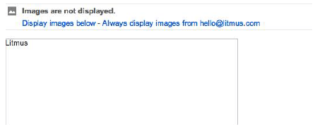
This text provides a textual alternative to the non-textual content of an email. If the images are not displayed, it can considerably reduce the understanding of the email by the recipients. It is therefore very important to fill in the altand to optimize its graphic formatting, to guarantee an optimal rendering of the email when the images are not displayed. Keep in mind that the style will not be applied in all email clients. This will be possible by indicating some CSS properties via the image style attribute.
<img src="images/nomdelimage.jpg" alt="Texte alternatif" style="display:block; font:16px/20px Arial, Helvetica, sans-serif; color:#333; margin:0px auto">
Alternative text also has an accessibility function: it is announced by screen review software, making the content or function of the image accessible to users with visual or cognitive impairments. Without alternative text, screen review software sometimes indicates the other information available in the image (file name, dimensions).
Therefore, when writing the alternative text, keep in mind that its content should be precise and equivalent to the content and functions of the image. Be short: in a few words, as few as possible. Not be redundant with other alt text or other textual information in the email. Do not contain "image of..." or "graphic of...". If a link is present on the image, the alt text can summarize the function present on the link, related to the image.
When it is a decorative image, an attribute alt can be sufficient. In the case of a large cut-out image, it is best to fill in the alternative text only once in the largest image, and not to repeat it for each piece of image. Background images cannot have alt text. If the content of an image is important, the image should not be applied in the background. Finally, it is important to remember that the alternative text is chosen according to the context.
src
src (for source) tag is required to specify the path of the called image. It therefore goes hand in hand with the img. The syntax of this attribute is as follows: src="urldelimage". In a local HTML integration, the paths will be relative: they will point to a folder where the images are located.
<img src="images/produit_01_visuel.jpg">Once the images are hosted on a server, the paths of the visuals will be said to be absolute (or absolute urls).
<img src="https://www.badsender.com/images/produit_01_visuel.jpg">href
href (for Hypertext REFerence) specifies the destination of the link. Generally, it is a url (of type http://)but this url can also contain tracking information and take a more complex aspect. Finally, it can also be more "specific" paths:
- A link to an element of the page or email with a
idprecise. However, this feature should not be used in HTML emailing integration (we will see why later). - Another protocol:
mailto(to write an email) ortel(to generate a call to a specific number). In the case of amailtoattribute, thehrefwill take the following syntax:
<a href="mailto:someone@example.com?cc=someoneelse@example.com&bcc=andsome
oneelse@example.com&subject=Summer%20Party&body=You%20are%20invited%20to%20a%20big%20summer%20party!">Send mail!</a>
In this case, several fields have been specified in the protocol mailto : the email addresses in copy (via the variables cc)the subject of the mail (via the variable subject) and finally, the content of the mail (via the variable body). In the case of the telthe syntax will be as follows:
<a href="tel:+33344547301">Appelez-nous !</a>width
Specifies the width of an element, in pixels. The attribute width is very important: it will, most of the time, be assigned to tables, cells, or visuals. This attribute is often filled in pixels (in this case, the unit is not specified). It can also be specified as a percentage (in this case, the percentage unit is specified).
<img src="chemindelimage" width="400">Its purpose is to specify the width of an HTML element. It is possible to leave it blank for a cell or a table, to let the element take the width of its content. With the growth in the use of fluid and hybrid methods, tables will regularly be filled in as a percentage, to adapt to the resolution of the viewing window.
height
Specifies the height of an element, in pixels (in this case, the unit is not specified). The height will be used mainly on the images and visuals of the HTML integration. It is important to fill in this attribute correctly to avoid any rendering inconvenience on some email clients when the images are not displayed (except when the visuals have a width indicated in percentage).
If the attribute width also concerns cells and tables, we advise against setting a fixed height on these elements: coupled with some CSS properties (margin, padding)It can be interpreted differently by different email clients. Moreover, the integration of an email must be "flexible" and stretchable, the structure must be able to adapt to its content. The integration must breathe, keep some elasticity, to adapt to its content.
cellpadding
Defines the space (in pixels) between the edge of the cell and the content of the cell. As a precaution, we recommend that you always specify this attribute for each tableand to inform its value at 0. The internal margins of the cells will be generated via the CSS property paddingbecause even if the attribute cellpadding property is correctly supported by all mail clients, it will be much more complex to modify its value in responsive, unlike the CSS padding.
cellspacing
Defines the space between the cells. As for the cellpaddingwe recommend that you specify this attribute for each created, and set the value to 0.
border
Not to be confused with the CSS property borderThis attribute specifies the width in pixels of a border. To avoid any rendering problems, a good practice is to fill this attribute on any image, and to specify its value to 0.
bgcolor
Regularly used in the HTML integration of an email, it allows to specify a background color (bgcolor for background-color). Its value will be, most of the time, a hexadecimal code. This attribute will be specified mainly on cells or tables, to ensure its correct interpretation by all mail clients.
There are several ways to specify the color: it can be in all letters (red, yellow)in rgb code (for Red Green Blue, with values from 0 to 255)in rgba code (for Red Green Blue and Alpha, for transparency)hsl (for Hue Saturation Lightness), hsla or hexadecimal code (HEX value).
The hexadecimal code, which is probably the most widely used because it is the best supported, is composed of six digits. Each pair of characters in the Hex code representing the intensity of red, green and blue in the color, respectively. The value of a pair of characters varies from 00 (the lowest intensity) to FF (which represents the highest intensity). The color white for example is made by each of the three primary colors, at their full intensity, resulting in the color code Hex #FFFFFF. The Hex code is not case sensitive.
<td bgcolor="#F2F2F2">align
Allows to align horizontally contents or elements of block type. Can take several values: left, right, center, justify... Depending on its value, the content of the cell will be left-ironed, right-ironed, centered, or justified...
<td align="center">Ici, un contenu texte centré</td>style
Specifies an inline style for an HTML element. This attribute will override all other styles, specified for example in the style or in an external CSS file.
<p style="font:14px/20px Arial, Helvetica, sans-serif; color:#333; text-align:left">Mon contenu</p>id
Corresponds to a unique identifier for an HTML element. Its value must therefore also be unique within an HTML document. There cannot be two identical ids (on their value) in the same HTML document. This attribute is mainly used to specify a specific style for an element, and in particular when using media queries: it allows to target, in media queries, the single element of the HTML integration concerned by the CSS modifications to be made.
<p style="font:12px/16px Arial, Helvetica, sans-serif; color:#000" id="monparagraphe">Mon contenu</p>class
Has, finally, the same function in HTML emailing integration as the idattribute, that is to say: pointing to an element in order to assign specific CSS styles to it. The difference is that the class does not have to be unique. Thus, it will be possible to fill in several values for the attribute class to a single HTML element. For example:
<p style="font:12px/16px Arial, Helvetica, sans-serif; color:#000" class="fontsize14px margintop20px">Mon contenu</p>Via the attribute classIn this way we can specify several CSS properties that we can then define in our media queries. It is also possible to apply the same class on multiple HTML elements within the same document.
role
The attribute role is mainly used in email marketing to optimize the accessibility of an email. Indeed, the tables used to format the email are actually data tables. It is therefore necessary to indicate to screen readers that they are used here as formatting tables. This is done through the attribute rolewith the value presentation.
<table role="presentation">CSS
CSS for Cascading Style Sheets (cascading style sheets). CSS is a computer language that describes how HTML elements should be displayed on screen, on paper or on other media. The standards defining CSS are published by the World Wide Web Consortium (W3C).
Unlike software, CSS specifications are not developed in successive versions, which would allow a browser to refer to a particular version. CSS is developed in "levels", which forces each new level to integrate the previous one, and each implementation to be compatible with the previous one: CSS1 is thus developed to be a subset of CSS2, which is itself developed to be a subset of CSS3. This partly explains the slow progress of CSS.
As we have seen in the previous chapters, CSS can be added to HTML elements in 3 ways:
- Inline - using the
stylein HTML elements. - Internal - using an element
stylein the sectionhead. - External - using an external CSS file.
We will use inline and internal styles in the email coding. The characteristics applicable to CSS are expressed as a couple propriété: valeur. These couples are separated by ;. When a CSS property can take several values, these values are separated by ,.
The values can be expressed with normalized units, or with CSS keywords. In an internal style, the properties are grouped by blocks of rules, delimited by the braces {}.
CSS online
Should we stop writing inline styles in emails? The question has often been asked to email integrators: Can we stop writing our inline styles when Litmus seems to allow it? (Because it must be admitted that this method is a bit tedious). Until 2016, Gmail supported almost only inline styles. Webmails from Yahoo, AOL, Outlook.com and even versions of Outlook from 2007 to 2016 on Windows support the tags style for a long time. The 2016 Gmail update seemed to change everything by officially adding support for tags style and attributes class and id.
And yet: Many international clients do not support the style. Popular clients like Libero (Italy)Mail.ru, Yandex (Russia)Nate, Naver (Korea)T-online (Germany)Telstra (Australia) or Terra (Brazil). But there are also some versions of some mail clients, like the iOS application of SFR or the Android application of Orange. And finally, there is always Gmail on Android with an account other than Gmail (nicknamed GANGA)Yahoo in their Android application or mobile webmail, and Outlook.com on mobile in the old version of their webmail.
In addition, mail clients have their own default styles. The HTML of your email could therefore, potentially, inherit too generic styles from webmails. The advantage of writing your styles online is that it automatically overrides the default styles of the mail clients.
The main advantage of writing styles online is that they will override the default styles of the mail clients (because mail clients have their own default styles, like Outlook.com which adds styles like background-color or border-bottom on each tag style).
The main disadvantage: the weight of the email is heavier (sometimes up to 25% difference with an email without online styles)The style of each cell, each text, must be filled in, even if the styles are sometimes identical. A lighter HTML code means that it will be faster to send, faster to load, and most importantly, avoids truncating the email on some email clients like Gmail which cuts any content after the 102ers kilobytes of an email.
Conversely, not writing inline styles for elements that appear only once in the email can unnecessarily overload the code (an attribute class + a tag style will carry more weight than a simple attribute style online).
To simplify the writing of online styles, there are nowadays inliners, snippets or :
- Snippet for Dreamweaver
- Emmet
CSS properties
CSS properties allow you to modulate, work on, and modify a set of technical and graphic characteristics of an HTML element. Font, color, size, fat, text alignment, width, height, position, background color and image and container behavior, borders, internal margins... Multiple possibilities are offered on the graphic formatting of HTML elements via CSS properties. There is no limit to the declaration of these CSS properties within an attribute style. Any CSS property can be modified directly in the media queries for the responsive version of an email. The following list is not exhaustive but includes the most commonly used CSS properties in email coding.
font-size
Specifies the typography size of a text. The value is usually given in pixels (fixed unit)but it is possible to choose among several values: xx-small, x-small, small, medium, large, x-large, xx-large, smaller, larger... It is also possible to enter the value of font-size in percent (evolving value).
font-family
Specifies the font family of a text. The property font-family can contain several surnames as backup typefaces (then separated by commas). If the browser or mail client does not support the first specified font, it will switch to the next font (and so on).
font-family:Arial, Helvetica, Sans-Serif;There are two types of typography families: family-name (Times, Courier, Arial) and generic-family (serif, sans-serif, cursive...). Ideally, it is better to start with a specific typeface (family-name) and end the declaration of the property with a generic family, to let the machine, the mail client or the browser choose a typeface in a generic family if it doesn't find any of the typefaces previously filled in.
font-weight
Allows to define the fat of the concerned text. Its values can be defined in words (normal, bold, bolder, lighter) than in a sequence of numbers (from 100 to 900, in increments of 100, 400 corresponding to the value normaland 700 to the value bold).
color
Allows you to specify the color of a text. There are several ways to define the value of a color (see attribute bgcolor).
padding
Allows, in CSS, to specify internal margins for an HTML element (the space between a content and its border, between the content and its container). It can be declined according to the concerned sides: padding-top, padding-right, padding-bottom, padding-left.
Let us detail the multiple cases of its values:
- 4 values (
padding: 10px 5px 15px 20px) :- Padding-top at 10px
- Padding-right at 5px
- Padding-bottom at 15px
- Padding-left at 20px
- 3 values (
padding: 10px 5px 15px) :- Padding-top at 10px
- Padding-right and padding-left at 5px
- Padding-bottom at 15px
- 2 values (
padding: 10px 5px) :- Padding-top and padding-bottom at 10px
- Padding-right and padding-left at 5px
- 1 value (
padding: 10px) :- The four paddings at 10px
Negative values are not allowed in the padding. The CSS property padding is mainly well supported on the td.
<td bgcolor="#f5a316" style="padding:20px 30px 40px">
  <p style="font:14px/20px Arial, Helvetica, sans-serif; color:#FFF; text-align:left">Nullam hendrerit condimentum orci vel aliquam. Donec vitae aliquam leo. Ut pulvinar mi quis metus venenatis convallis.</p>
</td>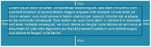
margin
This property allows, in CSS, to specify external margins to an HTML element. As for the paddingIt can contain in four values the 4 sides of the element concerned. The property margin is particularly well supported and useful on p or hnto add spacing.
<p style="margin-top:20px">Mon paragraphe</p>line-height
Allows you to specify the line spacing of a text. Its value can be expressed in pixels, points (for fixed units)or without unit. In the latter case, the value concerned will be multiplied by the font-size assigned to obtain the final line spacing. Negative values create rendering problems in Outlook for Windows.
<p style="font-size:14px; line-height:20px">Mon texte</p>text-align
Allows you to specify the horizontal alignment of a text within an HTML element. This property can take the following values: left, right, center, justify. Justify a text allows you to make the text take the width of its container (as in newspapers and magazines).
<p style="text-align:justify">Mon texte</p>vertical-align
Allows you to specify the vertical alignment of a content within an HTML element. It can take several values: top, middle, bottom, baseline. Its use will be particularly noticed in the case where two cells (or more) of the same line contain contents of different heights (or variables) and that a decision will have to be made about the vertical positioning of this data.
<td style="vertical-align:top"><p>Mon contenu</p></td>
display
Allows you to change the behavior of an HTML element. Remember that HTML elements (as img) behaves as an inline element. While other (comme table) behave as a block element. A block element always starts on a new line and takes the whole width of its container. It is possible to modify these behaviors by specifying the display the values inline, inline-block, none or block (among others).
In response, when an element (td for example) element must take all the width, and the brother element must go underneath, it will be possible to modify the styles of these elements via the media queries by modifying their behavior in display:block.
Comments
In CSS as in HTML, it is possible to add comments, or to pass some pieces of code as comments. This not only allows you to comment your code for any future update, or any code transfer by another integrator, but also to avoid deleting certain properties that could be useful in other integrations. The syntax is however different from HTML: in CSS, any text between /* (beginning of commentary) and */ (end of comment) will be correctly interpreted as a comment.
<style>
  /* Pour cacher des éléments sur Outlook 2007 à 2013 */
  .visibility_mobile {
    display:none;
    mso-hide:all;
    visibility:hidden;
    max-height:0;
    font-size:0;
    line-height:0;
    padding:0
}
</style>
Warning: CSS comments can only be inserted in the style. Outside the styleyou will have to use HTML comments.
Character encoding
Web pages can be written in all kinds of languages and a large number of characters can be used, which requires either a character set for each type of writing or a universal character set. At the time of the appearance of HTML, the universal character set Unicode had not yet been invented, and many character sets were in use, including ISO-8859-1 for the Latin and Western European alphabets, Shift-JIS for Japanese, KOI8-R for Cyrillic. Today, Unicode's UTF-8 encoding is the most widely used.
The HTTP communication protocol transmits the name of the character set. The HTML header may contain a reminder of this character set, which should be the same unless it is set incorrectly. Finally, as a result of an incorrect setting, the character set actually used may still differ from the announced character set. These wrong settings usually cause text display errors, especially for characters not covered by the ASCII standard.
Because, originally, HTML files are made to be encoded in ASCII, that is to say without special characters. In ASCII, the characters are coded on 7 bits, that is to say a code composed of seven digits which are all equal to 0 or 1. It thus makes it possible to represent 27 or 128 different characters. 128 characters are enough to store our alphabet, numbers, punctuation elements, but not enough to store our special characters (accents, cedillas...).
Before the generalization of Unicode, entities were defined to represent some non-ASCII characters: each special character is thus translated by a numeric alpha code. Several lists of these characters are available on the web. Even today, using a conversion table allows to avoid incompatibilities.
Indentation
In computer science, indentation consists in adding tabs or spaces in a file, for a better reading and understanding of the code. The indentation of an HTML file is important: it facilitates the reading of the code, the resolution of bugs, the dissociation of the different elements and their correct opening and closing. An optimal HTML code for email must absolutely be correctly indented.
Mobile, why create a responsive email template?
Mobile email is no longer optional. Mobile email is imperative. An emailing campaign must, today, propose a version adapted to its multiple consultation supports.
So how can you not design an email for this new kind of interface? Email is constantly evolving, but mobile email marketing is, in this sense, not really a novelty. Many techniques have been created, tested, implemented and continue to evolve, to guarantee the mobile recipient a different viewing experience.
Because that's where the interest lies: if desktop email is a technical peculiarity in the world of web development, mobile email requires and imposes a certain number of constraints to optimize the understanding of the message on a screen that is now much smaller and narrower than that of a computer: it is no longer possible to be satisfied with typography sizes that are too small, with illegible texts, with visuals that are difficult to identify, or with miniature calls to action.
Where the emailing integrator used to focus on obtaining a perfect rendering on complex email software based on code interpretation (Outlook), the priority today is to provide a quality mobile rendering that is ergonomic, accessible and practical.
The most common technique nowadays is Responsive Web Design.
What is Responsive Web Design?
The responsive web design encompasses the design methods that propose, thanks to different principles and techniques, contents and ergonomics that are self-adaptable according to the consultation interfaces used by the visitor, and therefore a comfortable consultation, whatever the support used. The responsive in email marketing induces to facilitate the reading or consultation of an email from a mobile support. The recipient can consult the same email "across a wide range of devices with the same visual comfort and without having to scroll horizontally or zoom in/out on touch devices in particular, manipulations that can sometimes degrade the user experience, both in reading and in browsing.
In other words, with a reduced screen, offer a content that is just as readable and understandable. But not only: by extension, with a reduced connection, propose content that will be displayed just as quickly. When interaction is impossible, offer backup solutions. The truth is that mobile email client usage is slowly eclipsing that of webmail and desktop clients, which means that providing a poor reading experience on a small screen can now be inconvenient for the majority of recipients. This can lead to lower response rates, or as Return Path summarized in a recent report:
"...those that aren't tracking which device their subscribers are reading their emails on, or optimizing their emails or websites for mobile devices stand to lose out. A poor user experience could mean no response, no action, or plainly put, no ROI."
Return Path
The responsive in email marketing is therefore a collection of graphic practices, techniques (media queries, fluid grids, fluid images) that aim to provide the optimal visual experience on various platforms.
Constraints related to mobile media
The mobile supports imply, by some of their characteristics, a certain number of constraints which it is judicious to revise here:
- The screen of a smartphone or a tablet is smaller than that of a computer: The navigation space is therefore restricted.
- The network is not stable all the time: The internet connection can be fluctuating from cell phones, or not very present.
- Hovering features cannot be detected on touch screens.
From these constraints come certain requirements on the product:
- Visual superfluity due to small size is not allowed.
- The organization of the elements, the ergonomics, the gestures are all elements to which we must pay great attention.
- The features can't fit in large numbers without drowning the user.
- You should only keep the information that is important for the customers and avoid transposing the desktop version to mobile.
- The design must be simple and light to support network instabilities.
- Given the unstable or fluctuating connection, it is important to design the mails accordingly, especially by reducing the amount of data to be received as much as possible. It is very unpleasant for users to have to wait while images are loading.
Good practices / customs
If email consultation on mobile now supplants desktop consultation, this induces editorial, graphic, ergonomic, but also technical impacts. If we take this into account, it becomes logical to apply some sensible practices to improve the user experience of email consultation on mobile media.
The best way to apprehend, understand, guess and grasp these practices remains the user experience, and therefore, to test.
Keep in mind: "What bothers me, will bother my recipients... Surely."
Change navigation
Avoid or even ban all horizontal scrolling and favor vertical scrolling.
More than ever, keep the message concise and place all important design elements at the top of the email. Is the main Call to Action immediately visible when the email is opened on mobile? Does the recipient have to scroll to see it? This also includes the ability to hide (or show) specific content on mobile, add or remove margins around content, and change the order of modules and the hierarchy of information...
Modulation of Call to Action
Simply facilitate the area and increase the click margin on a Call to Action. A Call to Action with dimensions of 140 pixels wide by 40 pixels high will seem, on a desktop screen, quite visible and easily clickable.
Will it be the same on a mobile or tablet? The precision of a finger is not the same as that of a mouse cursor. Who has never had the unpleasant surprise of clicking on a Call to Action contained in an email consulted on a mobile device, without anything happening? Or to find yourself in "text selection" mode after tapping on a link? The reaction is sometimes immediate and heavy with consequences: the recipient, frustrated, may leave the consultation.
Call to Action size is a key factor in mobile emails. Increasing the click area, or the size of the button itself is an imperative task when switching to responsive. Links and buttons should ideally have (and according to old recommendations and instructions from Apple) a minimum target area of 44 pixels high by 44 pixels wide.
Text size
Increase the size of HTML texts if necessary to guarantee their readability, comprehension and accessibility. Will a 10px text still be readable on an iPhone 5S screen? Will it be necessary to zoom in to understand the content? To find out, the real rendering test is always the best option...
Resize / change visuals
A visual for the desktop version of an email will not necessarily be adapted to a mobile version: consider a visual of 600 pixels wide, in which a text of 14 pixels is inserted. If we quickly divide the width of this visual to arrive at the lowest resolution for a mobile consultation (i.e. 300 pixels)In the mobile version, we can quickly deduce the size of the text: 7 pixels. It becomes impossible to read or understand this text.

Responsive may mean providing visuals specific to the mobile version, or resizing a desktop visual for the Responsive version.
Order of the modules
Let's ask ourselves the right questions: when a content configuration looks like this: visual on the left, text and Call to Action on the right, what will be the default rendering in mobile? Chances are that the visual will be in the first part, and the text and Call to Action in the second. If the visual is clickable, or includes the main offer, this may not be a concern. But what if it's not? If it is only an illustrative visual?
The CSS property direction allows you to alternate the order of the contents in order to offer the recipient the contents that the sender considers appropriate as quickly as possible.
Loading time
Without doubt the most important objective to achieve in responsive email: reduce the loading time of the email on mobile consultation. An emailing design can quickly turn out to be relatively heavy in HTML code and attached images. Even if the recommendations are to limit the weight of an email in desktop version, it becomes essential to drastically reduce it in responsive version in order to improve the loading and display speed.
This can be done through several techniques: display only the images that are essential to the proper understanding of the email and do not show superfluous visuals. Hiding "secondary" modules, whose presence has no impact on the understanding of the entire email (menu, reassurance banner).
Data weight
An email without images is probably less attractive than an email with images, that's a fact. Even if one of the trends in email marketing is the increase in sending emails in "full text", it remains that the image has an important part in the recipient's behavior on the email. However, images are definitely the largest volume of data to be downloaded when an email is opened.
In this case, how to optimize the loading time of these images? How to overcome the complexities of the reception speed of each, and display quickly visuals of quality despite everything? It is precisely through the intermediary of requests (Media Queries) that the sender can decide not to display certain visuals, certain modules, using CSS properties like display attribute with the value presentation to all none. The concerned elements will not be displayed, so it can considerably reduce the weight of the email and its data.
Moreover, it is essential to optimize the weight of the images themselves, not only when exporting and cutting them, but in a second time, via platforms specialized in image compression such as JPEGmini, tinyjpg, tinypng, or ezgif for example. The quality will, in most cases, be maintained, while the weight will be considerably reduced.
The extension of the images is, there too, more than important. If it was still possible to ignore it on exclusively desktop consultations, it is no longer a question of ignoring this subject with the connection and data constraints: an image in .gif format will not, without a doubt, have the same weight as the same image in jpeg or png format.
Although the quality of a visual is important in a campaign, it is wise to ask yourself the right questions: Should you prioritize the maximum quality of an image, even if it means impacting its display time? We are, especially with the web and mobile, in a world of immediacy. It becomes laborious to wait for the display of a content. The information must be displayed instantly! Inflicting a waiting time to the recipient for the display of information can only negatively impact the click rate on a campaign.
Responsive, the media queries method
The CSS3 Media Queries specification defines the techniques for applying style sheets to the viewing devices used for HTML.
History
With CSS2 and HTML4, it was already possible to specify a destination media for the application of one or several style sheets. This is how it was possible to associate additional CSS rules for printing, modifying the layout, favoring one element or making another useless for the paper output, for example a navigation menu. The tag is then duplicated for as many style sheets as necessary, and includes a media specifying the context in which the styles must be applied:
<link media="screen" href="screen.css">
<link media="print" href="print.css">
The media attribute can take (since CSS2) the following values: screen (Screens) | handheld (Mobile or small devices) | print (Print) | aural (CSS 2.0) / speech (CSS 2.1) (Voice synthesis) | braille (Braille pages) | embossed (Braille printers) | projection (Projectors or presentations with slides) | tty (Terminal/police with fixed pitch) | tv (Television) | all (All precedents).
The philosophy of Media Queries (or media requests) is to offer a wider and more precise set of criteria, using properties and numerical values, as well as multiple combinations of these same criteria. The goal is to target destination devices more finely based on their intrinsic capabilities.
In most cases, we use media queries to produce specific improvements for mobile displaywhich are directly concerned by criteria on the dimensions of the screen (in terms of resolution and available space) and on the tactile use.
Thus we will find most frequently rules for :
- Increase the size of the text.
- Increase the size of controls and clickable areas (for use with a finger).
- Move the content to a single column.
- Hide or show specific items.
- Adjust dimensions and margins.
The responsive email uses a multimedia request (@media) with a special set of CSS styles that act as conditional instructions or dynamic rules. Carefully planned, they can help make emails more readable on different screen sizes. Multimedia queries detect the screen size of a device, then activate different sets of rules based on the screen size. These can be very simple to implement or quite complex, depending on what you want to accomplish. They require more planning and testing than standard emails and do not work in all email clients.
Operation
In the context of email, media types define the CSS styles to be used based on the screen size. This media type indicates "If the email is displayed on a screen size of 480 pixels or less, use the following CSS code".
"The CSS3 Media Queries specification defines techniques for applying style sheets based on the viewing devices used for HTML."
This statement is to be adapted to emailing: media queries, a particular CSS3 code, allows to apply particular formatting according to the devices of consultation. Media queries are therefore, by their definition, the logical continuation of responsive web design. It is an integral part of responsive, since we dynamically adapt the design using CSS. Concretely, media queries indicate this:
"If the viewing media has a width less than/superior to [value]pixels, then:"
These additional rules can therefore be used to modify the layout, favouring one element or removing another that has become useless or too cumbersome. The media queries directives are integrated directly into the style of an HTML integration. It will then be necessary to use the @media followed directly by the type of media (in general, screen for email marketing).
The writing of these queries is quite explicit: a media query is an expression whose value is always true or false. It is enough to associate the different possible declarations with a logical operator to define the set of conditions to be met for the application of the styles included in the adjacent block.
Logical operators can be :
andand",only: "only".not: "no"
To get the equivalent of "or", simply list different media queries in a row, separated by commas: if one of them is valid, then the whole rule will be applied. In general, a media type is combined together (screen, all...) and an expression through andalthough a single expression can be used. The expression is always written in parentheses.
The following two examples target screens smaller than 640 pixels in width using the rule max-width associated with the value 640px.
@media screen and (max-width:640px) {
  .bloc {
    display:block;
  }
}
The combinations can be multiple. Here we are addressing a screen whose width resolution is between 200 and 640 pixels:
@media screen and (min-width:200px) and (max-width:640px) {
  .bloc {
    display:block;
  }
}
Most of the criteria (or features) can be prefixed by min- and max- when they accept numerical values to define minimum or maximum values to be respected: device-aspect-ratio (ratio of the output device, e.g. 16/9), aspect-ratio (ratio of the display area), device-height (dimension in height of the peripheral), device-width (width dimension of the device), width (dimension in width of the display area)... Dimensions can be evaluated with units (px, em).
The functionality (or criteria) The most commonly used width in email marketing remains the width, since it is the main constraint that leads us to use media queries and propose a more readable version. We will then talk about "breakpoints": A breakpoint is a milestone, a particular size from which we switch to another display style, other CSS properties.
Directly in the HTML code of the emailing we assign class and id to several content elements that will be displayed, or not, depending on the resolution of the recipient terminal, which will take into account this or that modification of typography size, colors, margins, positioning, etc...
Support
The first thing to be aware of is that it is not possible to have Media Queries in CSS style inline. The media queries must be filled in the stylepresent in the head of the email. A responsive email on a client that does not support CSS in head is therefore already excluded.
To target class and idthe syntax will be as follows:
<style>
@media only screen and (max-width:600px) {
  .width300px {
    width:300px !important
  }
}
</style>
The support of media queries is quite good on all mail clients, as shown in this table:
| Desktop | Mobile | Webmails |
|---|---|---|
| v AOL Desktop | v Android 4.2.2 Mail | x AOL Mail |
| v Apple Mail | v Android 4.4.4 Mail | v G Suite |
| x IBM Notes 9 | x AOL Alto Android app | v Gmail |
| v Outlook 2000-03 | x AOL Alto iOS app | v Google Inbox |
| v Outlook 2007-16 | v BlackBerry | x Outlook.com |
| v Outlook Express | v Gmail Android app | v Yahoo! Mail |
| v Outlook for Mac | x Gmail Android app IMAP | |
| v Thunderbird | v Gmail iOS app | |
| x Windows 10 Mail | x Gmail mobile webmail | |
| v Windows Live Mail | v Google Inbox Android app | |
| v Google Inbox iOS app | ||
| v iOS 10 Mail | ||
| v iOS 11 Mail | ||
| v Outlook Android app | ||
| v Outlook iOS app | ||
| v Windows Phone 8 Mail | ||
| v Yahoo! Mail Android app | ||
| v Yahoo! Mail iOS app |
Responsive, the fluid hybrid method
The Hybrid coding approach (sometimes called "Spongy Coding") is a direct reaction to mail clients such as Gmail (on some versions) that ignore media queries. Created by Fabio Carneiro, popularized by Mike Regan and Nicole Merlin, this technique still uses fluid tables and images which, unlike responsive emails with media queries, are "fluid by default" here. Instead of using media queries to trigger these fluid behaviors, Hybrid coding favors Microsoft's conditional comments to contain the width of tables on larger screens. Hybrid emails work according to the following principles:
- Tables and fluid elements by default.
- The CSS property
max-widthto constrain the width of elements on desktop. - Outlook conditional comments to limit the width on Outlook.
Let's look at a piece of code from a hybrid email a little closer:
<table role="presentation">
  <tr>
    <td align="center"><!--[if (gte mso 9)|(IE)]><table border="0" cellspacing="0" cellpadding="0" style="width:600px"><tr><td><![endif]-->

      <table role="presentation" border="0" cellpadding="0" cellspacing="0" width="100%" style="max-width:600px">
        <tr>
          <td><img src="monimage.jpg" width="400" style="display:block"></td>
        </tr>
        <tr>
          <td><p style="margin:0">Mon texte</p></td>
        </tr>
      </table>

      <!--[if (gte mso 9)|(IE)]></td></tr></table><![endif]--></td>
  </tr>
</table>
So here we use percentage values for table or image widths. This allows the email content to "fill" all possible screen sizes. To prevent the recipient from seeing a very wide email on his desktop, we need to add the CSS property max-width to the table and image. However, Microsoft Outlook does not currently understand this property. It will therefore be necessary to use conditional comments to create invisible fixed-width tables, which will only be present in Outlook. All elements are fluid by default, so our email works fine on all screen resolutions. And since it does not rely on any media query to trigger this responsive behavior, it also works on email clients that would not interpret media queries.
The advantage of the hydbrid method is that it supports all email clients. Since everything happens in the (body) and that no media query or style in the head is not necessary, this method works everywhere. Moreover, it will always be possible to add media queries to further improve the rendering on email clients supporting these requests. On the other hand, the hybrid method requires a particular work on the design of the email: since media queries are not possible, you will have to adopt a system of columns to obtain a correct graphic rendering on mobile. These same columns (on a two-column side-by-side system) will not be able to exceed a maximum width of 300 or 320 pixels wide, since this is the lowest resolution on mobile. This means that you must limit your email to a maximum width of 600 to 640 pixels wide for the desktop version.
Before implementing such a coding technique and method, or even before starting an email design, it is therefore important to consider these few questions:
- Should I consider mail clients that do not support media queries (to be analyzed in relation to statistics and feedback from previous campaigns) ?
- How complex is my layout?
- How comfortable am I with such code complexity?
It takes a lot of practice and experimentation to develop hybrid emails. If you don't have the knowledge or time to invest in learning hybrid code, media queries and traditional responsive will do. Also, analyze any design before deciding how to code.
Email integration: content to be used with care
HTML integration for email is a complex subject partly due to the way it is coded. But, as we have seen so far, its difficulty also lies in the support of HTML tags, attributes, and CSS properties depending on the email client. However, any emailing designer would like to avoid having his creativity limited by a set of too many constraints. However, before starting any creation, it is imperative to know the contents to be used with care, and those that will simply be banned. Let's get started.
Background images
Sometimes it is necessary to use background images. Even if every emailing designer is quite nervous and reluctant to use background images, they are sometimes essential to bring some rhythm to the whole creative. If the subject of background images is sensitive, it is mainly because it is technically complex. Solutions exist, sometimes heavy and difficult, but they do exist. Campaign Monitor has even developed a background image generator for email some time ago to simplify our lives.
Background images are therefore difficult to implement within an HTML email integration because the support is very complex. This requires a considerable amount of time in email rendering tests. Despite all the existing techniques, none of them allows a total support. Wherever possible, it is necessary to separate the textual content from the design. This avoids the need to export textual information as an image, or to use the background image technique.
Typography
Standard fonts or websafe font
The so-called standard fonts or websafe, are fonts installed by default on the client machine. There are several different configurations (Windows, Mac OS, Linux...)and each configuration has its own basic font set (Arial is provided on Windows but not on Mac OS, and conversely for Helvetica). In CSS, we will therefore, within an email, try to define a list of fonts (or policy family) more or less similar and compatible to ensure a homogeneous rendering for everyone.
The list of Websafe fonts is quite limited: Arial, Helvetica, Times New Roman, Times, Courier New, Courier, Verdana, Georgia, Palatino, Garamond, Bookman, Comic Sans MS, Trebuchet MS, Arial Black, Impact. There are several categories of fonts: Sans-Serif (sans serif fonts, similar to "stick" typefaces, without embellishment), Serif (serif fonts), Monospace (or fixed width font: each character takes the same width/height)Fantasy, Script. Each of these categories includes several typefaces, more or less well supported on this or that operating system.
The main advantage of these fonts is that they do not require any additional loading since they are already present on the client computer (and thus limits to the maximum the loading time for the display of an email, since no call to an external typography). The disadvantages: depending on the OS, you may not have all of them. Limiting yourself to these typographies also limits your creativity.
Unfortunately, there are some specificities on some fonts, making the choice of websafe fonts sometimes complex. For example, Symbol or Webdings fonts only work on IE, and will be substituted by other fonts on other browsers.
Webfont, specific fonts, exotic fonts
Which mail client supports web fonts? Apple Mail, Outlook 2011 for Mac, iOS Mail, Apple Mail, ipad and iphone (other than GANGA account)Android Mail (other than GANGA account)Thunderbird. Which mail client does not support web fonts? Lotus Notes 8, Lotus Notes 8.5, Gmail, Google Apps, Office 365, Yahoo!, Outlook.com, Outlook 2003/2007/2010/2013/2016, AOL, Free.
So keep in mind that the web font call is a rather perilous exercise, to be handled with care. Its support is still relatively weak. However, if you really want to use it, one method is to be preferred: In 2010, Google launched its own free font library: Google Fonts. Create a linkat the top of your HTML integration, in the head. Within this element linkuse the police url.
<link href="https://fonts.googleapis.com/css?family=Open+Sans" rel="stylesheet">Then, call the police in question first, in your property font-familyfollowed by the typos or families of relief:
font-family:'Open Sans', sans-serifThere are other methods of importing specific typos: The first is to specify a @import in the CSS code :
<style>
@import url('https://fonts.googleapis.com/css?family=Open+Sans');
</style>
The second method uses the query @font-face :
<style>
@font-face {
  font-family:'Open Sans';
  font-style:normal;
  font-weight:400;
  src:local('Open Sans'),
  local('OpenSans'),
  url('https://fonts.gstatic.com/s/opensans/v10/cJZKeOuBrn4kERxqtaUH3bO3LdcAZYWl9Si6vvxL-qU.woff') format('woff');
}
</style>
Ideally, and if the HTML integration allows it, always use the link.
Retina and image quality
Besides screen sizes, the mobile email revolution introduces another challenge for email integrators: high-resolution screens. These screens, often referred to as Retina displays, have the power to enhance an email campaign by giving subscribers a better experience. In 2010, Apple released the iPhone 4, which then featured what Apple called a Retina display. This type of display was one of the first high-resolution displays (high resolution of dots per inch, pixel density on the screen). Plus DPI (Dots per inch) is high, the more detailed and clear the images and text on this screen are. Other display manufacturers have also been quick to jump on the bandwagon, and Retina displays are now found on tablets, laptops and desktops.
Because of the way high-resolution displays work, images not optimized for Retina end up appearing blurry and pixelated in an email on these same screens.
As users get used to using Retina displays, they also expect text and images to appear crisp and clear. If you don't optimize these elements, recipients see a degraded design, which can lead to a loss of brand trust.
Technique
High resolution displays have twice as many pixels per inch as other traditional displays. Therefore, the images in an email need to be twice as large for Retina screens to display more pixels. So, first of all, it is necessary to design your email images with twice the size. Then, in the HTML code, we call the original display size provided in the attributes width and heightto correctly scale this much larger image. Thus, for an image that should originally have a width of 120 pixels and a height of 50 pixels, we will work on a width of 240 pixels for a height of 100 pixels. However, in the HTML code, the definition of its attributes width and height will remain as follows:
<img src="nomdelimage.jpg" width="120" height="50" style="display:block;">It is also possible to use Retina images for background images, although the technique is a bit more complex.
Email code, content not to use
Javascript
JavaScript is a programming language that elaborates interactive web content and allows, on websites, to propose transition effects, animation, such as auto-scrolling effects, slides and carousels, but also to check, validate and send forms (among other utilities). However, in the world of email marketing, adding javascript to an email code will ensure that your campaign is sent directly to your recipients' Junk Box.
Why is this? On a web page, it is the Internet user who decides which web pages to visit. He will decide not to visit pages that he thinks may contain elements that could harm his computer or his security. With emails, the sender has the most control over the emails sent, and the recipient has much less control. This is where anti-spam robots and filtering techniques come into play: the security settings of email programs prevent Javascript from running in emails as a security measure to prevent viruses, among other things, or because the scripts in the email could hide malicious content.
Iframe element
This is an HTML tag that allows you to embed an HTML page within another HTML document. Iframe for Inline Frame. The iframe tag allows you to insert elements from another server into a web page without the visitor being aware of it. And this is the problem of iframe in emailing: As iframes can potentially create a link to malicious content (like JavaScript)Many email clients disable them. The support of this tag is therefore very low.
| Customer | Display of the iframe |
|---|---|
| AOL Webmail | No |
| Gmail | No |
| Windows Live Hotmail | No |
| Yahoo! Mail | No |
| AOL 9 | No |
| Apple Mail ¾ | Yes |
| Entourage 2008 | No |
| Lotus Notes 6/7 | No |
| Lotus Notes 8 | Yes |
| Outlook 2000 | Yes |
| Outlook XP/2003/2007/2010 | No |
| Thunderbird | Yes |
| Windows Mail | Yes |
| Blackberry | No |
| iPhone/iPad | Yes |
| Windows Mobile 5 | No |
| Windows Mobile 6 | Yes |
| Android (default client) | Yes |
| Android (Gmail client) | No |
Flash
Flash should no longer be integrated into an email: first of all, its support is absolutely deplorable. Only Mac Mail will display the content. Most mail clients will not display Flash content, nor its alternative content. But, in addition, security warnings will also be displayed on some mail clients (Outlook). The Flash technique should therefore definitely be banned.
HTML Forms
Forms are important because they allow you to share data from subscribers or customers. The problem is that a form in an email is not secure and, even if there were a way to do this, the email clients that subscribers use may see the form as a security risk and send an alert to the subscriber that would discourage them from completing it.
In addition, text fields, text inputs, radio buttons and checkboxes are simple HTML form elements, but the submit button often requires JavaScript. Some email clients will display the forms, but unfortunately subscribers will not be able to send them. Avoid HTML forms and consider an alternative.
Alternatives
Multiple choice questions
It is possible, in order to obtain the same feedback as a form, to propose to the recipient answers to the questions asked in an email, and to let him choose his answers. Depending on the answer clicked, the tracking will be different, or the redirection page different. The MCQ method can be an alternative if you want to get answers to questions directly in your email campaigns.
AMP
AMP for Accelerated Mobile Pages: an initiative by Google in 2015 to speed up the loading time of mobile pages by eliminating unnecessary codes and scripts such as Javascript. Due to its popularity and efficiency, AMP has grown. Now, it is not only used to load pages or articles faster: It can create carousels on mobile, accept user feedback via forms, create personalized interactions, etc... Logically, the evolution of AMP also aims to expand to one of the most popular communication channels in the world: email.
AMP4email
The goal is to improve and modernize the messaging experience by supporting dynamic content and interactivity while ensuring user security.
By introducing AMP into email, recipients could then perform tasks typically reserved for websites. AMP could be a game changer for the impact of email and promises more engaging, interactive and actionable email experiences. As a result, Google presents the following possibilities:
- Design interactive components using an extensive library of supported AMP components, such as carousel, forms, lists...
- Help email designers to update their content automatically and offer interactivity to users.
The most important advantage of AMP is probably that users could act quickly via email, without having to visit a separate landing page: this limits the number of steps and interactions, which is only positive in an email campaign, as the conversion rate can be greatly optimized: tasks such as filling out a form, scheduling an appointment, browsing interactive catalogs, lists, saving them... AMP would also use dynamic content to offer automatically updated emails, without a lifespan
Technique
Until now, an email can be designed in two formats: plain text version, or HTML version. The AMP version is now to be considered. This means that when you send an email, the AMP version will appear on email clients supporting AMP, and will use the HTML or plain text version for all clients not supporting AMP.
The AMP version will not affect the HTML or plain text versions of the email. AMP in email marketing would support most of the AMP components already used for AMP pages, including:
- Dynamic content (
amp-from,amp-selector,amp-bind,amp-state,amp-list,amp-mustache) - Presentation (
amp-acordion,amp-carousel,amp-sidebar,amp-image-lightbox,amp-lightbox,amp-fit-text,amp-timeage) - Media (
amp-img,amp-anim)
AMP for Email is a subset of AMP that, like AMP, provides Javascript-like functionality for email. Since all email clients block Javascript by default, AMP offers a limited and secure alternative to Javascript without giving senders the ability to execute code in their email. The "AMP HTML for Email spec" specification involves adding a new "text-x-amphtml" MIME part to your email address containing AMP HTML markup. The reasoning is that AMP-enabled email clients would then render this part instead of the HTML part and other non-AMP clients would continue to render the HTML part.
Controversies
If interactivity seems to be an advantage in an email, it can become a disadvantage when viewing websites. AMP would blur the line between emails and websites. Its detractors also see in this technique another way for Google to control and insert itself in the web experience of its users: the motivations would therefore be less focused on "user experience" than it would seem.
Google also hopes that other email clients will also adopt AMP. This is also where the problem lies: not only does Google ask email integrators to do a new job in addition to the one they had to do until now. But if Google allows itself, Microsoft or another system could just as easily create its own language. The complexity of an email campaign will be even more affected.
Conclusion
There are still a lot of grey areas when it comes to AMP: will all actions taken from an AMP-encoded email be trackable? Will senders have access to analytics showing them who interacted with their emails? Beyond that, it's unclear whether there will be an option for users to disable AMP in favor of normal HTML emails. Also, the release date of this language and its support are still unclear for the moment. Finally, emailgeeks insist that it would be better to focus on existing HTML and CSS standards to allow forms, CSS animations and interactivity instead of extending a controversial specification controlled by Google to the email environment.
Integrated media
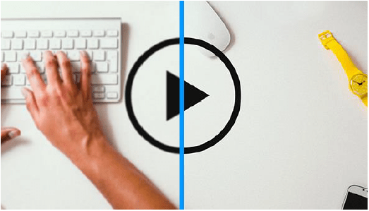
Video is engaging and entertaining. Including video in an email can result in a 19% increase in open rate and click-through rate would increase by over 50%. However, this media will not display in the inbox unless your subscriber's email client supports the HTML5 format and tags. Since only one popular email client, Apple Mail, supports these tags, it's best to avoid embedded media and consider an alternative. Consider animated gifs or Kristian Robinson's "Fake Video" technique. To send audio files, share a link to an audio file.
Using a play button above a static image is probably the easiest way to link to video content hosted on site.

Another very easy way to give the illusion of a video in an email is to use an animated gif. The gif format is widely supported, but keep in mind that it doesn't work everywhere: In Outlook 2007, 2010, 2013 and Windows Phone 7, only the first image of your GIF file will be displayed. So make sure that all key information is in that first image. Also, be aware of the weight of your animated gif.
Eco-design and accessibility
Email template weight
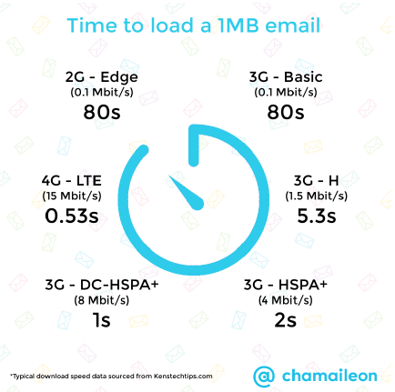
The weight of an HTML file as well as the attached images is a particularly important subject in emailing. It impacts several important points of a good campaign: its deliverability, its loading time. To get an idea of the loading time required to display an email, here is a small illustration of the loading time of a 1 MB email on mobile networks. By analyzing this document, we recommend that you keep the weight of your email at (images + HTML file) less than 1 Mb (preferably around 500 kb) to provide an appropriate loading experience, even for those who read your emails with limited download speed.
The weight of images
Images are a considerable resource in the loading time of an email. If an email may seem to take a long time to download and display, it may be due to the weight of the attached images. Connection speeds are variable, and with mobile devices now ubiquitous, it is essential to optimize the number and weight of images to improve the loading speed. To do this, you need to:
- Choose the right image formats: GIF, JPEG, PNG. Choose the extension according to the quality, the content, and the desired rendering of the image.
- Use image "optimizers" to reduce the weight, while maintaining the best possible quality.
- Make sure that the server where your images are hosted will be able to display them quickly on a large scale.
- Use as few images as possible: each image you include in your email will be downloaded from your server. If you have 20 images, that means 20 requests to the server.
The weight of HTML CSS code
Should we restrict ourselves to a certain weight for the HTML file? Keep in mind: less is more! If the weight of an HTML file is reduced to its minimum, its loading time will be optimized! Moreover, you should know that Gmail truncates any content after the 102ers kilobytes of an email.
To reduce the weight of an HTML file, you must first think about it upstream, before any integration begins: the integration method (responsive coding, hybrid) can impact the total weight of an HTML file. You should almost think about the weight of the file even further upstream, during the graphic creation of the email: a very "high" email, with a complex responsive version, requiring many media queries, should get your attention!
To reduce the size of the HTML file, remove all media queries, styles, attributes, properties, comments that are not absolutely necessary. You can also decide to "minify" your HTML file, by removing the indentation, but make sure that the CSS properties and the HTML code will remain unchanged.
Height
Outlook 2007 and 2010 use the Microsoft Word rendering engine to display an email. Microsoft Word offers different display modes. Outlook uses the "Web" view. Within this mode there are text limits. If the limit is exceeded, a line break is automatically inserted. The last value returned was 23.7 inches, or about 1790 pixels. To avoid this problem, split your integration into separate tables.
Semantics
Semantic HTML is the use of HTML markup to enhance the semantics of a website. (the meaning) of the information contained, i.e. its meaning, rather than simply defining its presentation (or appearance). Semantic HTML is processed by common browsers, but also by many other user agents.
For example, recent HTML specifications discourage the use of the iwhich indicates an italic font style, in favor of semantically more precise tags, such as emwhich indicates an emphasis. It is the CSS that then specifies whether this emphasis is represented by an italic style, a bold style, an underline, a slower or stronger pronunciation, etc. Tagging information in different ways allows Web agents to (or user-Agent) such as search engines and other software to accurately assess the importance of the text.
If semantics is starting to appear in email, it is mainly for accessibility reasons.
Accessibility
Accessibility includes notions that we can no longer ignore. The accessibility of an email is not only about its support on email clients, its readable design, the ability to understand the information, or the presence of a full text version or a link to a mirror page. Accessibility also means being able to work with assistive tools. And this is where semantics also comes into play. Assistive tools are screen readers, magnifiers, software to accentuate contrast or tints, the ability to navigate through the email without the use of the mouse...
The new good practices recommend using the right tools for a better understanding: using p for paragraphs ul and li for bulleted lists table for tables... Finally, semantic markup in an email will have an accessibility function mainly for screen readers who, by scanning the content of the email, will then be able to correctly define titles, lists, emphasized texts, specific texts, quotes, etc...
Inboxes: mail clients and OS
Web developers consider a handful of browsers when designing and building a website. Standards-based Web design has brought most browsers to relative parity. But in the email world, there are dozens of email clients, some of which have been around for decades. Large, slow-moving companies still have employees who rely on outdated clients such as Lotus Notes or Outlook 2000.
Besides email software, webmails present twice as many problems: you are forced to consider not only how the email client itself displays and interprets HTML and CSS, but also how the browser in which the client is displayed interprets those same languages. An email displayed in Gmail on Firefox can look very different from an email in Gmail on Internet Explorer 8.
With the exponential growth of mobile, a new scene for email clients has materialized. Here is a non-exhaustive list of the most used email clients.
Desktop email clients
Desktop clients or email software are the traditional way to read email, as they are strongly linked to desktop environments. Actual usage is dominated by Outlook. But as the number of mobile readers increases, desktop viewing continues to experience a significant decline.
Microsoft Windows
Microsoft's Outlook is by far the most popular software in the world. For years, Outlook has been integrated into the Windows operating system, which has ensured its widespread use in homes and businesses.
Outlook 2007/2010/2013
In 2007, Microsoft chose to replace the HTML rendering engine of Outlook that was previously based on Internet Explorer 6 with a rendering engine based on Word. As a result, Outlook 2007 has catastrophic CSS support. The 2010 and 2013 versions suffer from the same problem.
Conditional comments
Conditional comments are actually used to provide Outlook-specific styles or HTML elements. It works the same way as targeting Internet Explorer when designing a website, but here we target Microsoft Office, or "mso". Precede the comment with gt (for greater than) will target newer versions to the targeted version. Precede the comment with lt (for lesser than) will target older versions to the targeted version. Add a e à gt or lt will allow to target higher, lower or equal versions, respectively.
<!--[if gte mso 9]>
<style>
/* Votre CSS spécifique à Outlook vient ici */
</style>
<![endif]-->
In the example above for example, gte is added so that the comment applies only to Microsoft Office versions greater than or equal to 9ème version. Version 9 of Outlook corresponds to Office 2000. Here is the list of the different versions and their correspondences:
- Outlook 2000: Version 9
- Outlook 2002: Version 10
- Outlook 2003: Version 11
- Outlook 2007: Version 12
- Outlook 2010: Version 14
- Outlook 2013: Version 15
Conditional comments are remarkable for eliminating bugs and greatly reducing Outlook-related coding issues.
DPI
DPI stands for "dots per inch". Dots per inch. Computer screens are usually configured in 72 dpi. (at least that's what was set in the 1990s)This is 72 pixels by 72 pixels, or 5184 pixels in a square 2.54 cm wide by 2.54 cm high. This changes in 2011, when the fictitious resolution of 96 dpi takes over. But a 120 dpi resolution becomes the default setting on most new high-resolution laptops (HiDPI devices) or perhaps the machine is configured that way for accessibility reasons. However, when a higher DPI is used, all text and graphic elements are scaled, as when you zoom in on text from Mozilla Firefox for example.
However, since Outlook uses Microsoft Word to render an email, the rendering on Outlook in 120 DPI will be affected by this change. The code will be modified, but only on certain parts, while leaving other parts unchanged. Specifically, the pixel values of the width and height of table and td will remain unchanged (so, in pixels) when the other pixel values in the email will be transformed into points (the property font-size for example). This combination of non-evolving values (pixels) and evolving values (dot) creates rendering problems that we see in Outlook at 120 DPI.
A solution exists to overcome these rendering problems:
- Add an XML Namespace to the tag
html. This point is essential for Outlook to interpret the changes to be made.
<html xmlns="http://www.w3.org/1999/xhtml" xmlns:o="urn:schemas-microsoft-com:office:office">- Correct the DPI for images. We'll add a piece of code specific to Outlook just before closing the
head. This piece of code allows us to force the desired DPI parameter, which is 96.
<!--[if gte mso 9]>
<xml>
<o:OfficeDocumentSettings>
<o:AllowPNG/>
<o:PixelsPerInch>96</o:PixelsPerInch>
</o:OfficeDocumentSettings>
</xml>
<![endif]-->- Use widths and heights as CSS properties instead of attributes. This makes the task a little more difficult, but it is essential (and in the end, it's just a good habit to get into). This is only necessary when widths and heights are defined in pixels of course, since the percentage is already a scalable value. Thus :
<table width="600">Will become :
<table style="width:600px">And the same goes for cells! Keep this fix in mind for anything that might contain attributes with the unit "pixel" after all: cellpadding, cellspacingOutlook specific codes for hybrid emails...
Background image
Setting up background images in Outlook is a particularly perilous exercise. A particular technique uses the VML language (Vector Markup Language) to ensure the display of background images in Microsoft's Outlook suite of email clients. Campaign Monitor has developed a bulletproof" background image generator based on this technique.
Background image and DPI
The width in pixels and the height entered in the cell containing the background image in question are not correctly transcribed at 120 DPI, even if they are well entered in CSS properties. As a result, the cell remains at the defined width and height, and the content is completely cut off.
For this, a trick exists. Replace the tag at the top of the code with the following piece of code:
<html xmlns="http://www.w3.org/1999/xhtml" lang="en" xml:lang="en"
xmlns:v="urn:schemas-microsoft-com:vml" xmlns:o="urn:schemas-microsoftcom:
office:office">
And then add, just before closing the tag, the following piece of code:
<!--[if mso]>
<xml xmlns:w="urn:schemas-microsoftcom:
office:word"><w:WordDocument><w:AutoHyphenation/></w:WordDocument></xml>
<![endif]-->
Call to action
Good email marketing practices require that all "Call to action" be generated in HTML and CSS: first of all, this allows for immediate display of this essential content without downloading or displaying the necessary images. In addition, it also makes it easier to modulate the size of the element using media queries on the responsive version of the email, but also improves the accessibility of the email, as the data in the element will, perhaps, be more easily readable and better interpreted by voice readers or other accessibility tools.

However, a CTA sometimes implies a methodology of use and visual recognition somewhat "returned in the standards" and in the habits of the recipient (border, rounded edges, fully clickable button). So many graphic properties and interactions that are difficult to reproduce in a complex mail client like Outlook. Indeed, the displaywhich would make the a fully clickable by assigning a fixed width, height and line-height, is laborious to implement in an email. Moreover, the CSS properties that allow to reproduce the rounded edge effect will also be difficult to interpret on most email clients.
Campaign Monitor has also made life much easier for email integrators by offering a platform generating a codeThis code will give a more than correct rendering on most of the expected mail clients. On Outlook, the desired effects and rendering will be obtained using conditional comments and VML code. The main disadvantage of this solution is the duplication (according to the criteria entered) of the button, i.e. the generation of two links (identical) to be modified during an update. Finally, the difficulty and limitations come from the fact that the width of the button is fixed and does not adapt to its content, and that a CTA with more than one line of text cannot be considered.
You should also know that it will not be possible for you to (for the moment) to combine the use of "Bulletproof buttons" and "Bulletproof background images", because Outlook does not support nested VML elements.
Empty cell
In Outlook 2013, empty table cells, or cells containing a have a minimum height of about 15 pixels, regardless of the CSS property height that you have defined.
This can be annoying when you use empty cells to create margins between paragraphs, internal cell margins, or, why not, horizontal lines. But there is a solution. If you have an empty cell the kind :
<td style="height:5px">Outlook will therefore give this cell a minimum size of 15 pixels high, unless you add a style="line-height:5px; font-size:5px" where 5px would be the height of the cell you are looking for. This gives us :
<td style="height:5px; font-size:5px; line-height:5px">Google Font
In Outlook 2010 and 2013, non-web safe fonts are replaced by Times New Roman, regardless of the backup fonts implemented in the code. A 1era solution would be to target only Outlook with conditional comments and to assign to all cells with text in specific typeface (via a class for example) this code:
<!--[if mso]>
<style>
.myfont {
  font-family:Arial, sans-serif !important
}
</style>
<![endif]-->
Another solution exists, which allows to display correctly the backup fonts on Outlook. To do this, add the following style to your code:
<style>
[style*="Open Sans"] {
font-family:'Open Sans', Arial, sans-serif !important
}
</style>
Then, simply move the call to the specific typeface to the end of your property font-family :
<p style="font-family:Arial, sans-serif, 'Open Sans'">Outlook 2000/2002/2003
Unlike its more modern counterparts, early versions of Outlook tend to display HTML emails better simply because of the difference in rendering engine. Prior to 2007, Outlook email clients were powered by the Internet Explorer engine. Although they were better at rendering HTML than modern Outlook clients, these versions still relied on Internet Explorer browser technology and thus shared the same problems.
Windows Live Mail
Live Mail is a free desktop client for Windows, integrated with the Windows Essentials suite of software. Considering Microsoft's track record, this mail client is surprisingly good. Unfortunately, although it supports CSS, its total market share is relatively small.
Lotus/IBM Notes
IBM Notes - formerly Lotus Notes - is a Windows desktop client with similar functionality to Microsoft Outlook. Its CSS support is just as poor (or worse) than the latest versions of Outlook. This mail client should be excluded if you are looking for a correct rendering of an HTML email integration. Its use is more and more restricted, and it represents today a very small part of the email client market.
Apple OSX
Email clients on Apple's OSX operating system use the WebKit rendering engine to display HTML emails, which means that emails generally encounter few problems in the platform's email clients.
Apple Mail is flawless as an email client. It's based on the WebKit rendering engine, which powers browsers like Apple Safari and Google Chrome all the way to the PlayStation 3 browser. Its CSS support is state-of-the-art, and you will rarely encounter rendering problems, as its CSS support is so advanced.
Outlook
Microsoft has also designed an Outlook client for Mac, but unlike its Windows cousins, it is powered by WebKit. This means that it works just as well as Apple Mail with excellent HTML and CSS support.
Entourage
Entourage is another Microsoft desktop email client, and is the predecessor of Outlook for OSX. Entourage 2008 has a WebKit-based HTML rendering engine, and with that, pretty solid CSS support. Microsoft stopped developing Entourage in favor of Outlook for Mac.
Multiplatform
Thunderbird
Thunderbird, an email client from Mozilla, the maker of Firefox, has a very small market share. Nevertheless, it is a solid mail client that supports HTML and CSS quite well.
Webmails
A webmail or online email solution is the third most popular way to receive and read emails, after mobile and desktop. The rise of mobile readers has hurt webmails, whose usage continues to decline moderately.
Outlook.com/Hotmail
Outlook.com, formerly Hotmail, is Microsoft's webmail offering. It is also the most popular webmail client, which means it greatly influences email design in general. Unfortunately, it suffers from a few quirks that can be troublesome for your email layout.
Yahoo! Mail
The second most popular webmail after Outlook.com/Hotmail, making it an important client to consider when designing and creating your email. Yahoo's CSS support is among the best.
Gmail
102kb limit
If a mail exceeds a weight of 102kb, Gmail will display the 102ers kilobytes of the message, then generate a text informing that the message has been truncated and prompt you to click on the "View full message" message.
This already requires a first action from the recipient, and you should try to limit the interactions as much as possible, and get to the message itself as quickly as possible. With this system, the recipient does not have direct access to the content, you risk losing his attention and therefore, losing him altogether. This will affect the click rate of your campaigns.
Moreover, the unsubscribe link usually located at the bottom of the email is no longer visible, which means that, technically, the email is no longer compatible with the legal obligations of the CAN-SPAM and the RGPD... Finally, the tracking code that you usually place at the bottom of the email is also missing: you are unable to know the precise opening rate of your campaign. On mobile, it will regularly happen that you have to "reload" the email, or scroll down, and sometimes, no indication appears.
Is it possible to design emails with a weight lower than 102kb? You should already know that Google only takes into account the HTML code, and not the images. But 102kb are quickly reached, especially when it comes to templates with many modules, responsive versions with large media queries, etc.
A few tips for staying on track:
- Avoid overloading your code: Remove any property, cell, table, row, media queries that might be superfluous (
paddinginstead of thetdempty for example for internal margins). - Keep your campaign message simple, engaging, without too much information. Make sure you only broadcast the information you really need.
- Don't send multiple campaigns with the same subject line, as Gmail combines these emails into one "thread", which can make the message heavier than 102ko.
If you can't reduce the message to less than 102kb, then make the right decisions: propose a link to a mirror page in the first 102kb, insert your tracking pixel in the email header (even if it is not very aesthetic)and place the unsubscribe link in the 102ers ko too!
AOL
AOL is arguably the best webmail client: It has the best CSS support, including support for background images, positioning and display, and even some CSS3 properties. Unfortunately, AOL has a limited user base.
Mobile email customers
Apple iOS
Apple's iOS platform is not limited to the iPhone. It also includes the iPad and iPod Touch, both of which can receive email. The iOS email app is based on WebKit, like its big brother OSX. Its CSS support is unmatched, giving you a lot of freedom in designing your emails. However, iOS mail has a few small quirks that you should be aware of:
- It requires the CSS property
min-width:100%to encompass the entire email. - It needs the CSS property
webkit-text-size-adjust. - The graphic styles of addresses, phone numbers, dates or personalities of the music world are replaced by blue automatic links with underlining.
Gmail app
To the question: "Does it work in Gmail?", we will answer: "It depends... On which version?
It is important to realize that CSS support depends on multiple factors. Google has several official mail clients for Gmail (G Suite Basic, G Suite Business, G Suite for Education, G Suite for Nonprofits, etc.). But the Gmail app on Android also allows you to use any address from any email provider since November 2014. And in February 2016, Google also introduced a feature to "Gmailify" an address and thus activate certain Gmail features, even on third-party addresses.
Since its update in 2016, Gmail is therefore supposed to guarantee better support for CSS properties. However, depending on the type of client, the CSS support is not the same. So, depending on the use of Gmail, you will find different types of CSS support, which could then be summarized as follows:
The different levels mentioned here are levels established by Rémi Parmentier on the CSS support.
- Level 1 would thus correspond to "basic" CSS. This level now only concerns the Gmail Android application configured with a third party account (nicknamed GANGA for Gmail Android with a Non Gmail Account).
- Level 2 corresponds to level 1 + property support
calc()and background images. - As for level 3, it is the level 2 + the support of the
style
But how much of your campaigns will be viewed from an Android mobile with a default POP/IMAP account? Take the time to ask yourself this question...
Tips 'N Tricks
Force desktop rendering on Gmail app
This leaves very few types of Gmail usage that do not interpret the style and media queries. But it can still account for a big chunk of views on your campaigns. And if you don't code your emails in Fluid, you'll find that Gmail app automatically resizes the layout of your emailing to the size of the smartphone (which can cause serious rendering problems: the columns are much narrower if a column layout is used of course, the background images will repeat, breaks appear...).
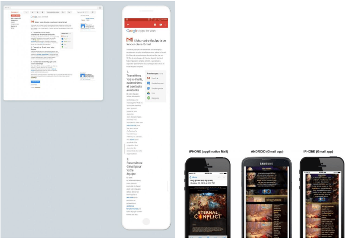
If you want to force Gmail to display the Desktop version (on media that do not support media)There are two fixes: one for Android, the second for iPhone. This solution is not necessarily ideal, since it is sometimes necessary to zoom in to read certain content, but at least the layout remains consistent since the desktop version will be displayed at the scale of the smartphone.
For Android:
- Create a spacer (one pixel transparent gif)
- Create a class
.hide {display:none}in the header of the HTML document to hide the spacer on other email clients. - Insert the following piece of HTML code in the main table of your email.
<tr>
  <td height="1" class="hide" style="min-width:600px; font-size:0px;
line-height:0px"><img height="1" src="spacer.gif" style="min-width:600px; text-decoration:none; border:none; -ms-interpolation-mode:bicubic"></td>
</tr>
For iPhone :
- Create a class
.gmailfix {display:none; display:none !important}in the header of the HTML document. - Insert the following piece of HTML code at the bottom of your HTML code.
<div class="gmailfix" style="white-space:nowrap; font:15px
courier; line-height:0">
</div>width="100%"
Recently we noticed on the Gmail application on Android that our tables, even with an attribute width="100%"were limited in width to their content (a kind of automatic shrinkage). We were not able to reproduce the problem. So we just added a style="width:100% !important ; margin:0px auto" which, it seems, solved the problem on the real tests.
Mark Robbins posted on the Litmus community forum that he had encountered the same problem on several campaigns, but now he could not reproduce it. He also noticed that Gmail app refused to respect the 100% width assigned to some tables and adapted the width to the content. Mark Robbins even added that even when a style="width:100%" was put in place, it did not solve the concern. Instead, he argued that adding a style="min-width :100%" assigned to the painting in question solved the problem.
In fact, it is at Mosaico that the explanation was found: The Gmail application for Android (and not on iOS) would sometimes, under certain circumstances, remove the properties width and min-width tables, cells and images by adding a class .munged on the elements concerned. This class .munged is defined as follows by Gmail App on Android:
table.munged {
  width:auto !important;
  table-layout:auto !important;
}
td.munged {
  width:auto !important;
  white-space:normal !important;
}
To get more technical via the source code generated by Gmail App on Android: a script performs some logic to add this class according to certain variables, including a constant WEBVIEW_WIDTH (relative to the consultation medium itself).
documentWidth = document.body.offsetWidth;
goalWidth = WEBVIEW_WIDTH;
The script adds the classand then observe the width of the email resulting from this change. If the result is satisfactory (a constant TRANSFORM_MINIMUM_EFFECTIVE_RATIO is used to determine the successful reduction rate)the class will be kept, otherwise the script will reverse all operations.
// If the transformations shrank the width significantly enough, leave them in place.
// We figure that in those cases, the benefits outweight the risk of rendering artifacts.
if (!done && (elWidth - newWidth) / (elWidth - docWidth) >
TRANSFORM_MINIMUM_EFFECTIVE_RATIO) {
console.log("transform(s) deemed effective enough");
done
The classes .munged being applied and kept on some tables, cells, or images only, this can explain the "random" side of this bug. Finally, it should be noted that this problem only concerns Gmail App on Android, not on iOS. Mozaico deduced that this could be due to differences in screen size and resolution, or to the fact that the same script was not necessarily used on iOS.
Email code tips and best practices
sup
Each mail client has a particular interpretation (at least, that's the impression you get when you run a test) of this small HTML tag. If the difference in graphic rendering often seems infinitesimal, it can be much more important on texts in a much larger font size. Similarly, when you want to set a particular type size on the supthe rendering can really become problematic.

sup depending on the messaging solutionTo ensure that this tag is rendered in the same way on most email clients, you need to implement the following HTML/CSS code:
<sup style="font-size:[valeur]px; line-height:0; vertical-align:[
valeur]px">®</sup>strong, em, i, u, mark
Many HTML integrations make unintended use of strong, em, b, ior u to format graphically (not for semantic use) a piece of text. And this is a bad habit. Indeed, any text within a strong will be displayed in bold. Any text in a em will be displayed in italics, and so on...
But these tags are in no way intended for a graphic formatting of an HTML text. It is a default formatting that is assigned to them for the moment, where all email clients and browsers seem to be unanimous on the display. However, when we consult the definitions and uses of each of these tags on the w3schools website, we can see that these tags have a "semantic" function.
iThis tag defines a part of the text in another tone or "mood".uThis tag represents text that must be "stylistically" different from normal text, such as misspelled words.strongThis tag defines an important text.emThis tag defines an underlined text, in the sense of "the emphasis is on...".markThis tag is used to highlight parts of a text.
The tag mark can already be definitively removed from the list: its "graphic" support is not supported by all mail clients. As for the other tags, keep in mind that their purpose is semantic. But if it is only a graphic formatting, prefer the use of a span with the corresponding CSS property : font-weight, font-style, text-decoration, background-color.
This point does not really pose a problem for rendering on the mail clients for the moment, but it is necessary to address it, because, in the future, perhaps the graphic formatting of the strong, em, i, u or mark could change.
Underlining and automatic links
The automatic underlining of addresses, phone numbers, dates or sequence of numbers or words on iOS, with that characteristic electric blue, sometimes interferes with your creative! But if the formatting leaves something to be desired, it is still interesting to leave the link automatically present on these pieces of text. Why should you do this? Because it's a question of ergonomics, functionality and accessibility! If a phone number can become automatically clickable to generate a call, or an address to bring on Google map, or a date to create an event in a calendar, it would be a shame to remove these features.
However, let's admit that the formatting of the blue text can also cause readability problems (if the background of the cell is in a shade of blue or purple for example). This can impact the readability of the email and its content.
If we take a closer look at the code generated on iOS, we realize that on iOS devices, the attribute x-apple-data-detectors is added to the links in question.
<a href="#" x-apple-data-detectors="true">A "tip" can then be applied accordingly: in the declaration stylespecify all links with this attribute to apply color, font-size, font-family, font-weightand line-height in inherit (inherited from their cell).
a[x-apple-data-detectors] {
  color:inherit !important;
  text-decoration:none !important;
  font-size:inherit !important;
  font-family:inherit !important;
  font-weight:inherit !important;
  line-height:inherit !important
}
Thus, these automatic links will automatically inherit the colors, font-weight, line-height defined in the HTML element, while maintaining their functionality! Of course, don't forget the !important to overwrite the automatic formatting (and specify, if necessary, a text-decoration:none if you do not wish to see these texts underlined).
If, in spite of everything, pieces of text or numbers should contain links when there is no need for them (suite de nombre sur un code SIRET par exemple)or you are on Gmail which since September 2017 has applied the same features as iOS on addresses and phone numbers, there is another little tip that should allow you to solve the problem: put a around the concerned text :
<span class="appleLinks01">RCS 195 645 362</span>with a named class, for example, appleLinks01. Then, in the style of your email, specify that this class must be in a certain color, without text-decoration :
.appleLinks01 * {text-decoration:none !important; color:#000 !important}On the Zimbra webmail (used by Free and by laposte.net) Zimbra transforms the dates into blue links to connect the date with the integrated calendar. Here too, a small piece of code solves the problem:
span.Object {
  color:inherit !important
}
span.Object-hover {
  color:inherit !important;
  text-decoration:none !important
}
Invalid "a" link tag and office 365
More than three years ago, we learned that Office 365 was removing all tag a with an attribute href vacuum (or without attribute href). In truth, it is a little more complex: When you insert, within your hrefIf you want to use a URL other than a URL, Office 365 will display this content within the email inside the brackets. Thus, the following code :
<a href="Hello">world</a>Will become :

While Justin Khoo (from Freshinbox) and Elliot Ross (Action Rocket / Taxi for Email) specified that adding a # (for an anchor) or a http:// (for a valid url) just before the content would solve the problem, we still have the impression that this is not enough today (at least for the #). Because we often have to set up #toreplace within attributes hrefThis can become particularly problematic when you try to insert anchors for example in your email (starting with a #).
The solution is of course to fill in valid urls in the href attributes of your a and to abandon, at least for the moment, the use of anchors which are not well supported on all mail clients. Rémi Parmentier even detailed that the styles applied to a a The "problematic" elements were applied to the first element with an attribute style in the following code. Thus, on Outlook.com, the following code:
<a style="color:red; background-color:yellow;"></a>
<p>A paragraph</p>
<p>Second paragraph with no style</p>
<p style="">Third paragraph with style</p>
<p style="">Fourth paragraph with style</p>
Became :
<p>A paragraph</p>
<p>Second paragraph with no style</p>
<p style="color:red; background-color:yellow;">Third paragraph with
style</p>
<p style="">Fourth paragraph with style</p>
And to go further: any style of a tag a invalid will be "pushed" to a kind of styles array, array then inserted on the first element with a style attribute. So :
<a style="color:cyan; background-color:cyan;">cyan</a>
<a style="color:purple; background-color:purple;">purple</a>
<a style="color:black; background-color:black;">black</a>
<p style="">Empty style 1</p>
<p style="">Empty style 2</p>
<p style="">Empty style 3</p>
Will become :
<p style="color:cyan; background-color:cyan; color:purple; background-color:purple; color:black; background-color: black;">Empty style 1</p>
<p style="">Empty style 2</p>
<p style="">Empty style 3</p>
Increasing efforts of email clients
We now see, and this is probably thanks to the growing email marketing community, that the rendering problems reported are generally quickly solved, not only by hacks & tips developed by integrators, but also by the email client itself (and it is important to note this, because it shows the willingness of some email clients, not all of them, to evolve).
Goomoji
Thus, on November 27, 2017, EmailonAcid brought up on his blog the fact that the symbols ™ (trademark), ® (registered) or ©. (copyright) were replaced, on Gmail iOS, by blue Emoji (more precisely goomoji) larger than the substituted text (24 pixels by 24 pixels).
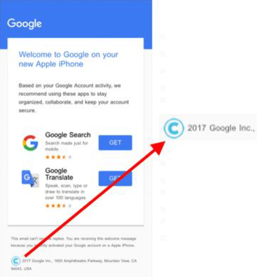
Several fixes were developed and tested, more or less successful. Two days later, the problem was solved by Gmail.
Spaces under the images
We at Badsender have contributed, in our own way, to the correction of a bug on Outlook.com. A little more than a year ago, we noticed on our email preview tests that a space came under our images on Office 365 and Outlook.com.
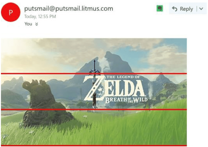
We had a solution: add a style="font-size:0px" on the cells containing these images. But we did not understand the problem. We posted a message on the Litmus community forum to find out what the problem was.
This was followed by a series of discussions (Outlook actually came to transform a simple img in div/button/img)a set of hacks (adding id starting with OWATemporaryImageDivContainer on the images). But Rémi Parmentier hastened to close the subject: The Outlook.com staff had implemented an update that corrected this problem.
Once again, the teams of the concerned email clients tried to solve, by themselves, the problems raised, and thus contributed to the improvement of the HTML integration of the emails.
Concluding rendering and opening environments
Get to know the clients and operating systems for which you will be graphically and technically designing your emails. This is just as important as knowing how to design (graphically and technically) of the emails. This task is done step by step by regularly analyzing, via the campaign statistics, the email clients on which your campaigns are consulted.
BtoB webmails and email software are clearly not the same as BtoC ones. This is not the only element to take into account of course, it is only an example, but the technical constraints that can result from it are quite different. Analyze the average age of your target, its type of consultation medium (resolution, OS)Know your target to adjust your emails, your coding methods (as in design) accordingly.
If you don't have any feedback on your campaigns, or are just starting out with email marketing, then get inspired by an overview of the usage and market share of email clients, such as the one proposed by Litmus. These statistics are automatically updated every month. You can use the top 10 customers as a basis.
Email Integrator Mantra
What's best for the user?
The email template uses third party fonts? I can code this email all in images. Or I can integrate this font in CSS and leave the text in HTML, knowing however that it won't work everywhere.
Not all mail clients support the style ? I can write all my styles inline. Or I can make sure that the email will degrade gracefully and display as well as possible on other email clients.
There is no absolute answer to this question, because each project is specific. What will work for one project may not work tomorrow for another.
It all depends on the target
Each project is specific, in the sense that the list of recipients is specific to each project. Depending on the target of the campaign, and on its behavior (the medium used for the consultation of the email, or the requested email client)some coding techniques and methods may be preferred to others (if the consultation on international webmails is absent, and the opening from a GANGA very weak, then it is perhaps interesting not to code the CSS online for example).
To summarize:
| Safe use | Use with care | Do not use |
|---|---|---|
| - Static layouts with tables - HTML tables and nested tables - Model width less than or equal to 600px - Simple, inline CSS - Standard fonts | - Background images - Specific/exotic web fonts - The CSS in the style | - JavaScript – iframe- Flash - Integrated audio - Integrated video - Forms – div |
Use with caution: limited support for most mail clients.
Do not use: not supported by most email clients.
Anticipate HTML integration from the design phase
The work on the design of the email must be carried out with the knowledge of the technical constraints to be expected during the coding phase. That's why a Print Designer is not suitable for email design. Nor a Web Designer for that matter. Because a Web Designer will think of the email as a page (if he does not know and master the complexities) and will therefore not take into account, for example: the fact of not designing emails with a width greater than 600 pixels, of using very few specific fonts, of using background images with care, of not setting up a video, etc.
What tools do you need to create your emails?
The HTML integration of an emailing is made of multiple steps, each requiring specific tools: design and development of the HTML code, auto-completion, indentation, email preview / email rendering tests, delivery to the client... Let's see in detail the tools and platforms specific to these different phases.
Email design tools
Dreamweaver
Dreamweaver is a WYSIWYG web site editor for Microsoft Windows and Mac OS X created in 1997, marketed by Macromedia and then Adobe Systems. Dreamweaver was one of the first "such a view, such a result" HTML editors, but also one of the first to integrate a site manager. These innovations quickly made it one of the main web site editors, usable by both beginners and professionals.
Dreamweaver offers two design modes through its view menu. The user can choose between a creation mode allowing to make the layout directly with simple tools, comparable to a word processor (table insertion, image insertion, etc.). It is also possible to display and modify directly the code (HTML or other) which composes the page. You can easily switch from one display mode to another, or opt for a mixed display. This last option is particularly interesting for beginners who, in the long run, wish to become familiar with the HTML language.
Brackets
Brackets is an open source editor for web design and development on web technologies such as HTML, CSS and JavaScript. The project was created and is maintained by Adobe, and is released under an MIT license.
Notepad++ and Sublime Text
It is quite possible to code an HTML file from a text editor. Notepad++ for Windows and Sublime Text for Apple are both text editors with features that help with HTML development (Tag colors, etc.). They are also free.
Test your email templates: tools and methodology
The "Testing" part is undoubtedly one of the most important steps in HTML integration. Every HTML campaign must be tested before being sent to the client, in particular to ensure that it is rendered correctly. This step should never be neglected by the integrator. To confirm a correct rendering and validated by the client, several solutions are possible:
Physical support
The preferred method is, of course, real-life testing on physical media. Few structures have the means to set this up. The panel of supports to test is large, and it requires consequent investments. However, let's keep in mind that any physical medium at immediate disposal should not be neglected. At least one test on a physical device should be essential: email preview platforms will probably never be able to cover the multiplicity of software versions, resolutions, particular connection parameters... They can only with difficulty give you an estimate of the time spent downloading and displaying the images, of the cuts or bugs that will sometimes be caused by the weight or height of the tested email...
Email preview solutions
"Email rendering" or "email preview" are related: They refer to "the preview of the rendering of an email". The email preview makes it possible to test the email rendering of a campaign. The one does not go without the other. The email preview only precedes and confirms (or correct if necessary) email rendering. As a designer, project/campaign manager, integrator, we want to make sure that the HTML integration is rendered correctly, and the email preview is there for that.
"Email rendering refers to the problem of visual rendering of email messages within the different tools and email services used by the recipients of a campaign. One of the characteristics of email marketing is the fact that the same message can give different visual renderings from one reading environment to another depending on the tool used and the email rendering engine, but also depending on the different configurations of the same solution. Email rendering tests prior to a campaign allow us to see how the code is interpreted by the different environments, to see what the message looks like depending on whether the image display option is activated or not, and to possibly see the previews in the preview window."
marketing.com
Email preview platforms have become important allies (see indispensable) to ensure a consistent and correct rendering on the majority of mail clients and media. Some of these tools are more or less "advanced", and develop and offer interesting features, optimizing relentlessly their clients' campaigns: code optimization, graphic inspiration, reporting, spam and deliverability testing, loading time and image weight optimization, instant rendering, "mozified" images... It's all a question of ... means! The battle is also on the number of renderings delivered. Let's review the best-known and most important email preview platforms on the market:
Litmus
THE email preview platform par excellence. Litmus stands out by the whole of the functionalities which it proposes: Builder and tests in real time, tests of the links, email analytics, spam testing, resources, community and forums, innovations... Without any doubt, Litmus exceeded the threshold of the simple platform of email preview to become an actor impossible to circumvent of the email marketing. True reference, the brand organizes from now on " Litmus Live " to share on the email marketing: Design, ergonomics, code, innovations, optimization of campaigns... All (or almost) is discussed.
EmailonAcid
Hosting
During the email preview phase, some platforms will automatically host the images attached to the HTML integration. Others, on the other hand, will require that the images are already hosted on a server and that the paths of these images within the HTML integration are absolute.
Filezilla, FTP software (for File Transfer Protocol) is undoubtedly the easiest to use to host images correctly. This software is available for Windows, Mac OS X, and GNU/Linux.
Delivery
Usually, the delivery method of the HTML integration is to send a ZIP file containing the HTML file, as well as the attached image folder. The most efficient solution for this is the "Compressed Folder" offered by Windows, or the possibility of compressing these elements directly via the Winrar or Winzip tools, Windows data compression utilities, which focus on the RAR and ZIP data compression formats.
Conclusion: how difficult it is to code HTML email these days
In HTML, email integration is a delicate art, partly due to the number of email clients on the market that have very different behaviors. This disparity in the interpretation of HTML emails comes from several factors:
- Thick email clients (Outlook, Thunderbird, Lotus Notes...) have a radically different operation from webmails (Gmail, Yahoo Mail, Hotmail, Outlook.com...).
- These same webmails impose very strict rules on the HTML and CSS code contained in the emails because the messages themselves are displayed in a web page structure that has its own styles.
- Some engines are very exotic, for example Outlook 2013 still uses Word's HTML interpretation engine, which virtually means that CSS support in Outlook has not changed between versions 2007, 2010 and 2013, where browsers have made giant leaps.
Even more than the web, pixel-perfect HTML email graphics on all platforms is a utopia199. What's more, the real interest lies not in this objective, but in the mobile versions of these emails, and their accessibility. It is therefore important toimprove the display of your emails in messaging servicesbut not to aim for perfection.
Resources
Many of the texts in this white paper come from multiple blogs/websites dealing with the subject of email marketing. When the sources are good and verified and the texts are perfectly well written, why try to transcribe them otherwise? "Render to Caesar what belongs to Caesar, and to God what belongs to God. We can never thank them enough for their contribution and hope not to commit any omission by listing below the contributors concerned.
Badsender
- https://www.badsender.com/2009/08/03/can-spam-act-spam-loi-etats-unis-optin-optout/
- http://test.badsender.com/krktr/
- https://www.badsender.com/2017/11/09/email-css-position-absolute/
- https://www.badsender.com/
- http://agence.badsender.com
Campaign Monitor
- https://www.campaignmonitor.com/blog/email-marketing/2010/11/the-trouble-with-anchor-links-in-email-newsletters/
- https://www.campaignmonitor.com/resources/guides/web-fonts-in-email/
- https://www.campaignmonitor.com/blog/email-marketing/2013/01/outlook-com-drops-margin-and-float-support-entirely/
- https://buttons.cm/
- https://www.campaignmonitor.com/blog/email-marketing/2012/08/outlook-2013-says-no-to-empty-table-cells/
- https://backgrounds.cm/
- https://www.campaignmonitor.com/resources/guides/video-in-email/
- https://www.campaignmonitor.com/blog/email-marketing/2006/01/the-truth-about-flash/
- https://www.campaignmonitor.com/blog/email-marketing/2016/07/10-things-need-know-web-fonts-email-right-now/
- https://www.campaignmonitor.com/css/media-queries/media/
- https://www.campaignmonitor.com/blog/email-marketing/2011/04/media-query-issues-in-yahoo-mail-mobile-email/
- https://www.campaignmonitor.com/dev-resources/guides/mobile/
- https://www.campaignmonitor.com/resources/guides/alt-text-in-email/
- https://www.campaignmonitor.com/blog/email-marketing/2010/11/correct-doctype-to-use-in-html-email/
- https://www.campaignmonitor.com/css/
- Campaign Monitor, "Email Interaction across mobile and desktop
Chamaileon
- https://blog.chamaileon.io/limitations-of-html-email-design-email-width-and-size/
- https://blog.chamaileon.io/what-do-scalable-fluid-responsive-and-hybrid-email-design-mean/
EmailonAcid
- https://www.emailonacid.com/
- https://www.emailonacid.com/blog/article/email-development/gmail-ios-replacing-copyright-symbols-with-blue-emoji-and-how-to-fix-it
- https://www.emailonacid.com/blog/article/email-development/mobile-optimization-retina-images-in-email/
- https://www.emailonacid.com/blog/article/email-development/demystifying-meta-tags-in-email/
- https://www.emailonacid.com/blog/article/email-development/doctype_-_the_black_sheep_of_html_email_design/ V1 - October 2018. p.100
Email Designer
- http://email-designer.net/supprimer-modifier-couleur-liens-webmail-zimbra/
EmailMonday
- https://www.emailmonday.com/google-amp-for-email-everything-you-wanted-to-know/
- https://blog.google/products/gmail/gmailify-best-of-gmail-without-gmail/
- https://developers.google.com/gmail/design/reference/supported_css
- https://www.blog.google/products/g-suite/bringing-power-amp-gmail/
Hteumeuleu
- https://emails.hteumeuleu.fr/2016/05/est-ce-qu-un-e-mail-doit-avoir-le-meme-rendu-partout/
- https://emails.hteumeuleu.com/outlook-coms-latest-bug-and-how-to-fix-gaps-under-images-ee1816671461
- https://emails.hteumeuleu.fr/2016/10/quel-doctype-faut-il-utiliser-dans-un-email/
- https://github.com/hteumeuleu/email-bugs/issues/10
- https://emails.hteumeuleu.fr/2016/01/gmail-app-on-android-tries-to-shrink-your-email-with-munged-classes/
- https://emails.hteumeuleu.com/trying-to-make-sense-of-gmail-css-support-after-the-2016-update-53c15151063a
- https://emails.hteumeuleu.fr/2014/08/outlook-com-supporte-bien-css-float-margin/
- https://emails.hteumeuleu.fr/2017/02/faut-il-arreter-d-ecrire-ses-styles-en-ligne-dans-des-e-mails/
- https://emails.hteumeuleu.com/how-webmails-block-images-4cc2ba4d2d0e
- https://www.hteumeuleu.fr/le-mantra-de-l-integrateur/
Litmus
- https://litmus.com/ https://litmus.com/blog/the-pros-and-cons-of-video-in-email-video
- https://litmus.com/blog/why-is-email-rendering-so-complex
- https://litmus.com/community http://emailclientmarketshare.com/
- https://litmus.com/community/discussions/4594-outlook-365-displays-tbd-on-empty-href-tags
- https://litmus.com/community/discussions/1475-office-365-links
- https://litmus.com/community/discussions/6509-html-semantic-elements-in-email
- https://litmus.com/community/discussions/1524-do-you-care-about-semantics-in-html-emails
- https://litmus.com/community/discussions/4624-fixed-gmail-app-not-respecting-100-width
- https://litmus.com/community/discussions/4410-gmail-app-stacked-column-width-woes-no-media-queries
- https://litmus.com/blog/the-tyranny-of-tables-why-web-and-email-design-are-so-different
- https://litmus.com/blog/the-ultimate-guide-to-styled-alt-text-in-email
- https://litmus.com/community/discussions/36-outlook-and-fallback-fonts
- https://litmus.com/blog/the-ultimate-guide-to-web-fonts
- https://litmus.com/blog/a-guide-to-bulletproof-buttons-in-email-design
- https://litmus.com/community/discussions/960-outlook-2013-breaks-td-height
- https://litmus.com/blog/ultimate-guide-accessible-emails
- https://litmus.com/community/discussions/4931-using-retina-images-as-background-images
- https://litmus.com/blog/understanding-retina-images-in-html-email https://litmus.com/blog/the-ultimate-guide-to-web-fonts
- https://litmus.com/blog/the-ultimate-guide-to-background-images-in-email
- https://litmus.com/blog/understanding-responsive-and-hybrid-email-design
- https://litmus.com/help/email-clients/media-query-support/ V1 - October 2018. p.101
- https://litmus.com/blog/understanding-media-queries-in-html-email
- https://litmus.com/blog/top-email-design-trends
- https://litmus.com/community/discussions/6116-here-s-why-litmus-didn-t-inline-css-for-its-first-newsletter-of-2017
- https://litmus.com/community/discussions/261-td-display-block-not-working-on-android
- https://litmus.com/blog/background-colors-html-email Litmus, "State of Email," March 2017
Mailchimp
- https://mailchimp.com/fr/help/limitations-of-html-email/
- https://templates.mailchimp.com/development/css/outlook-conditional-css/
- https://templates.mailchimp.com/concepts/email-clients/
Mosaico
- https://mosaico.io/email-client-tricks/gmail-android-tries-to-shrink-your-email/
- https://mosaico.io/email-client-tricks/email-inliners/
Slideshare
- https://fr.slideshare.net/M_J_Robbins/accessibility-in-email-eoainsights
- https://fr.slideshare.net/paulairy/a-type-of-accessibility-65004974?next_slideshow=1
W3Schools
- https://www.w3schools.com/tags/
- https://www.w3schools.com/cssref/pr_pos_vertical-align.asp
- https://www.w3schools.com/css/css_float.asp
- https://www.w3schools.com/cssref/pr_class_display.asp
- https://www.w3schools.com/css/css_positioning.asp
- https://www.w3schools.com/cssref/pr_margin.asp
- https://www.w3schools.com/tags/tag_html.asp
- https://www.w3schools.com/cssref/pr_dim_line-height.asp
- https://www.w3schools.com/tags/tag_doctype.asp
- https://www.w3.org/QA/2002/04/valid-dtd-list.html
- https://www.w3schools.com/cssref/pr_text_text-align.asp
- https://www.w3schools.com/cssref/pr_font_weight.asp
- https://www.w3schools.com/cssref/pr_padding.asp
- https://www.w3schools.com/cssref/
- https://www.w3schools.com/tags/tag_head.asp
- https://www.w3schools.com/tags/tag_meta.asp
- https://www.w3schools.com/cssref/pr_font_font-size.asp
- https://www.w3schools.com/cssref/pr_font_font-family.asp
- https://www.w3schools.com/html/html_css.asp
- https://www.w3schools.com/tags/att_global_dir.asp
- https://www.w3schools.com/tags/att_global_style.asp
- https://www.w3schools.com/tags/att_global_id.asp
- https://www.w3schools.com/tags/att_global_class.asp
- https://www.w3schools.com/tags/att_a_target.asp
- https://www.w3schools.com/tags/att_td_rowspan.asp
- https://www.w3schools.com/tags/att_td_colspan.asp
- https://www.w3schools.com/tags/att_td_valign.asp
- https://www.w3schools.com/tags/att_table_cellpadding.asp
- https://www.w3schools.com/tags/att_table_cellspacing.asp
- https://www.w3schools.com/tags/att_img_border.asp V1 - October 2018. p.102
- https://www.w3schools.com/tags/att_global_title.asp
- https://www.w3schools.com/tags/att_width.asp
- https://www.w3schools.com/tags/att_height.asp
- https://www.w3schools.com/tags/att_img_src.asp
- https://www.w3schools.com/tags/att_a_href.asp
- https://www.w3schools.com/tags/att_img_alt.asp
- https://www.w3schools.com/tags/tag_p.asp
- https://www.w3schools.com/tags/tag_hn.asp
- https://www.w3schools.com/tags/tag_comment.asp
- https://www.w3schools.com/tags/tag_a.asp
- https://www.w3schools.com/tags/tag_span.asp
- https://www.w3schools.com/tags/tag_br.asp
- https://www.w3schools.com/tags/tag_div.asp
- https://www.w3schools.com/tags/tag_img.asp
- https://www.w3schools.com/tags/tag_tr.asp
- https://www.w3schools.com/tags/tag_td.asp
- https://www.w3schools.com/tags/tag_th.asp
- https://www.w3schools.com/tags/tag_body.asp
- https://www.w3schools.com/tags/tag_table.asp
- https://www.w3schools.com/tags/tag_style.asp
- https://www.w3schools.com/html/html_blocks.asp
- https://www.w3schools.com/html/html_basic.asp
- https://www.w3schools.com/tags/ref_byfunc.asp
- https://www.w3schools.com/html/html_elements.asp
Wikipedia
- https://fr.wikipedia.org/wiki/Adobe_Dreamweaver
- https://fr.wikipedia.org/wiki/Brackets
- https://fr.wikipedia.org/wiki/WebKit
- https://fr.wikipedia.org/wiki/Vector_Markup_Language
- https://fr.wikipedia.org/wiki/Syst%C3%A8me_d%27exploitation
- https://fr.wikipedia.org/wiki/Site_web_adaptatif https://fr.wikipedia.org/wiki/Indentation
- https://fr.wikipedia.org/wiki/Feuilles_de_style_en_cascade
- https://fr.wikipedia.org/wiki/World_Wide_Web_Consortium
Other
- https://www.win-rar.com/start.html?L=10
- https://www.winzip.com/win/fr/downwz.html
- https://blog.gorebel.com/absolute-positioning-in-email/
- https://www.lafabriquedunet.fr/email-marketing/guide/coder-email-html-css/
- http://xhtml.le-developpeur-web.com/balise_autofermante-xhtml.php
- https://www.whoishostingthis.com/blog/2014/12/06/jpeg-gif-png/
- https://css-tricks.com/snippets/css/comments-in-css/
- https://www.w3.org/TR/html401/present/graphics.html#h-15.1.2
- https://filezilla-project.org/
- https://www.definitions-marketing.com/definition/integration-email-html/
- https://webdesign.tutsplus.com/tutorials/creating-a-future-proof-responsive-email-without-media-queries–cms-23919
- https://www.definitions-marketing.com/definition/email-rendering/
- https://github.com/FunWithEmail/HTML-Email-Hacks
- https://helpx.adobe.com/dreamweaver/using/reuse-code-with-snippets.html V1 - October 2018. p.103
- https://emmet.io/
- http://removebluelinks.com/
- http://www.comprendre-internet.com/Qu-est-ce-que-le-HTML.html
- http://www.pompage.net/traduction/Bien-utiliser-le-texte-alternatif
- http://blog.emailwizardry.co/2012/12/how-to-fix-superscript-characters/
- https://github.com/bago/android-gmail-emulator
- http://xahlee.info/js/html5_non-closing_tag.html
- https://www.pierre-giraud.com/html-css/cours-complet/block-inline-html-css.php
- https://audreytips.com/gmail-emailing-tronque/
- http://www.courtneyfantinato.com/correcting-outlook-dpi-scaling-issues/
- http://sebsauvage.net/comprendre/dpi/index.html
- https://www.lesintegristes.net/2011/05/06/web-resolution-72dpi/
- http://freshinbox.com/blog/faux-video-video-in-email-using-sprites/
- https://codepen.io/kristianrobinson/pen/EwERve
- http://www.emailmarketingtipps.de/2018/02/19/amp-for-email-controversies/
- https://www.lafabriquedunet.fr/email-marketing/articles/google-amp-emails-interactifs/
- https://blog.internet-formation.fr/2018/02/google-introduit-amp-for-email-pour-gmail/
- https://www.presse-citron.net/amp-google-veut-rendre-e-mails-plus-interactifs/
- http://blog.agence-bmobile.com/2018/02/amp-email-ce-que-le-gmail-interactif-va-peut-etre-changer-pour-vous/
- https://www.youtube.com/watch?v=sj2KANF9o3k
- https://ignitevisibility.com/amp-for-email/
- https://www.definitions-marketing.com/definition/flash/
- http://email-a-table.fr/le-javascript-dans-les-emails,495
- http://www.ampsoft.net/webdesign-l/WindowsMacFonts.html https://www.anthony-brard.com/les-fonts-web-safe
- https://websitesetup.org/web-safe-fonts-html-css/
- https://www.cssfontstack.com/
- https://www.alsacreations.com/article/lire/930-css3-media-queries.html
- https://compressjpeg.com/fr/
- https://www.jpegmini.com/
- https://tinyjpg.com/
- https://tinypng.com/
- https://ezgif.com/
- https://www.emailmonday.com/mobile-email-usage-statistics/
- http://formation.upyupy.fr/html-xhtml/caracteres-speciaux/
- https://www.jchr.be/html/caracteres.htm
- https://htmlcolorcodes.com/fr/noms-de-couleur/
- https://unsplash.com
- The Radicati Group, "Email Statistics Reports, 2014-2018."
- Email in Motion: How Mobile is Leading the Email Revolution, Return Path, 2011
