At Badsender, we're concerned about the climate crisis facing our world. Aware that in our business, the end result of marketing actions isn't always the most virtuous, we'd like to use this guide to explain the basics of emailing eco-design, so as to improve your marketing. email carbon footprint.
What is eco-design?
Eco-design is the set of methods used to reduce the environmental impact of a product or service. In the case of eco-design in emailing, the aim is to reduce the amount of energy and resources needed to produce, transport, display and store an email.
While there are many ways in which the CRM to support the ecological transitionin this guide, we focus on best practices in terms of email design and html integration for email.
What impact does email have on the carbon footprint?
There are various studies that calculate the carbon footprint of an emailbut it's extremely complicated to measure precisely. Many factors go into the calculation.
But there's one element that has a direct impact on the carbon footprint of an email: its weight.. The heavier the email, the more server space and energy it requires to get from sender to recipient.
For example: if you can put 1GB on a server, and store emails that are 100kb in size, you can put 10,000 emails on one server. But if the emails are 200kb in size, you'd need 2 servers, so twice as much energy for storage.
The average carbon footprint of an email is very difficult to estimate, due to the different servers and their energy consumption, the transit of emails, their weight, etc. It is therefore very complicated, if not impossible, to have precise figures. It is therefore very complicated, if not impossible, to have precise figures. A 2010 study puts the figure at 4 grams per email. This figure is often found on the Internet, but it's an average estimate that can vary widely. And if 4 grams doesn't seem like a lot, don't forget that you need to multiply this by the volume of emails sent to a database per year. (To take the example above,) With a database of 500,000 recipients, to whom I send an average of 4 emails per month, I have 96 tons of CO2 per year. So yes, reducing the weight of an email will reduce its carbon footprint.
See also: Email, a micro-pile of digital carbon emissions?
How can I reduce the weight of an email?
An e-mail is made up of two parts: the HTML code and associated images; and in some cases a third part, the attachments. Of course, it is strongly advised not to put attachments in mass emails. It is much more effective to put a link to the file you want to show to your recipients. The emailing design also has a direct impact on the HTML code.
The problem must therefore be tackled from several angles.
Email eco-conception and design
Design is an often misused tool in emails. The purpose of a design is to support a message and, in most cases, get recipients to react by clicking on the email. Another point of design is to convey a company's brand image. Whether an e-mail is "pretty" or not is a totally subjective notion.
And in this context, if we're going for eco-design, we need to come up with a design that limits the number of images and also takes into account their size, format and compression. No weight, no energy consumption. A design that also takes into account the limitations between different email clients and anticipates the email code will subsequently enable more robust and less cumbersome code to be implemented.
Prefer eco-color web
Have you already immersed yourself in the subject of Dark Mode in emailing ? One of its advantages would be that dark backgrounds with light text would use less energy (because less luminosity) than light backgrounds with dark text. In other words, the white background of your email would consume more energy than a black background, since pixels on screens displaying white (and therefore brightness) consume more energy than pixels displaying black. It also shows that white is the most energy consuming color, followed by blue, purple, pink, red, yellow, green, and finally black).

So why not design all our emails with dark backgrounds? This would also help solve certain problems specific to Dark Mode Email. This hypothesis requires a great deal of verification and testing before it can be definitively confirmed. In particular, because the influence of colors on energy depends on screen technology (LCD, IPS, Retina, AMOLED, Super AMOLED, TFT).
Text instead of images
Why insist on representing the social networks on which you are present via icons? Icons which, by the way, evolve more or less regularly, and of which we're never sure of having the latest version. And besides, how do you reconcile the colors of these icons with your own graphic charter? So many questions you don't have to worry about when you use a simple text with a hyperlink.
In the same way, why not take advantage of the phenomenal choice of HTML special characters before necessarily considering an image? For example, does a speech bubble in a text or bulleted list really need to be in a particular design? Why not simply use the • which not only allows your recipient to display this element as soon as the email is opened, without having to download the images, but also reduces the need to call on external resources?
Try emojis
Emojis, those little images used in an e-mail message to express an emotion, represent a character, an action, an object... quickly add a graphic dimension to an e-mail. And yet, they are not, strictly speaking, images (at least for emoji characters imported into the Unicode space)!
It's true that emoji are displayed differently in different browsers and messaging solutions. But this is a very good example of acceptable degradation in emailing In the end, as long as the message gets across, and the graphic aspect is relatively respected, that's what counts, isn't it?
Avoid exotic or non-web-safe fonts
Graphic design includes, of course, the formatting of text elements. Of course, it's possible to create highly graphic, aesthetically pleasing emails using only text, text formatting and a little color. Images are not mandatory. Less is more. But it does mean choosing particular typographies, taken from sites such as dafont.com, or Google Fonts. These are so-called "non-web-safe" fonts, or exotic typographies. Why this name? Because they are probably not installed by default on your recipients' machines.
In addition to the difficulty of displaying typography correctly on all messaging solutions, it should be noted that their proper display not only requires additional HTML code, but also requires an additional call to these hosted typographies (which are therefore external resources). This logically requires energy. And if you were thinking of converting these texts into images, you should know that this is not the best solution either, for reasons ofemail accessibilityadaptability or, quite simply, translation.
Ideally, use web-safe fonts that are already present on your recipients' machines: CSS Font Stack: Web Safe and Web Font Family with HTML and CSS code.
Working in "One Column
To avoid overly "high" emails, and because technology allows it, email designers have got into the habit of building some of their design content on several columns side by side. On desktop, the columns are next to each other, while on mobile they are stacked.

However, this method requires much more HTML code:
- Firstly, because HTML tables have to be nested inside one another
tablewhich, it should be remembered, are not data arrays and therefore, for accessibility reasons, require arole="presentation"and therefore additional code.- In addition, we'll need media queries to achieve cell stacking on the mobile version.
- Finally, to enable stacking to take place, the cells must not be
tdbut someth. And thethrequest a CSS reset to overcome rendering problems specific to some email solutions.
In short, you've understood: the multiple-column method requires more development time. But also more code, and therefore more storage capacity. Favoring a single-column design would therefore simplify the coding time and reduce the final weight of the HTML file.
Prepare the images correctly
You've clearly understood that when you can do without images, don't hesitate to do so. So be it. But in this case, you have no choice but to insert visuals (still or background images) into your email creative. Let's take a look at the best practices for preparing them.
Prepare the images at the right size
It is highly recommended to design your visuals at the dimensions at which they are displayed and called in the HTML code (except in the case of Retina). It's not necessary to design images larger than the dimensions at which they'll be displayed, because then your images are heavier for no good reason.
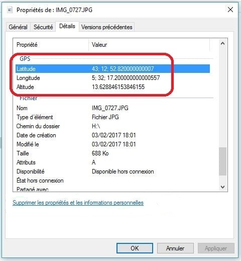
Delete metadata
When a photograph is taken from a camera, the visual file includes information such as the date the picture was taken, the type and model of camera, geolocation... All this data adds weight to the file! It's all very silly, but remember to make sure that the visuals you use have no metadata attached.
Optimize weight
You've included visuals in your email. That's perfectly understandable. But which software do you use to prototype your emails: Figma? Photoshop? Invision? Adobe XD? In any case, it's important to export your visuals :
- in a relevant format is a first step, but we'll deal with this subject in the following chapters.
- by reducing their weight. Because images require server hosting; and the heavier your images, the more space you need, and therefore energy.
With Photoshop, nothing could be simpler, since you can reduce the "quality" of your file with a slider at the very moment of export. At the same time, you can evaluate the weight savings achieved and the final quality of your visual.
On Figma, there are plugins like Downsize to compress and resize your images without leaving Figma! However, if none of these solutions speak to you, you can choose online solutions like squoosh.app, tinypng.com, or tinyjpg.com, depending on whether you want to do batch or non-batch processing.
Taking advantage of Retina
Retina is a brand of screen resolution used by Apple on its devices, such as iPhones, iPads and MacBooks. A Retina display has a very high resolution, which means it can display images and text with great sharpness and precision.
However, in order to display high-quality images on a Retina screen, it's necessary to call up visuals with dimensions twice as large as those specified in the HTML code. This means heavier visuals (instead of 2 pixels by 2 pixels for a given surface, we'll have 4 pixels by 4 pixels, since the resolution is twice as high. So we won't have 4 pixels in total, but 16 pixels).
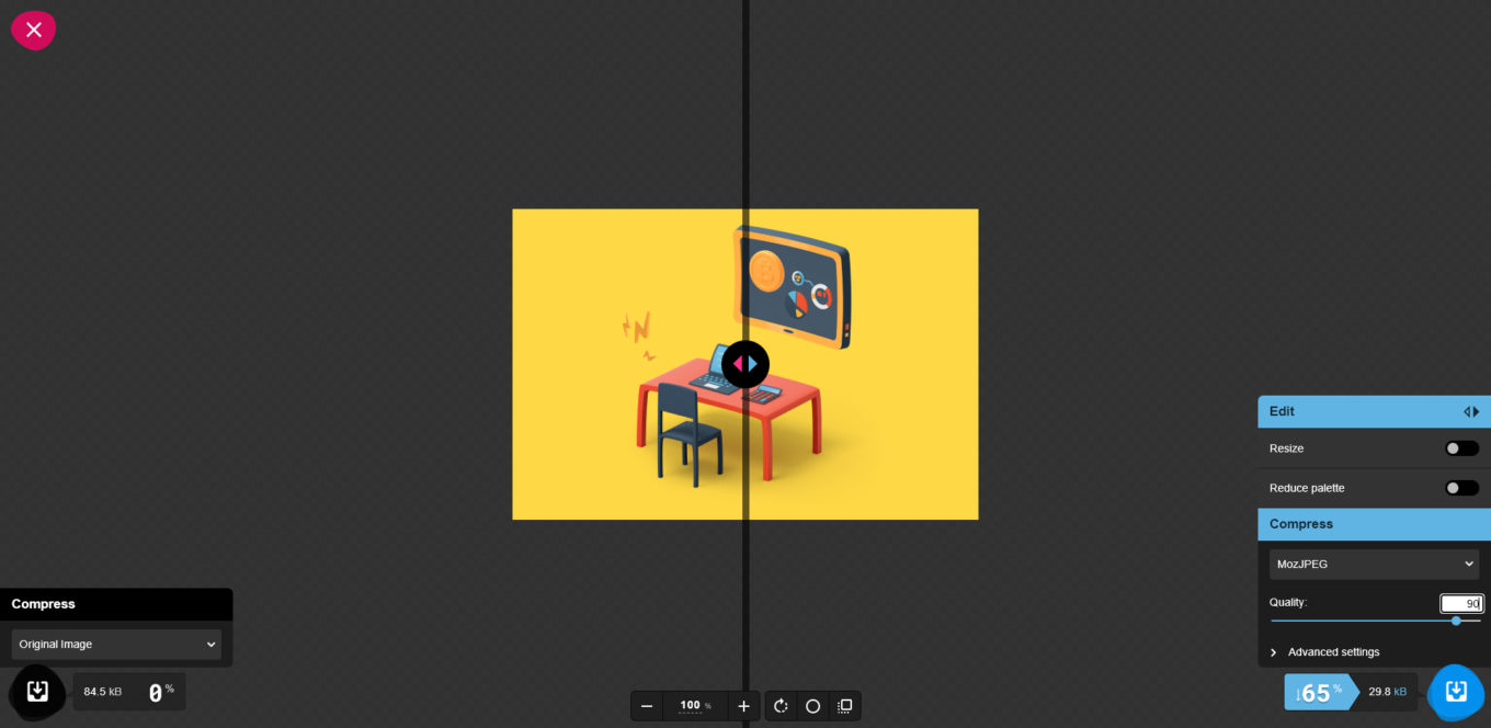
So should Retina be the standard for all visuals? Well, no, EXCEPT if your Retina visuals are highly compressedAnd here's a tip we'd like to share with you: Let's take a visual 250 pixels wide by 166 pixels high.

Without image compression and without planning for the Retina, this same visual will weigh 55kb. After compressing this visual to 90% on a solution such as Squoosh.app, it shrinks from 55kb to 16kb. And the quality remains the same to the naked eye.

We might therefore think that by preparing this visual for the Retina, i.e. by doubling the width and respecting the homothety, the visual would be heavier. Without a doubt... UNLESS YOU COMPRESS THE QUALITY OF THE VISUAL IN PHOTOSHOP! Because, as the visual is larger and more detailed, it is also possible to compress it much more. And, surprisingly, the weight of the Retina display can then compete with the weight of the non-Retina display, or even beat it, while keeping a better level of details!
Limit (drastically) the animated gifs
Animated gifs are very practical for simulating a video or presenting an animated visual, that's a fact. However, they are generally very heavy and difficult to optimize while maintaining respectable image quality. Ask yourself the right questions: is this animation really worth animating? Can I insert all this information in a static jpg visual?
If GIF animation is essential, don't forget to optimize it (by compressing it, reducing the quality, removing some unnecessary states) as much as possible with platforms like ezgif.com.
Choose the format
Only three image formats are correctly supported in an e-mail: JPEG, GIF and PNG. Find out which format to choose when exporting your visuals with the table below.. But above all, between these three formats, it is important to understand that the weight will not be the same for the same visual.
| Benefits | Disadvantages | |
|---|---|---|
| JPEG | JPEG retains optimum image quality with 16 million colors | Does not support transparency or animation. |
| GIF | GIF is an 8-bit image format, which generally makes it lighter than JPEG or PNG. It also supports animation. | It is limited in terms of color and image quality. Animated gifs are "stuck" in their first state on Outlook e-mail software on Windows. |
| PNG | PNG is a lossless image format that offers higher quality than GIF while retaining transparency. | Using a PNG format for an image with many colors can make your PNG heavier than your JPEG. |
It is important to note that the choice of format will depend on the intended use of the image. For example, if you need an image with lots of detail and little concern for file size, PNG would be a better choice. If you need an animated image, GIF would be the ideal format. And if you need an image with a good compromise between image quality and file size, JPEG might be the best choice.
Take advantage of the images already hosted...
Some visuals can be found on several campaigns: the logo, the social network pictograms, the visuals for the reassurance banner... So why not take advantage of them? There's no need to export these images again for each new campaign, and no need to optimize them. Simply take advantage of the work you've already done!
... and clean your images
If your campaign has been out for a while... Is it necessary to keep the images on the server? It's unlikely that your recipients will open the campaign again after too long a delay, is it? This could be an opportunity to delete images from campaigns that are too old on your server, with the aim of reducing the amount of storage space required. Because eco-design isn't just before, or during... It's also after!
Dissociate textual content and graphic formatting
To simplify the HTML integration of the email, to guarantee optimum accessibility, and also to use a minimum of visuals, we recommend, wherever possible, designing as much text content as possible in raw HTML (with CSS formatting if necessary).
Coding the buttons
A call-to-action can take many forms, but the most common is a button, with or without rounded corners and with or without a border. Limiting yourself to these few graphic layouts (without forgetting the layout of the text the button contains, of course) can easily be managed entirely with HTML attributes and CSS properties.

A button like the one above can therefore be coded as follows:
<table role="presentation" cellpadding="0" cellspacing="0" border="0" align="center">
  <tr>
    <td bgcolor="#141414" style="border-radius:50px; padding:20px 40px;"><p style="margin:0; font:bold 18px/22px Arial, Helvetica, sans-serif; text-transform:uppercase;"><a href="https://www.monsite.fr" style="color:#FFD845; text-decoration:none;">Je fonce !</a></p></td>
  </tr>
</table>
Not only do you gain in user experience, since the button will be displayed straight away, with no image download required, but you also greatly reduce the need to call on external resources. We could just as easily add a drop shadow to the button directly in CSS, or a hover effect with the pseudo CSS class :hoverprovided, of course, that you accept its elegant degradation.
Think about the background images
The background images are a real asset to email design. They enable text or buttons to be superimposed on a background image. In other words, textual content and graphic layout are separated.
However, if their primary implementation technique is relatively simple (use of the CSS background), it requires much more code to ensure that it is displayed on the majority of messaging solutions. It will therefore often be necessary to accumulate both the HTML attribute background, the CSS property background, and the CSS property background-image.
But it's a different story when it comes to displaying them on... Outlook, the Windows e-mail software.
In fact, for a background image to appear on this messaging software, VML (Vector Markup Language) must be added: code in which it will be essential to add fixed dimensions. Apart from the problem of automatic block stretching, this also represents additional code. So :
<td background="https://www.monsite.fr/images/monimagedefond.jpg" style="background:url('https://www.monsite.fr/images/monimagedefond.jpg') no-repeat top center; background-image:url('https://www.monsite.fr/images/monimagedefond.jpg'); background-repeat:no-repeat; background-position:top center;">
</td>
Will become, so that the background image is supported on Outlook :
<td background="https://www.monsite.fr/images/monimagedefond.jpg" style="background:url('https://www.monsite.fr/images/monimagedefond.jpg') no-repeat top center; background-image:url('https://www.monsite.fr/images/monimagedefond.jpg'); background-repeat:no-repeat; background-position:top center; width:200px; height:200px;">
  <!--[if gte mso 9]>
  <v:rect xmlns:v="urn:schemas-microsoft-com:vml" fill="true" stroke="false" style="width:200px;height:200px;">
    <v:fill type="frame" src="https://www.monsite.fr/images/monimagedefond.jpg" color="#000000" />
    <v:textbox inset="0,0,0,0">
  <![endif]-->
  <div>
	</div>
  <!--[if gte mso 9]>
    </v:textbox>
  </v:rect>
  <![endif]-->
</td>
Do you see where we are going? Background images should be used with care, as they greatly overload the weight of the final HTML code.
Moderating innovations
Another important part is to limit "gadget" sections. A carousel in an e-mail is fun, but it only works in a few e-mail clients. And that requires a significant amount of code, plus a second layer of code to handle some cases where the carousel doesn't work.
The impact of a carousel compared to a "standard" section is also often negligible. It's the kind of element that pleases decision-makers and marketers looking for a "WAOUW" effect. Even for Badsender, it's something we appreciate for the technological stakes, the R&D and therefore the challenge. But in the end, it will have very little impact on the expected objectives of an email.
Design System Email
We often talk about Design System Email such as, among other things, greater consistency and efficiency in email production. Efficiency in itself saves production time, and therefore energy. But that's clearly not the only benefit! Whether at the design or code stage, Design System Email also allows you to "save" on the number of files you'll need.
Let's take the Figma prototyping platform as an example: if you design atoms, molecules and organisms according to the principle of Atomic Design, you can call up these organisms as instances of the main components in your future campaigns. This eliminates the need to recreate each organism separately, each time.
Email eco-design and code
Coding an email is complex. It's all about rendering correctly in different email clients, each with their own specificities. To achieve this, we tend to have redundant code, as one email client will understand instruction A and the other will understand instruction B. If we want to lighten the code, and therefore the weight of the email, we need to find solutions to optimize the amount of code written.
A few characters on an email will result in a fairly small change in weight, only a few kilobytes. But with the effects of scale, a few kilobytes multiplied by hundreds of thousands, or even millions of emails, over several mailings per month, starts to add up.
For example, 10kb on four emails per month sent to 500.000 recipients, represents 240GB per year...
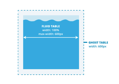
Coding in Fluid or Spongy
The Fluid or Spongy coding method consists in providing emails of 100% width, fluid therefore, with a maximum width via the CSS property max-width to limit the width of the email in desktop format.
This technique is designed to display a mobile version of the email on messaging solutions that don't support media queries or that suppress the media queries contained in the style style tag in the head head of the email.
It has both advantages and disadvantages.
- Advantages: It often includes design constraints, favoring one column or a colonization system. As a result, the design is generally a little more simplified. As this method doesn't change the "size" of certain elements on mobile (since media queries are excluded), it can also simplify the work and time spent on design. And since media queries aren't required, there's always that much less code to worry about. There's no need to worry about breakpoints either, since the email automatically adapts to the screen size.
- Disadvantages: because the CSS property
max-widthis not supported on Outlook Windows e-mail software, it is necessary to surround fluid tables with conditional comments by so-called "phantom" tables, which have a fixed width. And adddiv... And CSS reset... Anyway, this includes the use of additional code, making it more difficult to understand, maintain and, above all, weigh down..
We're talking here only about the Fluid or Spongy method, and not Hybrid, which combines both the Fluid method + the use of media queries to further optimize the display of the mobile version of the email on messaging solutions that support them.
Calling non-websafe fonts
We're not going to talk here about the support or the ease of implementation of this or that method. That's not the point. Our focus is on the resources called up, or the weight of the code.
Several methods are possible to call an exotic typeface. We will detail here the two most common ones:
- The method
linkwith the CSS sheet path where the hosted font is described. In the case of a Google Font, this would be :
<link rel="preconnect" href="https://fonts.googleapis.com">
<link rel="preconnect" href="https://fonts.gstatic.com" crossorigin>
<link href="https://fonts.googleapis.com/css2?family=Montserrat&display=swap" rel="stylesheet">
- The method
@font-face. Copy and paste the content of this CSS sheet into the style tagstyleof your email. This gives :
/* cyrillic-ext */ @font-face {
font-family: 'Montserrat';
font-style: normal;
font-weight: 400;
font-display: swap;
src: url(https://fonts.gstatic.com/s/montserrat/v25/JTUHjIg1_i6t8kCHKm4532VJOt5-QNFgpCtr6Hw0aXpsog.woff2) format('woff2');
unicode-range: U+0460-052F, U+1C80-1C88, U+20B4, U+2DE0-2DFF, U+A640-A69F, U+FE2E-FE2F;
} /* cyrillic */
@font-face {
font-family: 'Montserrat';
font-style: normal;
font-weight: 400;
font-display: swap;
src: url(https://fonts.gstatic.com/s/montserrat/v25/JTUHjIg1_i6t8kCHKm4532VJOt5-QNFgpCtr6Hw9aXpsog.woff2) format('woff2');
unicode-range: U+0301, U+0400-045F, U+0490-0491, U+04B0-04B1, U+2116;
} /* vietnamese */
@font-face {
font-family: 'Montserrat';
font-style: normal;
font-weight: 400;
font-display: swap;
src: url(https://fonts.gstatic.com/s/montserrat/v25/JTUHjIg1_i6t8kCHKm4532VJOt5-QNFgpCtr6Hw2aXpsog.woff2) format('woff2');
unicode-range: U+0102-0103, U+0110-0111, U+0128-0129, U+0168-0169, U+01A0-01A1, U+01AF-01B0, U+1EA0-1EF9, U+20AB;
} /* latin-ext */
@font-face {
font-family: 'Montserrat';
font-style: normal;
font-weight: 400;
font-display: swap;
src: url(https://fonts.gstatic.com/s/montserrat/v25/JTUHjIg1_i6t8kCHKm4532VJOt5-QNFgpCtr6Hw3aXpsog.woff2) format('woff2');
unicode-range: U+0100-024F, U+0259, U+1E00-1EFF, U+2020, U+20A0-20AB, U+20AD-20CF, U+2113, U+2C60-2C7F, U+A720-A7FF;
} /* latin */
@font-face {
font-family: 'Montserrat';
font-style: normal;
font-weight: 400;
font-display: swap;
src: url(https://fonts.gstatic.com/s/montserrat/v25/JTUHjIg1_i6t8kCHKm4532VJOt5-QNFgpCtr6Hw5aXo.woff2) format('woff2');
unicode-range: U+0000-00FF, U+0131, U+0152-0153, U+02BB-02BC, U+02C6, U+02DA, U+02DC, U+2000-206F, U+2074, U+20AC, U+2122, U+2191, U+2193, U+2212, U+2215, U+FEFF, U+FFFD;
}
You might logically think that the second method is more code-intensive. This is undoubtedly true. But is it on the resources called? In fact, we're not calling up an external style sheet here, since its content is entered directly into the email code.
It's up to you to draw your own conclusions.
Exploiting the HTML5 doctype
This doctype declaration, made at the very beginning of your HTML code in the form a specific tag !DOCTYPE HTML !DOCTYPE HTMLhas a significant advantage: be able to shorten self-closing tags even further. Thus, the :
<meta />
<link />
<img />
<br />
<hr />
Can, with the HTML 5 doctype, be written in the following way:
<meta>
<link>
<img>
<br>
<hr>
Define the click zones
You may want to make the whole email clickable. This maximizes the likelihood of clicks on your campaigns, but it puts a considerable strain on your code.
Know how to correctly delimit the click zones of your campaign. Generally, buttons or texts with underlining are to be preferred.
Perfecting media queries
The media queries required to display the mobile version of the email can be improved in several ways to reduce their weight and maintainability.
Think about the naming of class CSS.
To make it easier for any new integrator to find their way around your CSS classes (and thus gain in efficiency, productivity and work time, and therefore energy), don't hesitate to use explicit class naming. Let's clarify our thinking with a concrete example: we regularly come across obscure classes in email codes. For example:
<p class="xd_45_haut">Mon paragraphe</p>For a higher statement of the sort:
@media screen and (max-width:600px) {
.xd_45_haut {
font-size:18px !important;
}
}
So how could any new integrator taking over HTML integration suspect that the class xd_45_haut can be used to change the font size of the element in 18px on mobile? And, in fact, why not simply name this class fontsize18px ? It's a bit more explicit, isn't it?
Declare the classes separately.
Here again, let's use a concrete case.
<p class="premier_paragraphe">Mon paragraphe</p>
<p class="second_paragraphe">Mon paragraphe</p>
<p class="troisieme_paragraphe">Mon paragraphe</p>
And the following attached media query:
@media screen and (max-width:600px) {
.premier_paragraphe {
font-size:18px !important;
color:#000000 !important;
text-align:center !important;
}
.second_paragraphe {
font-size:18px !important;
color:#000000 !important;
text-align:left !important;
}
.troisieme_paragraphe {
font-size:18px !important;
color:#000000 !important;
text-align:left !important;
}
}
You could greatly simplify the understanding and weight of the code in the following way:
<p class="fontsize18px colornoir textaligncenter">Mon paragraphe</p>
<p class="fontsize18px colornoir textalignleft">Mon paragraphe</p>
<p class="fontsize18px colornoir textalignleft">Mon paragraphe</p>
And the following media queries:
@media screen and (max-width:600px) {
.fontsize18px {
font-size:18px !important
}
.colornoir {
color:#000000 !important;
}
.textaligncenter {
text-align:center !important;
}
.textalignleft {
text-align:left !important;
}
}
Minimize the code
Minification reduces the weight of HTML files by eliminating indentation in HTML code, thereby saving a few kilobytes (or even a lot of weight!). In addition to indentation, the extreme version of minification also removes all line breaks from HTML code. This practice can be used, but always make sure that the rendering of HTML code is not "broken" or that ESP supports this minification!
In the framework MaizzleWhen producing the final code, we can ask for the code to be minified (indentation and line breaks removed). At Badsender, depending on the situation, we don't minify our HTML code so that the customer can update the code, make changes and find his way around easily.
Delete comments
At Badsender, we don't necessarily think about deleting comments for the good reason that they're there... for a good reason. But in general, we don't use comments, especially in our CSS code: not only to avoid bugs, but also to reduce the weight of the code. So don't forget to clean up your HTML code of any unnecessary comments!
Shorten...
Hexadecimal codes
It's customary to write a hexadecimal code for a color in six characters, for example #FF0000 for red. However, this value can be shortened to three characters for codes composed of identical pairs. Thus, #FF0000 will become #F00.
CSS values and properties
Here, we're talking about CSS property values, and CSS properties themselves. Let's start by imagining a cell with the following CSS properties:
<td style="padding-top:10px; padding-right:20px; padding-bottom:10px; padding-left:20px;">Well, you can shorten all these individual declarations : padding-top, padding-right, padding-bottom and padding-left in a single CSS property padding, this way:
<td style="padding:10px 20px;">This is of course applicable to the CSS property margin. (At Badsender, as we use the Maizzle framework, it's more difficult to combine all these variations into one mega-property). Let's take another example, that of text formatting. Let's imagine a paragraph with the following graphic formatting:
<p style="font-family:Arial, Helvetica, sans-serif; font-size:16px; line-height:22px; font-weight:bold; font-style:italic;">It's perfectly possible to shorten the code this way :
<p style="font: Arial, Helvetica, sans-serif 16px/22px bold italic;">And the support is really good! Be careful though to respect the order of values to make it work. Can I email... font shorthand
Take advantage of automatic tag formatting
Some HTML tags (some of them obsolete, admittedly) inherit automatic graphic formatting. These are the b, strong, em, i, u. Here is the reconciliation of their graphic layout :
| Tags | Graphic layout |
|---|---|
b | fat |
strong | fat |
em | italics |
i | italics |
u | underlined |
So why not use these tags, whose formatting is universally appreciated? See this code:
<span style="font-weight:bold; font-style:italic; display:inline;">Mon texte</span>From this code, we can get :
<b><i>Mon texte</i></b>Practical, isn't it? On the other hand, you also need to think in terms of "accessibility", and therefore use the appropriate tags. If it's just a question of graphic formatting (bold, italic), you can use the tags i, u, b. But for important text, use the strong or em.
<strong><i>Mon texte</i></strong>Similarly, let's be practical: an HTML a attribute, to insert a link around a text, will (undoubtedly) automatically underline the text. So is it necessary to add a style with the value text-decoration:underline to this link? No.
Abandon the target="_blank"
Today, we usually declare all links as follows:
<a href="https://www.monsite.fr" target="_blank">With an attribute target="_blank" to open a new tab in a browser when checking emails in webmail. However, in terms of user experience (UX), it is strongly recommended not to change the native behavior of elements. In fact, we can take the liberty of no longer declaring this attribute targetand thus save some weight.
Don't add a title to your links, which are counterproductive in terms of accessibility.
Deletion of units
Still looking for a few characters to delete? Then why not look at the units set to zero values? If the values are equal to 0, why keep unity? So:
<td style="padding:0px 0px 0px 10px;">will become :
<td style="padding:0 0 0 10px;">Getting out of the table
Mark Robbins as Rémi Parmentier have already raised the idea and taken this initiative, through their respective movements " Get off the table " and " Thinking outside the table" . Here's a quick look at the test results we're currently extracting.
- Most HTML elements (
hn,p,ul,li,em,strong,b,cite,blockquote...) have an automatic graphic formatting (or by default) which differs according to the mail clients, media and browsers. Bold, italic, background color, indentation, bullets, text size... We can see that the tags of typehnare for example automatically in bold on almost all mail clients. This means that a series of "resets" must be implemented in CSS. Can we then apply them directly in thestylepresent in thehead? - The
stylepresent in theheadis not interpreted by Android 5.1, Android 6.0, Gmail App IMAP (Android 4.4) or T-Online (regardless of browser). This major constraint forces us to write our styles inline, directly on our HTML elements. - Inline CSS reset through CSS properties
line-height,font-size,margin,padding,font-family,font-weighttags work correctly onhnorp. - We see that we can use the element
divproperty within an HTML email integration, but it doesn't support the CSSbackground-coloron Outlook 2007, 2010, 2013, 2016, and 2019. In addition, the CSS propertywidthis not interpreted at all on Outlook 2007, Outlook 2010, Outlook 2013, Outlook 2019 on Windows 10, and Windows 10 Mail (Windows 10), nor is the CSS propertymax-width. Therefore, we are forced to use conditional comments specific to Outlook (versions greater than or equal to Outlook 2007) to simulate fixed widths on tables.
Without totally leaving the tableHowever, it is possible to limit their use! Here are a few tips...
Using semantic tags
Since accessibility has become a major concern in email marketing, it has become common practice to use semantic tags: multi-level titles (h1, h2, h3, h4, h5, h6), paragraphs (p), bulleted lists (ul and li)...
But did you know that you can also take advantage of these tags to lighten the weight of the code by accumulating these tags one after the other, without necessarily declaring a new row and cell each time? Thus:
<table>
  <tr>
    <td>Titre de niveau 01</td>
  </tr>
  <tr>
    <td>Titre de niveau 02</td>
  </tr>
  <tr>
    <td style="padding-top:20px;">Paragraphe 01</td>
  </tr>
  <tr>
    <td>Paragraphe 02</td>
  </tr>
</table>
Will become :
<table>
  <tr>
    <td><h1>Titre de niveau 01</h1>
      <h2>Titre de niveau 02</h2>
      <p style="margin-top:20px;">Paragraphe 01</p>
      <p>Paragraphe 02</p></td>
  </tr>
</table>
Use the padding and margin
An old myth in email coding is that margins between elements can only be designed with empty cells and rows. However, there are two handy CSS properties for managing both external and internal margins: margin and padding.
These two CSS properties can be used with the knowledge of their support and their small specificities: for example, the padding will be mainly well supported on td. However, beware of their use in the case of sister cells. The margin can be correctly used on paragraphs or titles.
Thus, the following code :
<table bgcolor="#F6F6F6">
<tr>
<td style="line-height:1px; font-size:1px; height:40px; width:40px;" height="40" width="40"> </td>
<td style="line-height:1px; font-size:1px; height:40px;" height="40"> </td>
<td style="line-height:1px; font-size:1px; height:40px; width:40px;" height="40" width="40"> </td>
</tr>
<tr>
<td style="line-height:1px; font-size:1px; width:40px;" width="40"> </td>
<td><h2>Titre</h2></td>
<td style="line-height:1px; font-size:1px; width:40px;" width="40"> </td>
</tr>
<tr>
<td style="line-height:1px; font-size:1px; height:10px;" height="10" colspan="3"> </td>
</tr>
<tr>
<td style="line-height:1px; font-size:1px; width:40px;" width="40"> </td>
<td><p>Mon paragraphe</p></td>
<td style="line-height:1px; font-size:1px; width:40px;" width="40"> </td>
</tr>
<tr>
<td style="line-height:1px; font-size:1px; height:40px; width:40px;" height="40" width="40" colspan="3"> </td>
</tr>
</table>Can be transformed in the following way:
<table bgcolor="#F6F6F6">
  <tr>
    <td style="padding:40px;"><h2>Titre</h2>
      <p style="margin-top:10px;">Mon paragraphe</p></td>
  </tr>
</table>
Quite a difference, isn't it?
Handling the "accessibility VS HTML file size" paradox
Coding methods for making email accessible to people with disabilities include :
- The use of semantic tags (
p,h1,h2,h3...). - Setting up attributes
role="presentation"on all tables that are not data tables. - Adding an attribute
langon the taghtmlto specify the language of our content. - Adding a
title>. - The addition of a
divjust after thebody...
Yes, but let's take the example of semantic tags: if we want to use them, we also need to think about adding CSS resets so as not to inherit the default styles of certain browsers or messaging solutions.
In short, many additions to be made. But then, isn't that counterproductive to our desire to lighten HTML code? Or rather, our desire to reduce emailing's carbon footprint?
Yes... and no. Because if you don't offer an accessible version of your email, the disabled user will use other solutions (themselves generating digital usage) to try to browse and understand the content of your email. So it's best to be ahead of the game.
And then, it is quite possible to find a balance between these two objectives, isn't it?
Keep only the minimum
A well-designed email is one that works, renders and complies with all messaging solutions... And contains only the bare minimum in terms of HTML code, with nothing superfluous. And that in itself can be a paradox. For, in order to render consistently across all messaging solutions, it is sometimes necessary to double HTML attributes with CSS properties, for example, whose function is the same (but whose support is not).
What's more, spending time making sure that the graphic rendering of the email conforms sometimes requires code adjustments, multiple tests... In short, time spent! And time spent on a computer is also, in itself, an expenditure of energy...
Accepting the paradox with Render / Pixel perfect
One of the complexities of email marketing is the difficulty of achieving identical rendering in different email clients. And yes, of course everyone thinks of Outlook... Here it's important to know your target audience. If you're targeting individuals, the use of Outlook desktop applications will be marginal. So it's not worth spending time and code weight on getting Outlook to render "perfectly". Often, a whole series of degradations will be acceptable and will in no way hinder the message (background images replaced by color, rounded corners that become straight, etc.). And if your target audience uses Outlook for the most part, then it will be important at the design stage to come up with a creative that meets your objectives and is realistic given the limitations of Outlook software.
Outlook is an example, but it is not limited to this case. There are many different contexts These include desktop and mobile versions, optimization for multiple screen sizes, retina images, darkmode, and of course, all the different interpretations between email clients. Once again, the aim of design is above all to meet the objectives of an email.
The elegant degradation
The premise of elegant degradation is to build first for the avant-garde and the best, and then to manage the least efficient systems.
http://www.pompage.net/traduction/degradation-elegante-et-amelioration-progressive
This concept, applied to email design and email code, involves accepting the degradation of a CSS effect, for example, on email solutions that are less efficient in terms of support.
Let's take the example of rounded corners: to design rounded corners in CSS, use the property border-radius. This same property is not supported by all messaging solutions.
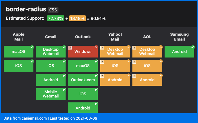
To guarantee the display of rounded corners on all messaging solutions, you would therefore need :
- to use rounded corners in images,
- or to use VML.
And therefore add extra code (not to mention the problems this can cause for Dark Mode or element elasticity, since VML requires the use of fixed widths and heights).
Rendering an element with a simple CSS property border-radius, without workaround on a messaging solution that does not support this same property, will render square corners. But does this affect the comprehension of the message?
Of course not. We can therefore "accept" that graphic effects or formatting are not supported, as long as they are not essential to the graphic rendering of the email or to the understanding of the message.
Choose your tools
Another part of Badsender's email design process is the choice of tools. We choose responsible digital tools. For example, we have moved away from Microsoft Teams and OneDrive towards Infomaniak, a Swiss provider of similar services with carbon neutral servers and data protection in accordance with Swiss laws (and RGPD compliant), we opt for OpenSource tools whenever possible, etc.
Email Builder & Framework
Beware of heavy email builder codes that include many cases (without making a generalization). The best is to code emails by hand.
Of course, when a lot of emails are produced, it's worth using an Email Builder. But should you use a Builder when you only produce 4 campaigns a year? Be careful when choosing your Email Builder, and try to select one that is responsible for the HTML code produced.
Le Patron, the email builder developed by Badsender, is a special case, since it's an email builder that uses "hand-crafted", made-to-measure code.
At Badsender, we also use a framework called Maizzle for HTML code production, which doesn't necessarily accept all the recommendations mentioned above, but which allows us to save a great deal of production time. As a result, it's easy to see the trade-off between time savings (energy savings) and the slightly heavier code produced using this framework.
Reduce testing
It's a fact that email preview tests are essential for debugging and validating the rendering of an email campaign before sending.
But do we need to test a lot? Apart from the fact that this can quickly become a considerable cost, it's also important to note that testing not only requires time (and therefore energy for the integrator and the machine), but also hosted screenshots (over 80, for example, on EmailOnAcid).
You should therefore opt for tests when you're sure that your email has been fully finalized, or that you've carried out all the necessary returns. And don't forget to archive or delete your test results. on these platforms when you no longer need them!
The Mantra to eco-design your emails
Before starting any investigation into an innovation, a design idea, a particular parameter, always ask yourself the question: is it worth it? Is it necessary to spend so much time in R&D to achieve such a rendering, such a configuration?
Isn't that clear? Well, let's take Dark Mode as an example: rendering emails on media or messaging solutions configured in dark mode is really hard to perfect. But is this really the goal? Get to know your recipients' viewing habits (which e-mail solution do they use? What is their primary viewing format? Desktop? Mobile? Tablet?)

The results you get from this will highlight the choices you need to make in your design and coding methods. If your recipients are primarily a BtoC target, there's little chance that they'll open mainly on Outlook for Windows. So can't we do away with all the Outlook-specific code palliatives and lighten the load?
To conclude
Marketing is a practice that often runs counter to the ecological needs of our time. Badsender is aware of this, and we want to do everything we can to be in line with our values. This includes, among other things, reducing, as far as possible, the amount ofcarbon footprint of an email campaign. From now on, it's something we'll be systematically promoting and offering our customers.
And we're only talking here about the levers that can be activated when creating the email, but there are many other ways to limit the impact of email marketing in general: target relevant recipients for emails, so as to send fewer of them; use the most carbon-friendly tools and service providers possible (You can see the result of Badsender's 2021 carbon footprint here); getting involved in projects like Zero Carbon Email (supported by Badsender); making it easier to unsubscribe so as not to send emails to people who aren't interested; etc. These are all avenues that will require further articles to explore in greater depth.
See also: What is the role of a CRM team in the ecological transition?
